mui-tiptap
Version:
A Material-UI (MUI) styled WYSIWYG rich text editor, using Tiptap
468 lines (374 loc) • 55.8 kB
Markdown
<p align="center">
<a href="https://github.com/sjdemartini/mui-tiptap" target="_blank">
<img src="https://github.com/sjdemartini/mui-tiptap/assets/1647130/e1f01441-c74a-410c-b25d-5a58615d3e6a" alt="mui-tiptap logo" width="350" />
</a>
</p>
<p align="center">
<b>mui-tiptap</b>: A customizable <a href="https://mui.com/material-ui/getting-started/overview/">Material UI</a> styled WYSIWYG rich text editor, using <a href="https://tiptap.dev/">Tiptap</a>.
</p>
<p align="center">
<a href="https://www.npmjs.com/package/mui-tiptap">
<img alt="npm mui-tiptap package" src="https://img.shields.io/npm/v/mui-tiptap">
</a>
<a href="https://www.npmjs.com/package/mui-tiptap">
<img alt="npm type definitions" src="https://img.shields.io/npm/types/mui-tiptap">
</a>
<a href="https://github.com/sjdemartini/mui-tiptap/actions">
<img alt="GitHub Workflow Status" src="https://img.shields.io/github/actions/workflow/status/sjdemartini/mui-tiptap/build-test.yml">
</a>
<a href="https://github.com/sjdemartini/mui-tiptap/blob/main/LICENSE">
<img alt="project license" src="https://img.shields.io/npm/l/mui-tiptap">
</a>
</p>
- :sparkles: Styled based on your own MUI theme (colors, fonts, light vs dark mode, etc.)
- :hammer_and_wrench: Built on powerful Tiptap and ProseMirror foundations (extensible, real-time collaborative editing, cross-platform support, etc.)
**Features:**
- :toolbox: An all-in-one `RichTextEditor` component to get started immediately (no other components or hooks needed!), or individual modular components to customize to your needs
- :sunglasses: Built-in styles for Tiptap’s extensions (text formatting, lists, tables, Google Docs-like collaboration cursors; you name it!)
- :arrow_forward: Composable and extendable menu buttons and controls for the standard Tiptap extensions
- :framed_picture: [`ResizableImage` extension](#resizableimage) for adding and resizing images directly in the editor
- :anchor: [`HeadingWithAnchor` extension](#headingwithanchor) for dynamic GitHub-like anchor links for every heading you add
- :link: [`LinkBubbleMenu`](#components) so adding and editing links is a breeze
- :1234: [`FontSize` extension](#fontsize) for controlling text sizes
- :white_square_button: [`TableImproved` extension](#tableimproved) that [fixes](https://github.com/ueberdosis/tiptap/issues/2041) [problems](https://github.com/ueberdosis/tiptap/issues/2301) in the underlying Tiptap `Table` extension
- :pencil: [`TableBubbleMenu`](#components) for interactively editing your rich text tables
- :speech_balloon: General-purpose [`ControlledBubbleMenu`](#components) for building your own custom menus, [solving some shortcomings](https://github.com/ueberdosis/tiptap/issues/2305#issuecomment-1020665146) of the Tiptap `BubbleMenu`
- And more!
<details>
<summary><b>README Table of Contents</b></summary>
- [Demo](#demo)
- [Installation](#installation)
- [Get started](#get-started)
- [Use the all-in-one component](#use-the-all-in-one-component)
- [Create and provide the `editor` yourself](#create-and-provide-the-editor-yourself)
- [Render read-only rich text content](#render-read-only-rich-text-content)
- [mui-tiptap extensions and components](#mui-tiptap-extensions-and-components)
- [Tiptap extensions](#tiptap-extensions)
- [`HeadingWithAnchor`](#headingwithanchor)
- [`FontSize`](#fontsize)
- [`LinkBubbleMenuHandler`](#linkbubblemenuhandler)
- [`ResizableImage`](#resizableimage)
- [`TableImproved`](#tableimproved)
- [Components](#components)
- [Controls components](#controls-components)
- [Localization](#localization)
- [Tips and suggestions](#tips-and-suggestions)
- [Choosing your editor `extensions`](#choosing-your-editor-extensions)
- [Extension precedence and ordering](#extension-precedence-and-ordering)
- [Other extension tips](#other-extension-tips)
- [Drag-and-drop and paste for images](#drag-and-drop-and-paste-for-images)
- [Re-rendering `RichTextEditor` when `content` changes](#re-rendering-richtexteditor-when-content-changes)
- [Contributing](#contributing)
</details>
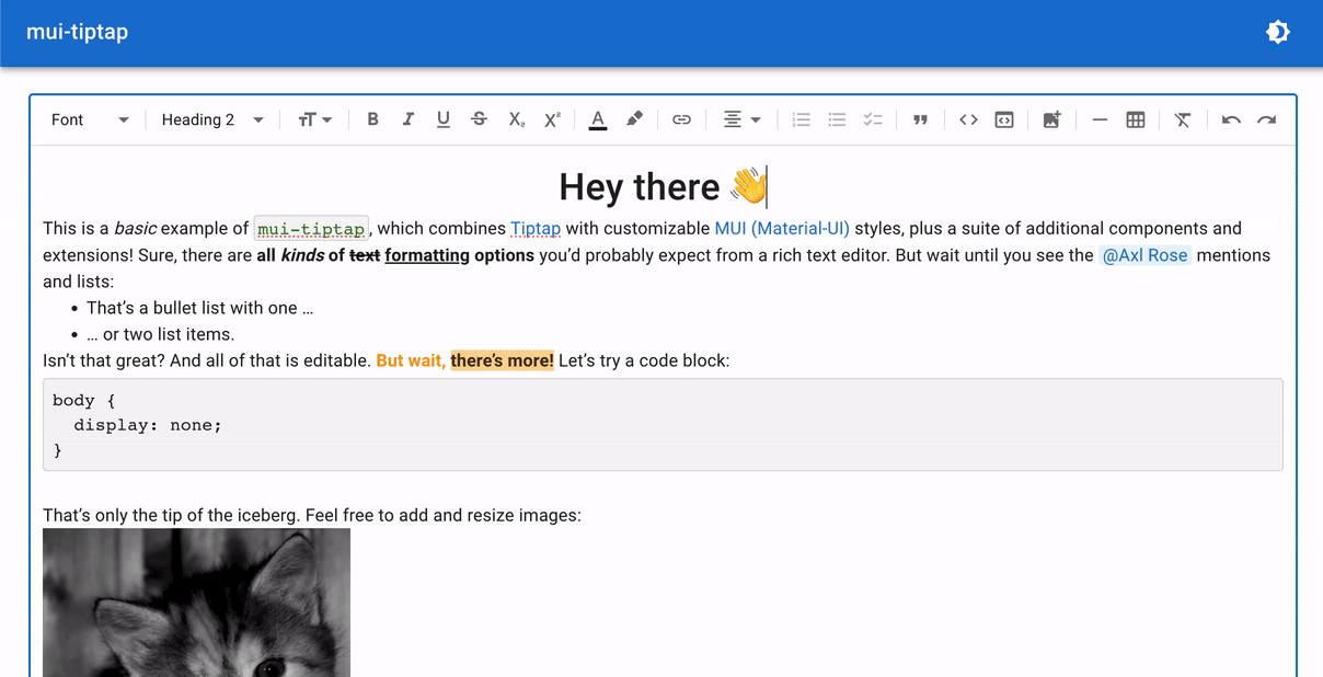
## Demo
Try it yourself in this **[CodeSandbox live demo](https://codesandbox.io/p/sandbox/mui-tiptap-demo-3zl2l6)**!
## Installation
```shell
npm install mui-tiptap
```
or
```shell
yarn add mui-tiptap
```
There are peer dependencies on [`@mui/material`](https://www.npmjs.com/package/@mui/material) and [`@mui/icons-material`](https://www.npmjs.com/package/@mui/icons-material) (and their `@emotion/` peers), and [`@tiptap/`](https://tiptap.dev/installation/react) packages. These should be installed automatically by default if you’re using npm 7+ or pnpm. Otherwise, if your project doesn’t already use those, you can install them with:
```shell
npm install @mui/material @mui/icons-material @emotion/react @emotion/styled @tiptap/react @tiptap/extension-heading @tiptap/extension-image @tiptap/extension-table @tiptap/pm @tiptap/core
```
or
```shell
yarn add @mui/material @mui/icons-material @emotion/react @emotion/styled @tiptap/react @tiptap/extension-heading @tiptap/extension-image @tiptap/extension-table @tiptap/pm @tiptap/core
```
## Get started
### Use the all-in-one component
The simplest way to render a rich text editor is to use the `RichTextEditor` component:
```tsx
import { Button } from "@mui/material";
import StarterKit from "@tiptap/starter-kit";
import {
MenuButtonBold,
MenuButtonItalic,
MenuControlsContainer,
MenuDivider,
MenuSelectHeading,
RichTextEditor,
type RichTextEditorRef,
} from "mui-tiptap";
import { useRef } from "react";
function App() {
const rteRef = useRef<RichTextEditorRef>(null);
return (
<div>
<RichTextEditor
ref={rteRef}
extensions={[StarterKit]} // Or any Tiptap extensions you wish!
content="<p>Hello world</p>" // Initial content for the editor
// Optionally include `renderControls` for a menu-bar atop the editor:
renderControls={() => (
<MenuControlsContainer>
<MenuSelectHeading />
<MenuDivider />
<MenuButtonBold />
<MenuButtonItalic />
{/* Add more controls of your choosing here */}
</MenuControlsContainer>
)}
/>
<Button onClick={() => console.log(rteRef.current?.editor?.getHTML())}>
Log HTML
</Button>
</div>
);
}
```
Check out [mui-tiptap extensions and components](#mui-tiptap-extensions-and-components) below to learn about extra Tiptap extensions and components (like more to include in `renderControls`) that you can use. See [`src/demo/Editor.tsx`](./src/demo/Editor.tsx) for a more thorough example of using `RichTextEditor`.
### Create and provide the `editor` yourself
If you need more customization, you can instead define your editor using Tiptap’s `useEditor` hook, and lay out your UI using a selection of `mui-tiptap` components (and/or your own components).
Pass the `editor` to `mui-tiptap`’s `RichTextEditorProvider` component at the top of your component tree. From there, render whatever children within the provider that fit your needs.
The easiest is option is the `RichTextField` component, which is what `RichTextEditor` uses under the hood:
```tsx
import { useEditor } from "@tiptap/react";
import StarterKit from "@tiptap/starter-kit";
import {
MenuButtonBold,
MenuButtonItalic,
MenuControlsContainer,
MenuDivider,
MenuSelectHeading,
RichTextEditorProvider,
RichTextField,
} from "mui-tiptap";
function App() {
const editor = useEditor({
extensions: [StarterKit],
content: "<p>Hello <b>world</b>!</p>",
});
return (
<RichTextEditorProvider editor={editor}>
<RichTextField
controls={
<MenuControlsContainer>
<MenuSelectHeading />
<MenuDivider />
<MenuButtonBold />
<MenuButtonItalic />
{/* Add more controls of your choosing here */}
</MenuControlsContainer>
}
/>
</RichTextEditorProvider>
);
}
```
Or if you want full control over the UI, instead of `RichTextField`, you can build the editor area yourself and then just use the `<RichTextContent />` component where you want the (styled) editable rich text content to appear. `RichTextContent` is the MUI-themed version of Tiptap's `EditorContent` component.
### Render read-only rich text content
Use the `RichTextReadOnly` component and just pass in your HTML or ProseMirror JSON and your configured Tiptap extensions, like:
```tsx
<RichTextReadOnly content="<p>Hello world</p>" extensions={[StarterKit]} />
```
Alternatively, you can set the `RichTextEditor` `editable` prop (or `useEditor` `editable` option) to `false` for a more configurable read-only option. Use `RichTextReadOnly` when:
- You just want to efficiently render editor HTML/JSON content directly, without any outlined field styling, controls setup, extra listener logic, access to the `editor` object, etc. (This component also skips creating the Tiptap `editor` if `content` is empty, which can help performance.)
- You want a convenient way to render content that updates as the `content` prop changes. (`RichTextEditor` by contrast does not re-render automatically on `content` changes, as [described below](#re-rendering-richtexteditor-when-content-changes).)
## mui-tiptap extensions and components
### Tiptap extensions
#### `HeadingWithAnchor`
A modified version of [Tiptap’s `Heading` extension](https://tiptap.dev/api/nodes/heading), with dynamic GitHub-like anchor links for every heading you add. An anchor link button will appear to the left of a heading when hovering over it, when the `editor` has `editable` set to `false`. This allows users to share links and jump to specific headings within your rendered editor content.
#### `FontSize`
Sets text font size. This extension requires the [`@tiptap/extension-text-style`](https://tiptap.dev/api/marks/text-style) package to be installed and its `TextStyle` mark to be included in your `extensions`.
Can be controlled with the [`MenuSelectFontSize` component](#controls-components).
##### Commands <!-- omit from toc -->
- `setFontSize()`: Set the text font size (using [a valid CSS `font-size` property](https://developer.mozilla.org/en-US/docs/Web/CSS/font-size)). ex: `"12px"`, `"2em"`, `"small"`
- `unsetFontSize()`: Remove any previously set font size, reverting to the default size for the given mark.
#### `LinkBubbleMenuHandler`
To be used in conjunction with the [`LinkBubbleMenu` component](#components), as this extension provides editor commands to control the state of the link bubble menu.
##### Commands <!-- omit from toc -->
- `openLinkBubbleMenu()`: Open/show the link bubble menu. Create a link if one doesn't exist at the current cursor selection, or edit the existing link if there is already a link at the current selection.
- `editLinkInBubbleMenu()`: Edit an existing link in the bubble menu, to be used when currently viewing a link in the already-opened bubble menu.
- `closeLinkBubbleMenu()`: Close/hide the link bubble menu, canceling any ongoing edits.
#### `ResizableImage`
A modified version of [Tiptap’s `Image` extension](https://tiptap.dev/api/nodes/image), which adds the ability to resize images directly in the editor. A drag handle appears in the bottom right when clicking on an image, so users can interactively change the size.
#### `TableImproved`
A modified version of [Tiptap’s `Table` extension](https://tiptap.dev/api/nodes/table) that fixes problems related to column-resizing and editable state.
Namely, this version of the extension, coupled with the `mui-tiptap` CSS styles ensures that:
1. Columns respect their resized widths even when the editor has `editable=false`
2. Column resizing is possible regardless of initial editor state, when toggling from `editable=false` to `editable=true`
(Resolves these reported Tiptap issues: [1](https://github.com/ueberdosis/tiptap/issues/2041), [2](https://github.com/ueberdosis/tiptap/issues/2301), [3](https://github.com/ueberdosis/tiptap/issues/4044).)
### Components
| Component | Description |
| ------------------------ | ------------------------------------------------------------------------------------------------------------------------------------------------------------------------------------------------------------------------------------------------------------------------------------------------------------------------------------------------------------------------------------------------------------------------------------------------------------------------------------------------------------------------------------------------------------------------------------------------------------------------------------------------------------------------------------------------------------------------------------------------------------------------------------------------------------------------------------------------------------------------------------------------------------------------------------------------------------------------------------------------------------------------------------------------------ |
| `RichTextEditor` | An all-in-one component to directly render a MUI-styled Tiptap rich text editor field. Utilizes many of the below components internally. See the ["Get started" notes on usage above](#use-the-all-in-one-component). In brief: `<RichTextEditor ref={rteRef} content="<p>Hello world</p>" extensions={[...]} />` |
| `RichTextReadOnly` | An all-in-one component to directly render read-only Tiptap editor content. While `RichTextEditor` (or `useEditor`, `RichTextEditorProvider`, and `RichTextContent`) can be used as read-only via the editor's `editable` prop, this is a simpler and more efficient version that only renders content and nothing more (e.g., does not instantiate a toolbar, bubble menu, etc. that you probably wouldn’t want in a read-only context, and it skips instantiating the editor at all if there's no content to display). |
| `RichTextEditorProvider` | Uses React context to make the Tiptap `editor` available to any nested components so that the `editor` does not need to be manually passed in at every level. Required as a parent for most mui-tiptap components besides the all-in-one `RichTextEditor` and `RichTextReadOnly`. Utilize the provided `editor` in your own components via the `useRichTextEditorContext()` hook. |
| `RichTextField` | Renders the Tiptap rich text editor content and a controls menu bar. With the `"outlined"` variant, renders a bordered UI similar to the Material UI `TextField`. The `"standard"` variant does not have an outline/border. |
| `MenuBar` | A collapsible, optionally-sticky container for showing editor controls atop the editor content. (This component is used to contain `RichTextEditor`’s `renderControls` and `RichTextField`’s `controls`, but can be used directly if you’re doing something more custom.) |
| `RichTextContent` | Renders a Material UI styled version of Tiptap rich text editor content. Applies all CSS rules for formatting, as a styled alternative to Tiptap’s `<EditorContent />` component. (Used automatically within `RichTextEditor` and `RichTextField`.) |
| `LinkBubbleMenu` | Renders a bubble menu when viewing, creating, or editing a link. Requires the Tiptap [`Link` extension](https://tiptap.dev/api/marks/link) (`@tiptap/extension-link`) and the mui-tiptap [`LinkBubbleMenuHandler` extension](#linkbubblemenuhandler). Pairs well with the [`<MenuButtonEditLink />` component](#controls-components). <br /><br />_If you're using `RichTextEditor`, include this component via `RichTextEditor`’s `children` render-prop. Otherwise, include the `LinkBubbleMenu` as a child of the component where you call `useEditor` and render your `RichTextField` or `RichTextContent`. (The bubble menu itself will be positioned appropriately as long as it is re-rendered whenever the Tiptap `editor` forces an update, which will happen if it's a child of the component using `useEditor`). See [`src/demo/Editor.tsx`](./src/demo/Editor.tsx) for an example of this._ |
| `TableBubbleMenu` | Renders a bubble menu to manipulate the contents of a Table (add or delete columns or rows, merge cells, etc.), when the user's caret/selection is inside a Table. For use with [mui-tiptap’s `TableImproved` extension](#tableimproved) or Tiptap’s `@tiptap/extension-table` extension. <br /><br />_If you're using `RichTextEditor`, include this component via `RichTextEditor`’s `children` render-prop. Otherwise, include the `TableBubbleMenu` as a child of the component where you call `useEditor` and render your `RichTextField` or `RichTextContent`. (The bubble menu itself will be positioned appropriately as long as it is re-rendered whenever the Tiptap `editor` forces an update, which will happen if it's a child of the component using `useEditor`). See [`src/demo/Editor.tsx`](./src/demo/Editor.tsx) for an example of this._ |
| `ControlledBubbleMenu` | General-purpose component for building your own custom bubble menus, [solving some shortcomings](https://github.com/ueberdosis/tiptap/issues/2305#issuecomment-1020665146) of [Tiptap’s `BubbleMenu`](https://tiptap.dev/api/extensions/bubble-menu). This is what both `LinkBubbleMenu` and `TableBubbleMenu` use under the hood. |
| `ColorPicker` | A color-picker that includes hue/saturation/alpha gradient selectors (via [react-colorful](https://github.com/omgovich/react-colorful)), plus a text input to enter a color directly, and optional `swatchColors` for color presets. Used by `MenuButtonColorPicker`/`MenuButtonTextColor`/`MenuButtonHighlightColor` under the hood. Important props:<br />• `swatchColors`: Array of colors to show as preset buttons.<br />• `colorToHex`: Override the default implementation for converting a given CSS color string to a string in hex format (e.g. `"#ff0000"`). Should return null if the given color cannot be parsed as valid. See `ColorPickerProps` definition for more details, such as examples using more full-featured libraries like [colord](https://www.npmjs.com/package/colord) or [tinycolor2](https://www.npmjs.com/package/@ctrl/tinycolor).<br />• `disableAlpha`: If true, disables the alpha/transparency slider.<br />• `value`/`onChange`: controlled color value string (empty string if unset) and its change callback. |
| `ColorSwatchButton` | Renders a button that shows and allows selecting a color preset. Utilized by `ColorPicker` for its `swatchColors`. |
#### Controls components
These controls components help you quickly put together your menu bar, for each of the various Tiptap extensions you may want to use.
You can override all props for these components (e.g. to change the `IconComponent`, `tooltipLabel`, `tooltipShortcutKeys` for which shortcut is shown, `onClick` behavior, etc.). Or easily create controls for your own extensions and use-cases with the base `MenuButton` and `MenuSelect` components.
| Extension | `mui-tiptap` component(s) |
| ---------------------------------------------------------------------------------------------------------------------------------- | ------------------------------------------------------------------------------------------------------------------------------------------------------------------------------------------------------------------------------------------------------------------------------------------------------------------------------------------------------------------------------------------------------------------------------------------------------------------------------------------------------------------------------------------------- |
| [`@tiptap/extension-blockquote`](https://tiptap.dev/api/nodes/blockquote) | `MenuButtonBlockquote` |
| [`@tiptap/extension-bold`](https://tiptap.dev/api/marks/bold) | `MenuButtonBold` |
| [`@tiptap/extension-bullet-list`](https://tiptap.dev/api/nodes/bullet-list) | `MenuButtonBulletedList` |
| [`@tiptap/extension-color`](https://tiptap.dev/api/extensions/color) | `MenuButtonTextColor` (Takes optional `defaultTextColor` prop. See `MenuButtonColorPicker` below for other customization details.) |
| [`@tiptap/extension-code`](https://tiptap.dev/api/marks/code) | `MenuButtonCode` |
| [`@tiptap/extension-code-block`](https://tiptap.dev/api/nodes/code-block) | `MenuButtonCodeBlock` |
| [`@tiptap/extension-font-family`](https://tiptap.dev/api/extensions/font-family) | `MenuSelectFontFamily` (use the `options` prop to specify which font families can be selected, like `[{ label: "Monospace", value: "monospace" }, ...]` ) |
| mui-tiptap’s [`FontSize`](#fontsize) | `MenuSelectFontSize` (use the `options` prop to override the default size options) |
| mui-tiptap’s [`HeadingWithAnchor`](#headingwithanchor)<br />or [`@tiptap/extension-heading`](https://tiptap.dev/api/nodes/heading) | `MenuSelectHeading` |
| [`@tiptap/extension-highlight`](https://tiptap.dev/api/marks/highlight) | • `MenuButtonHighlightColor`: For `Highlight`’s `multicolor: true` mode. Takes optional `defaultMarkColor`. See `MenuButtonColorPicker` below for other customization details. <br />• `MenuButtonHighlightToggle`: For `Highlight`’s default `multicolor: false` mode |
| [`@tiptap/extension-history`](https://tiptap.dev/api/extensions/history) | `MenuButtonRedo`, `MenuButtonUndo` |
| [`@tiptap/extension-horizontal-rule`](https://tiptap.dev/api/nodes/horizontal-rule) | `MenuButtonHorizontalRule` |
| mui-tiptap’s [`ResizableImage`](#resizableimage)<br />or [`@tiptap/extension-image`](https://tiptap.dev/api/nodes/image) | • `MenuButtonAddImage`: General purpose button. Provide your own `onClick` behavior (e.g. [like this](https://github.com/sjdemartini/mui-tiptap/blob/c3ea4641c14508af1719dceec091feda4ed455eb/src/demo/EditorMenuControls.tsx#L142-L150) for a user to provide an image URL). <br />• `MenuButtonImageUpload`: Upload an image. Provide `onUploadFiles` prop to handle uploading files and returning servable URLs. <br />See also mui-tiptap’s [`insertImages`](./src/utils/images.ts) util for inserting images into the Tiptap editor content. |
| [`@tiptap/extension-italic`](https://tiptap.dev/api/marks/italic) | `MenuButtonItalic` |
| [`@tiptap/extension-link`](https://tiptap.dev/api/marks/link) | `MenuButtonEditLink` (requires the `mui-tiptap` [`LinkBubbleMenuHandler` extension](#linkbubblemenuhandler) and [`<LinkBubbleMenu />` component](#components)) |
| [`@tiptap/extension-list-item`](https://tiptap.dev/api/nodes/list-item) | `MenuButtonIndent`, `MenuButtonUnindent` |
| [`@tiptap/extension-ordered-list`](https://tiptap.dev/api/nodes/ordered-list) | `MenuButtonOrderedList` |
| [`@tiptap/extension-paragraph`](https://tiptap.dev/api/nodes/paragraph) | `MenuSelectHeading` |
| [`@tiptap/extension-strike`](https://tiptap.dev/api/marks/strike) | `MenuButtonStrikethrough` |
| [`@tiptap/extension-subscript`](https://tiptap.dev/api/marks/subscript) | `MenuButtonSubscript` |
| [`@tiptap/extension-superscript`](https://tiptap.dev/api/marks/superscript) | `MenuButtonSuperscript` |
| mui-tiptap’s [`TableImproved`](#tableimproved)<br />or [`@tiptap/extension-table`](https://tiptap.dev/api/nodes/table) | • Insert new table: `MenuButtonAddTable` <br />• Edit a table (add columns, merge cells, etc.): [`TableBubbleMenu`](#components), or `TableMenuControls` if you need an alternative UI to the bubble menu |
| [`@tiptap/extension-task-list`](https://tiptap.dev/api/nodes/task-list) | `MenuButtonTaskList` |
| [`@tiptap/extension-text-align`](https://tiptap.dev/api/extensions/text-align) | `MenuSelectTextAlign` (all-in-one select)<br />or `MenuButtonAlignLeft`, `MenuButtonAlignCenter`, `MenuButtonAlignRight`, `MenuButtonAlignJustify` (individual buttons) |
| [`@tiptap/extension-underline`](https://tiptap.dev/api/marks/underline) | `MenuButtonUnderline` |
**Other controls components:**
- `MenuButtonColorPicker`: a button which can be used to bring up a mui-tiptap `ColorPicker`, letting the user select a color. Used by `MenuButtonTextColor` and `MenuButtonHighlightColor`, the props of which extend `MenuButtonColorPicker`. Important props:
- `swatchColors`: Array of color options to show as "preset" color buttons.
- `value`/`onChange`: Current color (CSS string) and its change callback. This is a controlled component, so these props must be provided, unless you're using `MenuButtonTextColor` or `MenuButtonHighlightColor`, which handle that logic.
- `popperId`: Unique HTML ID for the color picker popper that will be shown when clicking this button (used for `aria-describedby` for accessibility).
- `PopperProps`: Override the props for the popper that houses the color picker.
- `ColorPickerProps`: Override the props for mui-tiptap [`ColorPicker`](#components), such as `colorToHex` to customize the color-parsing logic.
- `MenuButtonRemoveFormatting`: a control button that removes all inline formatting of marks (calling Tiptap’s [`unsetAllMarks()`](https://tiptap.dev/api/commands/unset-all-marks))
- `MenuDivider`: renders a vertical line divider to separate different sections of your menu bar and implicitly group separate controls.
- `MenuControlsContainer`: provides consistent spacing between different editor controls components provided as `children`.
Typically you will define your controls (for `RichTextEditor`’s `renderControls` or `RichTextField`’s `controls`) like:
```tsx
<MenuControlsContainer>
<MenuSelectHeading />
<MenuDivider />
<MenuButtonBold />
<MenuButtonItalic />
{/* Add more controls of your choosing here */}
</MenuControlsContainer>
```
## Localization
All of the menu buttons, select components, and bubble menus allow you to override their default labels and content via props. Examples below.
<details>
<summary><b>Buttons</b></summary>
In general, use `tooltipLabel`:
```tsx
<MenuButtonBold tooltipLabel="Toggle bold" />
```
The `MenuButtonTextColor` and `MenuButtonHighlightColor` components also have a `labels` prop for overriding content of the color picker popper.
```tsx
<MenuButtonTextColor
tooltipLabel="Text color"
labels={{
cancelButton: "Cancel",
removeColorButton: "Reset",
removeColorButtonTooltipTitle: "Remove the color",
saveButton: "OK",
textFieldPlaceholder: 'Ex: "#7cb5ec"',
}}
/>
```
</details>
<details>
<summary><b>Selects</b></summary>
```tsx
<MenuSelectFontFamily
options={[
{ label: "Monospace", value: "monospace" },
{ label: "Serif", value: "serif" },
]}
aria-label="Font families"
emptyLabel="Font family"
tooltipTitle="Change font family"
unsetOptionLabel="Reset"
/>
```
```tsx
<MenuSelectFontSize
aria-label="Font sizes"
tooltipTitle="Change font size"
unsetOptionLabel="Reset"
/>
```
```tsx
<MenuSelectHeading
aria-label="Heading types"
tooltipTitle="Change heading type"
labels={{
empty: "Change to…",
paragraph: "Normal text",
heading1: "H1",
heading2: "H2",
heading3: "H3",
heading4: "H4",
heading5: "H5",
heading6: "H6",
}}
/>
```
```tsx
<MenuSelectTextAlign
aria-label="Text alignments"
tooltipTitle="Change text alignment"
options={[
{
value: "left",
label: "Text-align left",
shortcutKeys: ["mod", "Shift", "L"],
IconComponent: MyCustomLeftAlignIcon,
},
{
value: "right",
label: "Text-align right",
shortcutKeys: ["mod", "Shift", "R"],
IconComponent: MyCustomRightAlignIcon,
},
]}
/>
```
</details>
<details>
<summary><b>Bubble menus</b></summary>
```tsx
<LinkBubbleMenu
labels={{
viewLinkEditButtonLabel: "Edit link",
viewLinkRemoveButtonLabel: "Remove link",
editLinkAddTitle: "Add new link",
editLinkEditTitle: "Update this link",
editLinkCancelButtonLabel: "Cancel changes",
editLinkTextInputLabel: "Text content",
editLinkHrefInputLabel: "URL",
editLinkSaveButtonLabel: "Save changes",
}}
/>
```
```tsx
<TableBubbleMenu
labels={{
insertColumnBefore: "Add a new column before this",
insertColumnAfter: "Add a new column after this",
deleteColumn: "Remove current column",
// And several more. Check props type definition for details!
}}
/>
```
</details>
## Tips and suggestions
### Choosing your editor `extensions`
Browse [the official Tiptap extensions](https://tiptap.dev/extensions), and check out [`mui-tiptap`’s additional extensions](#tiptap-extensions). The easiest way to get started is to install and use Tiptap’s [`StarterKit` extension](https://tiptap.dev/api/extensions/starter-kit), which bundles several common Tiptap extensions.
To use an extension, you need to (1) install its package and (2) include the extension in the `extensions` array when instantiating your editor (either with `<RichTextEditor extensions={[]} />` or `useEditor({ extensions: [] })`).
#### Extension precedence and ordering
Extensions that need to be higher precedence (for their keyboard shortcuts, etc.) should come **later** in your extensions array. (See Tiptap's general notes on extension plugin precedence and ordering [here](https://github.com/ueberdosis/tiptap/issues/1547#issuecomment-890848888).) For example:
- Put the `TableImproved` (or `Table`) extension first in the array.
- As [noted](https://github.com/ProseMirror/prosemirror-tables/blob/b6054a0316dc60cda0f7065e186cfacf6d93519c/src/index.ts#L78-L82) in the underlying `prosemirror-tables` package, the table editing plugin should have the lowest precedence, since it depends on key and mouse events but