modern-data-table
Version:
910 lines (784 loc) • 28.2 kB
Markdown
# Modern Data Table

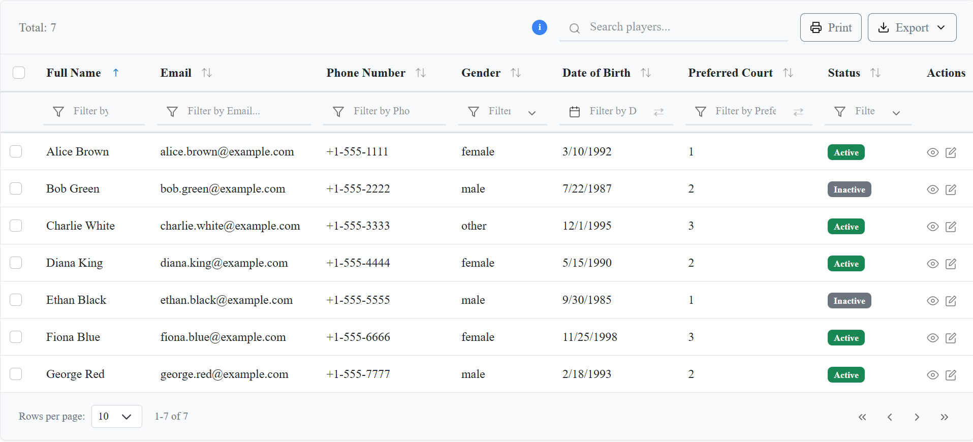
A powerful, responsive, and feature-rich React data table component with advanced filtering, sorting, and export capabilities.
## 📚 Documentation & Resources
📖 **For detailed documentation, licensing information, and guides, refer to the following documentation files:**
**Available Resources:**
- 📋 Usage Guide (USAGE-GUIDE.md) - Comprehensive usage examples and best practices
- 🔧 Troubleshooting Guide (TROUBLESHOOTING.md) - Solutions for common issues
- 📄 License Information (LICENSE) - MIT License details
- 🚀 Migration Guide (MIGRATION-GUIDE.md) - Upgrade instructions
- ⚙️ Workflow Documentation (WORKFLOW.md) - Development and build processes
> **Note**: The source code is private and not publicly accessible to protect intellectual property.
## 🚀 Features
- 📱 **Responsive Design**: Works seamlessly on desktop and mobile devices
- 🔍 **Advanced Filtering**: Multi-column filtering with various data types
- 📊 **Sorting**: Multi-column sorting with visual indicators
- 📅 **Date Range Picker**: Built-in date filtering capabilities
- 📤 **Export Options**: Export to CSV and PDF formats (PDF requires `jspdf` installation)
- 🎨 **Customizable Styling**: Material UI inspired design with scoped CSS to prevent conflicts
- ⚡ **Performance Optimized**: Efficient rendering and memory management
- 🔧 **TypeScript Support**: Full TypeScript definitions included
## 📦 Installation
```bash
npm install modern-data-table
```
### 📄 PDF Export Requirements
For PDF export functionality, you need to install `jspdf`:
```bash
npm install jspdf
```
**Troubleshooting PDF Export:**
- If you get "PDF library not available" error despite having `jspdf` installed, check the browser console for detailed error information
- Ensure `jspdf` is installed in the same project where you're using `modern-data-table`
- Some bundlers may require specific configuration for dynamic imports
```js
// Option 1: Standard CSS (may conflict with existing styles)
import 'modern-data-table/dist/styles/CustomTable.css';
import 'modern-data-table/dist/styles/Toast.css';
// Option 2: Scoped CSS (recommended to prevent conflicts)
import 'modern-data-table/dist/styles/CustomTableScoped.css';
import 'modern-data-table/dist/styles/Toast.css';
```
## 🎨 CSS Styling Options
The Modern Data Table provides two CSS options to accommodate different project needs:
### Option 1: Standard CSS
```js
import 'modern-data-table/dist/styles/CustomTable.css';
```
- **Use when**: You want the table to inherit your project's global styles
- **Note**: May conflict with existing CSS frameworks or custom styles
### Option 2: Scoped CSS (Recommended)
```js
import 'modern-data-table/dist/styles/CustomTableScoped.css';
```
- **Use when**: You want to prevent style conflicts with existing projects
- **Benefits**: All styles are scoped to `.modern-data-table` class, ensuring no conflicts
- **Recommended for**: Production applications and projects with existing CSS frameworks
Both options include the same visual design and functionality. Choose based on your project's styling requirements.
## 🎯 Quick Start
```tsx
import React from 'react';
import { DataTable } from 'modern-data-table';
// Helper for date formatting
function dateFormatter(date: string) {
return new Date(date).toLocaleDateString();
}
const columns = [
{
id: "fullName",
header: "Full Name",
accessorKey: "fullName",
sortable: true,
filterable: true,
filterType: "text" as const,
},
{
id: "email",
header: "Email",
accessorKey: "email",
sortable: true,
filterable: true,
filterType: "text" as const,
},
{
id: "phoneNumber",
header: "Phone Number",
accessorKey: "phoneNumber",
sortable: true,
filterable: true,
filterType: "text" as const,
},
{
id: "location",
header: "Location",
accessorKey: "location",
sortable: true,
filterable: true,
filterType: "dropdown" as const,
filterOptions: [
{ label: "San Francisco", value: "San Francisco" },
{ label: "Seattle", value: "Seattle" },
{ label: "Austin", value: "Austin" },
],
},
{
id: "gender",
header: "Gender",
accessorKey: "gender",
sortable: true,
filterable: true,
filterType: "dropdown" as const,
filterOptions: [
{ label: "Male", value: "male" },
{ label: "Female", value: "female" },
{ label: "Other", value: "other" },
],
},
{
id: "dateOfBirth",
header: "Date of Birth",
accessorKey: "dateOfBirth",
sortable: true,
filterable: true,
filterType: "date" as const,
render: (value: unknown) => <span>{dateFormatter(String(value))}</span>,
},
{
id: "preferredCourt",
header: "Preferred Court",
accessorKey: "preferredCourt",
sortable: true,
filterable: true,
filterType: "countRange" as const,
},
{
id: "isActive",
header: "Status",
accessorKey: "isActive",
sortable: true,
filterable: true,
filterType: "dropdown" as const,
filterOptions: [
{ label: "Active", value: true },
{ label: "Inactive", value: false },
],
render: (value: unknown) => (
<span className={`badge ${value ? "bg-success" : "bg-secondary"}`}>
{value ? "Active" : "Inactive"}
</span>
),
},
{
id: "createdAt",
header: "Created At",
accessorKey: "createdAt",
sortable: true,
filterable: true,
filterType: "date" as const,
render: (value: unknown) => <span>{dateFormatter(String(value))}</span>,
},
{
id: "actions",
header: "Actions",
accessorKey: "actions",
sortable: false,
filterable: false,
render: (_: unknown, row: any) => (
<div style={{ display: "flex", gap: "8px" }}>
<button
className="action-btn"
title="View Player"
onClick={() => alert('View player: ' + row.fullName)}
>
View
</button>
<button
className="action-btn edit"
title="Edit Player"
onClick={() => alert('Edit player: ' + row.fullName)}
>
Edit
</button>
</div>
),
},
] as const;
const mockData = [
{
id: 1,
fullName: "Alice Brown",
email: "alice.brown@example.com",
phoneNumber: "+1-555-1111",
location: "San Francisco",
gender: "female",
dateOfBirth: "1992-03-10",
playingStyle: "aggressive",
dominantHand: "Right",
preferredCourt: 1,
skillLevel: "Advanced",
isActive: true,
createdAt: "2023-01-10",
updatedAt: "2023-06-12",
},
{
id: 2,
fullName: "Bob Green",
email: "bob.green@example.com",
phoneNumber: "+1-555-2222",
location: "Seattle",
gender: "male",
dateOfBirth: "1987-07-22",
playingStyle: "defensive",
dominantHand: "Left",
preferredCourt: 2,
skillLevel: "Intermediate",
isActive: false,
createdAt: "2022-11-05",
updatedAt: "2023-04-18",
},
{
id: 3,
fullName: "Charlie White",
email: "charlie.white@example.com",
phoneNumber: "+1-555-3333",
location: "Austin",
gender: "other",
dateOfBirth: "1995-12-01",
playingStyle: "all-round",
dominantHand: "Right",
preferredCourt: 3,
skillLevel: "Beginner",
isActive: true,
createdAt: "2023-02-20",
updatedAt: "2023-07-01",
},
{
id: 4,
fullName: "Diana King",
email: "diana.king@example.com",
phoneNumber: "+1-555-4444",
location: "San Francisco",
gender: "female",
dateOfBirth: "1990-05-15",
playingStyle: "defensive",
dominantHand: "Left",
preferredCourt: 2,
skillLevel: "Intermediate",
isActive: true,
createdAt: "2023-03-11",
updatedAt: "2023-07-15",
},
{
id: 5,
fullName: "Ethan Black",
email: "ethan.black@example.com",
phoneNumber: "+1-555-5555",
location: "Seattle",
gender: "male",
dateOfBirth: "1985-09-30",
playingStyle: "aggressive",
dominantHand: "Right",
preferredCourt: 1,
skillLevel: "Advanced",
isActive: false,
createdAt: "2022-12-20",
updatedAt: "2023-05-10",
},
{
id: 6,
fullName: "Fiona Blue",
email: "fiona.blue@example.com",
phoneNumber: "+1-555-6666",
location: "Austin",
gender: "female",
dateOfBirth: "1998-11-25",
playingStyle: "all-round",
dominantHand: "Left",
preferredCourt: 3,
skillLevel: "Beginner",
isActive: true,
createdAt: "2023-04-05",
updatedAt: "2023-08-01",
},
{
id: 7,
fullName: "George Red",
email: "george.red@example.com",
phoneNumber: "+1-555-7777",
location: "San Francisco",
gender: "male",
dateOfBirth: "1993-02-18",
playingStyle: "defensive",
dominantHand: "Right",
preferredCourt: 2,
skillLevel: "Intermediate",
isActive: true,
createdAt: "2023-05-22",
updatedAt: "2023-09-10",
}
];
// --- Comprehensive fetchData Example ---
// Types for demonstration (copy from your DataTable types if needed)
interface DateRange { start?: Date | null; end?: Date | null; }
interface CountRange { min?: number | null; max?: number | null; }
interface SortingState { id: string; desc: boolean; }
interface ColumnFilters { [key: string]: string | DateRange | CountRange | null; }
interface FetchDataParams {
limit: number;
skip: number;
sorting: SortingState[];
filters: ColumnFilters & { search?: string };
}
interface FetchDataResponse<T> {
rows: T[];
total: number;
}
const fetchData = async ({ limit, skip, sorting, filters }: FetchDataParams): Promise<FetchDataResponse<typeof mockData[0]>> => {
// For demonstration, log all parameters (remove in production)
console.log("data", limit, skip, sorting, filters);
let rows = [...mockData];
// Filtering (text, dropdown, date range, count range)
if (filters) {
Object.entries(filters).forEach(([key, value]) => {
if (key === "search" || value === undefined || value === null || value === "") return;
// Date range filter
if (typeof value === "object" && value !== null && ("start" in value || "end" in value)) {
const { start, end } = value as { start?: string; end?: string };
rows = rows.filter((row) => {
const rowDate = new Date(row[key]);
if (start && end) return rowDate >= new Date(start) && rowDate <= new Date(end);
if (start) return rowDate >= new Date(start);
if (end) return rowDate <= new Date(end);
return true;
});
} else if (typeof value === "object" && value !== null && ("min" in value || "max" in value)) {
// Count range filter
const { min, max } = value as { min?: number; max?: number };
rows = rows.filter((row) => {
const rowValue = Number(row[key]);
if (min != null && max != null) return rowValue >= min && rowValue <= max;
if (min != null) return rowValue >= min;
if (max != null) return rowValue <= max;
return true;
});
} else {
// Text or dropdown filter
rows = rows.filter((row) => String(row[key]) === String(value));
}
});
}
// Global search (example: on fullName and email)
if (filters && filters.search) {
const searchLower = String(filters.search).toLowerCase();
rows = rows.filter(
(row) =>
row.fullName.toLowerCase().includes(searchLower) ||
row.email.toLowerCase().includes(searchLower)
);
}
// Sorting (only first sort for demo)
if (sorting && sorting.length > 0) {
const { id, desc } = sorting[0];
rows = rows.sort((a, b) => {
if (a[id] < b[id]) return desc ? 1 : -1;
if (a[id] > b[id]) return desc ? -1 : 1;
return 0;
});
}
// Pagination
const pagedRows = rows.slice(skip, skip + limit);
return { rows: pagedRows, total: rows.length };
};
// --- End Comprehensive fetchData Example ---
const MyComponent = () => (
<DataTable
columns={columns}
fetchData={fetchData}
defaultSorting={[{ id: "fullName", desc: false }]}
allowMultipleSorting={false}
showSearch={true}
searchPlaceholder="Search players..."
totalLabel="Players"
showExportActions={true}
showRowSelection={true}
showFooter={true}
/>
);
// Default behavior (no search, no filters)
const DefaultComponent = () => (
<DataTable
columns={columns}
fetchData={fetchData}
/>
);
// Multiple column sorting (opt-in)
const MultipleSortComponent = () => (
<DataTable
columns={columns}
fetchData={fetchData}
allowMultipleSorting={true}
showSearch={true}
searchPlaceholder="Search players..."
totalLabel="Players"
/>
);
## 🔢 Serial Number Column
The DataTable supports an optional serial number column that automatically displays sequential numbers for each row. Serial numbers are calculated based on the current page and page size, ensuring they remain consistent across pagination.
### Basic Usage
```tsx
<DataTable
columns={columns}
fetchData={fetchData}
showSerialNumber={true}
/>
```
### How Serial Numbers Work
- **Default Behavior**: Serial numbers are disabled by default (`showSerialNumber={false}`)
- **Calculation**: Serial numbers are calculated as `(pageIndex - 1) * pageSize + rowIndex + 1`
- **Pagination**: Numbers continue correctly across pages (e.g., page 1: 1-10, page 2: 11-20)
- **Position**: The serial number column appears after the row selection column (if enabled) and before your data columns
- **Header**: The column header displays "S. No."
### Example with Serial Numbers
```tsx
const columns = [
{ id: 'name', header: 'Name', accessorKey: 'name' },
{ id: 'email', header: 'Email', accessorKey: 'email' },
{ id: 'age', header: 'Age', accessorKey: 'age' },
];
<DataTable
columns={columns}
fetchData={fetchData}
showSerialNumber={true}
showRowSelection={true}
showSearch={true}
showExportActions={true}
/>
```
This will display a table with:
1. Row selection checkboxes (if enabled)
2. Serial number column (S. No.)
3. Your data columns (Name, Email, Age)
### Serial Number Alignment
You can customize the alignment of the serial number column content:
```tsx
// Center alignment (default)
<DataTable
columns={columns}
fetchData={fetchData}
showSerialNumber={true}
serialNumberAlignment="center"
/>
// Left alignment
<DataTable
columns={columns}
fetchData={fetchData}
showSerialNumber={true}
serialNumberAlignment="left"
/>
// Right alignment
<DataTable
columns={columns}
fetchData={fetchData}
showSerialNumber={true}
serialNumberAlignment="right"
/>
```
**Note:** The alignment uses custom CSS classes:
- `left` → `text-left`
- `center` → `text-center`
- `right` → `text-right`
You can define these classes in your CSS:
```css
.text-left { text-align: left; }
.text-center { text-align: center; }
.text-right { text-align: right; }
```
### Serial Numbers with Filters and Search
Serial numbers work seamlessly with all table features:
- **Search**: Numbers remain sequential even when search filters the data
- **Column Filters**: Numbers adjust based on filtered results
- **Sorting**: Numbers follow the sorted order
- **Pagination**: Numbers continue correctly across pages
## ⚡ Dynamic Toast Notifications & Date Filtering
> **Flexible toast system!** The DataTable includes a built-in toast notification system that can be customized or disabled entirely. You can use the built-in toast, provide your own custom toast implementation, or disable toast notifications completely.
### Toast Configuration Options
```tsx
interface ToastConfig {
showToast?: boolean; // Default: true
customToast?: (message: string, type?: 'success' | 'error' | 'info' | 'warning') => void;
}
```
#### Default Behavior (Built-in Toast)
```tsx
<DataTable
columns={columns}
fetchData={fetchData}
// Built-in toast is enabled by default
/>
```
#### Disable Toast Notifications
```tsx
<DataTable
columns={columns}
fetchData={fetchData}
toast={{ showToast: false }}
/>
```
#### Custom Toast Implementation
```tsx
import { toast } from 'react-toastify'; // or any toast library
const customToast = (message: string, type: 'success' | 'error' | 'info' | 'warning' = 'info') => {
toast[type](message);
};
<DataTable
columns={columns}
fetchData={fetchData}
toast={{ customToast }}
/>
```
> **Performance Benefit:** When `showToast: false` is set, the DataTable component does not include the ToastProvider wrapper, reducing bundle size and improving performance.
> **No setup required for date filtering!** Date filtering is built-in. You do NOT need to install or configure any third-party date picker libraries. Everything works out of the box with DataTable.
## 🔄 Sorting Behavior
The DataTable supports two sorting modes controlled by the `allowMultipleSorting` prop:
### Single Column Sorting (Default)
```tsx
<DataTable
columns={columns}
fetchData={fetchData}
// allowMultipleSorting defaults to false
/>
```
- Only one column can be sorted at a time
- Clicking a new column replaces the current sort
- Simpler sorting behavior for users who prefer single-column sorting
- Useful for simpler data tables or when server-side sorting is limited
### Multiple Column Sorting (Opt-in)
```tsx
<DataTable
columns={columns}
fetchData={fetchData}
allowMultipleSorting={true}
/>
```
- Users can sort by multiple columns simultaneously
- Each column maintains its own sort direction (ascending/descending)
- Sort order is preserved when adding new columns to sort
- Visual indicators show all active sort columns
## 📋 API Reference
### DataTable Props
| Prop | Type | Default | Description |
|------|------|---------|-------------|
| `columns` | `Column[]` | `[]` | Array of column configurations |
| `fetchData` | `(params: FetchParams) => Promise<FetchResult>` | **Required** | Function to fetch data |
| `defaultSorting` | `Sorting[]` | `[]` | Default sorting configuration |
| `allowMultipleSorting` | `boolean` | `false` | Enable multiple column sorting (true for multiple columns, false for single column only) |
| `showSearch` | `boolean` | `false` | Enable global search functionality |
| `searchPlaceholder` | `string` | `"Search..."` | Placeholder text for search input |
| `totalLabel` | `string` | `"Records"` | Label for total count display |
| `showExportActions` | `boolean` | `false` | Enable export functionality |
| `showRowSelection` | `boolean` | `true` | Enable row selection |
| `showSerialNumber` | `boolean` | `false` | Show serial number column (S. No.) |
| `serialNumberAlignment` | `'left' \| 'center' \| 'right'` | `'center'` | Alignment of serial number column content |
| `onRowSelect` | `(selectedData: any[]) => void` | `undefined` | Callback for row selection |
| `selectedRowsActionElement` | `React.ReactElement` | `undefined` | Custom React element that appears when rows are selected |
| `tooltipSearchableAccess` | `string` | `null` | Tooltip for searchable fields |
| `showFooter` | `boolean` | `true` | Show table footer with pagination |
| `showHeaderFilters` | `boolean` | `false` | Show filter icons in table header (next to sort icons) |
| `showBelowFilters` | `boolean` | `false` | Show filter inputs below table header |
| `toast` | `ToastConfig` | `{ showToast: true }` | Toast notification configuration |
### Column Configuration
```tsx
interface Column {
id: string; // Unique column identifier
header: string; // Display header text
accessorKey: string; // Data property key
sortable?: boolean; // Enable sorting (default: true)
filterable?: boolean; // Enable filtering (default: true)
filterType?: "text" | "date" | "dropdown" | "countRange"; // Filter type
filterOptions?: { label: string; value: string }[]; // Options for dropdown filters
render?: (value: unknown, row: unknown) => React.ReactNode; // Custom render function
}
```
### FetchData Function
```tsx
interface FetchDataParams {
limit: number; // Number of records to fetch
skip: number; // Number of records to skip (for pagination)
sorting: { id: string; desc: boolean }[]; // Current sorting configuration
filters: Record<string, string | DateRange | CountRange | null> & { search?: string }; // Applied filters
}
interface FetchDataResponse<T> {
rows: T[]; // Array of data records
total: number; // Total number of records (for pagination)
}
// Example implementation:
const fetchData = async ({ limit, skip, sorting, filters }: FetchDataParams): Promise<FetchDataResponse<MyRowType>> => {
// ... see above for full example ...
};
```
> **Tip:** Your `fetchData` function should handle all filtering, sorting, searching, and pagination logic on the server (or in your data source). The DataTable will pass all relevant parameters. See the example above for a full implementation.
## 🎨 Advanced Usage
### Custom Column Rendering
```tsx
const columns = [
{
id: "status",
header: "Status",
accessorKey: "status",
render: (value, row) => (
<span className={`badge ${value === 'active' ? 'bg-success' : 'bg-secondary'}`}>
{value === 'active' ? 'Active' : 'Inactive'}
</span>
),
},
{
id: "actions",
header: "Actions",
accessorKey: "actions",
sortable: false,
filterable: false,
render: (value, row) => (
<div className="flex gap-2">
<button onClick={() => handleEdit(row)}>Edit</button>
<button onClick={() => handleDelete(row)}>Delete</button>
</div>
),
},
];
```
### Date Range Filtering
```tsx
const columns = [
{
id: "createdAt",
header: "Created Date",
accessorKey: "createdAt",
filterType: "date" as const,
render: (value) => new Date(value).toLocaleDateString(),
},
];
```
### Header Filter Icons
The DataTable supports two types of filtering interfaces:
1. **Header Filter Icons**: Filter icons displayed next to sort icons in the table header
2. **Below Header Filters**: Traditional filter inputs displayed below the table header
You can control which filtering interface to use with the `showHeaderFilters` and `showBelowFilters` props:
```tsx
// Show both header filter icons and below filters
<DataTable
columns={columns}
fetchData={fetchData}
showHeaderFilters={true}
showBelowFilters={true}
/>
// Show only header filter icons
<DataTable
columns={columns}
fetchData={fetchData}
showHeaderFilters={true}
showBelowFilters={false}
/>
// Show only below filters
<DataTable
columns={columns}
fetchData={fetchData}
showHeaderFilters={false}
showBelowFilters={true}
/>
// Default behavior (no search, no filters shown)
<DataTable
columns={columns}
fetchData={fetchData}
// showSearch defaults to false
// showHeaderFilters defaults to false
// showBelowFilters defaults to false
/>
```
**Header Filter Icon Features:**
- Filter icons appear next to sort icons in the table header
- Icons show border when no filter is applied
- Icons show filled color when filter is applied
- Clicking the icon opens a dropdown with the appropriate filter type
- Supports all filter types: text, date range, dropdown, and count range
- Dropdowns are positioned intelligently to avoid viewport overflow
### Row Selection
```tsx
const MyComponent = () => {
const [selectedRows, setSelectedRows] = useState([]);
const handleRowSelect = (selectedData) => {
setSelectedRows(selectedData);
console.log('Selected rows:', selectedData);
};
return (
<DataTable
columns={columns}
fetchData={fetchData}
showRowSelection={true}
onRowSelect={handleRowSelect}
/>
);
};
```
#### Custom Selected Rows Action Element
You can add a custom React element that appears after the "Reset" button when rows are selected:
```tsx
const CustomActionElement = (props) => {
const selectedData = props.value || [];
const selectedCount = props.count || 0;
const handleDelete = () => {
if (confirm(`Delete ${selectedCount} selected items?`)) {
console.log('Deleting:', selectedData);
}
};
return (
<div className="d-flex gap-2 ms-2">
<button
className="btn btn-warning btn-sm"
onClick={handleDelete}
>
🗑️ Delete ({selectedCount})
</button>
<button
className="btn btn-info btn-sm"
onClick={() => console.log('Export:', selectedData)}
>
📤 Export
</button>
</div>
);
};
<DataTable
columns={columns}
fetchData={fetchData}
showRowSelection={true}
selectedRowsActionElement={<CustomActionElement />}
/>
```
**Features:**
- Appears only when rows are selected
- Positioned after the "Reset" button in the header
- Receives selected data and count via props (`value` and `count`)
- Complete customization with any React component
- Works on both desktop and mobile layouts
## 🔧 Dependencies
This package requires the following peer dependencies:
```json
{
"peerDependencies": {
"react": "^18.0.0 || ^19.0.0",
"react-dom": "^18.0.0 || ^19.0.0"
}
}
```
Make sure to install these dependencies in your project:
```bash
npm install react react-dom
```
## 🎨 Styling
The component includes its own CSS styles. No additional styling is required, but you can customize the appearance using CSS custom properties or by overriding the default styles.
## 🔒 Security & Code Protection
This package implements comprehensive security measures to protect against reverse engineering:
### Protection Features
- **Code Obfuscation**: Advanced JavaScript obfuscation with multiple protection layers
- **Source Map Protection**: No source maps are generated or included
- **Build Process Security**: Multi-stage build with automatic cleanup of sensitive files
- **Package Distribution Protection**: Only compiled code is distributed
- **Legal Protection**: License terms prohibit reverse engineering
### What's Protected
- Original source code structure and logic
- Variable and function names
- Control flow and implementation details
- String literals and comments
### What's Visible (By Design)
- Public API interfaces and component props
- TypeScript type definitions
- CSS styling (required for functionality)
- Package metadata and documentation
## 📞 Support
If you need help or have questions about this library, feel free to reach out:
- **Email**: brijeshvishwakarma059@gmail.com
---
**Made with ❤️ by Brijesh Vishwakarma**
---
**Note**: This component is designed for server-side data fetching. The `fetchData` function should handle all filtering, sorting, and pagination on the server side for optimal performance.