mk-magic-alerts
Version:
Flying in alerts for Angular applications
162 lines (114 loc) • 5.47 kB
Markdown
# Mk-Magic-Alerts
[](https://badge.fury.io/js/mk-magic-alerts)

[](https://codecov.io/gh/mkeller1992/mk-magic-messages-library)
Display animated success, info, warning and error alerts in your Angular application.
The latest library version is compatible with **Angular 22**.
Starting with version 20.1.0, `mk-magic-alerts` is fully **zoneless-compatible**.
---
## Demo
https://mkeller1992.github.io/mk-magic-messages-library
---
## Install
#### [npm](https://www.npmjs.com/package/mk-magic-alerts)
```bash
npm i mk-magic-alerts
```
## Setup
No required setup is needed. You can inject `AlertsService` directly.
### Optional: configure defaults
By default, alerts use `AlertEntryAnimation.DOT`. Existing applications do not need to change anything.
If you want to choose another animation or appearance globally, add `provideMagicAlerts()` to your application providers:
```typescript
import { provideZonelessChangeDetection } from '@angular/core';
import { bootstrapApplication } from '@angular/platform-browser';
import { provideRouter } from '@angular/router';
import { AlertAppearance, AlertEntryAnimation, provideMagicAlerts } from 'mk-magic-alerts';
import { AppComponent } from './app/app.component';
import { APP_ROUTES } from './app/app.routes';
bootstrapApplication(AppComponent, {
providers: [
provideRouter(APP_ROUTES),
provideZonelessChangeDetection(),
provideMagicAlerts({
entryAnimation: AlertEntryAnimation.BURST,
alertAppearance: AlertAppearance.GRADIENT
})
]
}).catch(err => console.error(err));
```
The config option is called `alertAppearance` and defaults to `AlertAppearance.CLASSIC`.
Available entry animations:
| Animation | Description |
| --- | --- |
| `AlertEntryAnimation.DOT` | Starts as a small dot in the top-left corner and grows into the alert. |
| `AlertEntryAnimation.BURST` | Pops out from the center with a short, elastic overshoot. |
| `AlertEntryAnimation.DROP` | Drops in from above with a subtle bounce. |
| `AlertEntryAnimation.SLIDE_LEFT` | Slides in horizontally from the left. |
| `AlertEntryAnimation.SLIDE_RIGHT` | Slides in horizontally from the right. |
| `AlertEntryAnimation.UNFOLD` | Opens vertically from the top, like unfolding paper. |
You can also switch the entry animation at runtime before showing an alert:
```typescript
this.alertsSvc.setEntryAnimation(AlertEntryAnimation.BURST);
this.alertsSvc.showInfo('Shown with burst animation');
```
### Optional: choose an alert appearance
By default, alerts use `AlertAppearance.CLASSIC`. Existing applications do not need to change anything.
Available alert appearances:
| Appearance | Preview | Description |
| --- | --- | --- |
| `AlertAppearance.CLASSIC` | 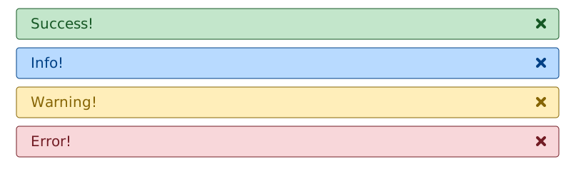 | The existing default style with a flat background and visible border. |
| `AlertAppearance.GRADIENT` | 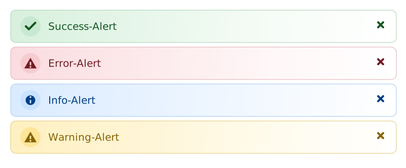 | A softer gradient style with a stronger icon badge. |
You can also switch the alert appearance at runtime before showing an alert:
```typescript
this.alertsSvc.setAlertAppearance(AlertAppearance.GRADIENT);
this.alertsSvc.showInfo('Shown with gradient appearance');
```
## Usage
Inject `AlertsService` into your component and call the alert methods:
```typescript
import { Component, inject } from '@angular/core';
import { AlertsService } from 'mk-magic-alerts';
@Component({
selector: 'app-example',
template: '<button type="button" (click)="showAlert()">Show alert</button>'
})
export class ExampleComponent {
private readonly alertsSvc = inject(AlertsService);
showAlert(): void {
const displayDurationInMillis = 3000;
this.alertsSvc.showError('Show me for 3 sec', displayDurationInMillis);
this.alertsSvc.showInfo('Info Alert');
this.alertsSvc.showSuccess('Success Alert');
this.alertsSvc.showWarning('Warning Alert');
}
}
```
To show an error alert until the user dismisses it, call `showError()` without a custom duration:
```typescript
this.alertsSvc.showError('Show me until the user dismisses me');
```
To remove all active alerts, call `clear()`:
```typescript
this.alertsSvc.clear();
```
## Mocking AlertsService for Unit Testing
The library provides `MockAlertsService` for tests that depend on `AlertsService`. It exposes the same public methods with empty implementations, so you can spy on them without triggering the real alert behavior.
```typescript
import { TestBed } from '@angular/core/testing';
import { AlertsService, MockAlertsService } from 'mk-magic-alerts';
TestBed.configureTestingModule({
providers: [
{ provide: AlertsService, useClass: MockAlertsService }
]
});
```
You can then use your test runner's spy API:
```typescript
it('should call showInfo', () => {
const alertsService = TestBed.inject(AlertsService);
const showInfoSpy = vi.spyOn(alertsService, 'showInfo');
alertsService.showInfo('Expected text');
expect(showInfoSpy).toHaveBeenCalledWith('Expected text');
});
```