mediasfu-reactnative-expo
Version:
mediasfu-reactnative-expo – Expo-managed React Native WebRTC SDK for video conferencing, webinars, live streaming, broadcast, screen sharing, whiteboard, chat, recording, live subtitles, translation, and AI agent rooms on iOS, Android, and web. Prebuilt r
1,284 lines (1,011 loc) • 229 kB
Markdown
# MediaSFU React Native Expo SDK · [mediasfu-reactnative-expo on npm](https://www.npmjs.com/package/mediasfu-reactnative-expo)
**mediasfu-reactnative-expo** is the Expo-managed React Native WebRTC SDK for video conferencing, webinars, live streaming, broadcast, screen sharing, whiteboard, chat, recording, live subtitles, translation, and AI agent rooms on iOS, Android, and web — powered by MediaSFU Cloud or your self-hosted MediaSFU Open server. Install with `npm install mediasfu-reactnative-expo`.
---
<p align="center">
<img src="https://www.mediasfu.com/logo192.png" width="100" alt="MediaSFU Logo">
</p>
<p align="center">
<a href="https://twitter.com/media_sfu">
<img src="https://img.shields.io/badge/Twitter-1DA1F2?style=for-the-badge&logo=twitter&logoColor=white" alt="Twitter">
</a>
<a href="https://github.com/MediaSFU">
<img src="https://img.shields.io/badge/GitHub-181717?style=for-the-badge&logo=github&logoColor=white" alt="GitHub">
</a>
<a href="https://www.mediasfu.com/">
<img src="https://img.shields.io/badge/Website-4285F4?style=for-the-badge&logo=google-chrome&logoColor=white" alt="Website">
</a>
<a href="https://www.youtube.com/channel/UCELghZRPKMgjih5qrmXLtqw">
<img src="https://img.shields.io/badge/YouTube-FF0000?style=for-the-badge&logo=youtube&logoColor=white" alt="YouTube">
</a>
<a href="https://www.mediasfu.com/forums">
<img src="https://img.shields.io/badge/Community-Forum-blue?style=for-the-badge&logo=discourse&logoColor=white" alt="Community Forum">
</a>
</p>
<p align="center">
<a href="https://opensource.org/licenses/MIT">
<img src="https://img.shields.io/badge/License-MIT-yellow.svg?style=flat-square" alt="License: MIT">
</a>
<a href="https://www.npmjs.com/package/mediasfu-reactnative-expo">
<img src="https://img.shields.io/npm/v/mediasfu-reactnative-expo.svg?style=flat-square" alt="NPM">
</a>
<img src="https://img.shields.io/badge/Built%20with-MediaSFU-blue?style=flat-square" alt="Built with MediaSFU">
<img src="https://img.shields.io/badge/Expo-000020?style=flat-square&logo=expo&logoColor=white" alt="Expo">
<img src="https://img.shields.io/badge/React_Native-20232A?style=flat-square&logo=react&logoColor=61DAFB" alt="React Native">
<img src="https://img.shields.io/badge/TypeScript-007ACC?style=flat-square&logo=typescript&logoColor=white" alt="TypeScript">
</p>
---
# MediaSFU React Native Expo SDK
`mediasfu-reactnative-expo` is the Expo-managed React Native package for shipping MediaSFU-powered calling, conferencing, webinar, broadcast, chat, screen sharing, whiteboard, recording, subtitle, translation, and AI-assisted room experiences on iOS, Android, and web.
Use this package when you want one of these paths:
- render a prebuilt room with `MediasfuGeneric`, `MediasfuConference`, `MediasfuWebinar`, `MediasfuBroadcast`, or `MediasfuChat`
- render the same room runtime with the modern themed shell via `ModernMediasfuGeneric`
- keep the MediaSFU runtime and replace targeted UI surfaces with `uiOverrides`, custom cards, and custom shells
- run MediaSFU headless with `returnUI={false}` and own the full native experience
- stay in the Expo-managed workflow while keeping the same product model across the MediaSFU SDK family
## Start Here
**1. Install**
```bash
npm install mediasfu-reactnative-expo
```
**2. Import & Render**
```tsx
import { MediasfuGeneric } from "mediasfu-reactnative-expo";
export default function App() {
return (
<MediasfuGeneric
credentials={{ apiUserName: "your-api-username", apiKey: "your-api-key" }}
connectMediaSFU={true}
/>
);
}
```
Prefer the themed modern shell? Start with `ModernMediasfuGeneric` instead:
```tsx
import { ModernMediasfuGeneric } from 'mediasfu-reactnative-expo';
export default function App() {
return (
<ModernMediasfuGeneric
credentials={{ apiUserName: 'your-api-username', apiKey: 'your-api-key' }}
/>
);
}
```
**3. Run**
```bash
npx expo start
```
> **Want to try without a server?** Use demo mode:
> ```tsx
> <MediasfuGeneric
> useLocalUIMode={true}
> useSeed={true}
> seedData={{ member: "DemoUser", eventType: "conference" }}
> />
> ```
## Backend Requirement
This SDK needs a MediaSFU-compatible backend for room lifecycle, signaling, and media routing.
| Option | Use it when | What to pass |
|---|---|---|
| MediaSFU Cloud | You want managed infrastructure | `credentials={{ apiUserName, apiKey }}` |
| MediaSFU Open / CE | You want to self-host | `localLink="http://your-server:3000"` and your own server config |
Cloud room helpers target `https://mediasfu.com/v1/rooms/` by default. For self-hosted deployments, pass a non-MediaSFU `localLink`.
## Integration Paths
- Keep the bundled room UI for the fastest route to production on iOS, Android, and web.
- Use `ModernMediasfuGeneric` when you want the premium themed shell as your default entry point.
- Replace targeted surfaces with `uiOverrides`, custom cards, and custom shells.
- Use `customComponent` or `returnUI={false}` when your app should own the entire native experience.
- Bare React Native users without Expo should use `mediasfu-reactnative` instead.
## Also Available: AI Phone Agents, SIP, and PSTN
MediaSFU supports AI phone agents and telephony workflows on the same platform. Call the live demos:
- 🇺🇸 **+1 (785) 369-1724** — Mixed Support Demo
- 🇬🇧 **+44 7445 146575** — AI Conversation Demo
- 🇨🇦 **+1 (587) 407-1990** — Technical Support Demo
- 🇨🇦 **+1 (647) 558-6650** — Friendly AI Chat Demo
📖 **[Complete SIP/PSTN Documentation →](https://mediasfu.com/telephony)**
## Package Links
- Docs portal: [https://mediasfu.com/documentation](https://mediasfu.com/documentation)
- User guide: [https://mediasfu.com/user-guide](https://mediasfu.com/user-guide)
- Storybook: [https://mediasfu.com/storybook](https://mediasfu.com/storybook)
- Bare React Native variant: [mediasfu-reactnative on npm](https://www.npmjs.com/package/mediasfu-reactnative)
- Props & overrides reference: [Component Props & UI Overrides ↓](#component-props--ui-overrides-reference)
- Detailed guide: [Comprehensive React Native Expo Guide ↓](#mediasfu-react-native-expo-module-documentation)
---
## Component Props & UI Overrides Reference
> **New:** UI override parity now extends across Webinar and Chat layouts, unifying customization for every MediaSFU interface.
Every primary MediaSFU UI export—`MediasfuGeneric`, `ModernMediasfuGeneric`, `MediasfuBroadcast`, `MediasfuConference`, `MediasfuWebinar`, and `MediasfuChat`—now ships with a consistent prop surface and a powerful `uiOverrides` map, so you can bend the bundled experience to match your product without losing MediaSFU's hardened real-time logic.
### Shared component props (applies to every MediaSFU UI component)
| Prop | Type | Default | What it does |
| --- | --- | --- | --- |
| `PrejoinPage` | `(options) => React.ReactNode` | `WelcomePage` | Swap in a custom pre-join experience. Receives unified pre-join options so you can add branding, legal copy, or warm-up flows. |
| `localLink` | `string` | `""` | Point the SDK at your self-hosted MediaSFU server. Leave empty when using MediaSFU Cloud. |
| `connectMediaSFU` | `boolean` | `true` | Toggle automatic socket/WebRTC connections. Set to `false` when you only need the UI shell. |
| `credentials` | `{ apiUserName: string; apiKey: string }` | `{ apiUserName: "", apiKey: "" }` | Supply cloud credentials without hard-coding them elsewhere. |
| `useLocalUIMode` | `boolean` | `false` | Run the interface in local/demo mode with no remote signaling. |
| `seedData`, `useSeed` | `SeedData`, `boolean` | `{}`, `false` | Pre-populate the UI for demos, snapshot tests, or onboarding tours. |
| `imgSrc` | `string` | `https://mediasfu.com/images/logo192.png` | Default artwork used across pre-join and modal flows. |
| `sourceParameters` | `Record<string, unknown>` | `undefined` | Shared helper bag (media devices, participant helpers, layout handlers). Pair with `updateSourceParameters` to mirror the SDK's internal utilities. |
| `updateSourceParameters` | `(helpers) => void` | `undefined` | Receive the latest helper bundle so you can bridge MediaSFU logic into your own components. |
| `returnUI` | `boolean` | `true` | When `false`, mount the logic only—a perfect stepping stone to a fully bespoke interface. |
| `noUIPreJoinOptions` | `CreateMediaSFURoomOptions \| JoinMediaSFURoomOptions` | `undefined` | Feed pre-join data when `returnUI` is `false` and you want to bypass the on-screen wizard. |
| `joinMediaSFURoom`, `createMediaSFURoom` | Functions | `undefined` | Inject your own networking layers for joining or creating rooms. |
| `customComponent` | `CustomComponentType` | `undefined` | Replace the entire UI while retaining transports, sockets, and helpers. |
| `customVideoCard`, `customAudioCard`, `customMiniCard` | Factories | `undefined` | Override participant card renders to add metadata, CTAs, or badges. |
| `containerStyle` | `React.CSSProperties` | `undefined` | Apply inline styles to the root wrapper (dashboards, split views, etc.). |
| `uiOverrides` | `MediasfuUICustomOverrides` | `undefined` | Targeted component/function overrides described below. |
> **Power combo:** Set `returnUI={false}` to run MediaSFU logic headless, capture helpers via `updateSourceParameters`, and selectively bring UI pieces back with `uiOverrides`. That gives you progressive migration with minimal code churn.
```ts
import type { MediasfuUICustomOverrides } from "mediasfu-reactnative-expo";
const overrides: MediasfuUICustomOverrides = { /* ... */ };
```
Bring the types into your project to unlock full IntelliSense for every override slot.
### Custom UI Playbook
Use a toggle-driven "playbook" component to experiment with MediaSFU's customization layers. Flip a couple of booleans and you can watch the SDK jump between prebuilt layouts, headless logic, or a fully bespoke workspace driven by `customComponent`.
#### What the playbook demonstrates
- **Connection presets**: toggle `connectionScenario` between `cloud`, `hybrid`, or `ce` to swap credentials, local links, and connection modes in one place.
- **Experience selector**: the `selectedExperience` switch renders `MediasfuGeneric`, `MediasfuBroadcast`, `MediasfuWebinar`, `MediasfuConference`, or `MediasfuChat` without touching the rest of your stack.
- **UI strategy flags**: booleans like `showPrebuiltUI`, `enableFullCustomUI`, and `enableNoUIPreJoin` demonstrate how to run the MediaSFU logic with or without the bundled UI.
- **Layered overrides**: toggles enable the custom video/audio/mini cards, drop-in `uiOverrides` for layout and modal surfaces, container styling, and backend proxy helpers.
- **Custom workspace demo**: a `customComponent` receives live MediaSFU helpers so you can build dashboards, CRM surfaces, or any bespoke host interface.
- **Debug panel & helpers**: optional JSON panel exposes the `updateSourceParameters` payload so you can see exactly what to wire into your own components.
#### Try it quickly
```tsx
const connectionScenario: "cloud" | "hybrid" | "ce" = "cloud";
const selectedExperience = "generic" as const;
const showPrebuiltUI = true;
const enableFullCustomUI = false;
const connectionPresets = {
cloud: { credentials: { apiUserName: "demo", apiKey: "demo" }, localLink: "", connectMediaSFU: true },
hybrid: { credentials: { apiUserName: "demo", apiKey: "demo" }, localLink: "http://localhost:3000", connectMediaSFU: true },
ce: { credentials: undefined, localLink: "http://localhost:3000", connectMediaSFU: false },
};
const Experience = {
generic: MediasfuGeneric,
broadcast: MediasfuBroadcast,
webinar: MediasfuWebinar,
conference: MediasfuConference,
chat: MediasfuChat,
}[selectedExperience];
export const CustomUIPlaybook = () => {
const overrides = useMemo(() => ({
mainContainer: enableFullCustomUI
? {
render: (props) => (
<View style={{ borderWidth: 4, borderColor: 'purple', borderRadius: 24, padding: 16 }}>
<MainContainerComponent {...props} />
</View>
),
}
: undefined,
}), [enableFullCustomUI]);
const current = connectionPresets[connectionScenario];
return (
<Experience
{...current}
showPrebuiltUI={showPrebuiltUI}
uiOverrides={overrides}
containerStyle={{ background: "linear-gradient(135deg, #0f172a, #1e3a8a)", minHeight: "100%" }}
/>
);
};
```
Toggle the configuration values at the top of the playbook and watch the UI reconfigure instantly. It's the fastest path to understand MediaSFU's override surface before you fold the patterns into your production entrypoint.
#### Passing custom props and UI overrides
Use the same playbook to validate bespoke cards, override bundles, and fully custom workspaces before you move them into production code:
```tsx
const videoCard: CustomVideoCardType = (props) => (
<VideoCard
{...props}
customStyle={{
borderRadius: 20,
border: "3px solid #4c1d95",
boxShadow: "0 28px 65px rgba(76,29,149,0.35)",
background: "linear-gradient(140deg, rgba(15,23,42,0.78), rgba(30,64,175,0.45))",
...(props.customStyle ?? {}),
}}
/>
);
const audioCard: CustomAudioCardType = (props) => (
<AudioCard
{...props}
barColor="#22c55e"
customStyle={{ borderRadius: 22, background: "rgba(34,197,94,0.1)" }}
/>
);
const miniCard: CustomMiniCardType = (props) => (
<MiniCard
{...props}
renderContainer={({ defaultContainer }) => (
<View style={{ display: "flex", alignItems: "center", justifyContent: "center", height: "100%" }}>
{defaultContainer}
</View>
)}
/>
);
const uiOverrides = useMemo<MediasfuUICustomOverrides>(() => ({
mainContainer: {
render: (props) => (
<View style={{ borderWidth: 4, borderColor: 'rgba(139,92,246,0.8)', borderRadius: 28, padding: 16 }}>
<MainContainerComponent {...props} />
</View>
),
},
menuModal: {
component: (modalProps) => <MenuModal {...modalProps} variant="glass" />,
},
consumerResume: {
wrap: (original) => async (params) => {
const startedAt = performance.now();
const result = await original(params);
analytics.track("consumer_resume", {
durationMs: performance.now() - startedAt,
consumerId: params?.consumer?.id,
});
return result;
},
},
}), []);
return (
<Experience
{...current}
customVideoCard={videoCard}
customAudioCard={audioCard}
customMiniCard={miniCard}
customComponent={enableFullCustomUI ? CustomWorkspace : undefined}
containerStyle={{ background: "#0f172a", borderRadius: 32, overflow: "hidden" }}
uiOverrides={uiOverrides}
/>
);
```
Because the playbook surfaces `updateSourceParameters`, you can also log or snapshot the helper bundle (`getParticipantMedia`, `toggleMenuModal`, `showAlert`, and more) to ensure your custom UI always receives the hooks it expects.
### `uiOverrides` map — override keys at a glance
Each key accepts a `CustomComponentOverride<Props>` object with optional `component` and `render` fields. You can fully replace the default implementation or wrap it while forwarding props.
#### Layout & control surfaces
| Key | Default component | Typical use |
| --- | --- | --- |
| `mainContainer` | `MainContainerComponent` | Inject theming providers or dashboard layouts. |
| `mainAspect` | `MainAspectComponent` | Tune how the main region splits space. |
| `mainScreen` | `MainScreenComponent` | Orchestrate hero video + gallery interplay. |
| `mainGrid` | `MainGridComponent` | Modify layout or layering of primary participants. |
| `subAspect` | `SubAspectComponent` | Restyle fixed control strips in webinar/conference modes. |
| `otherGrid` | `OtherGridComponent` | Change presentation of off-stage attendees. |
| `flexibleGrid`, `flexibleGridAlt` | `FlexibleGrid` | Implement AI-driven or branded array layouts. |
| `flexibleVideo` | `FlexibleVideo` | Add captions, watermarks, or overlays to highlighted speakers. |
| `audioGrid` | `AudioGrid` | Customise audio-only attendee presentation. |
| `pagination` | `Pagination` | Introduce infinite scroll or auto-cycling carousels. |
| `controlButtons` | `ControlButtonsComponent` | Rebrand the primary action bar. |
| `controlButtonsAlt` | `ControlButtonsAltComponent` | Control secondary button clusters. |
| `controlButtonsTouch` | `ControlButtonsComponentTouch` | Deliver mobile-first controls (used heavily by `MediasfuChat`). |
#### Participant cards & widgets
| Key | Default component | Typical use |
| --- | --- | --- |
| `videoCard` | `VideoCard` | Add host badges, reactions, or CRM overlays. |
| `audioCard` | `AudioCard` | Swap avatars or expose spoken-language info. |
| `miniCard` | `MiniCard` | Customize thumbnails in picture-in-picture modes. |
| `miniAudio` | `MiniAudio` | Re-style the audio-only mini indicators. |
| `meetingProgressTimer` | `MeetingProgressTimer` | Replace the elapsed-time widget with countdowns or milestones. |
| `miniAudioPlayer` | `MiniAudioPlayer` | Provide alternative UI for recorded clip playback. |
#### Modals, dialogs, and collaboration surfaces
| Key | Default component | Typical use |
| --- | --- | --- |
| `loadingModal` | `LoadingModal` | Show branded skeletons while connecting. |
| `alert` | `AlertComponent` | Route alerts through your notification system. |
| `menuModal` | `MenuModal` | Redesign quick-action trays. |
| `eventSettingsModal` | `EventSettingsModal` | Extend host tools with your own settings. |
| `requestsModal` | `RequestsModal` | Build moderation queues tailored to your workflows. |
| `waitingRoomModal` | `WaitingRoomModal` | Deliver custom waiting-room experiences. |
| `coHostModal` | `CoHostModal` | Manage co-hosts with bespoke UX. |
| `mediaSettingsModal` | `MediaSettingsModal` | Embed device tests or instructions. |
| `participantsModal` | `ParticipantsModal` | Introduce advanced filters, search, or notes. |
| `messagesModal` | `MessagesModal` | Drop in your full-featured chat module. |
| `displaySettingsModal` | `DisplaySettingsModal` | Let users pick layouts, themes, or captions. |
| `confirmExitModal` | `ConfirmExitModal` | Meet compliance wording requirements. |
| `confirmHereModal` | `ConfirmHereModal` | Customize attendance confirmations for webinars. |
| `shareEventModal` | `ShareEventModal` | Add referral codes or QR sharing. |
| `recordingModal` | `RecordingModal` | Tailor recording confirmation flows. |
| `pollModal` | `PollModal` | Integrate your polling/quiz engine. |
| `backgroundModal` | `BackgroundModal` | Hook AI background replacement or brand presets. |
| `breakoutRoomsModal` | `BreakoutRoomsModal` | Implement drag-and-drop or AI room suggestions. |
| `configureWhiteboardModal` | `ConfigureWhiteboardModal` | Adjust collaboration permissions before launch. |
| `whiteboard` | `Whiteboard` | Replace with your whiteboard provider. |
| `screenboard` | `Screenboard` | Modify shared-screen annotation layers. |
| `screenboardModal` | `ScreenboardModal` | Reimagine how users enable shared annotations. |
#### Entry flows & custom renderers
| Key | Default component | Typical use |
| --- | --- | --- |
| `welcomePage` | `WelcomePage` | Provide a fully branded welcome/marketing splash. |
| `preJoinPage` | `PrejoinPage` | Override the wizard used before joining live sessions. |
| `customMenuButtonsRenderer` | `ControlButtonsAltComponent` | Supply a bespoke renderer for menu button groups without overriding each button. |
#### Function overrides
| Key | Default function | Typical use |
| --- | --- | --- |
| `consumerResume` | `consumerResume` | Wrap errors, capture analytics, or rate-limit consumer resume behavior. |
| `addVideosGrid` | `addVideosGrid` | Replace participant ordering or layout heuristics on the fly. |
> Function overrides support `{ implementation, wrap }`. Provide `implementation` for a full replacement, or `wrap` to intercept the default behavior before/after it runs.
### Example: swap the chat modal and theme the controls
```tsx
import { MediasfuGeneric } from "mediasfu-reactnative-expo";
import { MyChatModal } from "./ui/MyChatModal";
import { MyControls } from "./ui/MyControls";
const uiOverrides = {
messagesModal: {
component: MyChatModal,
},
controlButtons: {
render: (props) => <MyControls {...props} variant="glass" />,
},
};
export const MyMeeting = () => (
<MediasfuGeneric credentials={credentials} uiOverrides={uiOverrides} />
);
```
### Example: wrap a MediaSFU helper instead of replacing it
```tsx
const uiOverrides = {
consumerResume: {
wrap: (original) => async (params) => {
const startedAt = performance.now();
const result = await original(params);
analytics.track("consumer_resume", {
durationMs: performance.now() - startedAt,
consumerId: params?.consumer?.id,
});
return result;
},
},
};
<MediasfuConference uiOverrides={uiOverrides} />;
```
The same override hooks power the newly refreshed `MediasfuWebinar` and `MediasfuChat` layouts, so you can guarantee a unified experience across events, webinars, or chat-first rooms.
---
---
# MediaSFU React Native (Expo) Module Documentation
## 🚀 Quick Access to New Features
### Media Device & Stream Utilities
The SDK now includes powerful utility methods for advanced media control:
**`getMediaDevicesList`** - Enumerate available cameras and microphones with automatic permission handling:
```javascript
const cameras = await parameters.getMediaDevicesList('videoinput');
const microphones = await parameters.getMediaDevicesList('audioinput');
```
**`getParticipantMedia`** - Retrieve specific participant's video or audio stream from the session:
```javascript
import { getParticipantMedia } from 'mediasfu-reactnative-expo';
const videoStream = getParticipantMedia({
participantId: 'producer-123',
mediaType: 'video',
parameters: sourceParameters,
});
```
These utilities enable advanced features like custom device selection interfaces, participant stream monitoring, and dynamic media routing. [See full documentation](#media-device-and-stream-utility-methods).
---
## Unlock the Power of MediaSFU Community Edition
**MediaSFU Community Edition is free and open-source**—perfect for developers who want to run their own media server without upfront costs. With robust features and simple setup, you can launch your media solution in minutes. **Ready to scale?** Upgrade seamlessly to **MediaSFU Cloud** for enterprise-grade performance and global scalability.
**[Get started now on GitHub!](https://github.com/MediaSFU/MediaSFUOpen)**
### ✅ React Native SDK Setup Guide
[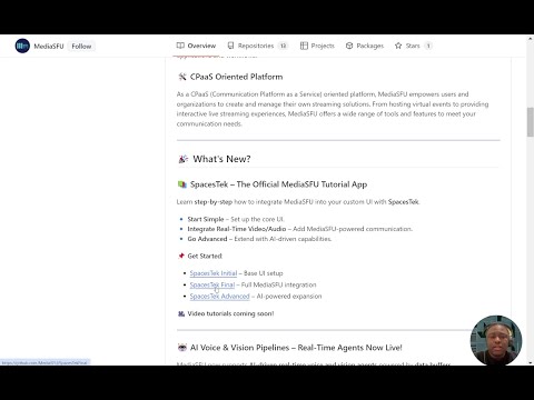](https://www.youtube.com/watch?v=uJkI7H26jq4)
🎥 [**Watch the React Native SDK Setup Guide**](https://youtu.be/uJkI7H26jq4)
---
## Table of Contents
- [Features](#features)
- [Getting Started](#getting-started)
- [Basic Usage Guide](#basic-usage-guide)
- [Custom Components Guide](#custom-components-guide)
- [Intermediate Usage Guide](#intermediate-usage-guide)
- [Advanced Usage Guide](#advanced-usage-guide)
- [API Reference](#api-reference)
- [Troubleshooting](#troubleshooting)
- [Contributing](#contributing)
# Features <a name="features"></a>
MediaSFU's React Native (Expo) SDK comes with a host of powerful features out of the box:
1. **Breakout Rooms**: Create multiple sub-meetings within a single session to enhance collaboration and focus.
2. **Pagination**: Efficiently handle large participant lists with seamless pagination.
3. **Polls**: Conduct real-time polls to gather instant feedback from participants.
4. **Media Access Requests Management**: Manage media access requests with ease to ensure smooth operations.
5. **Video Effects**: Apply various video effects, including virtual backgrounds, to enhance the visual experience.
6. **Chat (Direct & Group)**: Facilitate communication with direct and group chat options.
7. **Cloud Recording (track-based)**: Customize recordings with track-based options, including watermarks, name tags, background colors, and more.
8. **Managed Events**: Manage events with features to handle abandoned and inactive participants, as well as enforce time and capacity limits.
9. **AI Phone Agents**: Integrate AI-powered phone agents for automated customer interactions at a fraction of the cost of traditional providers.
10. **`getMediaDevicesList`**: Enumerate available cameras and microphones with permission handling
11. **`getParticipantMedia`**: Retrieve specific participant's video or audio streams by ID or name
## 🆕 **New Advanced Media Access**
**Interested in getting just the media stream of a specific participant?** You can now easily retrieve individual participant streams using `getParticipantMedia()` method. [Learn more →](#media-device-and-stream-utility-methods)
**Need to access available cameras and microphones?** Use `getMediaDevicesList()` to enumerate all available media devices on the user's system programmatically with automatic permission handling.
# Getting Started <a name="getting-started"></a>
This section will guide users through the initial setup and installation of the npm module.
> **Note:** this is specifically for **React-Native-Expo.**
If you are integrating into a **React Native CLI** app, the best option is to use the core `mediasfu-reactnative` package, which you can find on npm at [mediasfu-reactnative](https://www.npmjs.com/package/mediasfu-reactnative).
### Documentation Reference
For comprehensive documentation on the available methods, components, and functions, please visit [mediasfu.com](https://www.mediasfu.com/reactnativeexpo/). This resource provides detailed information for this guide and additional documentation.
## Installation
Instructions on how to install the module using npm.
### 1. Add the Package to Your Project
To install the `mediasfu-reactnative-expo` package, run:
```bash
npm install mediasfu-reactnative-expo
```
### **1.1 Important Installation Notes for React Native**
#### 🚫 **Avoid Using `--force` or `--legacy-peer-deps`**
Using these flags can override important dependency checks, potentially causing **unstable builds** or **unexpected behavior**.
- **Why Avoid Them?**
They bypass compatibility checks, which can introduce **bugs** or **conflicts** within your project.
---
#### ⚙️ **Use Package Overrides (Recommended)**
If you encounter **peer dependency conflicts**, use the `overrides` field in your `package.json` instead of forcing installations.
##### ✅ **Example of Safe Overrides:**
```json
{
"overrides": {
"some-package": {
"dependency-name": "^1.2.3"
}
}
}
```
- **Why This Works:**
Overrides let you resolve conflicts **safely** without compromising the integrity of your project.
---
#### 🚩 **If You Absolutely Need to Use `--force` or `--legacy-peer-deps`**
- Some peer dependencies **might be skipped**.
- You’ll need to **manually install** them to avoid runtime errors.
##### 🔑 **Install the Required Peer Dependencies:**
```bash
npm install \
"@config-plugins/react-native-webrtc@^9.0.0" \
"@expo/metro-runtime@^4.0.0" \
"@expo/vector-icons@^14.0.2" \
"@react-native-async-storage/async-storage@^1.23.1" \
"@react-native-community/slider@^4.5.2" \
"@react-native-picker/picker@^2.7.5" \
"expo@^52.0.11" \
"expo-av@~15.0.1" \
"expo-camera@~16.0.9" \
"expo-clipboard@~7.0.0" \
"expo-dev-client@~5.0.5" \
"expo-router@~4.0.11" \
"expo-web-browser@~13.0.3" \
"expo-screen-orientation@~8.0.1" \
"expo-splash-screen@~0.29.13" \
"expo-status-bar@~2.0.0" \
"mediasoup-client@^3.16.0" \
"react@18.3.1" \
"react-color@^2.19.3" \
"react-dom@18.3.1" \
"react-native@0.76.3" \
"react-native-gesture-handler@~2.20.2" \
"react-native-orientation-locker@^1.6.0" \
"react-native-picker-select@^9.0.0" \
"react-native-reanimated@~3.16.1" \
"react-native-safe-area-context@4.12.0" \
"react-native-web@~0.19.13" \
"react-native-webrtc@^118.0.0" \
"react-native-webrtc-web-shim@^1.0.7" \
"reanimated-color-picker@^2.4.2" \
"socket.io-client@^4.7.2"
```
- **Why This Is Important:**
These peer dependencies are critical for `mediasfu-reactnative-expo` to function correctly within React Native.
---
#### 🔍 **How to Check for Peer Dependencies**
1. **Open your `package.json`.**
2. Look for the `peerDependencies` section:
```json
"peerDependencies": {
"@config-plugins/react-native-webrtc": "^9.0.0",
"@expo/metro-runtime": "^4.0.0",
"@expo/vector-icons": "^14.0.2",
"@react-native-async-storage/async-storage": "^1.23.1",
"@react-native-community/slider": "^4.5.2",
"@react-native-picker/picker": "^2.7.5",
"expo": "^52.0.11",
"expo-av": "~15.0.1",
"expo-camera": "~16.0.9",
"expo-clipboard": "~7.0.0",
"expo-dev-client": "~5.0.5",
"expo-router": "~4.0.11",
"expo-web-browser": "~13.0.3",
"expo-screen-orientation": "~8.0.1",
"expo-splash-screen": "~0.29.13",
"expo-status-bar": "~2.0.0",
"mediasoup-client": "^3.16.0",
"react": "18.3.1",
"react-color": "^2.19.3",
"react-dom": "18.3.1",
"react-native": "0.76.3",
"react-native-gesture-handler": "~2.20.2",
"react-native-orientation-locker": "^1.6.0",
"react-native-picker-select": "^9.0.0",
"react-native-reanimated": "~3.16.1",
"react-native-safe-area-context": "4.12.0",
"react-native-web": "~0.19.13",
"react-native-webrtc": "^118.0.0",
"react-native-webrtc-web-shim": "^1.0.7",
"reanimated-color-picker": "^2.4.2",
"socket.io-client": "^4.7.2"
}
```
3. **Ensure all are installed.** If not, run the install command above.
---
#### ✅ **Final Recommendations**
- Always try to resolve conflicts using **overrides** first.
- Only use `--force` or `--legacy-peer-deps` as a **last resort**.
---
#### Resolving Dependency Issues
If you encounter an error related to `@config-plugins/react-native-webrtc@"^9.0.0"` during installation, you can resolve it by adding the following override to your `package.json`:
```json
"overrides": {
"@config-plugins/react-native-webrtc": {
"expo": "^52.0.11"
}
}
```
> Ensure the version specified (`^52.0.11`) matches the Expo SDK version used in your project. You can replace it with the latest compatible version if needed.
### 2.1 Obtain an API Key (If Required)
You can get your API key by signing up or logging into your account at [mediasfu.com](https://www.mediasfu.com/).
<div style="background-color:#f0f0f0; padding: 10px; border-radius: 5px;">
<h4 style="color:#d9534f;">Important:</h4>
<p style="font-size: 1.2em; color: black;">You must obtain an API key from <a href="https://www.mediasfu.com/">mediasfu.com</a> to use this package with MediaSFU Cloud. You do not need the API Key if self-hosting.</p>
</div>
### 2.2 **Self-Hosting MediaSFU**
If you plan to self-host MediaSFU or use it without MediaSFU Cloud services, you don't need an API key. You can access the open-source version of MediaSFU from the [MediaSFU Open Repository](https://github.com/MediaSFU/MediaSFUOpen).
This setup allows full flexibility and customization while bypassing the need for cloud-dependent credentials.
### 3. Configure Your Project
Before proceeding, ensure that your project is properly configured to work with `mediasfu-reactnative-expo`. Follow the steps below to set up the necessary configuration files.
#### a. Update `app.json`
Ensure that your `app.json` does not have the `output` field set to `'static'` in the web configuration. Remove or clear this field to prevent build issues.
```json
{
"expo": {
// ... other configurations
"web": {
// Remove or ensure the output field is not set to 'static'
// "output": "static" // This line should be removed or cleared
}
}
}
```
#### b. Configure `babel.config.js`
Your `babel.config.js` should include the necessary presets and plugins for Expo and React Native Reanimated. Here is an example configuration:
```javascript
module.exports = function (api) {
api.cache(true);
return {
presets: ['babel-preset-expo'],
plugins: [
'react-native-reanimated/plugin',
'@babel/plugin-transform-block-scoping'
],
};
};
```
#### c. Configure `metro.config.js`
Ensure your `metro.config.js` file includes the correct settings for Metro bundler:
```javascript
const { getDefaultConfig } = require('expo/metro-config');
const path = require('path');
const config = getDefaultConfig(__dirname);
config.resolver.nodeModulesPaths = [path.resolve(__dirname, 'node_modules')];
module.exports = config;
```
### 4. Complete the Setup
After completing the above steps, you can proceed to set up and run your project.
- **Start the Development Server:**
```bash
npx expo start
```
- **Create a Development Build:**
Since `react-native-webrtc` does not run on Expo Go, you will need to create a development build to test WebRTC functionalities on an actual device. Follow the [Expo Development Builds documentation](https://docs.expo.dev/develop/development-builds/introduction/) for guidance on creating a development build.
# 📱 React Native Expo SDK Comprehensive Guide <a name="sdk-guide"></a>
This comprehensive guide provides clear, progressive learning paths from beginner to advanced usage. Each section builds upon the previous one with practical examples and detailed explanations tailored for React Native Expo development.
---
## Table of Contents - SDK Guide
- [Quick Start (5 Minutes)](#quick-start-5-minutes)
- [Understanding MediaSFU Architecture](#understanding-mediasfu-architecture)
- [The Three-Layer Architecture](#the-three-layer-architecture)
- [Event Room Types](#event-room-types)
- [The Three Usage Modes](#the-three-usage-modes)
- [Parameters Object: Your Control Center](#parameters-object-control-center)
- [Core Concepts & Components](#core-concepts--components)
- [Display Components](#display-components)
- [Control Components](#control-components)
- [Modal Components](#modal-components)
- [Media Cards](#media-cards)
- [Working with Participants](#working-with-participants)
- [Stream Management](#stream-management)
- [Working with Methods](#working-with-methods)
- [Media Control Methods](#media-control-methods)
- [Device Management Methods](#device-management-methods)
- [Participant Management Methods](#participant-management-methods)
- [Chat & Messaging Methods](#chat-messaging-methods)
- [Recording Methods](#recording-methods)
- [Polls & Survey Methods](#polls-survey-methods)
- [Breakout Room Methods](#breakout-room-methods)
- [Advanced WebRTC Methods](#advanced-webrtc-methods)
- [Customization & Styling](#customization-styling)
- [Deployment Patterns](#deployment-patterns)
- [Understanding Data Structures](#understanding-data-structures)
- [Complete Production Example](#complete-production-example)
---
## Quick Start (5 Minutes) <a name="quick-start-5-minutes"></a>
Get your first MediaSFU app running in just a few minutes with React Native Expo.
### Step 1: Install the Package
```bash
npm install mediasfu-reactnative-expo
```
### Step 2: Import and Use
```javascript
import React from 'react';
import { MediasfuGeneric } from 'mediasfu-reactnative-expo';
const App = () => {
// Option 1: Use without credentials (for testing/development)
return <MediasfuGeneric />;
// Option 2: Use with MediaSFU Cloud credentials
// const credentials = { apiUserName: 'your_username', apiKey: 'your_api_key' };
// return <MediasfuGeneric credentials={credentials} />;
};
export default App;
```
### Step 3: Run Your App
```bash
npx expo start
```
**That's it!** You now have a fully functional video conferencing app with:
- ✅ Video and audio streaming
- ✅ Screen sharing
- ✅ Chat messaging
- ✅ Participant management
- ✅ Recording capabilities
- ✅ Breakout rooms
- ✅ Polls
- ✅ Custom UI components support
---
## Understanding MediaSFU Architecture <a name="understanding-mediasfu-architecture"></a>
Before diving deeper, let's understand how MediaSFU is structured. This knowledge will help you make better decisions when building your application.
### The Three-Layer Architecture
```
┌─────────────────────────────────────────────┐
│ Your React Native Expo Application │
│ (App.js, screens, navigation, logic) │
└─────────────────────────────────────────────┘
↓
┌─────────────────────────────────────────────┐
│ MediaSFU Components Layer │
│ (MediasfuGeneric, MediasfuBroadcast, etc.) │
│ - Pre-built UI components │
│ - Event handling │
│ - State management │
└─────────────────────────────────────────────┘
↓
┌─────────────────────────────────────────────┐
│ MediaSFU Core Methods Layer │
│ (Stream control, room management, │
│ WebRTC handling, socket communication) │
└─────────────────────────────────────────────┘
↓
┌─────────────────────────────────────────────┐
│ MediaSFU Backend Services │
│ (MediaSFU Cloud or Community Edition) │
└─────────────────────────────────────────────┘
```
**Understanding the layers:**
1. **Your Application Layer**: Where you build your app-specific features and navigation
2. **Components Layer**: Pre-built MediaSFU components that you can use or customize
3. **Core Methods Layer**: The engine that handles all real-time communication
4. **Backend Layer**: MediaSFU's servers that orchestrate the entire experience
### Event Room Types
MediaSFU provides 5 specialized room types, each optimized for specific use cases:
| Room Type | Best For | Key Features | Import |
|-----------|----------|--------------|--------|
| **MediasfuGeneric** | General purpose meetings | Flexible layout, all features enabled | `import { MediasfuGeneric } from 'mediasfu-reactnative-expo'` |
| **MediasfuBroadcast** | Live streaming events | Optimized for one-to-many communication | `import { MediasfuBroadcast } from 'mediasfu-reactnative-expo'` |
| **MediasfuWebinar** | Educational sessions | Presenter focus, Q&A features | `import { MediasfuWebinar } from 'mediasfu-reactnative-expo'` |
| **MediasfuConference** | Business meetings | Equal participant layout, collaboration tools | `import { MediasfuConference } from 'mediasfu-reactnative-expo'` |
| **MediasfuChat** | Interactive discussions | Chat-first interface, quick connections | `import { MediasfuChat } from 'mediasfu-reactnative-expo'` |
**Example: Choosing the right room type**
```javascript
import {
MediasfuGeneric,
MediasfuWebinar,
MediasfuBroadcast,
MediasfuConference,
MediasfuChat
} from 'mediasfu-reactnative-expo';
// For a webinar
<MediasfuWebinar credentials={credentials} />
// For a broadcast
<MediasfuBroadcast credentials={credentials} />
// For a conference
<MediasfuConference credentials={credentials} />
```
### The Three Usage Modes
MediaSFU offers three progressive levels of customization. Understanding these modes is crucial for choosing the right approach for your project.
#### Mode 1: Default UI (Simplest) ⭐ Best for Beginners
Use MediaSFU's complete pre-built interface - perfect for rapid development.
```javascript
import React from 'react';
import { MediasfuGeneric } from 'mediasfu-reactnative-expo';
const App = () => {
const credentials = {
apiUserName: 'your_username',
apiKey: 'your_api_key'
};
return <MediasfuGeneric credentials={credentials} />;
};
export default App;
```
**When to use:**
- ✅ Prototyping or MVP development
- ✅ Need a production-ready UI quickly
- ✅ Standard video conferencing features are sufficient
- ✅ Want to minimize development time
**Advantages:**
- Zero UI development needed
- All features work out of the box
- Automatic responsive layouts
- Professional appearance
#### Mode 2: Custom UI with MediaSFU Backend (Most Flexible) ⭐ Best for Custom Brands
Build your own UI while using MediaSFU's powerful backend infrastructure.
```javascript
import React, { useState } from 'react';
import { View, TouchableOpacity, Text, StyleSheet } from 'react-native';
import { MediasfuGeneric } from 'mediasfu-reactnative-expo';
const App = () => {
const [sourceParameters, setSourceParameters] = useState(null);
const credentials = { apiUserName: 'your_username', apiKey: 'your_api_key' };
return (
<View style={{ flex: 1 }}>
<MediasfuGeneric
returnUI={false}
sourceParameters={sourceParameters}
updateSourceParameters={setSourceParameters}
credentials={credentials}
noUIPreJoinOptions={{
action: 'create',
userName: 'Your Name',
capacity: 50,
duration: 30,
eventType: 'conference'
}}
/>
{/* Your completely custom UI */}
{sourceParameters && (
<View style={styles.customControls}>
<TouchableOpacity
onPress={() => sourceParameters.clickVideo({
parameters: sourceParameters
})}
style={styles.controlButton}
>
<Text style={styles.buttonText}>
{sourceParameters.videoAlreadyOn ? 'Stop Video' : 'Start Video'}
</Text>
</TouchableOpacity>
<TouchableOpacity
onPress={() => sourceParameters.clickAudio({
parameters: sourceParameters
})}
style={styles.controlButton}
>
<Text style={styles.buttonText}>
{sourceParameters.audioAlreadyOn ? 'Mute' : 'Unmute'}
</Text>
</TouchableOpacity>
{/* Display participant count */}
<Text style={styles.participantCount}>
{sourceParameters.participants.length} Participants
</Text>
</View>
)}
</View>
);
};
const styles = StyleSheet.create({
customControls: {
position: 'absolute',
bottom: 20,
left: 20,
right: 20,
backgroundColor: 'rgba(0,0,0,0.8)',
padding: 15,
borderRadius: 10,
},
controlButton: {
backgroundColor: '#4CAF50',
padding: 12,
borderRadius: 8,
marginVertical: 5,
alignItems: 'center',
},
buttonText: {
color: 'white',
fontSize: 16,
fontWeight: 'bold',
},
participantCount: {
color: 'white',
fontSize: 16,
marginTop: 10,
textAlign: 'center',
}
});
export default App;
```
**When to use:**
- ✅ Need complete control over UI/UX
- ✅ Building a custom branded experience
- ✅ Integrating into existing app design
- ✅ Want to position controls differently
**What you get:**
- Access to all MediaSFU methods via `sourceParameters`
- Full control over when and how to display UI
- Ability to create completely custom layouts
- Access to real-time room state and participant data
#### Mode 3: Component Replacement (Balanced) ⭐ Best for Partial Customization
Replace specific MediaSFU components while keeping the rest of the infrastructure.
```javascript
import React from 'react';
import { View, Text, StyleSheet } from 'react-native';
import {
MediasfuGeneric,
FlexibleVideo,
FlexibleGrid,
AudioGrid
} from 'mediasfu-reactnative-expo';
// Your custom main screen component
function CustomMainScreen({ parameters }) {
return (
<View style={styles.container}>
{/* Custom header */}
<View style={styles.header}>
<Text style={styles.roomName}>{parameters.roomName}</Text>
<Text style={styles.participantCount}>
{parameters.participants.length} participants
</Text>
</View>
{/* Use MediaSFU's FlexibleVideo for main display */}
<View style={styles.mainVideo}>
<FlexibleVideo
customWidth={parameters.componentSizes.mainWidth}
customHeight={parameters.componentSizes.mainHeight}
parameters={parameters}
/>
</View>
{/* Use MediaSFU's FlexibleGrid for participants */}
<View style={styles.participantGrid}>
<FlexibleGrid
customWidth={parameters.componentSizes.otherWidth}
customHeight={parameters.componentSizes.otherHeight}
parameters={parameters}
/>
</View>
{/* Show audio-only participants */}
<View style={styles.audioContainer}>
<AudioGrid parameters={parameters} />
</View>
</View>
);
}
const App = () => {
const credentials = { apiUserName: 'your_username', apiKey: 'your_api_key' };
return (
<MediasfuGeneric
credentials={credentials}
customComponent={CustomMainScreen}
/>
);
};
const styles = StyleSheet.create({
container: {
flex: 1,
backgroundColor: '#1a1a1a',
},
header: {
backgroundColor: '#2d2d2d',
padding: 15,
flexDirection: 'row',
justifyContent: 'space-between',
},
roomName: {
color: 'white',
fontSize: 18,
fontWeight: 'bold',
},
participantCount: {
color: '#4CAF50',
fontSize: 14,
},
mainVideo: {
flex: 3,
},
participantGrid: {
flex: 2,
},
audioContainer: {
height: 80,
},
});
export default App;
```
**When to use:**
- ✅ Need custom main interface but want to keep MediaSFU's components
- ✅ Partial customization with minimal effort
- ✅ Want to maintain MediaSFU's functionality while customizing layout
### Parameters Object: Your Control Center <a name="parameters-object-control-center"></a>
The `sourceParameters` object is your gateway to all MediaSFU functionality. Think of it as the control panel for your entire real-time communication experience.
```javascript
// The sourceParameters object contains everything you need:
// Media Controls
sourceParameters.clickVideo(options) // Toggle video on/off
sourceParameters.clickAudio(options) // Toggle audio on/off
sourceParameters.clickScreenShare(options) // Toggle screen sharing
// Room State
sourceParameters.roomName // Current room name
sourceParameters.participants // Array of all participants
sourceParameters.allVideoStreams // All video streams
sourceParameters.allAudioStreams // All audio streams
// UI State
sourceParameters.videoAlreadyOn // Is video currently on?
sourceParameters.audioAlreadyOn // Is audio currently on?
sourceParameters.screenAlreadyOn // Is screen sharing active?
// And 200+ more properties and methods...
```
**Access patterns in different modes:**
```javascript
// Mode 1 (Default UI): Parameters are managed internally
// You don't need to access them directly
// Mode 2 (Custom UI): Access via sourceParameters
<MediasfuGeneric
returnUI={false}
sourceParameters={sourceParameters}
updateSourceParameters={setSourceParameters}
/>
// Then use:
sourceParameters?.clickVideo({ parameters: sourceParameters });
// Mode 3 (Component Replacement): Passed to your custom component
function CustomMainScreen({ parameters }) {
// Use parameters directly
parameters.clickVideo({ parameters });
}
```
---
## Core Concepts & Components <a name="core-concepts--components"></a>
Now that you understand the architecture, let's explore the building blocks that make up a MediaSFU application.
### Display Components <a name="display-components"></a>
These components handle the visual presentation of media streams and participants.
#### Primary Layout Components
**1. FlexibleVideo** - Main video display area
```javascript
import { FlexibleVideo } from 'mediasfu-reactnative-expo';
<FlexibleVideo
customWidth={Dimensions.get('window').width}
customHeight={400}
parameters={parameters}
/>
```
**Features:**
- Automatically handles main presenter or screen share
- Smooth transitions between different video sources
- Responsive sizing
- Aspect ratio preservation
**Use cases:**
- Main stage video in webinars
- Screen sharing display
- Featured speaker in conferences
- Primary content area
**2. FlexibleGrid** - Participant grid layout
```javascript
import { FlexibleGrid } from 'mediasfu-reactnative-expo';
<FlexibleGrid
customWidth={Dimensions.get('window').width}
customHeight={600}
parameters={parameters}
/>
```
**Features:**
- Intelligent grid sizing (2x2, 3x3, 4x4, etc.)
- Pagination for large participant lists
- Automatic reflow on orientation change
- Optimized for different screen sizes
**Use cases:**
- Conference room participant display
- Brea