material-tabs
Version:
A simple React package that provides the Material Design tab component.
199 lines (134 loc) • 4.18 kB
Markdown
# material-tabs
## What is it?
A simple React package that provides the Material Design tab component.
This is what they look like:
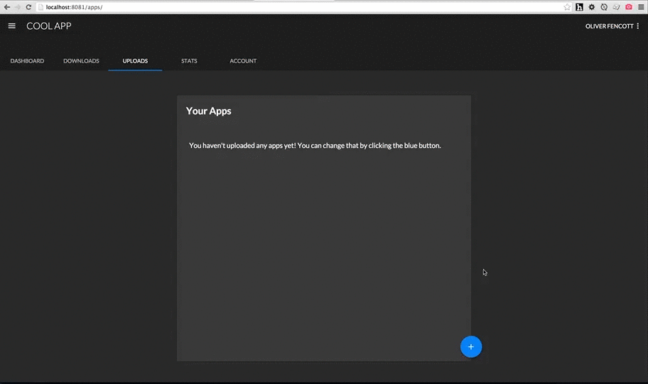
Gifs, because open source, because Internet.
## Get started
```
npm install --save material-tabs
```
## Example
The code in the above example looks like:
```js
import {TabGroup, Tab} from 'material-tabs';
const tabs = [
{linkTo: 'dashboard', label: 'Dashboard'},
{linkTo: 'downloads', label: 'Downloads'},
{linkTo: 'uploads', label: 'Uploads'},
{linkTo: 'totalStats', label: 'Stats'},
{linkTo: 'account', label: 'Account'}
];
const Layout = React.createClass({
render: function() {
return (
<div>
<div style={{backgroundColor: '#212121'}}>
<div style={{width: 700}}>
<TabGroup style={{indicator: {color: '#2196f3'}}}>
{this.renderTabs()}
</TabGroup>
</div>
</div>
// Rest of layout
</div>
);
},
renderTabs: function() {
return tabs.map((tab, index) => {
return (
<UnstyledLink to={tab.linkTo} key={index}>
<Tab>
{tab.label}
</Tab>
</UnstyledLink>
);
});
}
});
```
### Components
The package provides 2 components: Tab and TabGroup, used together like so:
``` js
import {Tab, TabGroup} from 'material-tabs';
const NavigationTabs = React.createClass({
render: function() {
return (
<TabGroup>
<Tab>
One
</Tab>
<Tab>
Two
</Tab>
</TabGroup>
);
}
)};
```
The following aspects are determined as a result of the number of children ```TabGroup``` has:
- The position of the indicator (underline), highlighting which tab was clicked and
- The width of each ```Tab```.
Meaning each Tab will always be identical in width.
#### TabGroup
By default, the following styles are applied:
- ```TabGroup``` is 100% width of it's parent,
- The indicator is #FFFFFF (white).
- Background colors are default (inherit).
```TabGroup``` accepts the following style prop:
```js
style={{ indicator: { color: '#FF5722' } }}
```
```TabGroup``` accepts an ```onChangeTab``` prop which passes the index of the newly selected ```Tab``` back up, used like so:
```js
render: function() {
return (
<TabGroup onChangeTab={this.handleChange}>
<Tab>
One
</Tab>
<Tab>
Two
</Tab>
</TabGroup>
);
},
handleChange: function(index) {
console.log(index); // 1
}
```
It also accepts a ```defaultSelectedTab``` prop, which should be the index of the tab to be selected on initial render, which by default is of course ```0```. This would be used to make sure the correct tab is selected when arriving from an external link.
Because the ```TabGroup``` component only cares about how many children it has (as opposed to what the children are), it's very easy to use the ```Tab```s nested inside links (such as when using the very excellent and highly recommended [React-router](https://github.com/rackt/react-router)). For example:
```js
render: function() {
return (
<TabGroup>
<Link to='home'>
<Tab>
Home
</Tab>
</Link>
<Link to='favourites'>
<Tab>
Favourites
</Tab>
</Link>
</TabGroup>
);
}
```
will render exactly the same without links (save for default link styling).
#### Tab
By default, the following styles are applied:
- The currently selected ```Tab``` text color is #FFFFFF (white),
- Unselected ```Tab```s are the same color, with an opacity of 0.7 applied,
- Background colors are default (inherit).
All other styles follow the [spec](https://www.google.com/design/spec/components/tabs.html#tabs-specs), such as text styling, spacing, heights, and animation.
```Tab``` accepts the following style prop:
```js
style={{ color: '#FF5722' }}
```
```Tab``` accepts a regular ```onClick``` prop as you would expect.
### Todo
- Add support for [icons with text](https://www.google.com/design/spec/components/tabs.html#tabs-specs)
- Add touch animations