hs-library
Version:
Optimistic UI library for React and Next.js. Modern, reusable components: Inputs, Buttons, Cards, Dropdowns, Modals, Toasts — and more magical UI tools for frontend developers. author: Hitesh Saini
127 lines (93 loc) • 3.86 kB
Markdown
# 🎨 hs-library — Modern React UI Components
**Author:** Hitesh Saini
**License:** ISC
**Tags:** react, next, dropdown, button, ui, input, card, modal, toast, component-library, optimistic-ui, tailwind, frontend, ux, reusable, react-components
## 📦 Installation
Install via npm or yarn:
```bash
npm install hs-library
# or
yarn add hs-library
```
## 🚀 Quick Start
Import components and styles from `hs-library` into your React or Next.js project:
```jsx
import { Button, SearchableDropdown } from "hs-library";
import "hs-library/dist/index.css";
```
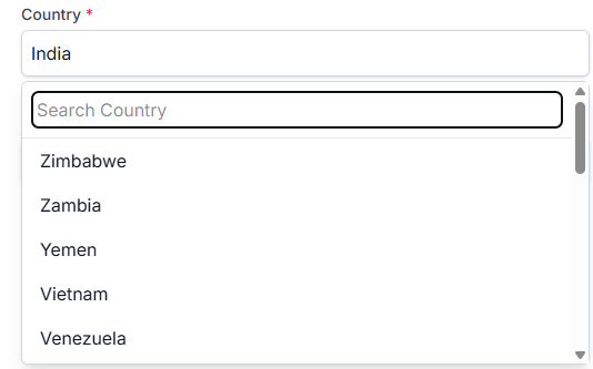
## 🌏 SearchableDropdown — Example
A powerful, customizable, and modern dropdown for React — with search support, async data fetching, and custom rendering.
```jsx
import React, { useState } from "react";
import { SearchableDropdown } from "hs-library";
import "hs-library/dist/index.css";
export default function App() {
const [formData, setFormData] = useState({ countryId: "" });
const fetchCountries = async (searchTerm) => {
// Example: fetch from API or filter local data
console.log("Searching for:", searchTerm);
};
return (
<SearchableDropdown
id="countryId"
label="Select Country"
options={[{ value: "1", label: "India" }]}
required
formData={formData}
setFormData={setFormData}
onSearch={fetchCountries}
RenderComponent={({ opt }) => (
<div style={{ display: "flex", justifyContent: "space-between" }}>
<span>{opt.label}</span>
<span>
<img src="https://flagcdn.com/16x12/in.png" alt="" />
</span>
</div>
)}
/>
);
}
```
## 🛠 Props
| Prop | Type | Required | Description |
|------------------|-----------|----------|-------------|
| `id` | `string` | ✅ | Field name key for form data. |
| `label` | `string` | ❌ | Label text for the dropdown. |
| `options` | `array` | ✅ | List of `{ value, label }` options. |
| `required` | `boolean` | ❌ | Marks field as required. |
| `formData` | `object` | ✅ | State object holding form values. |
| `setFormData` | `function`| ✅ | State updater for form data. |
| `onSearch` | `function`| ❌ | Callback for search term updates (great for API calls). |
| `RenderComponent`| `function`| ❌ | Custom renderer for each dropdown option. |
## ✨ Features
- 🔍 **Search-Optimized** — Handles large datasets and API-based search without lag.
- 🎨 **Fully Customizable** — Override CSS, change dropdown item layouts, and style to match your app.
- 🔗 **API Ready** — Plug in any `fetch` or Axios call to get options dynamically.
- ⚡ **Lightweight & Performant** — Built for speed in modern React apps.
- ♻ **Reusable Component** — One dropdown, endless use cases (countries, products, tags, etc.).
- 🛠 **Problem-Solver** — Designed to handle common dropdown headaches like:
- Dynamic filtering
- Async loading states
- Custom option rendering
- Form integration
## 📸 Example UI
## 💡 Pro Tip
Easily integrate with any API — for example, pulling countries from [REST Countries API](https://restcountries.com/) and showing flags automatically.
## 📚 Other Components in hs-library
- **Button** — Modern button styles with variants
- **Card** — Flexible content containers
- **Modal** — Accessible and animated dialogs
- **Toast** — Notification system
- **Inputs** — Text, number, and more
## 📄 License
This project is licensed under the ISC License — see the [LICENSE](./LICENSE) file for details.