header-sider-layout
Version:
ant-design-pro layout, based on pro-layout, with header and sider layout.
304 lines (233 loc) • 13 kB
Markdown
## Header Sider Layout
A custom layout for Ant-design-pro, based on [ant-design-pro-layout](https://github.com/ant-design/ant-design-pro-layout). Add the `both` layout type and some API for Header Nav.
<h1 align="center">Header Sider Layout</h1>
<div align="center">
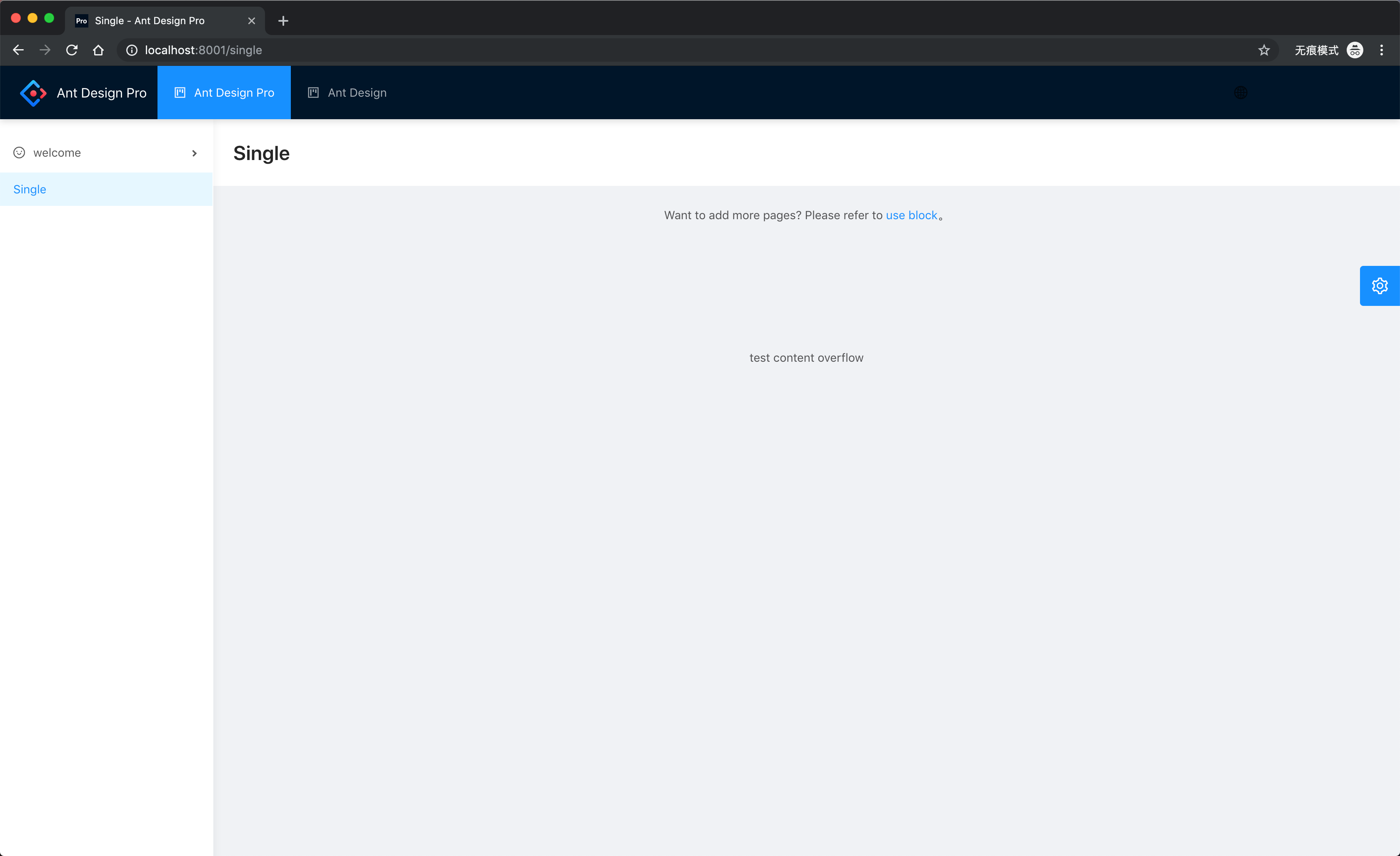
</div>
## Usage
```bash
npm i header-sider-layout --save
// or
yarn add header-sider-layout
```
```jsx
import ProLayout from 'header-sider-layout';
render(<ProLayout />, document.getElementById('root'));
```
## New API
| Property | Description | Type | Default Value |
| --- | --- | --- | --- |
| headerMenuProps | Props passed to ANTD MENU (for HeaderMenu), SEE (https://ant.design/components/menu-cn/) | MenuProps | same to origin menuProps |
| headerMenuData | The menuData of header menu | MenuDataItem[] | same to origin MenuDataItem[] get from routes |
| layout | layout menu mode, sidemenu: right navigation, topmenu: top navigation, both: header navigation and sider navigation | 'sidemenu' \| 'topmenu' \| 'both' | `'sidemenu'` |
<hr>
English | [简体中文](./README.zh-CN.md) [changelog](./changelog.en-US.md)
[](https://www.npmjs.com/package/@ant-design/pro-layout) [](https://www.npmjs.com/package/@ant-design/pro-layout) [](https://github.com/ant-design/ant-design-pro-layout/issues) [](https://david-dm.org/ant-design/ant-design-pro-layout) [](https://david-dm.org/ant-design/ant-design-pro-layout?type=dev) [](https://dev.azure.com/chenshuai2144/Pro-Layout/_build/latest?definitionId=2&branchName=master)
<h1 align="center">Ant Design Pro Layout</h1>
<div align="center">
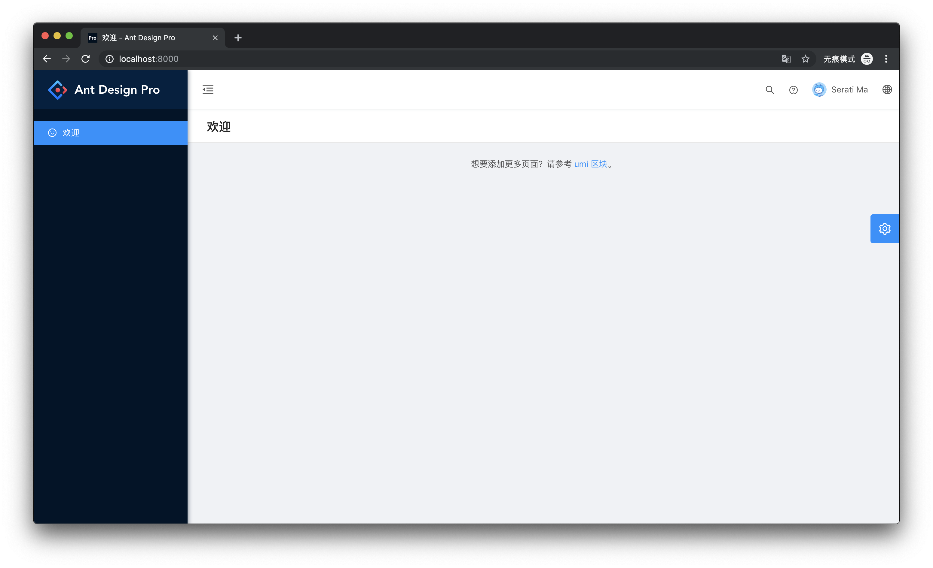
An out-of-box UI solution for enterprise applications as a React boilerplate. This repository is the layout of Ant Design Pro and was developed for quick and easy use of the layout.
</div>
## Usage
```bash
npm i @ant-design/pro-layout --save
// or
yarn add @ant-design/pro-layout
```
```jsx
import ProLayout from '@ant-design/pro-layout';
render(<ProLayout />, document.getElementById('root'));
```
## Demo
[site](https://ant-design.github.io/ant-design-pro-layout/)
## API
### ProLayout
> All methods with the suffix `Render` can prevent rendering by passing in `false`.
| Property | Description | Type | Default Value |
| --- | --- | --- | --- |
| title | layout in the upper left corner title | ReactNode | `'Ant Design Pro'` |
| logo | layout top left logo url | ReactNode \| ()=>ReactNode | - |
| menuHeaderRender | render logo and title | ReactNode \| (logo,title)=>ReactNode | - |
| onMenuHeaderClick | menu header click event | (e: React.MouseEvent<HTMLDivElement>) => void | - |
| layout | layout menu mode, sidemenu: right navigation, topmenu: top navigation | 'sidemenu' \| 'topmenu' | `'sidemenu'` |
| contentWidth | content mode of layout, Fluid: fixed width 1200px, Fixed: adaptive | 'Fluid' \| 'Fixed' | `'Fluid'` |
| navTheme | Navigation menu theme | 'light' \| 'dark' | `'dark'` |
| fixedHeader | whether to fix header to top | boolean | `false` |
| FixSiderbar | Whether to fix navigation menu | boolean | `false` |
| autoHideHeader | automatically hide the header when sliding | boolean' | `false` |
| menu | About the configuration of the menu, only locale, locale can turn off the globalization of the menu | { locale: boolean } | `{ locale: true }` |
| iconfontUrl | Use [IconFont](https://ant.design/components/icon-cn/#components-icon-demo-iconfont) icon configuration | string | - |
| locale | The language setting of the layout | 'zh-CN' \| 'zh-TW' \| 'en-US' | navigator.language |
| settings | layout settings | [`Settings`](#Settings) | [`Settings`](#Settings) | - |
| siderWidth | width of sider menu | number | 256 |
| collapsed | control menu's collapse and expansion | boolean | true |
| onCollapse | folding collapse event of menu | (collapsed: boolean) => void | - |
| headerRender | custom header render method | (props: BasicLayoutProps) => ReactNode | - |
| rightContentRender | header right content render method | (props: HeaderViewProps) => ReactNode | - |
| collapsedButtonRender | custom collapsed button method | (collapsed: boolean) => ReactNode | - |
| footerRender | custom footer render method | (props: BasicLayoutProps) => ReactNode | - |
| pageTitleRender | custom page title render method | (props: BasicLayoutProps) => ReactNode | - |
| menuRender | custom menu render method | (props: HeaderViewProps) => ReactNode | - |
| menuDataRender | The render method of menuData, with the definition of menuData | `(menuData: MenuDataItem[]) => MenuDataItem[]` | - |
| menuItemRender | the render method of a custom menu item | [(itemProps: MenuDataItem) => ReactNode](#MenuDataItem) | - |
| breadcrumbRender | custom breadcrumbs data | (route)=>route | - |
| route | Used to assist in the generation of menu and bread crumbs. Umi will automatically bring | [route](#Route) | - |
| disableMobile | Disable automatic switch to mobile mode | boolean | false |
| menuProps | Props passed to ANTD MENU, SEE (https://ant.design/components/menu-cn/) | MenuProps | undefined |
Layout support for most of [Menu](https://ant.design/components/menu-cn/#Menu) after 4.5.13.
### SettingDrawer
```js
import { SettingDrawer } from '@ant-design/pro-layout';
```
> SettingDrawer provides a graphical interface to set the layout configuration. Not recommended for use in a product environment.
| Property | Description | Type | Default Value |
| --- | --- | --- | --- |
| settings | layout settings | [`Settings`](#Settings) | [`Settings`](#Settings) | - |
| onSettingChange | The setting changes event | (settings: [Settings](#Settings)) => void | - |
### PageHeaderWrapper
PageHeaderWrapper encapsulates the PageHeader component of ant design, adds tabList, and content. Fill in the title and breadcrumb based on the current route. It depends on the route property of the Layout. Of course you can pass in parameters to override the default values. PageHeaderWrapper supports all the attributes of [Tabs](https://ant.design/components/tabs-cn/) and [PageHeader](https://ant.design/components/page-header-cn/).
| Property | Description | Type | Default Value |
| --- | --- | --- | --- |
| content | Content area | ReactNode | - |
| extraContent | Extra content area, on the right side of content | ReactNode | - |
| tabList | Tabs title list | `Array<{key: string, tab: ReactNode}>` | - |
| tabActiveKey | The currently highlighted tab item | string | - |
| onTabChange | Switch panel callback | `(key) => void` | - |
| tabBarExtraContent | Extra elements on the tab bar | React.ReactNode | - |
### RouteContext
RouteContext can provide built-in data for Layout. For example, isMobile and collapsed, you can consume this data to customize some behavior.
```tsx
import { RouteContext } from '@ant-design/pro-layout';
const Page = () => (
<RouteContext.Consumer>
{value => {
return value.title;
}}
</RouteContext.Consumer>
);
```
### GridContent
GridContent encapsulates [equal width](https://preview.pro.ant.design/dashboard/analysis?layout=topmenu&contentWidth=Fixed) and [streaming](https://preview.pro.ant.design/dashboard/) The logic of analysis?layout=topmenu). You can see the preview in [preview](https://preview.pro.ant.design/dashboard/analysis).
| Property | Description | Type | Default Value |
| ------------ | ------------ | ------------------ | ------------- |
| contentWidth | Content mode | 'Fluid' \| 'Fixed' | - |
### getMenuData
Generate menuData and breadcrumb based on the router information.
```js
import { getMenuData } from '@ant-design/pro-layout';
const { breadcrumb, menuData } = getMenuData(
routes,
menu,
formatMessage,
menuDataRender,
);
```
| Property | Description | Type | Default Value |
| --- | --- | --- | --- |
| routes | Routing configuration information | [route[]](#Route) | - |
| menu | Menu configuration item, default `{locale: true}` | `{ locale: boolean }` | - |
| menuDataRender | The render method of menuData, with the definition of menuData | `(menuData: MenuDataItem[]) => MenuDataItem[]` | - |
| formatMessage | The formatMessage method of react-intl | `(data: { id: any; defaultMessage?: string }) => string;` | - |
### getPageTitle
```js
import { getPageTitle } from '@ant-design/pro-layout';
const title = getPageTitle({
pathname,
breadcrumb,
menu,
title,
formatMessage,
});
```
getPageTitle encapsulates the logic based on the title generated on menuData.
| Property | Description | Type | Default Value |
| --- | --- | --- | --- |
| pathname | Current pathname | location.pathname | - |
| breadcrumb | Collection of MenuDataItem | `{ [path: string]: MenuDataItem }` | - |
| menu | Menu configuration item, default `{locale: true}` | `{ locale: boolean }` | - |
| title | Type of title | string | 'Ant Design Pro' |
| formatMessage | The formatMessage method of react-intl | `(data: { id: any; defaultMessage?: string }) => string;` | - |
## Data Structure
> For ease of viewing and use, Typescript is used here to write.
### Settings
```ts
// can be done via import { Settings } from '@ant-design/pro-layout/defaultSettings' to get this type
export interface Settings {
/**
* theme for nav menu
*/
navTheme: 'light' | 'dark';
/**
* primary color of ant design
*/
primaryColor: string;
/**
* nav menu position: `sidemenu` or `topmenu`
*/
layout: 'sidemenu' | 'topmenu';
/**
* layout of content: `Fluid` or `Fixed`, only works when layout is topmenu
*/
contentWidth: 'Fluid' | 'Fixed';
/**
* sticky header
*/
fixedHeader: boolean;
/**
* auto hide header
*/
autoHideHeader: boolean;
/**
* sticky siderbar
*/
fixSiderbar: boolean;
menu: { locale: boolean };
title: string;
pwa: boolean;
// Your custom iconfont Symbol script Url
// eg://at.alicdn.com/t/font_1039637_btcrd5co4w.js
// Usage: https://github.com/ant-design/ant-design-pro/pull/3517
iconfontUrl: string;
colorWeak: boolean;
}
```
### MenuDataItem
```ts
// can be imported { MenuDataItem } from '@ant-design/pro-layout/typings' to get this type
export interface MenuDataItem {
authority?: string[] | string;
children?: MenuDataItem[];
hideChildrenInMenu?: boolean;
hideInMenu?: boolean;
icon?: string;
locale?: string;
name?: string;
path: string;
[key: string]: any;
}
```
### Route
```ts
// can be imported { RouterTypes } from '@ant-design/pro-layout/typings' to get this type
export interface Route {
path: string;
routes: Array<{
exact?: boolean;
icon: string;
name: string;
path: string;
// optional secondary menu
children?: Route['routes'];
}>;
}
```
## Browsers support
Modern browsers and IE11.
| [<img src="https://raw.githubusercontent.com/alrra/browser-logos/master/src/edge/edge_48x48.png" alt="IE / Edge" width="24px" height="24px" />](http://godban.github.io/browsers-support-badges/)</br>IE / Edge | [<img src="https://raw.githubusercontent.com/alrra/browser-logos/master/src/firefox/firefox_48x48.png" alt="Firefox" width="24px" height="24px" />](http://godban.github.io/browsers-support-badges/)</br>Firefox | [<img src="https://raw.githubusercontent.com/alrra/browser-logos/master/src/chrome/chrome_48x48.png" alt="Chrome" width="24px" height="24px" />](http://godban.github.io/browsers-support-badges/)</br>Chrome | [<img src="https://raw.githubusercontent.com/alrra/browser-logos/master/src/safari/safari_48x48.png" alt="Safari" width="24px" height="24px" />](http://godban.github.io/browsers-support-badges/)</br>Safari | [<img src="https://raw.githubusercontent.com/alrra/browser-logos/master/src/opera/opera_48x48.png" alt="Opera" width="24px" height="24px" />](http://godban.github.io/browsers-support-badges/)</br>Opera |
| --- | --- | --- | --- | --- |
| IE11, Edge | last 2 versions | last 2 versions | last 2 versions | last 2 versions |
## Contributing
Any type of contribution is welcome, here are some examples of how you may contribute to this project:
- Use Ant Design Pro in your daily work.
- Submit [issues](http://github.com/ant-design/ant-design-pro/issues) to report bugs or ask questions.
- Propose [pull requests](http://github.com/ant-design/ant-design-pro/pulls) to improve our code.