gestalt
Version:
A set of React UI components which enforce Pinterest's design language
85 lines (84 loc) • 3.62 kB
TypeScript
import { ComponentProps, ReactElement, ReactNode } from 'react';
import Button from './Button';
import ButtonLink from './ButtonLink';
import Link from './Link';
type Props = {
/**
* Allows to insert a custom button for user interaction. Do not use except for allowed cases where primaryAction doesn't support functionality required in it.
*/
_dangerouslySetPrimaryAction?: ReactNode;
/**
* Allows to insert a custom thumbnail. Do not use except for allowed cases where thumbnail doesn't support functionality required in it or legacy code.
*/
_dangerouslySetThumbnail?: ReactNode;
/**
* Adds a dismiss button to Toast. See the [Dismissible variant](https://gestalt.pinterest.systems/web/toast#Dismissible) for more info.
* The `accessibilityLabel` should follow the [Accessibility guidelines](https://gestalt.pinterest.systems/web/toast#Accessibility).
*
*/
dismissButton?: {
accessibilityLabel?: string;
onDismiss: () => void;
};
/**
* Helper [Link](https://gestalt.pinterest.systems/web/link) to be placed after the subtext. See the [helper link variant](https://gestalt.pinterest.systems/web/toast#helperLink) to learn more.
*/
helperLink?: {
text: string;
accessibilityLabel: string;
href: string;
onClick?: (arg1: {
event: React.MouseEvent<HTMLAnchorElement> | React.KeyboardEvent<HTMLAnchorElement>;
dangerouslyDisableOnNavigation: () => void;
}) => void;
};
/**
* Adds an optional button for user interaction. Generally not recommended given the ephemeral nature of Toasts.
*/
primaryAction?: {
accessibilityLabel: string;
href: string;
label: string;
onClick?: ComponentProps<typeof ButtonLink>['onClick'];
rel?: ComponentProps<typeof Link>['rel'];
role: 'link';
size?: ComponentProps<typeof Button>['size'];
target?: ComponentProps<typeof Link>['target'];
} | {
accessibilityLabel: string;
label: string;
onClick: ComponentProps<typeof Button>['onClick'];
role?: 'button';
size?: ComponentProps<typeof Button>['size'];
};
/**
* Main content of Toast. Content should be [localized](https://gestalt.pinterest.systems/web/toast#Localization). See the [Text variant](https://gestalt.pinterest.systems/web/toast#Text) to learn more.
*/
text: string | ReactElement;
/**
* An optional thumbnail to display next to the text.
*/
thumbnail?: {
image: ReactElement;
} | {
avatar: ReactElement;
} | {
icon: ReactElement;
};
/**
* See the [type variant](https://gestalt.pinterest.systems/web/toast#Type) to learn more.
*/
type?: 'default' | 'success' | 'error' | 'progress';
};
/**
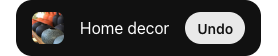
* [Toasts](https://gestalt.pinterest.systems/web/toast) are brief and small messages that overlay content, but do not block the user’s flow, as they are out of the way and ephemeral.
*
* Toasts do not require user action and primarily acknowledge that a user has performed an action or completed a task.
*
* 
*/
declare function Toast({ _dangerouslySetPrimaryAction, _dangerouslySetThumbnail, dismissButton, helperLink, primaryAction, text, thumbnail, type, }: Props): import("react/jsx-runtime").JSX.Element;
declare namespace Toast {
var displayName: string;
}
export default Toast;