gestalt
Version:
A set of React UI components which enforce Pinterest's design language
77 lines (76 loc) • 3.69 kB
TypeScript
import { Indexable } from './zIndex';
type TooltipProps = {
accessibilityLabel?: string;
inline?: boolean;
idealDirection?: 'up' | 'right' | 'down' | 'left';
text: string | ReadonlyArray<string>;
zIndex?: Indexable;
};
export type TileChangeHandler = (arg1: {
event: React.MouseEvent<HTMLDivElement> | React.KeyboardEvent<HTMLDivElement> | React.MouseEvent<HTMLAnchorElement> | React.KeyboardEvent<HTMLAnchorElement>;
selected: boolean;
id?: string;
}) => void;
export type DataVisualizationColors = '01' | '02' | '03' | '04' | '05' | '06' | '07' | '08' | '09' | '10' | '11' | '12' | 'neutral';
type TrendObject = {
accessibilityLabel: string;
value: number;
};
type Props = {
/**
* A valid color code from the [data visualization palette](https://gestalt.pinterest.systems/foundations/data_visualization/color/palette).
*/
color?: DataVisualizationColors;
/**
* Indicates if TileData should be disabled. Disabled TileDatas are inactive and cannot be interacted with. See the [disabled variant](https://gestalt.pinterest.systems/web/tiledata#Disabled) to learn more.
*/
disabled?: boolean;
/**
* An optional identifier to be passed back in the `onTap` callback. It can be helpful to distinguish multiple TileDatas.
*/
id?: string;
/**
* Handler called when the item selection state is changed.
*/
onTap?: TileChangeHandler;
/**
* Controls whether TileData is selected or not. Use this prop along with the `onTap` handler.
*/
selected?: boolean;
/**
* Shows a visible checkbox when TileData is in a selected state. See the [group variant](https://gestalt.pinterest.systems/web/tiledata#Group) to learn more.
*/
showCheckbox?: boolean;
/**
* The header text for TileData.
*/
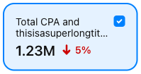
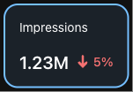
title: string;
/**
* Adds a tooltip on hover/focus of TileData. See the [with tooltip](https://gestalt.pinterest.systems/web/tiledata#Tooltip) variant to learn more.
*/
tooltip?: TooltipProps;
/**
* Object detailing the trend value (change in time - e.g. +30%), and accessibility label to describe the trend's icon (e.g., "Trending up"). See the [trend variant](https://gestalt.pinterest.systems/web/datapoint#Trend) to learn more.
*/
trend?: TrendObject;
/**
* A visual indicator whether the trend is considered "good", "bad" or "neutral". By setting \`trendSentiment\` to \`auto\`, a positive trend will be considered "good", a negative trend will be considered "bad" and a trend of zero will be considered "neutral". See the [trendSentiment variant](https://gestalt.pinterest.systems/web/datapoint#Trend-sentiment) to learn more.
*/
trendSentiment?: 'good' | 'bad' | 'neutral' | 'auto';
/**
* The datapoint value (e.g., 1.23M).
*/
value: string;
};
/**
* [TileData](https://gestalt.pinterest.systems/web/tiledata) enables users to select multiple categories to compare with each other in a graph or chart view, while still being able to see all of the data points.
*
* 
* 
*
*/
declare function TileData({ color, disabled, id, onTap, selected, showCheckbox, tooltip, title, trend, trendSentiment, value, }: Props): import("react/jsx-runtime").JSX.Element;
declare namespace TileData {
var displayName: string;
}
export default TileData;