gestalt
Version:
A set of React UI components which enforce Pinterest's design language
134 lines (133 loc) • 5.71 kB
TypeScript
import { ReactElement, ReactNode } from 'react';
import { autoCompleteType } from './TextField/InternalTextField';
export type MaxLength = {
characterCount: number;
errorAccessibilityLabel: string;
};
type Type = 'date' | 'email' | 'password' | 'tel' | 'text' | 'url';
type Props = {
/**
Indicate if autocomplete should be available on the input, and the type of autocomplete. All [autocomplete values](https://developer.mozilla.org/en-US/docs/Web/HTML/Attributes/autocomplete#values) are supported.
*/
autoComplete?: autoCompleteType;
/**
* Indicate if the input is disabled. See the [disabled example](https://gestalt.pinterest.systems/web/textfield#Disabled) for more details.
*/
disabled?: boolean;
/**
* Available for testing purposes, if needed. Consider [better queries](https://testing-library.com/docs/queries/about/#priority) before using this prop.
*/
dataTestId?: string;
/**
* For most use cases, pass a string with a helpful error message (be sure to localize!). In certain instances it can be useful to make some text clickable; to support this, you may instead pass a React.Node to wrap text in [Link](https://gestalt.pinterest.systems/web/link) or [TapArea](https://gestalt.pinterest.systems/web/taparea).
*/
errorMessage?: ReactNode;
/**
* This field is deprecated and will be removed soon. Please do not use.
*/
hasError?: boolean;
/**
* More information about how to complete the form field.
*/
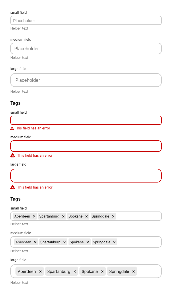
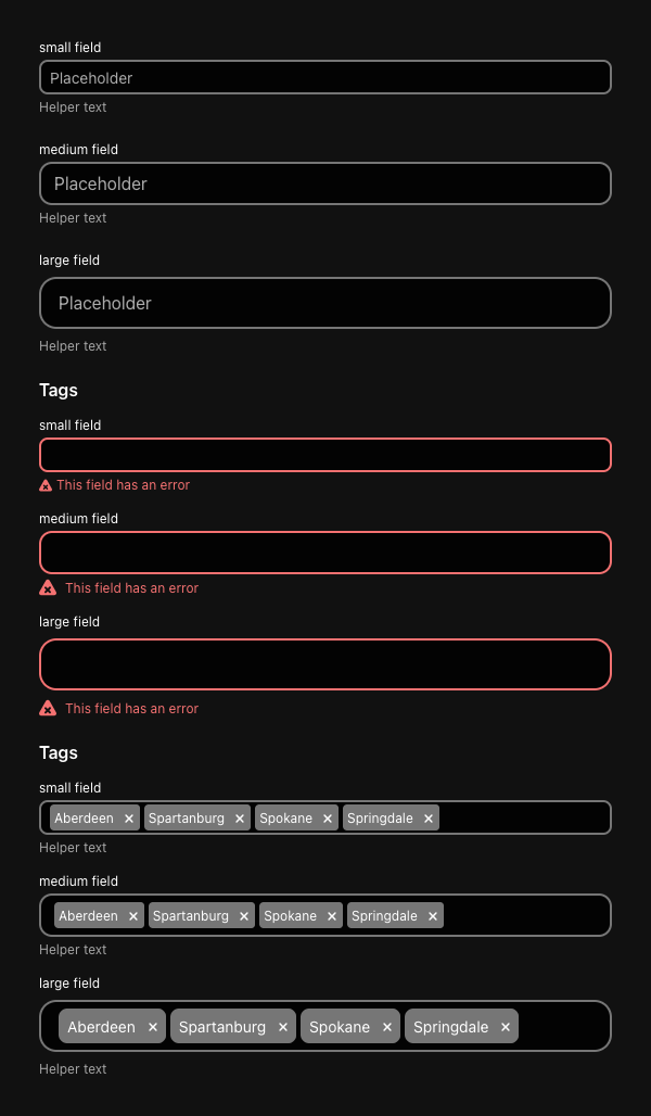
helperText?: string;
/**
* A unique identifier for the input.
*/
id: string;
/**
* The label for the input. Be sure to localize the text.
*/
label?: string;
/**
* Whether the label should be visible or not. If `hidden`, the label is still available for screen reader users, but does not appear visually. See the [label visibility variant](https://gestalt.pinterest.systems#Label-visibility) for more info.
*/
labelDisplay?: 'visible' | 'hidden';
/**
* The maximum number of characters allowed in Textfield. `maxLength` must be an integer value 0 or higher. See the [maximum length variant](https://gestalt.pinterest.systems/web/textfield#Maximum-length) for more details.
*/
maxLength?: MaxLength;
/**
* Mobile only prop. Optionally specify the action label to present for the enter key on virtual keyboards. See the [enterKeyHint variant](https://gestalt.pinterest.systems/web/textfield#EnterKeyHint) for more info.
*/
mobileEnterKeyHint?: 'enter' | 'done' | 'go' | 'next' | 'previous' | 'search' | 'send';
/**
* Mobile only prop. Optionally specify the type of data that might be entered by the user while editing the element or its contents. This allows mobile browsers to display an appropriate virtual keyboard. See the [enterKeyHint variant](https://gestalt.pinterest.systems/web/textfield#EnterKeyHint) for more info.
*/
mobileInputMode?: 'none' | 'text' | 'decimal' | 'numeric';
/**
* A unique name for the input.
*/
name?: string;
/**
* Callback triggered when the user blurs the input.
*/
onBlur?: (arg1: {
event: React.FocusEvent<HTMLInputElement>;
value: string;
}) => void;
/**
* Callback triggered when the value of the input changes.
*/
onChange: (arg1: {
event: React.ChangeEvent<HTMLInputElement>;
value: string;
}) => void;
/**
* Callback triggered when the user user clicks the input.
*/
onClick?: (arg1: {
event: React.MouseEvent<HTMLInputElement>;
value: string;
}) => void;
/**
* Callback triggered when the user focuses the input.
*/
onFocus?: (arg1: {
event: React.FocusEvent<HTMLInputElement>;
value: string;
}) => void;
/**
* Callback triggered when the user presses any key while the input is focused.
*/
onKeyDown?: (arg1: {
event: React.KeyboardEvent<HTMLInputElement>;
value: string;
}) => void;
/**
* Placeholder text shown the the user has not yet input a value.
*/
placeholder?: string;
/**
* Indicate if the input is readOnly. See the [readOnly example](https://gestalt.pinterest.systems/web/textfield#Read-only) for more details.
*/
readOnly?: boolean;
/**
* Ref that is forwarded to the underlying input element.
*/
ref?: ReactElement;
/**
* List of tags to display in the component.
*/
tags?: ReadonlyArray<ReactElement>;
/**
* The type of input. For non-telephone numerical input, please use [NumberField](https://gestalt.pinterest.systems/web/numberfield).
*/
type?: Type;
/**
* Defines the height of the TextField: sm: 32px, md: 40px (default), lg: 48px. See the [size variant](https://gestalt.pinterest.systems/web/TextField#Size) for more details.
*/
size?: 'sm' | 'md' | 'lg';
/**
* The current value of the input.
*/
value?: string;
};
/**
* [TextField](https://gestalt.pinterest.systems/web/textfield) allows for multiple types of text input.
*
* 
* 
*
*/
declare const TextFieldWithForwardRef: import("react").ForwardRefExoticComponent<Omit<Props, "ref"> & import("react").RefAttributes<HTMLInputElement>>;
export default TextFieldWithForwardRef;