gestalt
Version:
A set of React UI components which enforce Pinterest's design language
108 lines (107 loc) • 4.46 kB
TypeScript
import { ReactElement, ReactNode } from 'react';
type Props = {
/**
* Indicate if the input is currently disabled. See the [disabled example](https://gestalt.pinterest.systems/web/textarea#Disabled) for more details.
*/
disabled?: boolean;
/**
* Available for testing purposes, if needed. Consider [better queries](https://testing-library.com/docs/queries/about/#priority) before using this prop.
*/
dataTestId?: string;
/**
* For most use cases, pass a string with a helpful error message (be sure to localize!). In certain instances it can be useful to make some text clickable; to support this, you may instead pass a React.Node to wrap text in Link or TapArea. See the [error message example](https://gestalt.pinterest.systems/web/textarea#Error-message) for more details.
*/
errorMessage?: ReactNode;
/**
* This field is deprecated and will be removed soon. Please do not use.
*/
hasError?: boolean;
/**
* More information about how to complete the form field. See the [helper text example](https://gestalt.pinterest.systems/web/textarea#Helper-text) for more details.
*/
helperText?: string;
/**
* A unique identifier for the input.
*/
id: string;
/**
* The label for the input. Be sure to localize the text.
*/
label?: string;
/**
* Whether the label should be visible or not. If `hidden`, the label is still available for screen reader users, but does not appear visually. See the [label visibility variant](https://gestalt.pinterest.systems/web/textarea#Label-visibility) for more info.
*/
labelDisplay?: 'visible' | 'hidden';
/**
* The maximum number of characters allowed in TextArea. `maxLength` must be an integer value 0 or higher. See the [maximum length variant](https://gestalt.pinterest.systems/web/textarea#Maximum-length) for more details.
*/
maxLength?: {
characterCount: number;
errorAccessibilityLabel: string;
};
/**
* A unique name for the input.
*/
name?: string;
/**
* Callback triggered when the user blurs the input.!
*/
onBlur?: (arg1: {
event: React.FocusEvent<HTMLTextAreaElement>;
value: string;
}) => void;
/**
* Callback triggered when the value of the input changes.
*/
onChange: (arg1: {
event: React.ChangeEvent<HTMLTextAreaElement>;
value: string;
}) => void;
/**
* Callback triggered when the user focuses the input.
*/
onFocus?: (arg1: {
event: React.FocusEvent<HTMLTextAreaElement>;
value: string;
}) => void;
/**
* Callback triggered when the user presses any key while the input is focused.
*/
onKeyDown?: (arg1: {
event: React.KeyboardEvent<HTMLTextAreaElement>;
value: string;
}) => void;
/**
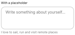
* Placeholder text shown the the user has not yet input a value.
*/
placeholder?: string;
/**
* Indicate if the input is currently readOnly. See the [readOnly example](https://gestalt.pinterest.systems/web/textarea#Read-only) for more details.
*/
readOnly?: boolean;
/**
* Ref that is forwarded to the underlying input element. See the [ref example](https://gestalt.pinterest.systems/web/textarea#With-a-ref) for more details.
*/
ref?: ReactElement;
/**
* Number of text rows to display. Note that tags take up more space, and will show fewer rows than specified.
*/
rows?: number;
/**
* List of tags to display in the component. See the [tags example](https://gestalt.pinterest.systems/web/textarea#With-tags) for more details.
*/
tags?: ReadonlyArray<ReactElement>;
/**
* The current value of the input.
*/
value?: string;
};
/**
* [TextArea](https://gestalt.pinterest.systems/web/textarea) allows for multi-line input.
*
* 
* 
*
*/
declare const TextAreaWithForwardRef: import("react").ForwardRefExoticComponent<Omit<Props, "ref"> & import("react").RefAttributes<HTMLTextAreaElement>>;
export default TextAreaWithForwardRef;