gestalt
Version:
A set of React UI components which enforce Pinterest's design language
70 lines (69 loc) • 4.16 kB
TypeScript
import { ReactNode } from 'react';
type Overflow = 'normal' | 'breakAll' | 'breakWord' | 'noWrap';
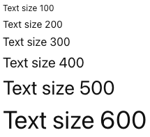
type Size = '100' | '200' | '300' | '400' | '500' | '600';
type Props = {
/**
* `"start"` and `"end"` should be used for regular alignment since they flip with locale direction. `"forceLeft"` and `"forceRight"` should only be used in special cases where locale direction should be ignored, such as tabular or numeric text. See the [alignment variant](https://gestalt.pinterest.systems/web/text#Alignment) for more details.
*/
align?: 'start' | 'end' | 'center' | 'forceLeft' | 'forceRight';
/**
* The text content to be displayed.
*/
children?: ReactNode;
/**
* The color of the text content. See the [colors variant](https://gestalt.pinterest.systems/web/text#Colors) for more details.
*/
color?: 'default' | 'disabled' | 'subtle' | 'success' | 'error' | 'warning' | 'shopping' | 'link' | 'inverse' | 'recommendation' | 'light' | 'dark';
/**
* Available for testing purposes, if needed. Consider [better queries](https://testing-library.com/docs/queries/about/#priority) before using this prop.
*/
dataTestId?: string;
/**
* A unique identifier for the element.
*/
id?: string;
/**
* Indicates how the text should flow with the surrounding content. See the [block vs inline variant](https://gestalt.pinterest.systems/web/text#Block-vs.-inline) for more details.
*/
inline?: boolean;
/**
* Indicates if the text should be displayed in italic. See the [styles variant](https://gestalt.pinterest.systems/web/text#Styles) for more details.
*/
italic?: boolean;
/**
* Visually truncate the text to the specified number of lines. This also adds the `title` attribute if `children` is a string, which displays the full text on hover in most browsers. See the [overflow and truncation variant](https://gestalt.pinterest.systems/web/text#Overflow-and-truncation) for more details.
*/
lineClamp?: number;
/**
* Indicates how the text content should handle overflowing its container. See the [overflow and truncation variant](https://gestalt.pinterest.systems/web/text#Overflow-and-truncation) for more details.
*/
overflow?: Overflow;
/**
* Ref that is forwarded to the underlying element. See the [ref variant](https://gestalt.pinterest.systems/web/text#Refs) for more details.
*/
ref?: HTMLDivElement | HTMLSpanElement;
/**
* The sizes are based on our [font-size design tokens](https://gestalt.pinterest.systems/foundations/design_tokens/overview#Font-size). See the [sizes variant](https://gestalt.pinterest.systems/web/text#Sizes) for more details.
*/
size?: Size;
/**
* This populates the `title` attribute of the element, which is visible on hover in most browsers. This is useful when truncating the text with `lineClamp` when `children` is a `React.Node`. See the [Title variant](https://gestalt.pinterest.systems/web/text#Title) for more details.
*/
title?: string;
/**
* Indicates if the text content should be underlined. See the [styles variant](https://gestalt.pinterest.systems/web/text#Styles) for more details.
*/
underline?: boolean;
/**
* Indicates the font weight for the text content. See the [styles variant](https://gestalt.pinterest.systems/web/text#Styles) for more details.
*/
weight?: 'bold' | 'normal';
};
/**
* [Text](https://gestalt.pinterest.systems/web/text) component is used for all non-heading text on all surfaces, whether inside of UI components or in long-form paragraph text.
*
* 
* 
*/
declare const TextWithForwardRef: import("react").ForwardRefExoticComponent<Omit<Props, "ref"> & import("react").RefAttributes<HTMLDivElement>>;
export default TextWithForwardRef;