gestalt
Version:
A set of React UI components which enforce Pinterest's design language
40 lines (39 loc) • 2.02 kB
TypeScript
type Props = {
/**
* If your app uses DefaultLabelProvider, a default value for this label will be used. Using this prop will override the default label value with a more specific label if desired. This populates the `aria-label` on the remove icon.
*/
accessibilityRemoveIconLabel?: string;
/**
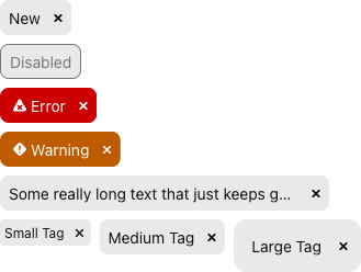
* Disabled tags appear inactive and cannot be interacted with.
*/
disabled?: boolean;
/**
* Callback fired when the user dismisses the tag. This handler should take care of state updates to no longer render the Tag.
*/
onRemove: (arg1: {
event: React.MouseEvent<HTMLButtonElement>;
}) => void;
/**
* Size of the Tag. Default is `md`. See [size variant](https://gestalt.pinterest.systems/web/tag#Size) for more details.
*/
size?: 'sm' | 'md' | 'lg';
/**
* Short text to render inside the Tag.
*/
text: string;
/**
* Communicate a "warning" or "error" state to the user, with an accompanying icon and specific background color.
*/
type?: 'default' | 'error' | 'warning';
};
/**
* [Tags](https://gestalt.pinterest.systems/web/tag) can be used to categorize, classify or filter content, usually via keywords. They can appear within [TextFields](https://gestalt.pinterest.systems/web/textfield#tagsExample), [TextAreas](https://gestalt.pinterest.systems/web/textarea#tagsExample), [ComboBox](https://gestalt.pinterest.systems/web/combobox#Tags) or as standalone components.
*
* 
* 
*/
declare function Tag({ accessibilityRemoveIconLabel, disabled, onRemove, size, text, type, }: Props): import("react/jsx-runtime").JSX.Element;
declare namespace Tag {
var displayName: string;
}
export default Tag;