gestalt
Version:
A set of React UI components which enforce Pinterest's design language
57 lines (56 loc) • 3.03 kB
TypeScript
import { LegacyRef, ReactNode } from 'react';
import icons from './icons/index';
type Props = {
/**
* The index of the active tab.
*/
activeTabIndex: number;
/**
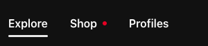
* If Tabs is displayed in a container with a colored background, use this prop to remove the white tab background. See the [background color example](https://gestalt.pinterest.systems/web/tabs#Background-color) to learn more.
*/
bgColor?: 'default' | 'transparent';
/**
* Available for testing purposes, if needed. Consider [better queries](https://testing-library.com/docs/queries/about/#priority) before using this prop.
*/
dataTestId?: string;
/**
* If your app requires client navigation, be sure to use [GlobalEventsHandlerProvider](https://gestalt.pinterest.systems/web/utilities/globaleventshandlerprovider#Link-handlers) and/or `onChange` to navigate instead of getting a full page refresh just using `href`.
*/
onChange: (arg1: {
event: React.MouseEvent<HTMLAnchorElement> | React.KeyboardEvent<HTMLAnchorElement>;
readonly activeTabIndex: number;
dangerouslyDisableOnNavigation: () => void;
}) => void;
/**
* See the [size variant](https://gestalt.pinterest.systems/web/tabs#Size) variant to learn more.
*/
size?: 'sm' | 'lg';
/**
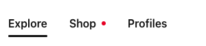
* The array of tabs to be displayed. The active tab (as indicated by `activeTabIndex`) will be underlined. Use the optional `indicator` field to show a notification of new items on the tab — see the [indicator variant](https://gestalt.pinterest.systems/web/tabs#Indicator) to learn more. Though `text` currently accepts a React.Node, this is deprecated and will be replaced by a simple `string` type soon.
*/
tabs: ReadonlyArray<{
notificationAccessibilityLabel?: string;
href: string;
id?: string;
indicator?: 'dot' | number;
ref?: LegacyRef<HTMLDivElement> | undefined;
text: ReactNode;
icon?: keyof typeof icons;
}>;
/**
* By default, tabs will all try to fit onto one line. Use this prop to allow the items to wrap onto multiple lines, from top to bottom.
*/
wrap?: boolean;
};
/**
* [Tabs](https://gestalt.pinterest.systems/web/tabs) may be used navigate between multiple URLs. Tabs are intended as page-level navigation - if you're looking at just switching panels of content, please use [SegmentedControl](https://gestalt.pinterest.systems/web/segmentedcontrol).
*
* 
* 
*
*/
declare function Tabs({ activeTabIndex, bgColor, onChange, tabs, size, wrap, dataTestId, }: Props): import("react/jsx-runtime").JSX.Element;
declare namespace Tabs {
var displayName: string;
}
export default Tabs;