gestalt
Version:
A set of React UI components which enforce Pinterest's design language
40 lines (39 loc) • 1.7 kB
TypeScript
type Props = {
/**
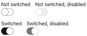
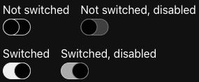
* Indicates if the input is currently disabled. See [Switch combinations](https://gestalt.pinterest.systems/web/switch#Disabled-and-switched-combinations) for more details.
*/
disabled?: boolean;
/**
* A unique identifier for the element.
*/
id: string;
/**
* A unique name for the element.
*/
name?: string;
/**
* Callback triggered when the user interacts with the input.
*/
onChange: (arg1: {
event: React.ChangeEvent<HTMLInputElement>;
value: boolean;
}) => void;
/**
* Indicates the current value of the input. See [Switch combinations](https://gestalt.pinterest.systems/web/switch#Disabled-and-switched-combinations) for more details.
*/
switched?: boolean;
};
/**
* Use [Switch](https://gestalt.pinterest.systems/web/switch) for single cell options that can be turned on and off only. If you have a cell with multiple options that can activated, consider using [Checkbox](https://gestalt.pinterest.systems/web/checkbox).
*
* Switch supports right-to-left(RTL) language locales layout (auto flip on RTL locales like Arabic).
*
* 
* 
*
*/
declare function Switch({ disabled, id, name, onChange, switched }: Props): import("react/jsx-runtime").JSX.Element;
declare namespace Switch {
var displayName: string;
}
export default Switch;