gestalt
Version:
A set of React UI components which enforce Pinterest's design language
96 lines (95 loc) • 5 kB
TypeScript
import { ReactNode } from 'react';
import SideNavigationGroup from './SideNavigationGroup';
import SideNavigationNestedGroup from './SideNavigationNestedGroup';
import SideNavigationSection from './SideNavigationSection';
export type Props = {
/**
* String that clients such as VoiceOver will read to describe the element.
*/
accessibilityLabel: string;
/**
* The content shown in SideNavigation. See [subcomponents](https://gestalt.pinterest.systems/web/sidenavigation#Subcomponents).
*/
children: ReactNode;
/**
* Content to display at the bottom of SideNavigation. Open slot available to display other functionality required in the page. See the [Footer variant](https://gestalt.pinterest.systems/web/sidenavigation#Header) to learn more.
*/
footer?: ReactNode;
/**
* Content to display at the top of SideNavigation. Open slot used for controlling the display of navigation items. See the [Header variant](https://gestalt.pinterest.systems/web/sidenavigation#Header) to learn more.
*/
header?: ReactNode;
/**
* Callback fired when SideNavigation requests to be closed in mobile devices. Must be used to control SideNavigation´s on/off display state. The accessibilityLabel should follow the Accessibility guidelines.
*/
dismissButton?: {
accessibilityLabel?: string;
onDismiss: () => void;
};
/**
* Displays a border in SideNavigation. See the [Border](https://gestalt.pinterest.systems/web/sidenavigation#Border) variant for more info.
*/
showBorder?: boolean;
/**
* Title for mobile navigation.
*/
mobileTitle?: string;
/**
* When passed SideNavigation becomes a collapsible controlled component. If not passed, it stays non-collapsible. See the [collapsible variant](https://gestalt.pinterest.systems/web/sidenavigation#Collapsible) to learn more. This functionality is not supported in mobile.
*/
collapsed?: boolean;
/**
* Callback fired when the SideNavigation is collapsible and the collapse/expand button is clicked. This functionality is not supported in mobile.
*/
onCollapse?: (arg1: boolean) => void;
/**
* Callback fired when the *collapsed* SideNavigation is hovered and opened in preview mode. This functionality is not supported in mobile.
*/
onPreview?: (arg1: boolean) => void;
};
/**
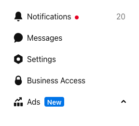
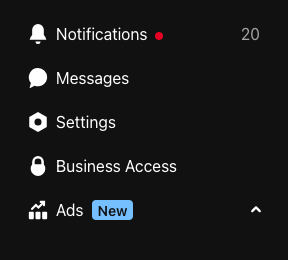
* [SideNavigation](https://gestalt.pinterest.systems/web/sidenavigation) is start-aligned and arranged vertically. It is used to navigate between page urls or sections when you have too many menu items to fit in horizontal [Tabs](https://gestalt.pinterest.systems/web/tabs).
*
* **NOTE**This component is on alpha phase, still under developoment. The component will support three levels and keyboard navigation. The component will change behavior and the API might also change in future component version releases.**NOTE**
*
* 
* 
*
*/
declare function SideNavigation({ accessibilityLabel, children, dismissButton, footer, header, showBorder, mobileTitle, collapsed, onCollapse, onPreview, }: Props): import("react/jsx-runtime").JSX.Element;
declare namespace SideNavigation {
var Section: typeof SideNavigationSection;
var TopItem: import("react").ForwardRefExoticComponent<Omit<import("./SideNavigationTopItem").Props, "ref"> & import("react").RefAttributes<HTMLLIElement>>;
var NestedItem: import("react").ForwardRefExoticComponent<Omit<{
active?: "page" | "section";
counter?: {
number: string;
accessibilityLabel: string;
};
disabled?: boolean;
href: string;
subtext?: string;
label: string;
onClick?: (arg1: {
event: React.MouseEvent<HTMLAnchorElement> | React.KeyboardEvent<HTMLAnchorElement>;
dangerouslyDisableOnNavigation: () => void;
}) => void;
primaryAction?: {
icon?: "ellipsis" | "edit" | "trash-can";
onClick?: (arg1: {
event: React.MouseEvent<HTMLDivElement> | React.KeyboardEvent<HTMLDivElement>;
}) => void;
tooltip: {
accessibilityLabel?: string;
text: string;
zIndex?: import("./zIndex").Indexable;
};
dropdownItems?: ReadonlyArray<import("react").ReactElement>;
};
ref?: HTMLLIElement;
}, "ref"> & import("react").RefAttributes<HTMLLIElement>>;
var Group: typeof SideNavigationGroup;
var NestedGroup: typeof SideNavigationNestedGroup;
var displayName: string;
}
export default SideNavigation;