gestalt
Version:
A set of React UI components which enforce Pinterest's design language
90 lines (89 loc) • 3.94 kB
TypeScript
import { ReactNode } from 'react';
import SelectListGroup from './SelectList/SelectListGroup';
import SelectListOption from './SelectList/SelectListOption';
type Props = {
/**
* Available for testing purposes, if needed. Consider [better queries](https://testing-library.com/docs/queries/about/#priority) before using this prop.
*/
dataTestId?: string;
/**
* One or more SelectList.Option components, which may be grouped using SelectList.Group.
*/
children: ReactNode;
/**
* Used to disable the entire SelectList.
*/
disabled?: boolean;
/**
* Used to communicate error information to the user. Be sure to localize the text. See the [error message](https://gestalt.pinterest.systems/web/selectlist#Error-message) variant to learn more.
*/
errorMessage?: string;
/**
* Used to provide more information about the form field. Be sure to localize the text. See the [helper text](https://gestalt.pinterest.systems/web/selectlist#Helper-text) variant to learn more.
*/
helperText?: string;
/**
* A unique identifier to connect the underlying `<select>` with the associated label.
*/
id: string;
/**
* The label shown above the input. Be sure to localize the label.
*/
label?: string;
/**
* Whether the legend should be visible or not. If `hidden`, the legend is still available for screen reader users, but does not appear visually. See the [label visibility variant](https://gestalt.pinterest.systems#Label-visibility) for more info.
*/
labelDisplay?: 'visible' | 'hidden';
/**
* Used to specify the name of the control.
*/
name?: string;
/**
* Callback triggered when the user blurs the input.
*/
onBlur?: (arg1: {
event: React.FocusEvent<HTMLSelectElement>;
value: string;
}) => void;
/**
/**
* Callback triggered when the user selects a new option. See the [controlled component](https://gestalt.pinterest.systems/web/selectlist#Controlled-component) variant to learn more.
*/
onChange: (arg1: {
event: React.ChangeEvent<HTMLSelectElement>;
value: string;
}) => void;
/**
* Callback triggered when the user focuses the input.
*/
onFocus?: (arg1: {
event: React.FocusEvent<HTMLSelectElement>;
value: string;
}) => void;
/**
* If not provided, the first item in the list will be shown. Be sure to localize the text. See the [controlled component](https://gestalt.pinterest.systems/web/selectlist#Controlled-component) variant to learn more.
*/
placeholder?: string;
/**
* md: 40px, lg: 48px. See the [size](https://gestalt.pinterest.systems/web/selectlist#Size) variant to learn more.
*/
size?: 'md' | 'lg';
/**
* The currently-selected value. See the [controlled component](https://gestalt.pinterest.systems/web/selectlist#Controlled-component) variant to learn more.
*/
value?: string | null | undefined;
};
/**
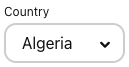
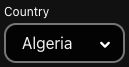
* [SelectList](https://gestalt.pinterest.systems/web/selectlist) displays a list of actions or options using the browser’s native select.
*
* 
* 
*
*/
declare function SelectList({ dataTestId, children, disabled, errorMessage, helperText, id, label, labelDisplay, name, onBlur, onChange, onFocus, placeholder, size, value, }: Props): import("react/jsx-runtime").JSX.Element;
declare namespace SelectList {
var Option: typeof SelectListOption;
var Group: typeof SelectListGroup;
var displayName: string;
}
export default SelectList;