gestalt
Version:
A set of React UI components which enforce Pinterest's design language
98 lines (97 loc) • 3.7 kB
TypeScript
type UnionRefs = HTMLDivElement | HTMLAnchorElement;
type Props = {
/**
* String that clients such as VoiceOver will read to describe the element. Always localize the label. See the [Accessibility section](https://gestalt.pinterest.systems/web/searchfield#Accessibility) for more info.
*/
accessibilityLabel: string;
/**
* String that clients such as VoiceOver will read to describe the clear button element. Always localize the label. See the [Accessibility section](https://gestalt.pinterest.systems/web/searchfield#Accessibility) for more info.
*/
accessibilityClearButtonLabel?: string;
/**
* The type of autocomplete used, if any. See [MDN](https://developer.mozilla.org/en-US/docs/Web/HTML/Attributes/autocomplete) for more info.
*/
autoComplete?: 'on' | 'off' | 'username' | 'name';
/**
* Available for testing purposes, if needed. Consider [better queries](https://testing-library.com/docs/queries/about/#priority) before using this prop.
*/
dataTestId?: string;
/**
* Error text displayed below the input field.
*/
errorMessage?: string;
/**
* Must be unique!
*/
id: string;
/**
* Text used to label the input. Be sure to localize the text. See the [Visible label variant](https://gestalt.pinterest.systems/web/searchfield#Visible-label) for more info.
*/
label?: string;
/**
* Whether the legend should be visible or not. If `hidden`, the legend is still available for screen reader users, but does not appear visually. See the [label visibility variant](https://gestalt.pinterest.systems/web/searchfield#Visible-label) for more info.
*/
labelDisplay?: 'visible' | 'hidden';
/**
*
*/
onBlur?: (arg1: {
event: React.FocusEvent<HTMLInputElement>;
value: string;
}) => void;
/**
* Primary callback to handle keyboard input.
*/
onChange: (arg1: {
value: string;
event: React.SyntheticEvent<HTMLInputElement | HTMLButtonElement>;
}) => void;
/**
* Callback when user clicks on clear button.
*/
onClear?: () => void;
/**
*
*/
onFocus?: (arg1: {
value: string;
event: React.FocusEvent<HTMLInputElement>;
}) => void;
/**
* Secondary callback for keyboard events. Possible uses include validation, form submission, etc.
*/
onKeyDown?: (arg1: {
event: React.KeyboardEvent<HTMLInputElement>;
value: string;
}) => void;
/**
* Text displayed before the user has entered anything.
*/
placeholder?: string;
/**
* Indicate if the input is readOnly.
*/
readOnly?: boolean;
/**
* Ref that is forwarded to the underlying input element.
*/
ref?: UnionRefs;
size?: 'md' | 'lg';
/**
* Use "-1" to remove SearchField from keyboard navigation.
*/
tabIndex?: -1 | 0;
/**
* The current value of the input.
*/
value?: string;
};
/**
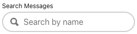
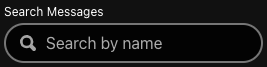
* [SearchField](https://gestalt.pinterest.systems/web/searchfield) allows users to search for free-form content.
*
* 
* 
*
*/
declare const SearchFieldWithForwardRef: import("react").ForwardRefExoticComponent<Omit<Props, "ref"> & import("react").RefAttributes<HTMLInputElement>>;
export default SearchFieldWithForwardRef;