gestalt
Version:
A set of React UI components which enforce Pinterest's design language
96 lines (95 loc) • 5.1 kB
TypeScript
import { ReactElement, ReactNode } from 'react';
import { Indexable } from './zIndex';
type Size = 'sm' | 'flexible';
type Role = 'dialog' | 'tooltip';
type PrimaryActionType = {
accessibilityLabel?: string;
href: string;
onClick?: (arg1: {
event: React.MouseEvent<HTMLAnchorElement> | React.KeyboardEvent<HTMLAnchorElement>;
dangerouslyDisableOnNavigation: () => void;
}) => void;
rel?: 'none' | 'nofollow';
role: 'link';
target?: null | 'self' | 'blank';
text: string;
} | {
accessibilityLabel?: string;
onClick?: (arg1: {
event: React.MouseEvent<HTMLButtonElement> | React.KeyboardEvent<HTMLButtonElement>;
}) => void;
role?: 'button';
text: string;
};
type Props = {
/**
* Unique label to describe each PopoverMessage. See the [accessibility section](https://gestalt.pinterest.systems/web/PopoverMessage#ARIA-attributes) for more guidance.
*/
accessibilityLabel?: string;
/**
* The reference element that PopoverMessage uses to set its position.
*/
anchor: HTMLElement | null | undefined;
/**
* The optional content shown in PopoverMessage. See the [custom content section](https://gestalt.pinterest.systems/web/PopoverMessage#Custom-content) for more guidance.
*/
children?: ReactNode;
/**
* Unique id to identify each PopoverMessage. Used for [accessibility](https://gestalt.pinterest.systems/web/PopoverMessage#ARIA-attributes) purposes.
*/
id?: string;
/**
* Specifies the preferred position of PopoverMessage relative to its anchor element. See the [ideal direction variant in Popover's](https://gestalt.pinterest.systems/web/popover#Ideal-direction) to learn more.
*/
idealDirection?: 'up' | 'right' | 'down' | 'left';
/**
* Forces the position of Popover relative to its anchor element.
*/
forceDirection?: boolean;
/**
* Callback fired when PopoverMessage is closed. Must be used to control Popover’s on/off display state. See the [visibility on page load variant](https://gestalt.pinterest.systems/web/PopoverMessage#Visibility-on-page-load) to learn more.
*/
onDismiss: () => void;
/**
* Main action for users to take on PopoverMessage. If `href` is supplied, the action will serve as a link. See [GlobalEventsHandlerProvider](https://gestalt.pinterest.systems/web/utilities/globaleventshandlerprovider#Link-handlers) to learn more about link navigation.
* If no `href` is supplied, the action will be a button.
* The `accessibilityLabel` should follow the [accessibility guidelines for Button](https://gestalt.pinterest.systems/web/button#ARIA-attributes).
* See the [primary action variant](https://gestalt.pinterest.systems/web/PopoverMessage#Primary-action) to learn more.
*/
primaryAction?: PrimaryActionType;
/**
* Main text content of PopoverMessage. Content should be [localized](https://gestalt.pinterest.systems/web/PopoverMessage#Localization). See the [message variant](https://gestalt.pinterest.systems/web/PopoverMessage#Message) to learn more.
*
*/
message?: string | ReactElement;
/**
* The underlying ARIA role for PopoverMessage. See the [role section in Accessibility](https://gestalt.pinterest.systems/web/PopoverMessage#Role) for more info.
*/
role?: Role;
/**
* Puts the focus on PopoverMessage when it’s triggered. See the [keyboard navigation section in Accessibility](https://gestalt.pinterest.systems/web/PopoverMessage#Keyboard-navigation) to learn more.
*/
shouldFocus?: boolean;
/**
* The maximum width of PopoverMessage. See the [size variant](https://gestalt.pinterest.systems/web/PopoverMessage#Size) to learn more.
*/
size?: Size;
/**
* An object representing the zIndex value of PopoverMessage. Learn more about [zIndex classes](https://gestalt.pinterest.systems/web/zindex_classes)
*/
zIndex?: Indexable;
/**
* If set to 'notification', the background color will be darkGray, and if set to 'education', background color will be blue.
*/
type?: 'notification' | 'education';
};
/**
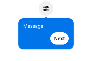
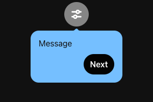
* [PopoverMessage](https://gestalt.pinterest.systems/web/PopoverMessageeducational) is a floating container that introduces users to elements on the screen. Used for education or onboarding experiences.
* 
* 
*/
declare function PopoverMessage({ accessibilityLabel, anchor, children, id, idealDirection, forceDirection, message, onDismiss, primaryAction, role, shouldFocus, type, size, zIndex, }: Props): import("react/jsx-runtime").JSX.Element | null;
declare namespace PopoverMessage {
var displayName: string;
}
export default PopoverMessage;