gestalt
Version:
A set of React UI components which enforce Pinterest's design language
79 lines (78 loc) • 4.11 kB
TypeScript
import icons from './icons/index';
type Props = {
/**
* Omit if and only if an ancestor element already has the aria-label set.
* This is similar to having [empty alt attributes](https://davidwalsh.name/accessibility-tip-empty-alt-attributes).
*/
accessibilityLabel?: string;
/**
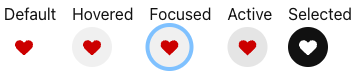
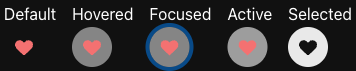
* Indicate if Pog is in an active state. See [state combinations](https://gestalt.pinterest.systems/web/pog#States) for more details.
*/
active?: boolean;
/**
* Indicates whether this component is hosted in a light or dark container.
* Used for improving focus ring color contrast.
*/
focusColor?: 'lightBackground' | 'darkBackground';
/**
* The background color. See [color combinations](https://gestalt.pinterest.systems/web/pog#backgroundColorCombinations) for more details.
*/
bgColor?: 'transparent' | 'transparentDarkBackground' | 'transparentDarkGray' | 'gray' | 'lightGray' | 'washLight' | 'white' | 'red';
/**
* Modifies the background color to imply a disabled Pog.
* Work in progress, not currently supported.
*/
disabled?: boolean;
/**
* Used for custom icons within Pog. Make sure that the viewbox around the SVG path is 24x24.
*/
dangerouslySetSvgPath?: {
__path: string;
};
/**
* Indicate if Pog is in a focused state. See [States](https://gestalt.pinterest.systems/web/pog#States) for more details.
*/
focused?: boolean;
/**
* Indicate if Pog is in a hovered state. See [States](https://gestalt.pinterest.systems/web/pog#States) for more details.
*/
hovered?: boolean;
/**
* Icon displayed in Pog to convey the behavior of the component. Refer to the [iconography](http://pinch.pinadmin.com/iconLibrary) guidelines regarding the available icon options.
*/
icon?: keyof typeof icons;
/**
* Color applied to the [Icon](https://gestalt.pinterest.systems/web/icon). See [Background Colors](https://gestalt.pinterest.systems/web/pog#Background-colors-on-white-backgrounds) for more details.
*/
iconColor?: 'gray' | 'darkGray' | 'red' | 'white' | 'brandPrimary' | 'light' | 'dark';
/**
* Padding in boints. If omitted, padding is derived from the \`size\` prop. See [padding combinations](https://gestalt.pinterest.systems/web/pog#paddingCombinations) for more details.
*/
padding?: 1 | 2 | 3 | 4 | 5;
/**
* See the [rounding](https://gestalt.pinterest.systems/web/pog#Rounding) variant for more info.
*/
rounding?: '0' | '100' | '200' | '300' | '400' | '500' | 'circle';
/**
* Indicate if Pog is in a selected state. See [States](https://gestalt.pinterest.systems/web/pog#States) for more details.
*/
selected?: boolean;
/**
* This controls the icon size and the default padding size. Available sizes are "xs" (12px), "sm" (16px), "md" (18px), "lg" (20px), and "xl" (24px). If padding is omitted, button sizes are "xs" (24px), "sm" (32px), "md" (40px), "lg" (48px), and "xl" (56px). See [size combinations](https://gestalt.pinterest.systems/web/pog#sizeCombinations) for more details.
*/
size?: 'xs' | 'sm' | 'md' | 'lg' | 'xl';
};
/**
* [Pog](https://gestalt.pinterest.systems/web/pog) is a lower-level functional component to show the active, hovered, & focused states of [IconButton](https://gestalt.pinterest.systems/web/iconbutton).
*
* This is an abstraction to allow for links that look like IconButton.
*
* 
* 
*
*/
declare function Pog({ accessibilityLabel, active, bgColor, focusColor, dangerouslySetSvgPath, disabled, focused, hovered, icon, iconColor, padding, rounding, selected, size, }: Props): import("react/jsx-runtime").JSX.Element;
declare namespace Pog {
var displayName: string;
}
export default Pog;