gestalt
Version:
A set of React UI components which enforce Pinterest's design language
104 lines (103 loc) • 7.3 kB
TypeScript
import { ReactElement, ReactNode } from 'react';
import { Dimension } from './boxTypes';
import { Indexable } from './zIndex';
export type ActionType = ReactElement;
type Props = {
/**
* Adds [Badge](https://gestalt.pinterest.systems/web/badge) displayed after the title. Be sure to localize the text. See the [title variant](https://gestalt.pinterest.systems/web/pageheader#Title) to learn more.
*
* \`type\` option determines the style of the badge. The default value is "info". See the [type](https://gestalt.pinterest.systems/web/badge#Type) variant to learn more.
*/
badge?: {
text: string;
tooltip?: {
accessibilityLabel?: string;
idealDirection?: 'up' | 'right' | 'down' | 'left';
text: string;
zIndex?: Indexable;
};
type?: 'info' | 'error' | 'warning' | 'success' | 'neutral' | 'recommendation' | 'darkWash' | 'lightWash';
};
/**
* Specify a bottom border style for PageHeader: "sm" is 1px. See the [max width & border variant](https://gestalt.pinterest.systems/web/pageheader#Max-width-and-border) to learn more.
*/
borderStyle?: 'sm' | 'none';
/**
* Label used for screen readers to provide information about the action [IconButton](https://gestalt.pinterest.systems/web/iconbutton) displayed under the [sm breakpoint](https://gestalt.pinterest.systems/foundations/screen_sizes#Web-(px)). See the [primary action variant](https://gestalt.pinterest.systems/web/pageheader#Primary-action) or [secondary action variant](https://gestalt.pinterest.systems/web/pageheader#Secondary-action) to learn more.
*/
dropdownAccessibilityLabel?: string;
/**
* Helper [IconButton](https://gestalt.pinterest.systems/web/iconbutton) to be placed after the title for a supplemental Call To Action (CTA). See the [title variant](https://gestalt.pinterest.systems/web/pageheader#Title) to learn more.
*/
helperIconButton?: {
accessibilityLabel: string;
accessibilityControls: string;
accessibilityExpanded: boolean;
onClick: (arg1: {
event: React.MouseEvent<HTMLButtonElement> | React.KeyboardEvent<HTMLButtonElement>;
}) => void;
};
/**
* Helper [Link](https://gestalt.pinterest.systems/web/link) to be placed after the subtext. See the [subtext variant](https://gestalt.pinterest.systems/web/pageheader#Subtext) to learn more.
*/
helperLink?: {
text: string;
accessibilityLabel: string;
href: string;
onClick?: (arg1: {
event: React.MouseEvent<HTMLAnchorElement> | React.KeyboardEvent<HTMLAnchorElement>;
dangerouslyDisableOnNavigation: () => void;
}) => void;
};
/**
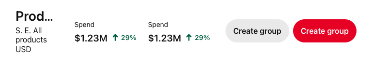
* Optional row of components. We mostly recommend using [Datapoint](https://gestalt.pinterest.systems/web/datapoint). See the [complementary items variant](https://gestalt.pinterest.systems/web/pageheader#Complementary-items) to learn more.
*/
items?: ReadonlyArray<ReactNode>;
/**
* Use numbers for pixels: \`maxWidth={100}\` and strings for percentages: \`maxWidth="100%"\`. See the [max width & border variant](https://gestalt.pinterest.systems/web/pageheader#Max-width-and-border) for more info.
*/
maxWidth?: Dimension;
/**
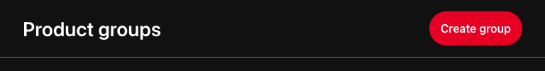
* The primary action of the page. Can be [Button](https://gestalt.pinterest.systems/web/button), [Link](https://gestalt.pinterest.systems/web/link), [Tooltip](https://gestalt.pinterest.systems/web/tooltip) surrounding IconButton or a combination of [IconButton](https://gestalt.pinterest.systems/web/iconbutton), Tooltip and [Dropdown](https://gestalt.pinterest.systems/web/dropdown).
*
* Primary and secondary actions are consolidated into [Dropdown](https://gestalt.pinterest.systems/web/dropdown) below the [sm breakpoint](https://gestalt.pinterest.systems/foundations/screen_sizes#Web-(px)). `primaryAction` takes both the main component and its equivalent using Dropdown subcomponents. See the [primary action variant](https://gestalt.pinterest.systems/web/pageheader#Primary-action) to learn more.
*/
primaryAction?: {
component: ActionType;
dropdownItems: ReadonlyArray<ReactElement>;
};
/**
* A secondary action for the page. Can be [Button](https://gestalt.pinterest.systems/web/button), [Link](https://gestalt.pinterest.systems/web/link), [Tooltip](https://gestalt.pinterest.systems/web/tooltip) surrounding IconButton or a combination of IconButton, Tooltip and [Dropdown](https://gestalt.pinterest.systems/web/dropdown).
*
* Primary and secondary actions are are consolidated into [Dropdown](https://gestalt.pinterest.systems/web/dropdown) below the [sm breakpoint](https://gestalt.pinterest.systems/foundations/screen_sizes#Web-(px)). `secondaryAction` takes both the main component and its equivalent using Dropdown subcomponents. See the [secondary action variant](https://gestalt.pinterest.systems/web/pageheader#Secondary-action) to learn more.
*/
secondaryAction?: {
component: ActionType;
dropdownItems: ReadonlyArray<ReactElement>;
};
/**
* Used primarily for metadata related to the current page, not designed to describe the title or the current surface. Content should be [localized](https://gestalt.pinterest.systems/web/pageheader#Localization). See the [subtext variant](https://gestalt.pinterest.systems/web/pageheader#Subtext) to learn more.
*/
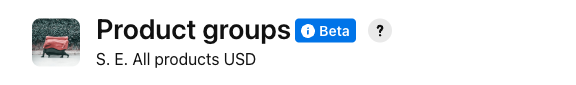
subtext?: string;
/**
* Page title. Will always be a level 1 heading. Content should be [localized](https://gestalt.pinterest.systems/web/pageheader#Localization). See the [title variant](https://gestalt.pinterest.systems/web/pageheader#Title) to learn more.
*/
title: string;
/**
* An optional thumbnail [Image](https://gestalt.pinterest.systems/web/image) to be displayed next to the title. See the [title variant](https://gestalt.pinterest.systems/web/pageheader#Title) to learn more.
*/
thumbnail?: ReactElement;
};
/**
* [PageHeader](https://gestalt.pinterest.systems/web/pageheader) is used to indicate the title of the current screen and can also provide additional content and actions that relate to the current screen as a whole.
*
* 
* 
* 
*
*/
declare function PageHeader({ badge, dropdownAccessibilityLabel, helperIconButton, helperLink, items, maxWidth, primaryAction, secondaryAction, subtext, title, thumbnail, borderStyle, }: Props): import("react/jsx-runtime").JSX.Element;
declare namespace PageHeader {
var displayName: string;
}
export default PageHeader;