gestalt
Version:
A set of React UI components which enforce Pinterest's design language
82 lines (81 loc) • 5.13 kB
TypeScript
import { ReactNode } from 'react';
type NodeOrRenderProp = ReactNode | ((arg1: {
onDismissStart: () => void;
}) => ReactNode);
type Props = {
/**
Supply a short, descriptive label for screen-readers as a text alternative to the Dismiss button. See the [Accessibility section](https://gestalt.pinterest.systems/web/overlaypanel#Accessibility) for more info.
*/
accessibilityDismissButtonLabel?: string;
/**
* Supply a short, descriptive label for screen-readers to contextualize the purpose of OverlayPanel. See the [Accessibility section](https://gestalt.pinterest.systems/web/overlaypanel#Accessibility) for more info.
*/
accessibilityLabel: string;
/**
* Supply the container element(s) or render prop that will be used as OverlayPanel's main content. See the [animation variant](https://gestalt.pinterest.systems/web/overlaypanel#Animation) for info on how to add exit animations to OverlayPanel content..
*/
children: NodeOrRenderProp;
/**
* Indicate whether clicking on the backdrop (gray area) outside of OverlayPanel will automatically close it. See the [outside click variant](https://gestalt.pinterest.systems/web/overlaypanel#Preventing-close-on-outside-click) for more info.
*/
closeOnOutsideClick?: boolean;
/**
* Supply the container element(s) or render prop that will be used as OverlayPanel's custom footer. See the [footer variant](https://gestalt.pinterest.systems/web/overlaypanel#Footer) for more info..
*/
footer?: NodeOrRenderProp;
/**
* The text used for OverlayPanel's heading. Be sure to localize this text. See the [heading variant](https://gestalt.pinterest.systems/web/overlaypanel#Heading) for more info.
*/
heading?: string;
/**
* Callback fired when the OverlayPanel in/out animations end. See the [animation](https://gestalt.pinterest.systems/web/overlaypanel#Animation) variant to learn more.
*/
onAnimationEnd?: (arg1: {
animationState: 'in' | 'out';
}) => void;
/**
* When supplied, it will disable component-controlled dismiss actions (ESC key press, backdrop click, or built-in dismiss IconButtons) and launch a confirmation Popover next to the dismiss IconButton requesting user confirmation before proceding. Pass an empty object to use the default text and labels. See the [dismiss confirmation](https://gestalt.pinterest.systems/web/overlaypanel#Dismiss-confirmation) variant to learn more.
*/
dismissConfirmation?: {
message?: string;
subtext?: string;
primaryAction?: {
accessibilityLabel?: string;
text?: string;
onClick?: (arg1: {
event: React.MouseEvent<HTMLButtonElement> | React.MouseEvent<HTMLAnchorElement> | React.KeyboardEvent<HTMLAnchorElement> | React.KeyboardEvent<HTMLButtonElement>;
}) => void;
};
secondaryAction?: {
accessibilityLabel?: string;
text?: string;
onClick?: (arg1: {
event: React.MouseEvent<HTMLButtonElement> | React.MouseEvent<HTMLAnchorElement> | React.KeyboardEvent<HTMLAnchorElement> | React.KeyboardEvent<HTMLButtonElement>;
}) => void;
};
};
/**
* Callback fired when the OverlayPanel is dismissed by clicking on the Dismiss button, pressing the ESC key, or clicking on the backdrop outside of the OverlayPanel (if `closeOnOutsideClick` is true).
*/
onDismiss: () => void;
/**
* Determine the width of the OverlayPanel component. See the [size variant](#Sizes) for more info.
*/
size?: 'sm' | 'md' | 'lg';
/**
* Supply the container element(s) or render prop that will be used as OverlayPanel's sub-heading docked under the heading. See the [sub-heading variant](#Sub-heading) for more info.
*/
subHeading?: NodeOrRenderProp;
};
/**
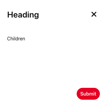
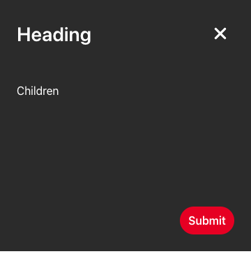
* [OverlayPanels](https://gestalt.pinterest.systems/web/overlaypanel ) are surfaces that allow users to view optional information or complete sub-tasks in a workflow while keeping the context of the current page. The most common example of OverlayPanel displays content in a panel that opens from the side of the screen for the user to read or input information. OverlayPanels have default, internal padding for content.
*
* 
* 
*/
declare function OverlayPanel({ accessibilityDismissButtonLabel, accessibilityLabel, children, closeOnOutsideClick, footer, heading, onAnimationEnd, dismissConfirmation, onDismiss, size, subHeading, }: Props): import("react/jsx-runtime").JSX.Element;
declare namespace OverlayPanel {
var displayName: string;
var DismissingElement: typeof import("./animation/DismissingElement").default;
}
export default OverlayPanel;