gestalt
Version:
A set of React UI components which enforce Pinterest's design language
67 lines (66 loc) • 3.77 kB
TypeScript
import { ReactNode } from 'react';
type Props = {
/**
* Temporary undocumented prop to disable ScrollBoundaryContainer.
*/
_dangerouslyDisableScrollBoundaryContainer?: boolean;
/**
* String that clients such as VoiceOver will read to describe the modal. Always localize the label. See [Accessibility section](https://gestalt.pinterest.systems/web/modal#Accessibility) for more info.
*/
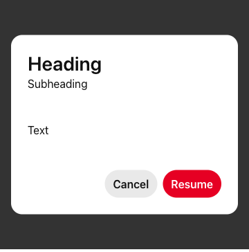
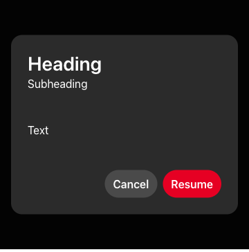
accessibilityModalLabel: string;
/**
* Specify the alignment of `heading` & `subHeading` strings. See the [Heading variant](https://gestalt.pinterest.systems/web/modal#Heading) for more info.
*/
align?: 'start' | 'center';
/**
* Supply the element(s) that will be used as Modal's main content. See the [Best Practices](https://gestalt.pinterest.systems/web/modal#Best-practices) for more info.
*/
children?: ReactNode;
/**
* Close the modal when you click outside of it. See the [outside click variant](https://gestalt.pinterest.systems/web/modal#Preventing-close-on-outside-click) for more info.
*/
closeOnOutsideClick?: boolean;
/**
* Supply the element(s) that will be used as Modal's custom footer. See the [Best Practices](https://gestalt.pinterest.systems/web/modal#Best-practices) for more info.
*/
footer?: ReactNode;
/**
* The text used for Modal's heading. See the [Heading variant](https://gestalt.pinterest.systems/web/modal#Heading) for more info.
*/
heading?: ReactNode;
/**
* Callback fired when Modal is dismissed by clicking on the backdrop outside of the Modal (if `closeOnOutsideClick` is true).
*/
onDismiss: () => void;
/**
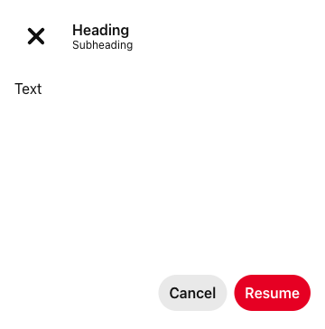
* The main Modal content has a "default" padding. For those cases where full bleed is needed, set `padding` to "none".
*/
padding?: 'default' | 'none';
/**
* The underlying ARIA role for the Modal. See the [Accessibility Role section](https://gestalt.pinterest.systems/web/modal#Role) for more info.
*/
role?: 'alertdialog' | 'dialog';
/**
* Determines the width of the Modal. See the [size variant](https://gestalt.pinterest.systems/web/modal#Sizes) for more info.
*
* sm: `540px` | md: `720px` | lg: `900px`
*/
size?: 'sm' | 'md' | 'lg' | number;
/**
* Subtext for Modal, only renders with `heading` strings. See the [sub-heading variant](https://gestalt.pinterest.systems/web/modal#Sub-heading) for more info.
*/
subHeading?: string;
};
/**
* A [Modal](https://gestalt.pinterest.systems/web/modal) displays content that requires user interaction. Modals appear on a layer above the page and therefore block the content underneath, preventing users from interacting with anything else besides the Modal. Modal should be used to gather short bits of information from the user. For confirmation of an action or acknowledgment, use [ModalAlert](https://gestalt.pinterest.systems/web/modalalert).
*
* 
* 
* 
*
*/
declare function Modal({ _dangerouslyDisableScrollBoundaryContainer, accessibilityModalLabel, align, children, closeOnOutsideClick, onDismiss, footer, padding, heading, role, size, subHeading, }: Props): import("react/jsx-runtime").JSX.Element;
declare namespace Modal {
var displayName: string;
}
export default Modal;