gestalt
Version:
A set of React UI components which enforce Pinterest's design language
73 lines (72 loc) • 4.28 kB
TypeScript
import { ReactNode } from 'react';
import DropdownItem from './DropdownItem';
import DropdownLink from './DropdownLink';
import DropdownSection from './DropdownSection';
import { Indexable } from './zIndex';
type Props = {
/**
* Ref for the element that the Dropdown will attach to, will most likely be a [Button](https://gestalt.pinterest.systems/web/button). See the [Accessibility](https://gestalt.pinterest.systems/web/dropdown#Accessibility) guidelines to learn more.
*/
anchor?: HTMLElement | null | undefined;
/**
* Must be instances of [Dropdown.Item](https://gestalt.pinterest.systems/web/dropdown#Types-of-items), [Dropdown.Link](https://gestalt.pinterest.systems/web/dropdown#Types-of-items) or [Dropdown.Section](https://gestalt.pinterest.systems/web/dropdown#Sections) components. See the [Types of items](https://gestalt.pinterest.systems/web/dropdown#Types-of-items) variant to learn more.
*/
children: ReactNode;
/**
* Enables correct behavior when Dropdown is used within a fixed container. To achieve this it removes the Layer component around Popover and enables positioning relative to its anchor element. Should only be used in cases where Layer breaks the Dropdown positionings such as when the anchor element is within a sticky component.
*/
isWithinFixedContainer?: boolean;
/**
* Content to display at the top of the Dropdown before any items or sections. See the [Custom header](https://gestalt.pinterest.systems/web/dropdown#Custom-header) variant to learn more.
*/
headerContent?: ReactNode;
/**
* Unique id to identify each Dropdown. Used for [Accessibility](https://gestalt.pinterest.systems/web/dropdown#Accessibility) purposes.
*/
id: string;
/**
* Specifies the preferred position of Dropdown relative to its anchor element. See the [ideal direction variant in Popover's](https://gestalt.pinterest.systems/web/popover#Ideal-direction) to learn more.
*/
idealDirection?: 'up' | 'right' | 'down' | 'left';
/**
* Forces the position of Dropdown relative to its anchor element.
*/
forceDirection?: boolean;
/**
* Define a controlled size to dropdown's Popover.
*/
maxHeight?: '30vh';
/**
* Mobile-only prop. Callback fired when Dropdown's in & out animations end. See the [mobile variant](https://gestalt.pinterest.systems/web/dropdown#mobile) to learn more.
*/
mobileOnAnimationEnd?: (arg1: {
animationState: 'in' | 'out';
}) => void;
/**
* Callback fired when the menu is closed.
*/
onDismiss: () => void;
/**
* Dropdown can adapt to mobile devices to [SheetMobile](https://gestalt.pinterest.systems/web/sheetmobile). Mobile adaptation is disabled by default. Set to 'false' to enable SheetMobile in mobile devices. See the [mobile variant](https://gestalt.pinterest.systems/web/dropdown#mobile) to learn more.
*/
disableMobileUI?: boolean;
/**
* An object representing the zIndex value of the Dropdown menu. Learn more about [zIndex classes](https://gestalt.pinterest.systems/web/zindex_classes)
*/
zIndex?: Indexable;
};
/**
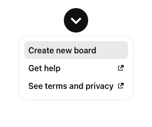
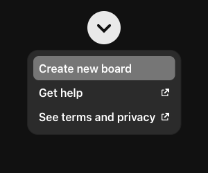
* [Dropdown](https://gestalt.pinterest.systems/web/dropdown) displays a list of actions, options or links. It is triggered when a user interacts with a Button, Textfield or other control. Dropdown allows for complex functionality that can’t be accomplished with SelectList.
*
* 
* 
*
*/
declare function Dropdown({ anchor, children, isWithinFixedContainer, headerContent, id, idealDirection, forceDirection, onDismiss, zIndex, maxHeight, mobileOnAnimationEnd, disableMobileUI, }: Props): import("react/jsx-runtime").JSX.Element;
declare namespace Dropdown {
var Item: typeof DropdownItem;
var Link: typeof DropdownLink;
var Section: typeof DropdownSection;
var displayName: string;
}
export default Dropdown;