gestalt
Version:
A set of React UI components which enforce Pinterest's design language
56 lines (55 loc) • 2.66 kB
TypeScript
import { Indexable } from './zIndex';
type BadgeObject = {
text: string;
type?: 'info' | 'error' | 'warning' | 'success' | 'neutral' | 'recommendation' | 'darkWash' | 'lightWash';
};
type TrendObject = {
accessibilityLabel: string;
value: number;
};
type Props = {
/**
* Adds a badge to the title. Currently a beta feature, expect changes.
*/
badge?: BadgeObject;
/**
* Used to set the size of the datapoint. See the [size](https://gestalt.pinterest.systems#Size) variant to learn more.
*/
size?: 'md' | 'lg';
/**
* The header text for the component.
*/
title: string;
/**
* Contextual information displayed in a tooltip to describe the Datapoint. See the [tooltipText](https://gestalt.pinterest.systems#Tooltip-text) variant to learn more.
*/
tooltipText?: string;
/**
* Specifying the z-index of the tooltip may be necessary if other elements with higher z-indices overlap the tooltip. See [ZIndex Classes](https://gestalt.pinterest.systems/web/zindex_classes) to learn more.
*/
tooltipZIndex?: Indexable;
/**
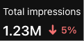
* Object detailing the trend value (change in time - e.g., +30%), and accessibilityLabel to describe the trend's icon (e.g., "Trending up"). See the [trend](https://gestalt.pinterest.systems/web/datapoint#Trend) variant to learn more.
*/
trend?: TrendObject;
/**
* A visual indicator whether the trend is considered "good", "bad" or "neutral". By setting \`trendSentiment\` to \`auto\`, a positive trend will be considered "good", a negative trend will be considered "bad" and a trend of zero will be considered "neutral". See the [trendSentiment](https://gestalt.pinterest.systems/web/datapoint#Trend-sentiment) variant to learn more.
*/
trendSentiment?: 'good' | 'bad' | 'neutral' | 'auto';
/**
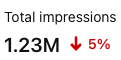
* The datapoint value (e.g., 1.23M).
*/
value: string;
};
/**
* [Datapoint](https://gestalt.pinterest.systems/web/datapoint) displays at-a-glance data for a user to quickly view key metrics.
*
* 
* 
*
*/
declare function Datapoint({ badge, size, title, tooltipText, tooltipZIndex, trend, trendSentiment, value, }: Props): import("react/jsx-runtime").JSX.Element;
declare namespace Datapoint {
var displayName: string;
}
export default Datapoint;