gestalt
Version:
A set of React UI components which enforce Pinterest's design language
137 lines (136 loc) • 6.13 kB
TypeScript
import { ReactElement, ReactNode, Ref } from 'react';
import { Indexable } from './zIndex';
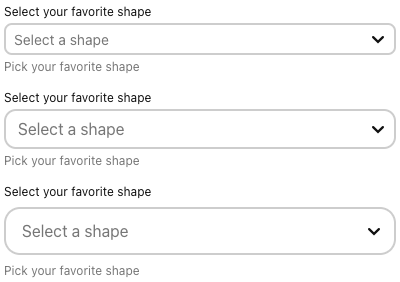
type Size = 'sm' | 'md' | 'lg';
type OptionType = {
label: string;
subtext?: string;
value: string;
};
type Props = {
/**
* Label to describe the clear button's purpose.
*/
accessibilityClearButtonLabel?: string;
/**
* When disabled, ComboBox looks inactive and cannot be interacted with. If tags are passed, they will appear disabled as well and cannot be removed. See [tags](https://gestalt.pinterest.systems/web/combobox#Tags) variant to learn more.
*/
disabled?: boolean;
/**
* Provide feedback when an error on selection occurs. See [error message variant](https://gestalt.pinterest.systems/web/combobox#Error-message).
*/
errorMessage?: ReactNode;
/**
* Provides additional information about how to select a ComboBox option. See [helper text variant](https://gestalt.pinterest.systems/web/combobox#Helper-text).
*/
helperText?: string;
/**
* The user input in ComboBox for controlled components. See [controlled ComboBox](https://gestalt.pinterest.systems/web/combobox#Controlled-vs-Uncontrolled) variant to learn more.
*/
inputValue?: string | null;
/**
* Unique id to identify each ComboBox. Used for [accessibility](https://gestalt.pinterest.systems/web/combobox#Accessibility) purposes.
*/
id: string;
/**
* Provide a label to identify the ComboBox field.
*/
label: string;
/**
* Whether the label should be visible or not. If `hidden`, the label is still available for screen reader users, but does not appear visually. See the [label visibility variant](https://gestalt.pinterest.systems/web/combobox#Label-visibility) for more info.
*/
labelDisplay?: 'visible' | 'hidden';
/**
* The text shown when the input value returns no matches.
*/
noResultText?: string;
/**
* Callback when you focus outside the component.
*/
onBlur?: (arg1: {
event: React.FocusEvent<HTMLInputElement> | React.SyntheticEvent<HTMLInputElement>;
value: string;
}) => void;
/**
* Callback when user types into the control input field.
*/
onChange?: (arg1: {
event: React.ChangeEvent<HTMLInputElement>;
value: string;
}) => void;
/**
* Callback when user clicks on clear button.
*/
onClear?: () => void;
/**
* Callback when you focus on the component.
*/
onFocus?: (arg1: {
event: React.FocusEvent<HTMLInputElement>;
value: string;
}) => void;
/**
* Callback for key stroke events. See [tags](#Tags) variant to learn more.
*/
onKeyDown?: (arg1: {
event: React.KeyboardEvent<HTMLInputElement>;
value: string;
}) => void;
/**
* Callback when an item is selected.
*/
onSelect?: (arg1: {
event: React.ChangeEvent<HTMLElement> | React.KeyboardEvent<HTMLElement>;
item: {
label: string;
subtext?: string;
value: string;
};
}) => void;
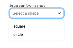
/**
* The data for each selection option. See [subtext](https://gestalt.pinterest.systems/web/combobox#Subtext) variant to learn more.
*/
options: ReadonlyArray<{
label: string;
subtext?: string;
value: string;
}>;
/**
* Specify a short description that suggests the expected input for the field.
*/
placeholder?: string;
/**
* Indicate if the input is readOnly. See the [readOnly example](https://gestalt.pinterest.systems/web/textfield#Read-only) for more details.
*/
readOnly?: boolean;
/**
* Forward the ref to the underlying component container element. See the [Ref](https://gestalt.pinterest.systems/web/combobox#Ref) variant to learn more about focus management.
*/
ref?: Ref<'input'>;
/**
* The selected option in ComboBox for controlled components. See [controlled ComboBox](https://gestalt.pinterest.systems/web/combobox#Controlled-vs-Uncontrolled) variant to learn more.
*/
selectedOption?: OptionType;
/**
* Defines the height of ComboBox: sm: 32px, md: 40px, lg: 48px. See the [size variant](https://gestalt.pinterest.systems/web/ComboBox#Size) for more details.
*/
size?: Size;
/**
* List of tags to display in the component. See [tags](https://gestalt.pinterest.systems/web/combobox#Tags) variant to learn more.
*/
tags?: ReadonlyArray<ReactElement>;
/**
* An object representing the zIndex value of the ComboBox list box. Learn more about [zIndex classes](https://gestalt.pinterest.systems/web/zindex_classes)
*/
zIndex?: Indexable;
};
/**
* [ComboBox](https://gestalt.pinterest.systems/web/combobox) is the combination of a [Textfield](https://gestalt.pinterest.systems/web/textfield) and an associated [Dropdown](https://gestalt.pinterest.systems/web/dropdown) that allows the user to filter a list when selecting an option. ComboBox allows users to type the full option, type part of the option and narrow the results, or select an option from the list.
*
* 
* 
* 
* 
*
*/
declare const ComboBoxWithForwardRef: import("react").ForwardRefExoticComponent<Omit<Props, "ref"> & import("react").RefAttributes<HTMLInputElement>>;
export default ComboBoxWithForwardRef;