gestalt
Version:
A set of React UI components which enforce Pinterest's design language
38 lines (37 loc) • 1.26 kB
TypeScript
import { ReactNode } from 'react';
type Columns = 0 | 1 | 2 | 3 | 4 | 5 | 6 | 7 | 8 | 9 | 10 | 11 | 12;
type ColumnProps = {
/**
* The content to be laid out.
*/
children?: ReactNode;
/**
* The number of units in a 12-unit width that this element will occupy.
*
* Also available in responsive sizes: `smSpan`, `mdSpan`, `lgSpan`
*/
span: Columns;
/**
* The number of units in a 12-unit width that this element will occupy in sm and larger viewports.
*/
smSpan?: Columns;
/**
* The number of units in a 12-unit width that this element will occupy in md and larger viewports.
*/
mdSpan?: Columns;
/**
* The number of units in a 12-unit width that this element will occupy in lg and larger viewports.
*/
lgSpan?: Columns;
};
/**
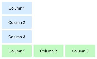
* Use [Column](https://gestalt.pinterest.systems/web/column) to implement a 12-column system.
*
* 
*
*/
declare function Column(props: ColumnProps): import("react/jsx-runtime").JSX.Element;
declare namespace Column {
var displayName: string;
}
export default Column;