gestalt
Version:
A set of React UI components which enforce Pinterest's design language
75 lines (74 loc) • 3.74 kB
TypeScript
import { ReactElement, ReactNode } from 'react';
type Props = {
/**
* Indicates whether or not Checkbox is checked. See the [state variant](https://gestalt.pinterest.systems/web/checkbox#State) to learn more.
*/
checked?: boolean;
/**
* Indicates whether or not Checkbox is disabled. Disabled Checkboxes do not respond to mouse events and cannot be reached by the keyboard. See the [state variant](https://gestalt.pinterest.systems/web/checkbox#State) to learn more.
*/
disabled?: boolean;
/**
* Displays an error message and error state. See the [accessibility section](https://gestalt.pinterest.systems/web/checkbox#Error-message) to learn more.
*/
errorMessage?: string;
/**
* Optional description for Checkbox, used to provide more detail about an option. See the [with helperText variant](https://gestalt.pinterest.systems/web/checkbox#With-helperText) to learn more.
*/
helperText?: string;
/**
* A unique identifier for the input.
*/
id: string;
/**
* An optional Image can be supplied to add an image to each Checkbox. See the [with Image variant](https://gestalt.pinterest.systems/web/checkbox#With-Image) to learn more.
*/
image?: ReactNode;
/**
* Indicates a state that is neither checked nor unchecked. See the [state variant](https://gestalt.pinterest.systems/web/checkbox#State) to learn more.
*/
indeterminate?: boolean;
/**
* The label for the input. Be sure to localize the text. See the [accessibility section](https://gestalt.pinterest.systems/web/checkbox#Labels) to learn more.
*/
label?: string;
/**
* Whether the label should be visible or not. If `hidden`, the label is still available for screen reader users, but does not appear visually. See the [label visibility variant](https://gestalt.pinterest.systems#Label-visibility) for more info.
*/
labelDisplay?: 'visible' | 'hidden';
/**
* A unique name for the input used to reference form data after it’s submitted. If the name attribute is not specified then the data of the checkbox would not be sent in the form submission.
*/
name?: string;
/**
* Callback triggered when the state of the input changes.
*/
onChange: (arg1: {
event: React.ChangeEvent<HTMLInputElement>;
checked: boolean;
}) => void;
/**
* Callback triggered when the user clicks on the input.
*/
onClick?: (arg1: {
event: React.ChangeEvent<HTMLInputElement>;
checked: boolean;
}) => void;
/**
* Ref that is forwarded to the underlying input element.
*/
ref?: ReactElement;
/**
* Determines the Checkbox size: sm = 16px, md = 24px. See the [size variant](https://gestalt.pinterest.systems/web/checkbox#Size) to learn more.
*/
size?: 'sm' | 'md';
};
/**
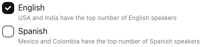
* [Checkbox](https://gestalt.pinterest.systems/web/checkbox) is used for multiple choice selection. They are independent of each other in a list, and therefore, different from [RadioGroup](https://gestalt.pinterest.systems/web/radiogroup), one selection does not affect other checkboxes in the same list.
*
* 
* 
*
*/
declare const CheckboxWithForwardRef: import("react").ForwardRefExoticComponent<Omit<Props, "ref"> & import("react").RefAttributes<HTMLInputElement>>;
export default CheckboxWithForwardRef;