gatsby-remark-code-buttons
Version:
Add copy buttons to code snippets
135 lines (111 loc) • 3.57 kB
Markdown
# gatsby-remark-code-buttons
Add buttons to **markdown** code snippets.
> This plugin doesn't support MDX. Example
of [MDX copy button](https://github.com/gatsbyjs/gatsby/pull/15834).
## Install
```bash
npm install gatsby-remark-code-buttons --save-dev
```
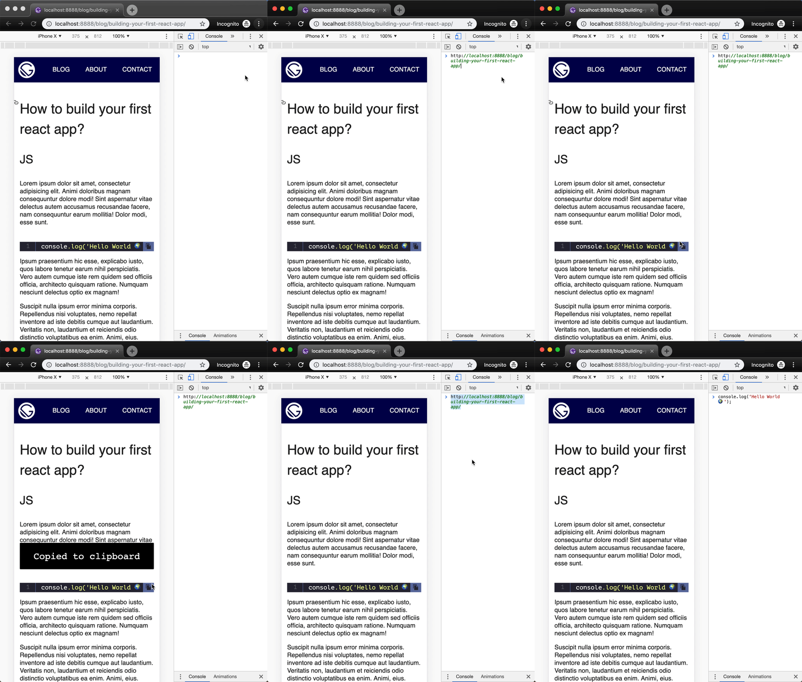
## How to use
in your `gatsby-config.js`
```js
plugins: [
{
resolve: 'gatsby-transformer-remark',
options: {
plugins: ['gatsby-remark-code-buttons']
}
}
]
```
## Options
```js
plugins: [
{
resolve: 'gatsby-transformer-remark',
options: {
plugins: [
{
resolve: 'gatsby-remark-code-buttons',
options: {
// Optional button container class name. Defaults
// to 'gatsby-code-button-container'.
buttonContainerClass: `customButtonContainerClass`,
// Optional button class name. Defaults to 'gatsby-code-button'.
buttonClass: `customButtonClass`,
// Optional button text. Defaults to ''.
buttonText: `customButtonText`,
// Optional svg icon class name. Defaults to 'gatsby-code-button-icon'.
svgIconClass: `customSvgIconClass`,
// Optional svg icon. Defaults to svg string and can be
// replaced with any other valid svg. Use custom classes
// in the svg string and skip `iconClass` option.
svgIcon: `customSvgIcon`,
// Optional tooltip text. Defaults to ''.
tooltipText: `customTooltipText`,
// Optional toaster class name. Defaults to ''.
toasterClass: `customToasterClass`,
// Optional toaster text class name. Defaults to ''.
toasterTextClass: `customToasterTextClass`,
// Optional toaster text. Defaults to ''.
toasterText: 'customToasterText',
// Optional toaster duration. Defaults to 3500.
toasterDuration: 5000
}
}
]
}
}
]
```
### Custom styling
Now that we've injected the custom button, we need to style it!
```css
.gatsby-code-button-container {}
.gatsby-code-button {}
.gatsby-code-button-icon {}
.gatsby-code-button-toaster {}
.gatsby-code-button-toaster-text {}
```
To apply custom styles import stylesheet in your app's root `gatsby-browser.js`.
```js
// gatsby-browser.js
import './src/styles/custom-code-buttons.scss';
```
### Usage in Markdown
In your Markdown content
``````js
```js
alert('click to copy 💾');
```
``````
This plugin will parse the Markdown AST, pluck the button, and then "clean" the code snippet language for further
processing. With the default config options this plugin will create the following structure, injecting a custom `div`:
```html
<div
class="gatsby-code-button-container"
data-toaster-id=""
data-toaster-class="gatsby-code-button-toaster"
data-toaster-text-class="gatsby-code-button-toaster-text"
data-toaster-text=""
data-toaster-duration="3500"
onClick="copyToClipboard(`alert('how cool is this');`)"
>
<div class="gatsby-code-button" data-tooltip="">
<svg class="gatsby-code-button-icon" xmlns="http://www.w3.org/2000/svg" viewBox="0 0 24 24">...</svg>
</div>
</div>
```
With `toasterText` config enabled this plugin will inject a custom toaster node:
```html
<div class="gatsby-code-button-toaster">
<div class="gatsby-code-button-toaster-text">Copied to clipboard</div>
</div>
```
Don't show button
``````js
```js:clipboard=false
alert('will not be copied 💾');
```
``````