ftr-timetable
Version:
A versatile timetable component for React
183 lines (156 loc) • 10.2 kB
Markdown
# React Timetable
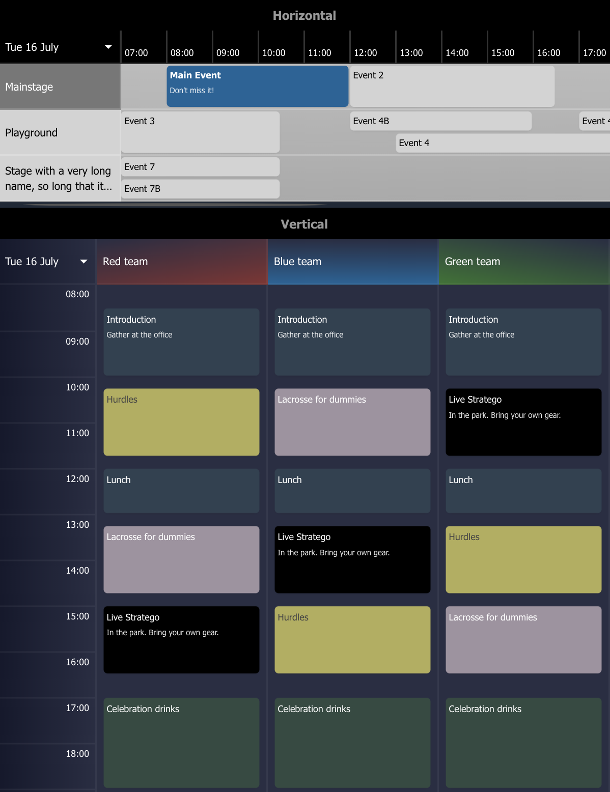
A versatile, configurable and responsive timetable component for React.
Ideal for showing the agenda for locations on a specific date.
### Changes in version 1.5
- Items can contain a `cancelled` property
- Items starting before or ending after the timetable scope are now included
- Increased configurability of the timetable style and its locations and items
- The current time indicator can be hidden by setting `showTimeMarker` to false
- Fixed the horizontal scrollbar which was hidden, so mouse-only users couldn't scroll horizontally
- The display format of the dates is now configurable through `dateFormat`
## Installation
```
npm i ftr-timetable
```
## Usage example
```ts
import {
TimeTable,
type TimeTableItem,
type TimeTableLocation,
type TimeTableRenderedItem,
} from "ftr-timetable";
interface EventData {
type?: string;
category?: string;
isFree: boolean;
}
const locations: TimeTableLocation[] = [
{
id: "1",
name: "Mainstage",
items: [
{
id: "4",
name: "Event included in location",
startDate: "2024-05-05T16:00:00+02:00",
endDate: "2024-05-05T18:00:00+02:00",
data: {
isFree: true,
},
},
],
},
{
id: "2",
name: "Garden",
},
];
const items: TimeTableItem[] = [
{
id: "1",
name: "Main event",
info: "Don't miss it!",
locationId: "1",
startDate: "2024-05-05T10:00:00+02:00",
endDate: "2024-05-05T15:00:00+02:00",
},
{
id: "2",
name: "Violin concert",
locationId: "2",
startDate: "2024-05-05T08:00:00+02:00",
endDate: "2024-05-05T12:00:00+02:00",
cancelled: true,
data: {
type: "Music",
category: "Classical",
isFree: true,
},
},
{
id: "3",
name: "Day 2 Main event",
locationId: "1",
startDate: "2024-05-06T10:00:00+02:00",
endDate: "2024-05-06T15:00:00+02:00",
},
];
const onItemClicked = (item: TimeTableRenderedItem<EventData>) => {
console.log("Item clicked: ", item, `Free: ${item.data?.isFree || false}`);
};
return (
<TimeTable
items={items}
variant="horizontal"
locations={locations}
onItemClick={onItemClicked}
styles={{
backgroundColor: "transparent",
dateBackgroundColor: "ivory",
locationBackgroundColor: "beige",
textColor: "#000",
borderStyle: "solid 1px #ccc",
itemBackgroundColor: "burlywood",
itemHoverBackgroundColor: "darkkhaki",
itemTextColor: "#fff",
}}
/>
);
```
## API Reference
### TimeTable
Options
| Option | Type | Required | Default | Description |
| --------------- | --------------------------------------------------------------- | -------- | ----------- | ----------------------------------------------------------------------------------------------------------------------------------------- |
| locations | [TimeTableLocation[]](#timetablelocation) | yes | | The locations to show in the timetable |
| items | [TimeTableItem[]](#timetableitem) | no | [] | The events to show in the timetable |
| variant | _string_ | no | horizontal | The display style of the timetable. Can be `horizontal` or `vertical`. Defaults to vertical when unspecified and there is only 1 location |
| dates | _string[]_ | no | | Predefined dates to choose from. The first date will be selected by default. The format needs to be `yyyy-MM-dd` |
| startingHour | _number_ | no | 6 | Starting hour of a day |
| numberOfHours | _number_ | no | 24 | Number of hours to display for a single day |
| styles | [TimeTableStyles](#timetablestyles) | no | | Custom styling to apply to the timetable |
| onDateChange | _function(date: string)_ | no | | Callback function when the date is changed. Returns the selected date as `yyyy-MM-dd` |
| onItemClick | _function(item: `TimeTableRenderedItem<T>`) => void_ | no | | Callback function when an item is clicked |
| onLocationClick | _function(item: `TimeTableLocation`) => void_ | no | | Callback function when a location is clicked |
| renderItem | _function(item: `TimeTableRenderedItem<T>`) => React.ReactNode_ | no | | Custom rendering of items |
| renderLocation | _function(item: `TimeTableLocation`) => React.ReactNode_ | no | | Custom rendering of locations |
| dateFormat | _string_ | no | eee dd MMMM | Date format of the date picker. [Guide](https://date-fns.org/v3.6.0/docs/format) |
| showTimeMarker | _boolean_ | no | true | Show or hide the current time marker |
### TimeTableLocation
Options
| Option | Type | Required | Default | Description |
| ------ | --------------------------------- | -------- | ------- | ----------------------------- |
| id | _string_ / _number_ | yes | | Location ID |
| name | _string_ | yes | | Location name |
| items | [TimeTableItem[]](#timetableitem) | no | | Event items for the location |
| style | `React.CSSProperties` | no | | Custom style for the location |
### TimeTableItem
Options
| Option | Type | Required | Default | Description |
| --------- | --------------------- | -------- | ------- | ----------------------------------------- |
| id | _string_ / _number_ | yes | | Item ID |
| name | _string_ | yes | | Item name |
| info | _string_ | no | | Item extra info |
| startDate | _Date_ / _string_ | yes | | Item start date |
| endDate | _Date_ / _string_ | yes | | Item end date |
| data | _{}_ | no | | Optional extra data. Useful for callbacks |
| style | `React.CSSProperties` | no | | Custom style for the item |
| cancelled | _boolean_ | no | false | Shows the item as cancelled |
### TimeTableStyles
Options
| Option | Type | Default | Description |
| ------------------------- | -------- | ----------------- | ----------------------------------------------------------------- |
| backgroundColor | _string_ | #1f2937 | Background color |
| borderStyle | _string_ | solid 2px #374151 | CSS Border style, specify "none" to remove borderStyle |
| dateBackgroundColor | _string_ | #1f2937 | Background color of the date and hours. Avoid using "transparent" |
| dateTextColor | _string_ | inherit | Text color of the date and hours |
| datePickerBackgroundColor | _string_ | #1f2937 | Background of the date picker |
| itemBackgroundColor | _string_ | #304151 | Background color of an item |
| itemHoverBackgroundColor | _string_ | #374151 | Background color of an item on hover |
| itemTextColor | _string_ | inherit | Text color of an item |
| locationBackgroundColor | _string_ | #000 | Background color of a location |
| locationTextColor | _string_ | inherit | Text color of a location |
| textColor | _string_ | #fff | General text color used in the timetable |
| timeMarkerColor | _string_ | #666 | Color of the current time indicator |