flowtoken-next
Version:
213 lines (155 loc) • 6.38 kB
Markdown
# FlowToken 🌊
### A smooth Animation Library for LLM Text Streaming

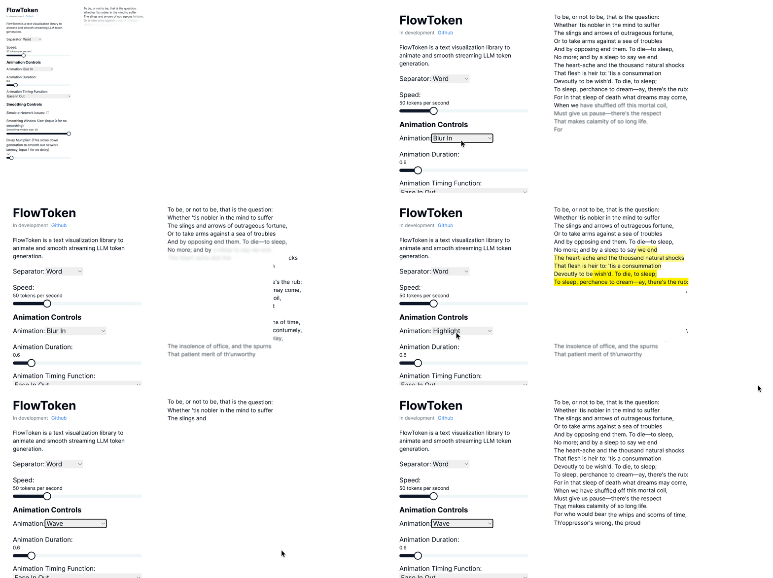
FlowToken is a React component library designed to enhance the visual presentation of text streaming from large language models (LLMs). This library offers a variety of animations that make the text appear smoothly and dynamically, providing an engaging user experience.
## Demo
Try the demo here: [Demo link](https://nextjs-omega-five-46.vercel.app/)
## Features
FlowToken includes several key features:
- **Customizable Animations:** A range of animations such as fade, blur-in, drop-in, slide from the left, typewriter effect, word pull-up, flip text, gradual spacing, and more.
- **Smooth Text Streaming:** Options to control the speed and manner of text appearance to handle the variability in text generation speed.
- **Responsive and Lightweight:** Optimized for performance and compatibility across all modern browsers.
## Installation
Install FlowToken using npm:
```bash
npm install flowtoken
```
Or using yarn:
```bash
yarn add flowtoken
```
## Usage with Next.js 15+
When using FlowToken with Next.js 15 and Turbopack, it's recommended to import and use the `injectStyles` function in your layout or page component. This resolves CSS loading issues that may occur with direct CSS imports:
```jsx
import { injectStyles } from 'flowtoken';
import { useEffect } from 'react';
export default function Layout({ children }) {
// Inject the styles globally on the client side
useEffect(() => {
injectStyles();
}, []);
return <div>{children}</div>;
}
```
Alternatively, you can create a global CSS file in your project and import the styles:
```css
/* In your global.css */
@import '~flowtoken/dist/styles.css';
```
## Usage
## Markdown Support
To use markdown, import the `AnimatedMarkdown` component.
```jsx
import React from 'react';
import { AnimatedMarkdown } from 'flowtoken';
const App = () => {
return (
<AnimatedMarkdown
content="## Hello, world!"
sep="word"
animation="fadeIn"
animationDuration="0.5s"
animationTimingFunction="ease-in-out"
/>
);
};
export default App;
```
### Real World with Vercel AI SDK
```jsx
'use client'
import { useChat } from 'ai/react'
import { AnimatedMarkdown } from 'flowtoken';
export default function Chat() {
const { messages, input, handleInputChange, handleSubmit } = useChat()
return (
<div>
{messages.map(m => (
<div key={m.id}>
{m.role}: <AnimatedMarkdown content={m.content}
sep="word"
animation={"fadeIn"}
animationDuration="0.5s"
animationTimingFunction="ease-in-out"
/>
</div>
))}
<form onSubmit={handleSubmit}>
<label>
Say something...
<input
value={input}
onChange={handleInputChange}
/>
</label>
</form>
</div>
)
}
```
### Custom Components
You can use custom components by passing a `customComponents` prop to the `AnimatedMarkdown` component where the key is the regex pattern (ex. `/\{\{.*?\}\}/`) or HTML tag (ex. `MyComponent`) to match and the value is the component to render. Then just prompt your LLM to output the custom component syntax and it will be rendered with your custom component.
#### Example
This is an example of a custom component. <ArticlePreview triggerText="Github" title="FlowToken" description="This is an example of a custom component." link="https://github.com/data-maki/flowtoken" />
### AnimatedMarkdown Props
- **content**: The text to be displayed.
- **sep**: `word` or `char`.
- **animation**: Name of the CSS animation to apply. See below for options or define your own in css.
- **animationDuration**: CSS Duration of the animation. Ex. `0.6s`
- **animationTimingFunction**: CSS Timing function of the animation. Ex. `ease`, `ease-in-out`, etc
- **codeStyle**: The highlighter js style object to use.
- **customComponents**: An object where the key is the regex pattern (ex. `/\{\{.*?\}\}/`) or HTML tag (ex. `MyComponent`) to match and the value is the react component to render.
- **htmlComponents**: An object where the key is the HTML tag (ex. `code`, `h1`, `h2`, etc) to match and the value is the react component to render.
## Animations
FlowToken supports various CSS animations:
- **fadeIn**
- **blurIn**
- **typewriter**
- **slideInFromLeft**
- **fadeAndScale**
- **rotateIn**
- **bounceIn**
- **elastic**
- **highlight**
- **blurAndSharpen**
- **dropIn**
- **slideUp**
- **wave**
For custom animations, define your keyframes in CSS and pass the animation name to the `animation` prop.
### Notes
To lower the memory footprint, disable animations by setting the `animation` parameter to `null` on any completed messages.
If using tailwind with generated markdown, be sure to setup tailwind typography: [https://github.com/tailwindlabs/tailwindcss-typography](here)
and add `prose lg:prose-md prose-pre:p-0 prose-pre:m-0 prose-pre:bg-transparent` to your flowtoken markdown container.
## StreamText
Here is a simple example of how to use the `StreamText` component from FlowToken, which does not render markdown:
```jsx
import React from 'react';
import { StreamText } from 'flowtoken';
const App = () => {
return (
<StreamText
content="Hello, world!"
windowSize={5}
delayMultiplier={1.1}
sep="word"
animation="fadeIn"
animationDuration="0.5s"
animationTimingFunction="ease-in-out"
/>
);
};
export default App;
```
This includes the option to smooth the rate of text display in effect reducing fluctuations in token generation speed by applying a simple moving average.
### StreamText Props
- **content**: The text to be displayed.
- **windowSize**: Number of tokens to consider for smoothing animations.
- **delayMultiplier**: Multiplier to adjust the delay for each token or character's appearance.
- **sep**: `word` or `char`
- **animation**: Name of the CSS animation to apply.
- **animationDuration**: Duration of the animation.
- **animationTimingFunction**: Timing function of the animation.
## Contributing
Contributions are welcome! Please feel free to submit pull requests or open issues to suggest features or report bugs.
## License
FlowToken is MIT licensed.