evol-colorpicker
Version:
jQuery UI widget for web color picking which looks like the one in Microsoft Office 2010.
328 lines (220 loc) • 8.21 kB
Markdown
# evol-colorpicker · [](https://github.com/evoluteur/colorpicker/blob/master/LICENSE.md) [](https://www.npmjs.com/package/evol-colorpicker)
**evol-colorpicker** is a web color picker which looks like the one in Microsoft Office 2010.
It can be used inline or as a popup bound to a text box.
It comes with several color palettes, can track selection history and supports "transparent" color.
It is a full jQuery UI widget, supporting various configurations and themes.
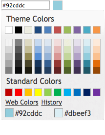 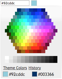 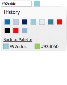
Check the [online demo](https://evoluteur.github.io/colorpicker/index.html) for several examples.
### Table of Contents
1. [Installation](#Installation)
2. [Usage](#Usage)
3. [Theming](#Theming)
4. [Options](#Options)
5. [Methods](#Methods)
6. [Events](#Events)
7. [License](#License)
Encourage this project by [becoming a sponsor](https://github.com/sponsors/evoluteur).
<a name="Installation"></a>
## Installation
Download or fork **evol-colorpicker** at [GitHub](https://github.com/evoluteur/colorpicker).
```
git clone https://github.com/evoluteur/colorpicker
```
or use the [npm package](https://www.npmjs.com/package/evol-colorpicker):
```
npm install evol-colorpicker
```
or install with Bower:
```
bower install evol-colorpicker
```
or use the [nuget package](https://www.nuget.org/packages/evol-colorpicker):
```
dotnet add package evol-colorpicker
```
<a name="Usage"></a>
## Usage
First, load [jQuery](http://jquery.com/) (v3.1 or greater), [jQuery UI](http://jqueryui.com/) (v1.12.1 or greater), and the plugin (for earlier version of jQuery-UI, use an earlier version of Colorpicker).
```html
<script
src="https://ajax.googleapis.com/ajax/libs/jquery/3.7.1/jquery.min.js"
type="text/javascript"
charset="utf-8"
></script>
<script
src="https://ajax.googleapis.com/ajax/libs/jqueryui/1.14.1/jquery-ui.min.js"
type="text/javascript"
charset="utf-8"
></script>
<script
src="js/evol-colorpicker.min.js"
type="text/javascript"
charset="utf-8"
></script>
```
The widget requires a jQuery UI theme to be present, as well as its own included base CSS file ([evol-colorpicker.css](http://github.com/evoluteur/colorpicker/raw/master/css/evol-colorpicker.css)). Here we use the "ui-lightness" theme as an example:
```html
<link
rel="stylesheet"
type="text/css"
href="http://ajax.googleapis.com/ajax/libs/jqueryui/1.14.1/themes/ui-lightness/jquery-ui.css"
/>
<link href="css/evol-colorpicker.css" rel="stylesheet" type="text/css" />
```
Now, let's attach it to an existing `<input>` tag:
```html
<script type="text/javascript">
$(document).ready(function () {
$("#mycolor").colorpicker();
});
</script>
<input style="width:100px;" id="mycolor" />
```
This will wrap it into a "holder" `<div>` and add another `<div>` beside it for the color box:
```html
<div style="width:128px;">
<input style="width:100px;" id="mycolor" class="colorPicker evo-cp0" />
<div class="evo-colorind" style="background-color:#8db3e2"></div>
</div>
```
Using the same syntax, the widget can also be instanciated on a `<div>` or a `<span>` tag to show inline. In that case the generated HTML is the full palette.
<a name="Theming"></a>
## Theming
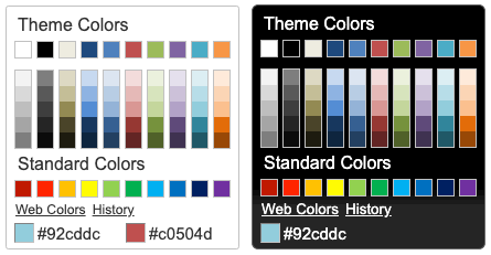
evol-colorpicker is as easily themeable as any jQuery UI widget, using one of the [jQuery UI themes](http://jqueryui.com/themeroller/#themeGallery) or your own custom theme made with [Themeroller](http://jqueryui.com/themeroller/).
<a name="Options"></a>
## Options
evol-colorpicker provides several options to customize its behaviour:
### color (String)
Used to set the color value.
```javascript
$("#mycolor").colorpicker({
color: "#ffffff",
});
```
Defaults to _null_.
### defaultPalette (String)
Used to set the default color palette. Possible values are "theme" or "web".
```javascript
$("#mycolor").colorpicker({
defaultPalette: "web",
});
```
Defaults to _theme_.
### displayIndicator (Boolean)
Used to show color value on hover and click inside the palette.
```javascript
$("#mycolor").colorpicker({
displayIndicator: false,
});
```
Defaults to _true_.
### hideButton (Boolean)
When binding the colorpicker to a textbox, a colored button will be added to the right of the textbox unless hideButton is set to true.
This option doens't have any effect if the colorpicker is bound to a DIV.
```javascript
$("#mycolor").colorpicker({
hideButton: true,
});
```
Defaults to _false_.
### history (Boolean)
Used to track selection history (shared among all instances of the colorpicker). The history keeps the last 28 colors selections.
```javascript
$("#mycolor").colorpicker({
history: false,
});
```
Defaults to _true_.
### initialHistory (Array strings)
Used to provide a color selection history. Colors are provided as strings of hexadecimal color values.
```javascript
$("#mycolor").colorpicker({
initialHistory: ["#ff0000", "#00ff00", "#0000ff"],
});
```
Defaults to _null_.
### showOn (String)
Have the colorpicker appear automatically when the field receives focus ("focus"), appear only when a button is clicked ("button"), or appear when either event takes place ("both").
This option only takes effect when the color picker is instanciated on a textbox.
```javascript
$("#mycolor").colorpicker({
showOn: "button",
});
```
Defaults to _"both"_.
### strings (String)
Used to translate the widget. It is a coma separated list of all labels used in the UI.
```javascript
$("#mycolor").colorpicker({
strings:
"Couleurs de themes,Couleurs de base,Plus de couleurs,Moins de couleurs,Palette,Historique,Pas encore d'historique.",
});
```
Defaults to _"Theme Colors,Standard Colors,Web Colors,Theme Colors,Back to Palette,History,No history yet."_.
### transparentColor (Boolean)
Allow for selection of the "transparent color". The hexadecimal value for the transparent color is "#0000ffff".
```javascript
$("#mycolor").colorpicker({
transparentColor: true,
});
```
Defaults to _false_.
<a name="Methods"></a>
## Methods
### clear()
Clears the color value (and close the popup palette if opened).
```javascript
$("#mycolor").colorpicker("clear");
```
### enable()
Get the currently selected color value (returned as a string).
```javascript
$("#mycolor").colorpicker("enable");
```
### disable()
Get the currently selected color value (returned as a string).
```javascript
$("#mycolor").colorpicker("disable");
```
### isDisabled()
Get the currently selected color value (returned as a string).
```javascript
$("#mycolor").colorpicker("isDisabled");
```
### val([color])
Get or set the currently selected color value (as a string, ie. "#d0d0d0").
```javascript
var colorValue = $("#mycolor").colorpicker("val");
$("#mycolor").colorpicker("val", "#d0d0d0");
```
### showPalette()
Show the palette (when using the widget as a popup).
```javascript
$("#mycolor").colorpicker("showPalette");
```
### hidePalette()
Hide the palette (when using the widget as a popup).
```javascript
$("#mycolor").colorpicker("hidePalette");
```
<a name="Events"></a>
## Events
### change.color
This event is triggered when a color is selected.
```javascript
$("#mycolor").on("change.color", function (event, color) {
$("#title").css("background-color", color);
});
```
### mouseover.color
This event is triggered when the mouse moves over a color box on the palette.
```javascript
$("#mycolor").on("mouseover.color", function (event, color) {
$("#title").css("background-color", color);
});
```
<a name="License"></a>
## License
Copyright (c) 2024 [Olivier Giulieri](https://evoluteur.github.io/).
**evol-colorpicker** is released under the [MIT license](http://github.com/evoluteur/colorpicker/raw/master/LICENSE.md).