dynamic-react-grid
Version:
Dynamic grid for react, responsive and inspired by the material-ui grid, however bringing greater simplicity, functionality and customization.
201 lines (158 loc) • 6.58 kB
Markdown
# dynamic-react-grid
## Installation
```bash
npm install --save dynamic-react-grid
```
```bash
yarn add dynamic-react-grid
```
**[DEMO](https://codesandbox.io/s/dinamic-grid-nviw4?file=/src/App.js)**
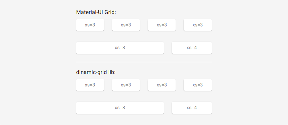
### Dynamic grid for react, responsive and inspired by the material-UI grid, however bringing greater simplicities, functionalities and customizations.
This lib was inspired by the [Grid](https://material-ui.com/pt/components/grid/) of material-UI, containing similar assignments.
## Props
Name | value | Description |
| ----- | -------- | ----------- |
| row | `true/false` | If assigned, indicates to component that it should be a line |
| xs, xs-m, sm, sm-m, md, md-m, lg, lg-m, xl | recommendable: `0...12` (but it can be from 0 to infinity, but this is madness) | They are the standard breakpoints, but you can customize and create yours (we'll see that later). |
| spacing | `0...infinity` | Defined in `Grid` tag with `row` props. Indicates column spacing, ranging from 0 to infinity. Default `0` |
| spacingY | `0...infinity` | Defined in the `Grid` tag with `row` props. Indicates the vertical spacing of columns, ranging from 0 to infinity. |
| spacingX | `0...infinity` | Defined in the `Grid` tag with `row` props. Indicates the horizontal column spacing, ranging from 0 to infinity. |
| direction | `row` `row-reverse` `column` `column-reverse` `inherit` `initial` `unset` | flex-direction values |
| justify | `center` `flex-start` `flex-end` `space-between` `space-around` `inherit` `initial` `unset` | justify-content values |
| alignContent | `center` `flex-start` `flex-end` `space-between` `space-around` `stretch` `inherit` `initial` `unset` | align-content values |
| align | `normal` `stretch` `center` `start` `end` `flex-start` `flex-end` `self-start` `self-end` `baseline` `first baseline` `last baseline` `safe center` `unsafe center` `inherit` `initial` `unset` | align-items values |
| wrap | `nowrap` `wrap` `wrap-reverse` `inherit` `initial` `unset` | flex-wrap values |
| self | `auto` `center` `flex-start` `flex-end` `baseline` `stretch` `inherit` `initial` `unset` | align-self values. Default `wrap` |
| order | `0...infinity` | order values |
<br/>
## Breakpoints Ramifications
I can also put Breakpoints ramifications for the above mentioned props, example:
```jsx
import Grid from 'dynamic-react-grid'
<Grid row spacing={2} or spacing={{xs:1, sm:4, md:3, /*...*/}}>
<Grid order={1} or order={{xs:1, sm:2, md:4, /*...*/}}>
</Grid>
</Grid>
<Grid row direction='row' or direction={{xs:'row', sm:'row-reverse', md:'column-reverse', /*...*/}}>
<Grid xs={12} md={6}>
</Grid>
</Grid>
```
This goes for all of the above props, except the `row` props
<br/>
## breakpoints
By default there are the following breakpoints:
```js
{
xs: 0,
'xs-m': 300,
sm: 600,
'sm-m': 780,
md: 960,
'md-m': 1120,
lg: 1280,
'lg-m': 1600,
xl: 1920
}
```
However you can create your own points:
```jsx
import {WithBreakpoints} from 'dynamic-react-grid'
let Grid = WithBreakpoints({
xs:0,
sm:400,
jsIsLife:600,
reactIsGood:1000
})
<Grid row>
<Grid row>
<Grid xs={6} jsIsLife={9} reactIsGood={12}>
...
</Grid>
</Grid>
</Grid>
```
> you can also use window.breakpoints = {/*...*/} which dynamic-react-grid will automatically detect, but not recommended; if you're using React it can be, but if it's Next I don't recommend it due to problems related to server-side renderings, to revert this instead of window you can use globalThis, but then there are also issues related to the javascript or node version.
<br/>
### If you prefer, you can also work as follows:
You can enter unique breakpoints for a given `Grid` tag:
```jsx
<Grid row>
<Grid row>
<Grid bp-sm={100} bp-hello={500} sm={6} hello={9}>
...
</Grid>
</Grid>
</Grid>
/*@media(min-width):100 e @media(min-width):500*/
```
bp-* is short for breakpoint-*
<br/>
## Nestling grid
The properties `row` and (the `breakpoints`) are independent. They can be combined.
```jsx
<Grid row>
<Grid row xs={12} md={6}>
<Grid lg={5}>
...
</Grid>
</Grid>
</Grid>
```
<br/>
## Limitations
### Negative margin
There is a limitation with the negative margin we use to implement spacing between items. A horizontal scrollbar will appear if a negative margin goes beyond the `<body>`. There are 2 solutions available:
1. Do not use the spacing feature and implement it in userspace spacing={0} (Default).
2. Applying Padding to the Father with at least 4 times the spacing value applied to the child:
```jsx
<body>
<div style={{ padding: 20 }}>
<Grid row spacing={5}>
//...
</Grid>
</div>
</body>
```
<br/>
## Automatic leyout
Both 4 columns below will have automatic widths, there is a flex-grow: 1 set by default, just set how to true the first breakpoint value:
```jsx
<Grid row spacing={2}>
<Grid xs>xs</Grid>
<Grid xs>xs</Grid>
<Grid xs>xs</Grid>
<Grid xs>xs</Grid>
</Grid>
```
<br/>
## Public utilities
useful to be used with [@emotion/styled](https://emotion.sh/docs/styled) or [styled-components](https://styled-components.com)
```jsx
import {media, mapMedia, breakpoints} from 'dynamic-react-grid'
let Container = styled.div(props => media(breakpoints)({
padding: 30,
color: 'red',
display: props.style.display,
// --------------------------------------
width: {xs:20, md:'50%', sm:'100vw'}
//or
width: mapMedia({xs:20, sm:30, md:40}, [key, val] => `calc(100px - ${val}px)`) // return -> {xs:'calc(100px - 20px)', sm:'calc(100px - 30px)', md:'calc(100px - 40px)'}
//or
width: mapMedia({xs:20, sm:30, md:40}, [key, val] => [`${key}-m`, `calc(100px - ${val}px)`]) // return -> {xs-m:'calc(100px - 20px)', sm-m:'calc(100px - 30px)', ...}
}))
//...
<Container
style={{
display: {
xs:'flex',
sm:'block',
md:'none',
/*...*/
}
}}
>
...
</Container>
```