db-formsearch-plus
Version:
基于 element-Plus 和 vue3 封装的 PC 后台管理系统搜索组件
226 lines (167 loc) • 5.53 kB
Markdown
## db-formsearch
基于 element-Plus 和 Vue3 封装的 PC 后台管理系统搜索组件
Search component of PC background management system based on element ui and vue encapsulation
### 效果图
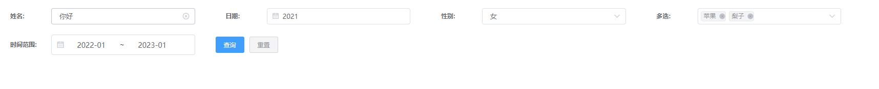
<!-- <img width="100%" height="400px" src="img.jpg" > -->
<p align="center">
<a href="./img.jpg" target="_blank">点击预览</a>
<img src="https://dbyxs.xyz:3006/uploads/21ed635034fe1f350aa92e14bc63e287" width="100%" alt="组件效果图">
</p>
## 使用方法 usage method
npm install db-formsearch-plus
vue 中
组件引入
In vue
Component import
```
import {formsearch} from 'db-formsearch-plus'
```
```
样式文件引入\*\*不引入样式会丢失
Style file import * * Style will be lost if not imported
import "db-formsearch/style.css";
```
### 提供方法
```
defineExpose({
formData,
search,
reset,
});
formData: 选择属性
search: 触发子传父组件方法
reset 清除表单
```
```例如:
<formSearch :opts="opts" @formSearch="formSearch"/>
opts: [
{
label: "姓名",
val: "",
key: "name",
type: "input",
size: "small",
},
{
label: "日期",
val: "",
key: "index",
type: "date",
format: "yyyy",
dateType: "year",
placeholder: "请选择日期",
size: "small",
},
{
label: "性别",
key: "max",
type: "select",
selects: [
{ id: 1, name: "男" },
{ id: 2, name: "女" },
],
size: "small",
},
{
label: "多选",
key: "maxs",
type: "remoteSelect",
selects: [
{ id: 1, name: "苹果" },
{ id: 2, name: "梨子" },
{ id: 3, name: "香蕉" },
{ id: 4, name: "桃子" },
],
size: "small",
},
{
label: "时间范围",
key: "maxs2",
type: "daterange",
key: "startTime",
key2: "endTime",
format: "yyyy",
starPlaceholder: "开始时间",
endPlaceholder: "结束时间",
size: "small",
},
],
```
## 新增 slot 插槽用法 New slot usage
```
{
type: "slot",
},
{
type: "slot",
name: "item1",
},
```
## 插槽页面使用方法 How to use the slot page
```
<template>
<div class="form_item_lable">测试 text</div>
<div class="form_item_val">
<el-input></el-input>
</div>
</template>
<template slot="item1">
<div class="form_item_lable">测试1 text</div>
<div class="form_item_val">
<el-input></el-input>
</div>
</template>
Form title and form value styles can be shared
```
```
## 提供 type 有
```
input 文本输入
date 年份选择
select 单选 selects 为下拉选项
selects: [
{ id: 1, name: "男" },
{ id: 2, name: "女" },
],
remoteSelect 多选 selects 为下拉选项
selects: [
{ id: 1, name: "苹果" },
{ id: 2, name: "梨子" },
{ id: 3, name: "香蕉" },
{ id: 4, name: "桃子" },
],
废弃 inputs 为区间输入 需要俩个 key ,key1
Two keys, key1, are required for interval inputs
daterange 为时间范围选择 同样需要俩个 key ,key2
The daterange also requires two keys, key2, to select a time range
```
### 属性选择
```
key 绑定的属性名称 Bound property name
type 需要渲染的类型 Types to render
label 名称 name
format 时间选择 type Time selection type
placeholder 默认文案 Default Copy
dateType 时间格式化 默认 type 为 date 时生效 Time format takes effect when the default type is date
selects type 为下拉选项时的渲染项 {id,name} Rendering item {id, name} when type is drop-down option
size 输入框&选择器尺寸 默认值 default &small &mini Input box&selector size default small&medium&mini
### 元素样式设置 Element Style Settings 暂时不提供 后期在更新
```
labelWidth label 宽度 类型为数字 The label width type is number
itemPadding 每个元素的间距 类型为字符串 例: 0 20px The spacing type of each element is string Example: 0 20px
itemWidth 每个元素的宽度 类型是百分比 传数字 The width type of each element is a percentage number
```
##### 新增自定义提交按钮配合插槽使用 Add custom submit button to use with slot
```
新增自定义按钮功能 传入 searchBtn 默认为 true
配合插槽使用
The default value of the newly added user-defined button function transferred to searchBtn is true
Used with slots
Call the search and reset reset methods in the component through ref to trigger the formSearch callback
Or directly obtain the searchForm through ref to get the form content
```
## 后期在进行时间优化和布局优化以及排版 In the later stage, time optimization, layout optimization and typesetting are being carried out
#### 注意 一行顶多展示 4 个选项后期在上线布局排版 Note that at most 4 options can be displayed in one line, which will be arranged in the online layout later
```
```