daterangepicker-4.x
Version:
Date range picker with time component and pre-defined ranges
707 lines (559 loc) • 44.9 kB
Markdown
# Date Range Picker
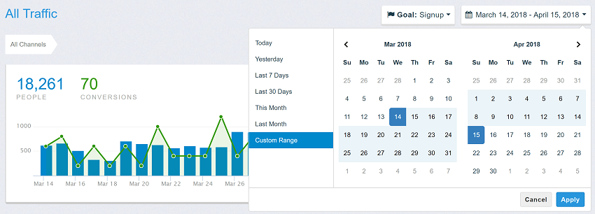
This date range picker component creates a dropdown menu from which a user can
select a range of dates.
Features include limiting the selectable date range, localizable strings and date formats,
a single date picker mode, a time picker, and predefined date ranges.
### [Documentation and Live Usage Examples](http://www.daterangepicker.com)
### [See It In a Live Application](https://awio.iljmp.com/5/drpdemogh)
Above samples are based on the [original repository](https://github.com/dangrossman/daterangepicker) from Dan Grossman. [New features](#Features) from this fork are not available in these samples.
## Basic usage
```html
<script type="text/javascript" src="https://cdn.jsdelivr.net/jquery/latest/jquery.min.js"></script>
<script type="text/javascript" src="https://cdn.jsdelivr.net/npm/luxon@3.5.0/build/global/luxon.min.js"></script>
<script type="text/javascript" src="https://cdn.jsdelivr.net/npm/daterangepicker-4.x@4.8.0/daterangepicker.min.js"></script>
<link type="text/css" href="https://cdn.jsdelivr.net/npm/daterangepicker-4.x@4.8.0/daterangepicker.min.css" rel="stylesheet" />
<input type="text" id="daterange" />
<script>
$(function() {
const options = {
timePicker: true
}
$('#daterange').daterangepicker(options);
});
</script>
```
## Examples
### `ranges`
<a name="options-ranges"></a>
```js
{
'Today': [DateTime.now().startOf('day'), DateTime.now().endOf('day')],
'Yesterday': [DateTime.now().startOf('day').minus({day: 1}), DateTime.now().endOf('day').minus({day: 1})],
'Last 7 Days': ['2025-03-01', '2025-03-07'],
'Last 30 Days': [new Date(new Date - 1000*60*60*24*30), new Date()],
'This Month': [DateTime.now().startOf('month'), DateTime.now().endOf('month')],
'Last Month': [DateTime.now().minus({month: 1}).startOf('month'), DateTime.now().minus({month: 1}).endOf('month')]
}
```
### `isInvalidDate`
```js
isInvalidDate: function(date) {
return date.isWeekend;
}
```
### `isInvalidTime`
```js
isInvalidTime: (time, side, unit) => {
if (unit == 'hour') {
return time.hour >= 10 && time.hour <= 14; // Works also with 12-hour clock
} else {
return false;
}
}
```
### `isCustomDate`
```js
.daterangepicker-bank-day {
color: red;
}
.daterangepicker-weekend-day {
color: blue;
}
isInvalidDate: function(date) {
if (date.isWeekend)
return 'daterangepicker-weekend-day';
const yyyy = date.year;
let bankDays = [
DateTime.fromObject({ year: yyyy, month: 1, day: 1 }), // New year
DateTime.fromObject({ year: yyyy, month: 7, day: 4 }), // Independence Day
DateTime.fromObject({ year: yyyy, month: 12, day: 25 }) // Christmas Day
];
return bankDays.some(x => x.hasSame(date, 'day')) ? 'daterangepicker-bank-day' : '';
}
```
### Features
Compared to [inital repository](https://github.com/dangrossman/daterangepicker), this fork added following features and changes:
- Replaced [moment](https://momentjs.com/) by [luxon](https://moment.github.io/luxon/index.html) (see differences below)
- Added option `weekendClasses`, `weekendDayClasses`, `todayClasses` to highlight weekend days or today, respectively
- Added option `timePickerStepSize` to succeed options `timePickerIncrement` and `timePickerSeconds`
- Added events `dateChange.daterangepicker` and `timeChange.daterangepicker` emitted when user clicks on a date/time
- Added event `beforeHide.daterangepicker` enables you to keep the picker visible after click on `Apply` or `Cancel` button.
- Added event `beforeRenderTimePicker.daterangepicker` and `beforeRenderCalendar.daterangepicker` emitted before elements are rendered
- Added method `setRange(startDate, endDate)` to combine `setStartDate(startDate)` and `setEndDate(endDate)`
- Added option `minSpan` similar to `maxSpan`
- Added option `isInvalidTime` similar to `isInvalidDate`
- Added option `altInput` and `altFormat` to provide an alternative output element for selected date value
- Added option `onOutsideClick` where you can define whether picker shall apply or revert selected value
- Added option `initalMonth` to show datepicker without an initial date
- Added option `singleMonthView` to show single month calendar, useful for shorter ranges
- Better validation of input parameters, errors are logged to console
- Highlight range in calendar when hovering over pre-defined ranges
- Option `autoUpdateInput` defines whether the attached `<input>` element is updated when the user clicks on a date value.<br/>
In original daterangepicker this parameter defines whether the `<input>` is updated when the user clicks on `Apply` button.
- Added option `locale.durationFormat` to show customized label for selected duration, e.g. `'4 Days, 6 Hours, 30 Minutes'`
- ... and maybe some new bugs 😉
### Localization
All date values are based on [luxon](https://moment.github.io/luxon/index.html#/intl) which provides great support for localization. Instead of providing date format, weekday and month names manually as strings, it is usually easier to set the default locale like this:
```
$(document).ready(function () {
const Settings = luxon.Settings;
Settings.defaultLocale = 'fr-CA'
$('#picker').daterangepicker({
timePicker: true,
singleDatePicker: false
};
});
```
instead of
```
$(document).ready(function () {
$('#picker').daterangepicker({
timePicker: true,
singleDatePicker: false,
locale: {
format: 'yyyyy-M-d H h m',
daysOfWeek: [ 'lun.', 'mar.', 'mer.', 'jeu.', 'ven.', 'sam.', 'dim.' ],
monthNames: [ "janvier', 'février', 'mars', 'avril', 'mai', 'juin', 'juillet', 'août', 'septembre', 'octobre', 'novembre', 'décembre" ],
firstDay: 7
}
};
});
```
## Methods
Available methods are listed below in [API documentation](#DateRangePicker). You will mainly use
* [.daterangepicker(options, callback)](#DateRangePicker.daterangepicker)
* [.setStartDate(startDate)](#DateRangePicker+setStartDate)
* [.setEndDate(endDate)](#DateRangePicker+setEndDate)
* [.setPeriod(startDate, endDate)](#DateRangePicker+setPeriod)
* `$(...).data('daterangepicker')` to get the daterangepicker object
all other methods are used rarely.
### Differences between `moment` and `luxon` library
This table lists a few important differences between datarangepicker using moment and luxon. Check them carefully when you migrate from older daterangepicker.
| Parameter | moment | luxon |
| ----------------------- | --------------------------------------------------- | ----------------- |
| `locale.daysOfWeek` | [ "Sun", "Mon", "Tue", "Wed", "Thu", "Fri", "Sat" ] | [ "Mon", "Tue", "Wed", "Thu", "Fri", "Sat", "Sun" ] |
| `locale.firstDay` | 0-6 (Sunday to Saturday) | 1 for Monday through 7 for Sunday |
| to ISO-8601 String | `toISOString()` | `toISO()` |
| to [Date](https://developer.mozilla.org/en-US/docs/Web/JavaScript/Reference/Global_Objects/Date) Object | `toDate()` | `toJSDate()` |
| from ISO-8601 String | `moment(...)` | `DateIme.fromISO(...)` |
| from [Date](https://developer.mozilla.org/en-US/docs/Web/JavaScript/Reference/Global_Objects/Date) Object | `moment(...)` | `DateIme.fromJSDate(...)` |
| current day | `moment()` | `DateTime.now()` |
| format to string | `format(...)` | `toFormat(...)` |
| format tokens | `'YYYY-MM-DD'` | `'yyyy-MM-dd'` |
## License
The MIT License (MIT)
Copyright (c) 2012-2019 Dan Grossman<br/>
Copyright (c) 2025 Wernfried Domscheit
Licensed under the [MIT license](LICENSE).
# API Documentation
## Classes
<dl>
<dt><a href="#DateRangePicker">DateRangePicker</a></dt>
<dd></dd>
</dl>
## Events
<dl>
<dt><a href="#event_beforeRenderCalendar.daterangepicker">"beforeRenderCalendar.daterangepicker" (this)</a></dt>
<dd><p>Emitted before the calendar is rendered.
Useful to remove any manually added elements.</p>
</dd>
<dt><a href="#event_beforeRenderTimePicker.daterangepicker">"beforeRenderTimePicker.daterangepicker" (this)</a></dt>
<dd><p>Emitted before the TimePicker is rendered.
Useful to remove any manually added elements.</p>
</dd>
<dt><a href="#event_show.daterangepicker">"show.daterangepicker" (this)</a></dt>
<dd><p>Emitted when the picker is shown</p>
</dd>
<dt><a href="#event_beforeHide.daterangepicker">"beforeHide.daterangepicker" (this)</a> ⇒ <code>boolean</code></dt>
<dd><p>Emitted before the picker will hide. When EventHandler returns <code>true</code>, then picker remains visible</p>
</dd>
<dt><a href="#event_hide.daterangepicker">"hide.daterangepicker" (this)</a></dt>
<dd><p>Emitted when the picker is hidden</p>
</dd>
<dt><a href="#event_outsideClick.daterangepicker">"outsideClick.daterangepicker" (this)</a></dt>
<dd><p>Emitted when user clicks outside the picker.
Use option <code>onOutsideClick</code> to define the default action, then you may not need to handle this event.</p>
</dd>
<dt><a href="#event_showCalendar.daterangepicker">"showCalendar.daterangepicker" (this)</a></dt>
<dd><p>Emitted when the calendar(s) are shown.
Only useful when <a href="#Ranges">Ranges</a> are used.</p>
</dd>
<dt><a href="#event_hideCalendar.daterangepicker">"hideCalendar.daterangepicker" (this)</a></dt>
<dd><p>Emitted when the calendar(s) are hidden.
Only useful when <a href="#Ranges">Ranges</a> are used.</p>
</dd>
<dt><a href="#event_dateChange.daterangepicker">"dateChange.daterangepicker" (this, side)</a></dt>
<dd><p>Emitted when the date changed. Does not trigger when time is changed,
use <a href="#event_timeChange.daterangepicker">"timeChange.daterangepicker"</a> to handle it</p>
</dd>
<dt><a href="#event_apply.daterangepicker">"apply.daterangepicker" (this)</a></dt>
<dd><p>Emitted when the <code>Apply</code> button is clicked, or when a predefined <a href="#Ranges">Ranges</a> is clicked</p>
</dd>
<dt><a href="#event_cancel.daterangepicker">"cancel.daterangepicker" (this)</a></dt>
<dd><p>Emitted when the <code>Cancel</code> button is clicked</p>
</dd>
<dt><a href="#event_timeChange.daterangepicker">"timeChange.daterangepicker" (this, side)</a></dt>
<dd><p>Emitted when the time changed. Does not trigger when date is changed</p>
</dd>
</dl>
## Typedefs
<dl>
<dt><a href="#Options">Options</a></dt>
<dd><p>Options for DateRangePicker</p>
</dd>
<dt><a href="#Ranges">Ranges</a> : <code>Object</code></dt>
<dd><p>A set of predefined ranges</p>
</dd>
<dt><a href="#Range">Range</a> : <code>Object</code></dt>
<dd><p>A single predefined range</p>
</dd>
<dt><a href="#constraintOptions">constraintOptions</a> : <code>Object</code></dt>
<dd></dd>
<dt><a href="#callback">callback</a> : <code>function</code></dt>
<dd></dd>
</dl>
<a name="DateRangePicker"></a>
## DateRangePicker
**Kind**: global class
* [DateRangePicker](#DateRangePicker)
* [new DateRangePicker(element, options, cb)](#new_DateRangePicker_new)
* _instance_
* [.setStartDate(startDate, isValid)](#DateRangePicker+setStartDate)
* [.setEndDate(endDate, isValid)](#DateRangePicker+setEndDate)
* [.setPeriod(startDate, endDate, isValid)](#DateRangePicker+setPeriod)
* [.constrainDate(options, [range])](#DateRangePicker+constrainDate) ⇒ <code>Array</code>
* [.updateView()](#DateRangePicker+updateView)
* [.showCalendars()](#DateRangePicker+showCalendars)
* [.hideCalendars()](#DateRangePicker+hideCalendars)
* [.updateElement()](#DateRangePicker+updateElement)
* [.remove()](#DateRangePicker+remove)
* _static_
* [.daterangepicker(options, callback)](#DateRangePicker.daterangepicker) ⇒
<a name="new_DateRangePicker_new"></a>
### new DateRangePicker(element, options, cb)
| Param | Type | Description |
| --- | --- | --- |
| element | [<code>jQuery</code>](https://api.jquery.com/Types/#jQuery/) | jQuery selector of the parent element that the date range picker will be added to |
| options | [<code>Options</code>](#Options) | Object to configure the DateRangePicker |
| cb | <code>function</code> | Callback function executed when |
<a name="DateRangePicker+setStartDate"></a>
### dateRangePicker.setStartDate(startDate, isValid)
Sets the date range picker's currently selected start date to the provided date.<br/>
`startDate` must be a `luxon.DateTime` or `Date` or `string` according to [ISO-8601](ISO-8601) or
a string matching `locale.format`.
The value of the attached `<input>` element is also updated.
Date value is rounded to match option `timePickerStepSize`<br/>
Functions `isInvalidDate` and `isInvalidTime` are not evaluated, you may set date/time which is not selectable in calendar.<br/>
If the `startDate` does not fall into `minDate` and `maxDate` then `startDate` is shifted and a warning is written to console.
**Kind**: instance method of [<code>DateRangePicker</code>](#DateRangePicker)
**Throws**:
- `RangeError` for invalid date values.
| Param | Type | Default | Description |
| --- | --- | --- | --- |
| startDate | [<code>DateTime</code>](https://moment.github.io/luxon/api-docs/index.html#datetime) \| [<code>Date</code>](https://developer.mozilla.org/en-US/docs/Web/JavaScript/Reference/Global_Objects/Date) \| <code>string</code> | | startDate to be set |
| isValid | <code>boolean</code> | <code>false</code> | If `true` then the `startDate` is not checked against `minDate` and `maxDate`<br/> Use this option only if you are really sure about the value you put in. |
**Example**
```js
const DateTime = luxon.DateTime;
const drp = $('#picker').data('daterangepicker');
drp.setStartDate(DateTime.now().startOf('hour'));
```
<a name="DateRangePicker+setEndDate"></a>
### dateRangePicker.setEndDate(endDate, isValid)
Sets the date range picker's currently selected end date to the provided date.<br/>
`endDate` must be a `luxon.DateTime` or `Date` or `string` according to [ISO-8601](ISO-8601) or
a string matching`locale.format`.
The value of the attached `<input>` element is also updated.
Date value is rounded to match option `timePickerStepSize`<br/>
Functions `isInvalidDate` and `isInvalidTime` are not evaluated, you may set date/time which is not selectable in calendar.<br/>
If the `endDate` does not fall into `minDate` and `maxDate` or into `minSpan` and `maxSpan`
then `endDate` is shifted and a warning is written to console.
**Kind**: instance method of [<code>DateRangePicker</code>](#DateRangePicker)
**Throws**:
- `RangeError` for invalid date values.
| Param | Type | Default | Description |
| --- | --- | --- | --- |
| endDate | [<code>DateTime</code>](https://moment.github.io/luxon/api-docs/index.html#datetime) \| [<code>Date</code>](https://developer.mozilla.org/en-US/docs/Web/JavaScript/Reference/Global_Objects/Date) \| <code>string</code> | | endDate to be set |
| isValid | <code>boolean</code> | <code>false</code> | If `true` then the `endDate` is not checked against `minDate`, `maxDate` and `minSpan`, `maxSpan`<br/> Use this option only if you are really sure about the value you put in. |
**Example**
```js
const drp = $('#picker').data('daterangepicker');
drp.setEndDate('2025-03-28T18:30:00');
```
<a name="DateRangePicker+setPeriod"></a>
### dateRangePicker.setPeriod(startDate, endDate, isValid)
Shortcut for [setStartDate](#DateRangePicker+setStartDate) and [setEndDate](#DateRangePicker+setEndDate)
**Kind**: instance method of [<code>DateRangePicker</code>](#DateRangePicker)
**Throws**:
- `RangeError` for invalid date values.
| Param | Type | Default | Description |
| --- | --- | --- | --- |
| startDate | [<code>DateTime</code>](https://moment.github.io/luxon/api-docs/index.html#datetime) \| [<code>Date</code>](https://developer.mozilla.org/en-US/docs/Web/JavaScript/Reference/Global_Objects/Date) \| <code>string</code> | | startDate to be set |
| endDate | [<code>DateTime</code>](https://moment.github.io/luxon/api-docs/index.html#datetime) \| [<code>Date</code>](https://developer.mozilla.org/en-US/docs/Web/JavaScript/Reference/Global_Objects/Date) \| <code>string</code> | | endDate to be set |
| isValid | <code>boolean</code> | <code>false</code> | If `true` then the `startDate` and `endDate` are not checked against `minDate`, `maxDate` and `minSpan`, `maxSpan`<br/> Use this option only if you are really sure about the value you put in. |
**Example**
```js
const DateTime = luxon.DateTime;
const drp = $('#picker').data('daterangepicker');
drp.setPeriod(DateTime.now().startOf('week'), DateTime.now().startOf('week').plus({days: 10}));
```
<a name="DateRangePicker+constrainDate"></a>
### dateRangePicker.constrainDate(options, [range]) ⇒ <code>Array</code>
Validate `startDate` and `endDate` or `range` against `timePickerStepSize`, `minDate`, `maxDate`,
`minSpan`, `maxSpan`, `invalidDate` and `invalidTime` and modifies them, if needed.
When `startDate` or `endDate` are modified, then a warning is written to console by default.
**Kind**: instance method of [<code>DateRangePicker</code>](#DateRangePicker)
**Returns**: <code>Array</code> - - Corrected range as array of `[startDate, endDate, isInvalid]` when range is set, otherwise just `isInvalid` object
**Throws**:
- `RangeError` if 'minDate' contradicts to 'minSpan'
| Param | Type | Description |
| --- | --- | --- |
| options | [<code>constraintOptions</code>](#constraintOptions) | Defines which constraints shall be validated |
| [range] | <code>Array</code> | Used to check prefefined range instead of `startDate` and `endDate` => `[name, startDate, endDate]` When set, then function does not modify anything, just returning corrected range. |
**Example**
```js
constrainDate({}, [DateTime.fromISO('2025-02-03'), DateTime.fromISO('2025-02-25')]) =>
[ DateTime.fromISO('2025-02-05'), DateTime.fromISO('2025-02-20'), { startDate: { stepped: ... }, endDate: { stepped: ..., modified: [{old: ... new: ..., reason: 'minSpan'}] } } ]
constrainDate({span: false, invalidDate: true, invalidTime: true}) =>
{ startDate: {stepped: ..., modified: [{old: ... new: ..., reason: 'minDate'}], isInvalidDate: true, isInvalidTime: false}, endDate: {stepped: ..., isInvalidDate: false, isInvalidTime: true} } ]
```
<a name="DateRangePicker+updateView"></a>
### dateRangePicker.updateView()
Updates the picker when calendar is initiated or any date has been selected.
Could be useful after running [setStartDate](#DateRangePicker+setStartDate) or [setEndDate](#DateRangePicker+setEndDate)
**Kind**: instance method of [<code>DateRangePicker</code>](#DateRangePicker)
**Emits**: <code>event:"beforeRenderTimePicker.daterangepicker"</code>
<a name="DateRangePicker+showCalendars"></a>
### dateRangePicker.showCalendars()
Shows calendar when user selects "Custom Ranges"
**Kind**: instance method of [<code>DateRangePicker</code>](#DateRangePicker)
**Emits**: <code>event:"showCalendar.daterangepicker"</code>
<a name="DateRangePicker+hideCalendars"></a>
### dateRangePicker.hideCalendars()
Hides calendar when user selects a predefined range
**Kind**: instance method of [<code>DateRangePicker</code>](#DateRangePicker)
**Emits**: <code>event:"hideCalendar.daterangepicker"</code>
<a name="DateRangePicker+updateElement"></a>
### dateRangePicker.updateElement()
Update attached `<input>` element with selected value
**Kind**: instance method of [<code>DateRangePicker</code>](#DateRangePicker)
**Emits**: [<code>change</code>](https://api.jquery.com/change/)
<a name="DateRangePicker+remove"></a>
### dateRangePicker.remove()
Removes the picker from document
**Kind**: instance method of [<code>DateRangePicker</code>](#DateRangePicker)
<a name="DateRangePicker.daterangepicker"></a>
### DateRangePicker.daterangepicker(options, callback) ⇒
Initiate a new DateRangePicker
**Kind**: static method of [<code>DateRangePicker</code>](#DateRangePicker)
**Returns**: DateRangePicker
| Param | Type | Description |
| --- | --- | --- |
| options | [<code>Options</code>](#Options) | Object to configure the DateRangePicker |
| callback | [<code>callback</code>](#callback) | Callback function executed when date is changed.<br/> Callback function is executed if selected date values has changed, before picker is hidden and before the attached `<input>` element is updated. As alternative listen to the ["apply.daterangepicker"](#event_apply.daterangepicker) event |
<a name="event_beforeRenderCalendar.daterangepicker"></a>
## "beforeRenderCalendar.daterangepicker" (this)
Emitted before the calendar is rendered.
Useful to remove any manually added elements.
**Kind**: event emitted
| Param | Type | Description |
| --- | --- | --- |
| this | [<code>DateRangePicker</code>](#DateRangePicker) | The daterangepicker object |
<a name="event_beforeRenderTimePicker.daterangepicker"></a>
## "beforeRenderTimePicker.daterangepicker" (this)
Emitted before the TimePicker is rendered.
Useful to remove any manually added elements.
**Kind**: event emitted
| Param | Type | Description |
| --- | --- | --- |
| this | [<code>DateRangePicker</code>](#DateRangePicker) | The daterangepicker object |
<a name="event_show.daterangepicker"></a>
## "show.daterangepicker" (this)
Emitted when the picker is shown
**Kind**: event emitted
| Param | Type | Description |
| --- | --- | --- |
| this | [<code>DateRangePicker</code>](#DateRangePicker) | The daterangepicker object |
<a name="event_beforeHide.daterangepicker"></a>
## "beforeHide.daterangepicker" (this) ⇒ <code>boolean</code>
Emitted before the picker will hide. When EventHandler returns `true`, then picker remains visible
**Kind**: event emitted
**Returns**: <code>boolean</code> - cancel - If `true`, then the picker remains visible
| Param | Type | Description |
| --- | --- | --- |
| this | [<code>DateRangePicker</code>](#DateRangePicker) | The daterangepicker object |
<a name="event_hide.daterangepicker"></a>
## "hide.daterangepicker" (this)
Emitted when the picker is hidden
**Kind**: event emitted
| Param | Type | Description |
| --- | --- | --- |
| this | [<code>DateRangePicker</code>](#DateRangePicker) | The daterangepicker object |
<a name="event_outsideClick.daterangepicker"></a>
## "outsideClick.daterangepicker" (this)
Emitted when user clicks outside the picker.
Use option `onOutsideClick` to define the default action, then you may not need to handle this event.
**Kind**: event emitted
| Param | Type | Description |
| --- | --- | --- |
| this | [<code>DateRangePicker</code>](#DateRangePicker) | The daterangepicker object |
<a name="event_showCalendar.daterangepicker"></a>
## "showCalendar.daterangepicker" (this)
Emitted when the calendar(s) are shown.
Only useful when [Ranges](#Ranges) are used.
**Kind**: event emitted
| Param | Type | Description |
| --- | --- | --- |
| this | [<code>DateRangePicker</code>](#DateRangePicker) | The daterangepicker object |
<a name="event_hideCalendar.daterangepicker"></a>
## "hideCalendar.daterangepicker" (this)
Emitted when the calendar(s) are hidden.
Only useful when [Ranges](#Ranges) are used.
**Kind**: event emitted
| Param | Type | Description |
| --- | --- | --- |
| this | [<code>DateRangePicker</code>](#DateRangePicker) | The daterangepicker object |
<a name="event_dateChange.daterangepicker"></a>
## "dateChange.daterangepicker" (this, side)
Emitted when the date changed. Does not trigger when time is changed,
use ["timeChange.daterangepicker"](#event_timeChange.daterangepicker) to handle it
**Kind**: event emitted
| Param | Type | Description |
| --- | --- | --- |
| this | [<code>DateRangePicker</code>](#DateRangePicker) | The daterangepicker object |
| side | <code>string</code> | Either `'start'` or `'end'` indicating whether startDate or endDate was changed. `null` when `singleDatePicker: true` |
<a name="event_apply.daterangepicker"></a>
## "apply.daterangepicker" (this)
Emitted when the `Apply` button is clicked, or when a predefined [Ranges](#Ranges) is clicked
**Kind**: event emitted
| Param | Type | Description |
| --- | --- | --- |
| this | [<code>DateRangePicker</code>](#DateRangePicker) | The daterangepicker object |
<a name="event_cancel.daterangepicker"></a>
## "cancel.daterangepicker" (this)
Emitted when the `Cancel` button is clicked
**Kind**: event emitted
| Param | Type | Description |
| --- | --- | --- |
| this | [<code>DateRangePicker</code>](#DateRangePicker) | The daterangepicker object |
<a name="event_timeChange.daterangepicker"></a>
## "timeChange.daterangepicker" (this, side)
Emitted when the time changed. Does not trigger when date is changed
**Kind**: event emitted
| Param | Type | Description |
| --- | --- | --- |
| this | [<code>DateRangePicker</code>](#DateRangePicker) | The daterangepicker object |
| side | <code>string</code> | Either `'start'` or `'end'` indicating whether startDate or endDate was changed |
<a name="Options"></a>
## Options
Options for DateRangePicker
**Kind**: global typedef
**Properties**
| Name | Type | Default | Description |
| --- | --- | --- | --- |
| parentEl | <code>string</code> | <code>"body"</code> | [jQuery selector](https://api.jquery.com/category/selectors/) of the parent element that the date range picker will be added to |
| startDate | [<code>DateTime</code>](https://moment.github.io/luxon/api-docs/index.html#datetime) \| [<code>Date</code>](https://developer.mozilla.org/en-US/docs/Web/JavaScript/Reference/Global_Objects/Date) \| <code>string</code> | | Default: `DateTime.now().startOf('day')`<br/>The beginning date of the initially selected date range.<br/> Must be a `luxon.DateTime` or `Date` or `string` according to [ISO-8601](https://en.wikipedia.org/wiki/ISO_8601) or a string matching `locale.format`.<br/> Date value is rounded to match option `timePickerStepSize`<br/> Option `isInvalidDate` and `isInvalidTime` are not evaluated, you may set date/time which is not selectable in calendar.<br/> If the date does not fall into `minDate` and `maxDate` then date is shifted and a warning is written to console. |
| endDate | [<code>DateTime</code>](https://moment.github.io/luxon/api-docs/index.html#datetime) \| [<code>Date</code>](https://developer.mozilla.org/en-US/docs/Web/JavaScript/Reference/Global_Objects/Date) \| <code>string</code> | | Defautl: `DateTime.now().endOf('day')`<br/>The end date of the initially selected date range.<br/> Must be a `luxon.DateTime` or `Date` or `string` according to [ISO-8601](https://en.wikipedia.org/wiki/ISO_8601) or a string matching `locale.format`.<br/> Date value is rounded to match option `timePickerStepSize`<br/> Option `isInvalidDate`, `isInvalidTime` and `minSpan`, `maxSpan` are not evaluated, you may set date/time which is not selectable in calendar.<br/> If the date does not fall into `minDate` and `maxDate` then date is shifted and a warning is written to console.<br/> |
| minDate | [<code>DateTime</code>](https://moment.github.io/luxon/api-docs/index.html#datetime) \| [<code>Date</code>](https://developer.mozilla.org/en-US/docs/Web/JavaScript/Reference/Global_Objects/Date) \| <code>string</code> \| <code>null</code> | | The earliest date a user may select or `null` for no limit.<br/> Must be a `luxon.DateTime` or `Date` or `string` according to [ISO-8601](https://en.wikipedia.org/wiki/ISO_8601) or a string matching `locale.format`. |
| maxDate | [<code>DateTime</code>](https://moment.github.io/luxon/api-docs/index.html#datetime) \| [<code>Date</code>](https://developer.mozilla.org/en-US/docs/Web/JavaScript/Reference/Global_Objects/Date) \| <code>string</code> \| <code>null</code> | | The latest date a user may select or `null` for no limit.<br/> Must be a `luxon.DateTime` or `Date` or `string` according to [ISO-8601](https://en.wikipedia.org/wiki/ISO_8601) or a string matching `locale.format`. |
| minSpan | [<code>Duration</code>](https://moment.github.io/luxon/api-docs/index.html#duration) \| <code>string</code> \| <code>number</code> \| <code>null</code> | | The maximum span between the selected start and end dates.<br/> Must be a `luxon.Duration` or number of seconds or a string according to [ISO-8601](https://en.wikipedia.org/wiki/ISO_8601) duration.<br/> Ignored when `singleDatePicker: true` |
| maxSpan | [<code>Duration</code>](https://moment.github.io/luxon/api-docs/index.html#duration) \| <code>string</code> \| <code>number</code> \| <code>null</code> | | The minimum span between the selected start and end dates.<br/> Must be a `luxon.Duration` or number of seconds or a string according to [ISO-8601](https://en.wikipedia.org/wiki/ISO_8601) duration.<br/> Ignored when `singleDatePicker: true` |
| initalMonth | [<code>DateTime</code>](https://moment.github.io/luxon/api-docs/index.html#datetime) \| [<code>Date</code>](https://developer.mozilla.org/en-US/docs/Web/JavaScript/Reference/Global_Objects/Date) \| <code>string</code> \| <code>null</code> | | Default: `DateTime.now().startOf('month')`<br/> The inital month shown when `startDate: null`. Be aware, the attached `<input>` element must be also empty.`<br/> Must be a `luxon.DateTime` or `Date` or `string` according to [ISO-8601](https://en.wikipedia.org/wiki/ISO_8601) or a string matching `locale.format`.<br/> When `initalMonth` is used, then `endDate` is ignored and it works only with `timePicker: false` |
| autoApply | <code>boolean</code> | <code>false</code> | Hide the `Apply` and `Cancel` buttons, and automatically apply a new date range as soon as two dates are clicked.<br/> Only useful when `timePicker: false` |
| singleDatePicker | <code>boolean</code> | <code>false</code> | Show only a single calendar to choose one date, instead of a range picker with two calendars.<br/> The start and end dates provided to your callback will be the same single date chosen. |
| singleMonthView | <code>boolean</code> | <code>false</code> | Show only a single month calendar, useful when typically selected ranges are rather short.<br/> Ignored for `singleDatePicker: true`. |
| showDropdowns | <code>boolean</code> | <code>false</code> | Show year and month select boxes above calendars to jump to a specific month and year |
| minYear | <code>number</code> | | Default: `DateTime.now().minus({year:100}).year`<br/>The minimum year shown in the dropdowns when `showDropdowns: true` |
| maxYear | <code>number</code> | | Default: `DateTime.now().plus({year:100}).year`<br/>The maximum year shown in the dropdowns when `showDropdowns: true` |
| showWeekNumbers | <code>boolean</code> | <code>false</code> | Show **localized** week numbers at the start of each week on the calendars |
| showISOWeekNumbers | <code>boolean</code> | <code>false</code> | Show **ISO** week numbers at the start of each week on the calendars.<br/> Takes precedence over localized `showWeekNumbers` |
| timePicker | <code>boolean</code> | <code>false</code> | Adds select boxes to choose times in addition to dates |
| timePicker24Hour | <code>boolean</code> | <code>true</code> | Use 24-hour instead of 12-hour times, removing the AM/PM selection |
| timePickerStepSize | [<code>Duration</code>](https://moment.github.io/luxon/api-docs/index.html#duration) \| <code>string</code> \| <code>number</code> | | Default: `Duration.fromObject({minutes:1})`<br/>Set the time picker step size.<br/> Must be a `luxon.Duration` or the number of seconds or a string according to [ISO-8601](https://en.wikipedia.org/wiki/ISO_8601) duration.<br/> Valid values are 1,2,3,4,5,6,10,12,15,20,30 for `Duration.fromObject({seconds: ...})` and `Duration.fromObject({minutes: ...})` and 1,2,3,4,6,(8,12) for `Duration.fromObject({hours: ...})`.<br/> Duration must be greater than `minSpan` and smaller than `maxSpan`.<br/> For example `timePickerStepSize: 600` will disable time picker seconds and time picker minutes are set to step size of 10 Minutes.<br/> Overwrites `timePickerIncrement` and `timePickerSeconds`, ignored when `timePicker: false` |
| timePickerSeconds | <code>boolean</code> | <code>boolean</code> | **Deprecated**, use `timePickerStepSize`<br/>Show seconds in the timePicker |
| timePickerIncrement | <code>boolean</code> | <code>1</code> | **Deprecated**, use `timePickerStepSize`<br/>Increment of the minutes selection list for times |
| autoUpdateInput | <code>boolean</code> | <code>true</code> | Indicates whether the date range picker should instantly update the value of the attached `<input>` element when the selected dates change.<br/>The `<input>` element will be always updated on `Apply` and reverted when user clicks on `Cancel`. |
| onOutsideClick | <code>string</code> | <code>"apply"</code> | Defines what picker shall do when user clicks outside the calendar. `'apply'` or `'cancel'`. Event [onOutsideClick.daterangepicker](#event_outsideClick.daterangepicker) is always emitted. |
| linkedCalendars | <code>boolean</code> | <code>true</code> | When enabled, the two calendars displayed will always be for two sequential months (i.e. January and February), and both will be advanced when clicking the left or right arrows above the calendars.<br/> When disabled, the two calendars can be individually advanced and display any month/year |
| isInvalidDate | <code>function</code> | <code>false</code> | A function that is passed each date in the two calendars before they are displayed,<br/> and may return `true` or `false` to indicate whether that date should be available for selection or not.<br/> Signature: `isInvalidDate(date)`<br/> Function has no effect on date values set by `startDate`, `endDate`, `ranges`, [setStartDate](#DateRangePicker+setStartDate), [setEndDate](#DateRangePicker+setEndDate). |
| isInvalidTime | <code>function</code> | <code>false</code> | A function that is passed each hour/minute/second/am-pm in the two calendars before they are displayed,<br/> and may return `true` or `false` to indicate whether that date should be available for selection or not.<br/> Signature: `isInvalidTime(time, side, unit)`<br/> `side` is `'start'` or `'end'` or `null` for `singleDatePicker: true`<br/> `unit` is `'hour'`, `'minute'`, `'second'` or `'ampm'`<br/> Hours are always given as 24-hour clock<br/> Function has no effect on time values set by `startDate`, `endDate`, `ranges`, [setStartDate](#DateRangePicker+setStartDate), [setEndDate](#DateRangePicker+setEndDate).<br/> Ensure that your function returns `false` for at least one item. Otherwise the calender is not rendered.<br/> |
| isCustomDate | <code>function</code> | <code>false</code> | A function that is passed each date in the two calendars before they are displayed, and may return a string or array of CSS class names to apply to that date's calendar cell.<br/> Signature: `isCustomDate(date)` |
| altInput | <code>string</code> \| <code>Array</code> | <code>null</code> | A [jQuery selector](https://api.jquery.com/category/selectors/) string for an alternative ouput (typically hidden) `<input>` element. Requires `altFormat` to be set.<br/> Must be a single string for `singleDatePicker: true` or an array of two strings for `singleDatePicker: false`<br/> Example: `['#start', '#end']` |
| =null | <code>function</code> \| <code>string</code> | | The output format used for `altInput`.<br/> Either a string used with [toFormat()](https://moment.github.io/luxon/api-docs/index.html#datetimetoformat) or a function.<br/> Examples: `'yyyyMMddHHmm'`, `(date) => date.toUnixInteger()` |
| applyButtonClasses | <code>string</code> | <code>"btn-primary"</code> | CSS class names that will be added only to the apply button |
| cancelButtonClasses | <code>string</code> | <code>"btn-default"</code> | CSS class names that will be added only to the cancel button |
| buttonClasses | <code>string</code> | | Default: `'btn btn-sm'`<br/>CSS class names that will be added to both the apply and cancel buttons. |
| weekendClasses | <code>string</code> | <code>"weekend"</code> | CSS class names that will be used to highlight weekend days.<br/> Use `null` or empty string if you don't like to highlight weekend days. |
| weekendDayClasses | <code>string</code> | <code>"weekend-day"</code> | CSS class names that will be used to highlight weekend day names.<br/> Weekend days are evaluated by [Info.getWeekendWeekdays](https://moment.github.io/luxon/api-docs/index.html#infogetweekendweekdays) and depend on current locale settings. Use `null` or empty string if you don't like to highlight weekend day names. |
| todayClasses | <code>string</code> | <code>"today"</code> | CSS class names that will be used to highlight the current day.<br/> Use `null` or empty string if you don't like to highlight the current day. |
| opens | <code>string</code> | <code>"right"</code> | Whether the picker appears aligned to the left, to the right, or centered under the HTML element it's attached to.<br/> `'left' \| 'right' \| 'center'` |
| drops | <code>string</code> | <code>"down"</code> | Whether the picker appears below or above the HTML element it's attached to.<br/> `'down' \| 'up' \| 'auto'` |
| ranges | <code>object</code> | <code>{}</code> | Set predefined date [Ranges](#Ranges) the user can select from. Each key is the label for the range, and its value an array with two dates representing the bounds of the range. |
| showCustomRangeLabel | <code>boolean</code> | <code>true</code> | Displays "Custom Range" at the end of the list of predefined [Ranges](#Ranges), when the ranges option is used.<br> This option will be highlighted whenever the current date range selection does not match one of the predefined ranges.<br/> Clicking it will display the calendars to select a new range. |
| alwaysShowCalendars | <code>boolean</code> | <code>false</code> | Normally, if you use the ranges option to specify pre-defined date ranges, calendars for choosing a custom date range are not shown until the user clicks "Custom Range".<br/> When this option is set to true, the calendars for choosing a custom date range are always shown instead. |
| locale | <code>object</code> | <code>{}</code> | Allows you to provide localized strings for buttons and labels, customize the date format, and change the first day of week for the calendars. |
| locale.direction | <code>string</code> | <code>"ltr"</code> | Direction of reading, `'ltr'` or `'rtl'` |
| locale.format | <code>object</code> \| <code>string</code> | | Default: `DateTime.DATE_SHORT` or `DateTime.DATETIME_SHORT` when `timePicker: true`<br/>Date formats. Either given as string, see [Format Tokens](https://moment.github.io/luxon/#/formatting?id=table-of-tokens) or an object according to [Intl.DateTimeFormat](https://developer.mozilla.org/en-US/docs/Web/JavaScript/Reference/Global_Objects/Intl/DateTimeFormat)<br/> I recommend to use the luxon [Presets](https://moment.github.io/luxon/#/formatting?id=presets). |
| locale.separator | <code>string</code> | | Defaut: `' - '`<br/>Separator for start and end time |
| locale.weekLabel | <code>string</code> | <code>"W"</code> | Label for week numbers |
| locale.daysOfWeek | <code>Array</code> | | Default: `luxon.Info.weekdays('short')`<br/>Array with weekday names, from Monday to Sunday |
| locale.monthNames | <code>Array</code> | | Default: `luxon.Info.months('long')`<br/>Array with month names |
| locale.firstDay | <code>number</code> | | Default: `luxon.Info.getStartOfWeek()`<br/>First day of the week, 1 for Monday through 7 for Sunday |
| locale.applyLabel | <code>string</code> | <code>"Apply"</code> | Label of `Apply` Button |
| locale.cancelLabel | <code>string</code> | <code>"Cancel"</code> | Label of `Cancel` Button |
| locale.customRangeLabel | <code>string</code> | <code>"Custom"</code> | Range - Title for custom ranges |
| locale.durationFormat | <code>object</code> \| <code>string</code> | <code>{}</code> | Format a custom label for selected duration, for example `'5 Days, 12 Hours'`.<br/> Define the format either as string, see [Duration.toFormat - Format Tokens](https://moment.github.io/luxon/api-docs/index.html#durationtoformat) or an object according to [Intl.NumberFormat](https://developer.mozilla.org/en-US/docs/Web/JavaScript/Reference/Global_Objects/Intl/NumberFormat/NumberFormat#options), see [Duration.toHuamn](https://moment.github.io/luxon/api-docs/index.html#durationtohuman). |
<a name="Ranges"></a>
## Ranges : <code>Object</code>
A set of predefined ranges
**Kind**: global typedef
**Properties**
| Name | Type | Description |
| --- | --- | --- |
| name | <code>string</code> | The name of the range |
| range | [<code>DateTime</code>](https://moment.github.io/luxon/api-docs/index.html#datetime) \| [<code>Date</code>](https://developer.mozilla.org/en-US/docs/Web/JavaScript/Reference/Global_Objects/Date) \| <code>string</code> | Array of 2 elements with startDate and endDate |
**Example**
```js
{
'Today': [DateTime.now().startOf('day'), DateTime.now().endOf('day')],
'Yesterday': [DateTime.now().startOf('day').minus({days: 1}), DateTime.now().minus({days: 1}).endOf('day')],
'Last 7 Days': [DateTime.now().startOf('day').minus({days: 6}), DateTime.now()],
'Last 30 Days': [DateTime.now().startOf('day').minus({days: 29}), DateTime.now()],
'This Month': [DateTime.now().startOf('day').startOf('month'), DateTime.now().endOf('month')],
'Last Month': [DateTime.now().startOf('day').minus({months: 1}).startOf('month'), DateTime.now().minus({months: 1}).endOf('month')]
}
```
<a name="Range"></a>
## Range : <code>Object</code>
A single predefined range
**Kind**: global typedef
**Properties**
| Name | Type | Description |
| --- | --- | --- |
| name | <code>string</code> | The name of the range |
| range | [<code>DateTime</code>](https://moment.github.io/luxon/api-docs/index.html#datetime) \| [<code>Date</code>](https://developer.mozilla.org/en-US/docs/Web/JavaScript/Reference/Global_Objects/Date) \| <code>string</code> | Array of 2 elements with startDate and endDate |
**Example**
```js
{ Today: [DateTime.now().startOf('day'), DateTime.now().endOf('day')] }
```
<a name="constraintOptions"></a>
## constraintOptions : <code>Object</code>
**Kind**: global typedef
**Properties**
| Name | Type | Default | Description |
| --- | --- | --- | --- |
| stepSize | <code>boolean</code> | <code>true</code> | If `true`, then `startDate` and `endDate` are rounded to match `timePickerStepSize` (no warning) |
| minMax | <code>boolean</code> | <code>true</code> | If `true` then and if the `startDate` and `endDate` do not fall into `minDate` and `maxDate` then dates are shifted and a warning is written to console. |
| span | <code>boolean</code> | <code>true</code> | If `true` then and if the `startDate` and `endDate` do not fall into `minDate` and `maxSpan` then `endDate` is shifted and a warning is written to console. |
| invalidDate | <code>boolean</code> | <code>false</code> | If `true` then and if `invalidDate` return `true`, then an error is logged to console |
| invalidTime | <code>boolean</code> | <code>false</code> | If `true` then and if `invalidTime` return `true`, then an error is logged to console |
| writeWarning | <code>boolean</code> | <code>true</code> | If `true` then a warning is written to console if `startDate` or `endDate` is modified with the exception of rounding due to `timePickerStepSize`. |
<a name="callback"></a>
## callback : <code>function</code>
**Kind**: global typedef
| Param | Type | Description |
| --- | --- | --- |
| startDate | [<code>DateTime</code>](https://moment.github.io/luxon/api-docs/index.html#datetime) | Selected startDate |
| endDate | [<code>DateTime</code>](https://moment.github.io/luxon/api-docs/index.html#datetime) | Selected endDate |
| range | <code>string</code> | |