custom-app
Version:
ITIMS��Ʒ�鿪��ר��React���,�Dz��ý��ּ�dhcc-app���������
154 lines (128 loc) • 3.99 kB
Markdown
# rc-dropdown
react dropdown component
[![NPM version][npm-image]][npm-url]
[![build status][travis-image]][travis-url]
[![Test coverage][coveralls-image]][coveralls-url]
[![gemnasium deps][gemnasium-image]][gemnasium-url]
[![node version][node-image]][node-url]
[![npm download][download-image]][download-url]
[npm-image]: http://img.shields.io/npm/v/rc-dropdown.svg?style=flat-square
[npm-url]: http://npmjs.org/package/rc-dropdown
[travis-image]: https://img.shields.io/travis/react-component/dropdown.svg?style=flat-square
[travis-url]: https://travis-ci.org/react-component/dropdown
[coveralls-image]: https://img.shields.io/coveralls/react-component/dropdown.svg?style=flat-square
[coveralls-url]: https://coveralls.io/r/react-component/dropdown?branch=master
[gemnasium-image]: http://img.shields.io/gemnasium/react-component/dropdown.svg?style=flat-square
[gemnasium-url]: https://gemnasium.com/react-component/dropdown
[node-image]: https://img.shields.io/badge/node.js-%3E=_0.10-green.svg?style=flat-square
[node-url]: http://nodejs.org/download/
[download-image]: https://img.shields.io/npm/dm/rc-dropdown.svg?style=flat-square
[download-url]: https://npmjs.org/package/rc-dropdown
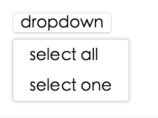
## Screenshot
## Example
online example: http://react-component.github.io/dropdown/examples/
## install
[](https://npmjs.org/package/rc-dropdown)
## Usage
```js
var Dropdown = require('rc-dropdown');
// use dropdown
```
## API
### props
<table class="table table-bordered table-striped">
<thead>
<tr>
<th style="width: 100px;">name</th>
<th style="width: 50px;">type</th>
<th style="width: 50px;">default</th>
<th>description</th>
</tr>
</thead>
<tbody>
<tr>
<td>overlayClassName</td>
<td>String</td>
<td></td>
<td>additional css class of root dom node</td>
</tr>
<tr>
<td>openClassName</td>
<td>String</td>
<td>`${prefixCls}-open`</td>
<td>className of trigger when dropdown is opened</td>
</tr>
<tr>
<td>prefixCls</td>
<td>String</td>
<td>rc-tooltip</td>
<td>prefix class name</td>
</tr>
<tr>
<td>transitionName</td>
<td>String</td>
<td></td>
<td>dropdown menu's animation css class name</td>
</tr>
<tr>
<td>animation</td>
<td>String</td>
<td></td>
<td>part of dropdown menu's animation css class name</td>
</tr>
<tr>
<td>onVisibleChange</td>
<td>Function</td>
<td></td>
<td>call when visible is changed</td>
</tr>
<tr>
<td>visible</td>
<td>boolean</td>
<td></td>
<td>whether tooltip is visible</td>
</tr>
<tr>
<td>defaultVisible</td>
<td>boolean</td>
<td></td>
<td>whether tooltip is visible initially</td>
</tr>
<tr>
<td>overlay</td>
<td>rc-menu</td>
<td></td>
<td><a href="https://github.com/react-component/menu">rc-menu</a> element</td>
</tr>
<tr>
<td>onOverlayClick</td>
<td>function(e)</td>
<td></td>
<td>call when overlay is clicked</td>
</tr>
<tr>
<td>minOverlayWidthMatchTrigger</td>
<td>boolean</td>
<td>true (false when set alignPoint)</td>
<td>whether overlay's width must not be less than trigger's </td>
</tr>
</tbody>
</table>
## Development
```
npm install
npm start
```
## Test Case
```
npm test
npm run chrome-test
```
## Coverage
```
npm run coverage
```
open coverage/ dir
## License
rc-dropdown is released under the MIT license.