cursor-style
Version:
Multiple prebuilt cursor styles to choose from
360 lines (291 loc) • 10.6 kB
Markdown
# cursor-style
Elevate your web application's user experience with cursor-style, a sophisticated library designed to customize and animate the cursor. From adding elegance and interactivity to standing out, cursor-style provides an array of options to enhance your site's interactive elements with minimal effort.

## Installation
```bash
npm install cursor-style
```
## Features
- **Five Cursor Types**: Choose from simple circle, dot+outline, outline-only, crosshair, or image hover cursors
- **Click Effects**: Built-in pulse animations on mouse clicks
- **Extensive Customization**: Control size, colors, delays, and animations
- **Optimized Performance**: Lightweight bundle with smooth 60fps animations
- **TypeScript Ready**: Full type safety with cursor-specific prop validation
- **Seamless Integration**: Drop-in solution for any React project
- **Mix Blend Modes**: Built-in support for difference blend mode effects
## 🆕 What's New in v1.4.9
- **NEW: Cursor Type 6 - Magnetic Morphing**: Shape-morphing cursor that magnetically snaps to elements and transforms to match their exact boundaries
- **Better TypeScript Support**: More precise type definitions for all cursor variants
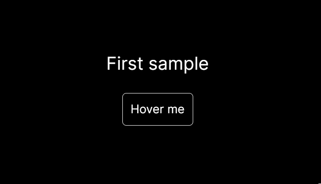
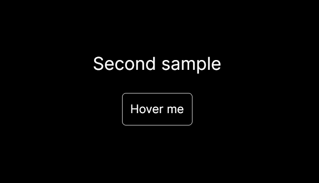
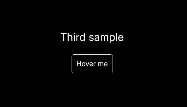
## Cursor Types
## 📖 Quick Start
### CustomCursor Component
```tsx
import { CustomCursor } from "cursor-style";
function App() {
return (
<div>
{/* Simple filled cursor */}
<CustomCursor
type="one"
size={20}
bgColor="white"
clickEffect="pulse"
/>
{/* Dot + outline cursor */}
<CustomCursor
type="two"
sizeDot={8}
sizeOutline={40}
bgColorDot="blue"
bgColorOutline="white"
delay={3}
/>
{/* Outline only cursor */}
<CustomCursor
type="three"
size={30}
bgColor="red"
scaleOnHover={2}
/>
{/* Crosshair cursor */}
<CustomCursor
type="four"
lineColor="blue"
tiltEffect={true}
hoverTransform={true}
/>
{/* Image hover cursor */}
<CustomCursor
type="five"
showImages={true}
imageSize={250}
/>
{/* Magnetic morphing cursor */}
<CustomCursor
type="six"
baseSize={20}
bgColor="purple"
morphDuration={300}
morphScale={0.8}
/>
</div>
);
}
```
## 🔧 API Reference
#### Common Props (All Types)
| Prop | Type | Default | Description |
|------|------|---------|-------------|
| `type` | `"one" \| "two" \| "three" \| "four" \| "five"` | **Required** | Cursor style type |
| `delay` | `number` | `0` | Movement delay (0-1000ms) |
| `useMixBlendDifference` | `boolean` | `true` | Enable difference blend mode |
| `size` | `number` | `35 / 10 / 35` | Cursor diameter |
| `scaleOnHover` | `number` | `1.5` | Scale factor when hovering interactive elements |
| `clickEffect` | `"pulse" \| "ripple" \| "fade"` | `undefined` | Click animation effect type |
| `clickEffectColor` | `string` | `"white"` | Pulse effect color |
| `clickEffectSize` | `number` | `1.5` | Pulse effect scale |
| `clickEffectDuration` | `number` | `300` | Pulse duration (ms) |
| `magnetEffect` | `boolean` | `false` | Enable magnetic attraction to elements |
| `magnetStrength` | `number` | `20` | Magnetic force strength |
| `magnetRange` | `number` | `100` | Magnetic field range in pixels |
| `magnetClassName` | `string` | `"cursor-magnet"` | CSS class for magnetic elements |
| `magnetType` | `"attract" \| "repel"` | `"attract"` | Magnetic behavior type |
#### Type "one" Specific Props
| Prop | Type | Default | Description |
|------|------|---------|-------------|
| `bgColor` | `string` | `"white"` | Fill color |
#### Type "two" Specific Props
| Prop | Type | Default | Description |
|------|------|---------|-------------|
| `sizeDot` | `number` | `10` | Center dot size |
| `sizeOutline` | `number` | `45` | Outline size |
| `bgColorDot` | `string` | `"white"` | Dot color |
| `bgColorOutline` | `string` | `"white"` | Outline color |
#### Type "three" Specific Props
| Prop | Type | Default | Description |
|------|------|---------|-------------|
| `bgColor` | `string` | `"white"` | Border color |
#### Type "four" Specific Props (Crosshair)
| Prop | Type | Default | Description |
|------|------|---------|-------------|
| `lineColor` | `string` | `"white"` | Color of crosshair lines |
| `lineThickness` | `number` | `2` | Thickness of lines in pixels |
| `lineLength` | `number` | `20` | Length of each line in pixels |
| `rotateAnimation` | `boolean` | `false` | Enable continuous rotation animation |
| `tiltEffect` | `boolean` | `false` | Enable directional tilt based on movement |
| `tiltIntensity` | `number` | `15` | Tilt intensity percentage |
| `hoverTransform` | `boolean` | `false` | Transform to X shape on hover |
#### Type "five" Specific Props (Image Hover)
| Prop | Type | Default | Description |
|------|------|---------|-------------|
| `bgColor` | `string` | `"white"` | Border color of base cursor |
| `showImages` | `boolean` | `false` | Enable image hover functionality |
| `imageSize` | `number` | `300` | Width of preview images in pixels |
| `imageFadeDuration` | `number` | `300` | Image fade animation duration (ms) |
#### Type "six" Specific Props (Magnetic Morphing)
| Prop | Type | Default | Description |
|------|------|---------|-------------|
| `baseSize` | `number` | `20` | Size of the base circle cursor in pixels |
| `bgColor` | `string` | `"white"` | Color of the cursor border |
| `morphDuration` | `number` | `200` | Duration of morphing animation in milliseconds |
| `morphScale` | `number` | `0.69` | Scale factor for element size (0.1-1.0) |
## 🎯 Pratical Examples
### Click Effects
```tsx
<CustomCursor
type="one"
clickEffect="pulse"
clickEffectColor="rgba(255, 0, 0, 0.8)"
clickEffectSize={10.5}
clickEffectDuration={500}
/>
```
### Magnetic Attraction
```tsx
<CustomCursor
type="two"
magnetEffect={true}
magnetStrength={25}
magnetRange={120}
magnetClassName="magnetic-element"
magnetType="attract"
/>
{/* Add this class to elements you want to be magnetic */}
<button className="magnetic-element">Magnetic Button</button>
<div className="magnetic-element">Magnetic Card</div>
```
### Magnetic Repulsion
```tsx
<CustomCursor
type="one"
magnetEffect={true}
magnetStrength={15}
magnetRange={80}
magnetClassName="repel-zone"
magnetType="repel"
/>
```
### Delayed Following
```tsx
<CustomCursor
type="two"
delay={8}
size={10}
bgColorOutline="#00ff00"
/>
```
### Hover Scaling
```tsx
<CustomCursor
type="three"
scaleOnHover={2}
size={45}
bgColor="purple"
/>
```
### Mix Blend Mode Disabled
```tsx
<CustomCursor
type="one"
useMixBlendDifference={false}
bgColor="rgba(0, 0, 0, 0.5)"
/>
```
### Crosshair with Effects
```tsx
<CustomCursor
type="four"
lineColor="red"
lineThickness={3}
lineLength={25}
tiltEffect={true}
tiltIntensity={20}
hoverTransform={true}
rotateAnimation={false}
/>
```
### Image Hover System
```tsx
<CustomCursor
type="five"
showImages={true}
imageSize={300}
imageFadeDuration={400}
delay={9}
/>
{/* Add data-cursor-image to elements */}
<span data-cursor-image="/path/to/image.jpg">
Hover me for image preview
</span>
<button data-cursor-image="https://example.com/photo.png">
Product with preview
</button>
```
### Magnetic Morphing Cursor
```tsx
<CustomCursor
type="six"
baseSize={25}
bgColor="cyan"
morphDuration={500}
morphScale={0.75}
/>
{/* Cursor automatically morphs to fit these elements */}
<button>Hover me - I'll be outlined!</button>
<a href="#">Links work too</a>
<div className="hoverable">Custom hoverable element</div>
<input type="text" placeholder="Form inputs morph too" />
```
## 🎨 Styling Tips
### CSS Integration
The library automatically hides the default cursor, but you might need to set it manually in some cases:
```css
* {
cursor: none;
}
```
### Interactive Elements
The cursor automatically detects and scales on these elements:
- `<a>`, `<button>`, `<input>`, `<textarea>`
- Elements with `role="button"`
- Elements with `tabindex` (except `-1`)
- Elements with class `hoverable`
Add the `hoverable` class to custom interactive elements:
```tsx
<div className="hoverable">This will trigger hover scaling</div>
```
## 🔧 TypeScript Support
Full TypeScript support with intelligent prop validation:
```tsx
// ✅ Valid - TypeScript approves
<CustomCursor type="two" sizeDot={10} bgColorDot="blue" />
// ❌ Invalid - TypeScript error
<CustomCursor type="one" sizeDot={10} /> // sizeDot not valid for type "one"
```
## 🐛 Troubleshooting
### Cursor Not Showing
1. Ensure the component is rendered in your app
2. Check that no CSS is overriding `cursor` styles
3. Verify the cursor colors aren't matching your background
4. Set a background color to the page/div if one is not provided (in case useMixBlendDifference is enabled)
### Performance Issues
1. Avoid setting `delay` values above 10 for smooth performance
2. Use `useMixBlendDifference={false}` if you experience rendering issues
3. Consider disabling click effects on high-frequency interactions
### TypeScript Errors
1. Update to the latest version for best type definitions
2. Ensure you're only using props valid for your chosen cursor type
3. Check that `clickEffect` is set to `"pulse"` (only supported value)
## 🤝 Contributing
We welcome contributions! Please feel free to submit a Pull Request.
## 📄 License
MIT License
## 🔗 Links
- **GitHub**: [nsl-nikos/cursor-style](https://github.com/nsl-nikos)
- **NPM**: [cursor-style](https://www.npmjs.com/package/cursor-style)
- **Issues**: [Report bugs or request features](https://github.com/nsl-nikos)
---
Made with ❤️ by [nsl-nikos](https://github.com/nsl-nikos)