cursor-style
Version:
Multiple prebuilt cursor styles to choose from
139 lines (95 loc) • 4.29 kB
Markdown
# Prebuilt Cursor Styles
Elevate your web application's user experience with cursor-style, a sophisticated library designed to customize and animate the cursor. From adding elegance and interactivity to standing out, cursor-style provides an array of options to enhance your site's interactive elements with minimal effort.

## 1. installation
```bash
npm install cursor-style
```
## 2. Features
- **Custom Cursor Shapes**: Easily transform the default cursor into a variety of shapes to match the context of different web page elements.
- **Cursor Animations**: Introduce animations to the cursor for interactive feedback in a stylish and engaging manner.
- **Seamless Integration**: Effortlessly integrate cursor-style into any web project with just a few lines of code.
- **Extensive Configurability**: Tailor size, color, animation speed, and more to perfectly align with your site's aesthetic.
- **Optimized Performance**: Engineered for efficiency, ensuring fluid animations that do not hinder site responsiveness.
- **Flexible Configuration**: Features such as optional movement delay allow for dynamic interaction customization.
## 3. New in This Release
- **New `clickEffect` Prop**
The new `clickEffect` prop is introduced for all cursor components to enable a pulse animation on mouse clicks. Currently, the only supported value is `"pulse"`.
- **Control Pulse Animation with the new prop**
The pulse effect can be customized with three additional props:
- `clickEffectColor` — sets the pulse color (default: inherits the cursor's dot color or `"white"`).
- `clickEffectSize` — controls the scale size of the pulse (default: `10`).
- `clickEffectDuration` — controls the duration of the pulse animation in milliseconds (default: `300`).
- **Usage Example:**
```tsx
<CursorOne
clickEffect="pulse"
clickEffectColor="red"
clickEffectSize={2}
clickEffectDuration={500}
/>
```
- **If no `clickEffect` prop is provided, the cursor components behave as before, without any pulse animation.**
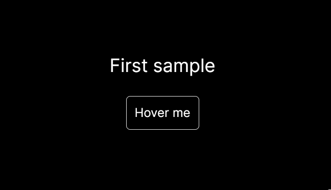
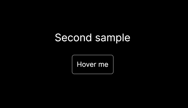
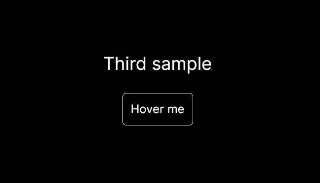
## 4. Visualisation
## 5. Usage
Integrate custom cursors into your project with ease. Here are examples for each cursor type, showcasing how to utilize various props for customization:
**CursorOne - Basic Circle**
```tsx
import { CursorOne } from "cursor-style";
function App() {
return (
<CursorOne size={30} delay={5} bgColor="red" useMixBlendDifference={true} />
);
}
```
**CursorTwo - Dot and Outline**
```tsx
import { CursorTwo } from "cursor-style";
function App() {
return (
<CursorTwo
size={40}
delay={5}
sizeDot={10}
sizeOutline={35}
bgColorDot="blue"
bgColorOutline="green"
/>
);
}
```
**CursorThree - Transparent with Border**
```tsx
import { CursorThree } from "cursor-style";
function App() {
return <CursorThree size={25} delay={2} />;
}
```
**CustomCursor - Flexible Type Selection**
```tsx
import { CustomCursor } from "cursor-style";
function App() {
return (
<CustomCursor
type="two"
size={40}
delay={5}
sizeDot={15}
sizeOutline={30}
bgColorDot="purple"
bgColorOutline="yellow"
/>
);
}
```
## 6. Customization
Each cursor component accepts specific props for customization:
- **size**: Adjusts the overall size of the cursor.
- **delay**: Alters the movement delay, creating a trailing effect.
- **bgColor**, **bgColorDot**, **bgColorOutline**: Customizes the color for different cursor elements.
- **sizeDot**, **sizeOutline**: Specifically for `CursorTwo`, these props adjust the sizes of the dot and outline elements.
## 7. Support
Encountered an issue or have a feature request? Reach out through my [Github account](https://github.com/nsl-nikos)