console-log-design-system
Version:
a console.log design system tool
370 lines (272 loc) • 18.8 kB
Markdown
# console.log design system
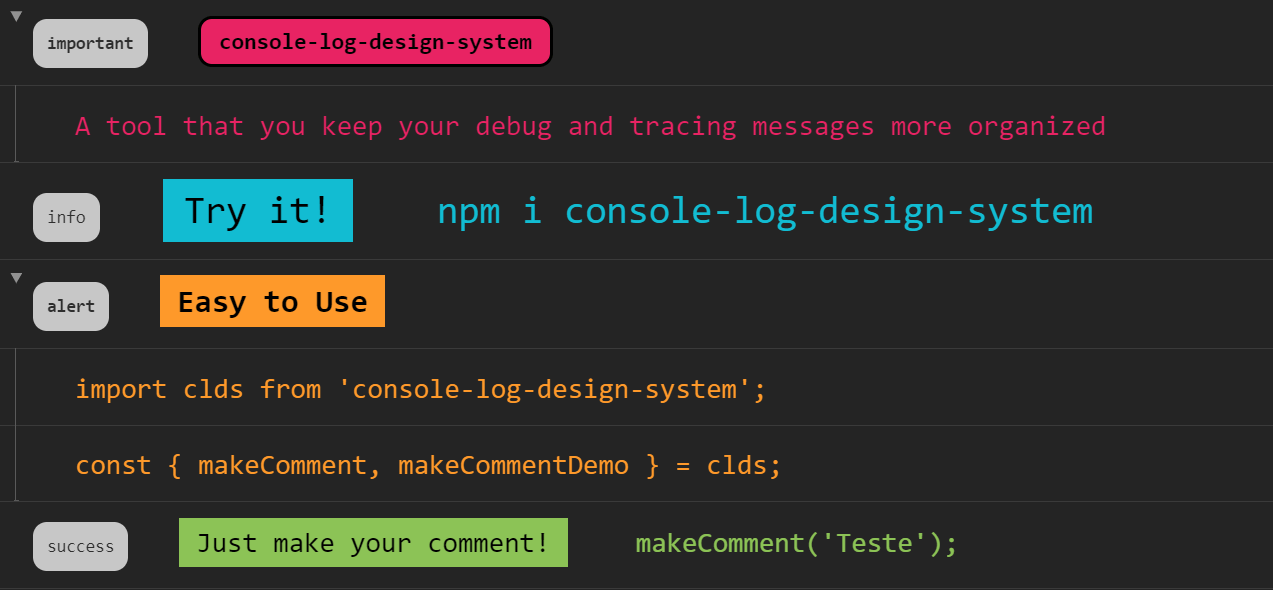
This package aims to make easier to create visual console messages (including groupCollapsed ones) as well as to create containers so messages will be more organized.
> This is the very first version of it. If you have any suggestions, feel free to get in touch!
This message was easily displayed by running `makeComment('makeComment()', ['Testando método makeComment()'], 'important', 'md', 'badgeInverted')`

* [Features](https://github.com/Marcelo-Diament/console-log-design-system#features)
+ [makeComment()](https://github.com/Marcelo-Diament/console-log-design-system#makecomment)
+ [makeCommentDemo()](https://github.com/Marcelo-Diament/console-log-design-system#makecommentdemo)
+ [Next Releases](https://github.com/Marcelo-Diament/console-log-design-system#next-releases)
* [Getting Started](https://github.com/Marcelo-Diament/console-log-design-system#getting-started)
+ [Dependencies](https://github.com/Marcelo-Diament/console-log-design-system#dependencies)
+ [Install Package](https://github.com/Marcelo-Diament/console-log-design-system#install-package)
+ [Import](https://github.com/Marcelo-Diament/console-log-design-system#import)
+ [Usage](https://github.com/Marcelo-Diament/console-log-design-system#usage)
* [Screenshots](https://github.com/Marcelo-Diament/console-log-design-system#screenshots)
* [More Details About makeComment()](https://github.com/Marcelo-Diament/console-log-design-system#more-details-about-makecomment)
* [Contact Me](https://github.com/Marcelo-Diament/console-log-design-system#contact-me)
___
## Features
### makeComment
Is the method responsable by printing the log message in the console. You can choose wether to display one or more `console.log()` messages or to print grouped `console.log()` message(s) within a `console.groupCollapsed()` group of messages.
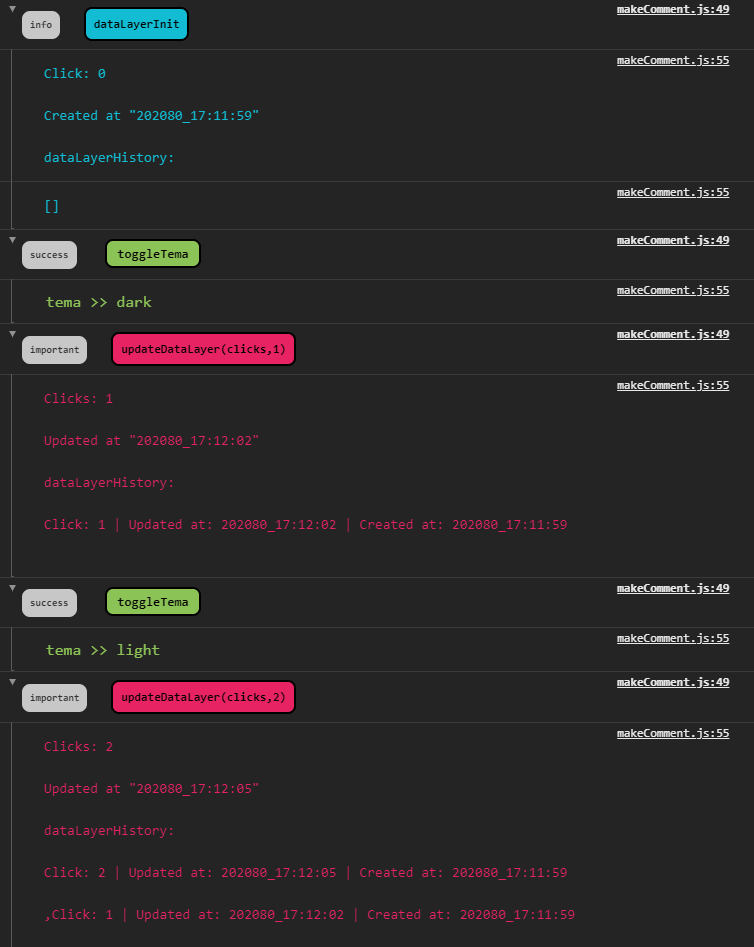
_This is an more complex possible application of the `makeComment()` method, in this example, to display datalayer pushed tags_
It is possible to define:
* **Title** (the message or message group title)
* **Comments** (the second part of the message or the inner messages)
* **Status** (like success, error, warning, info...),
* **Size** (for example large, small, extra extra small...)
* **Type** (main, secondary, badge or badgeInverted) of the message.
### makeCommentDemo
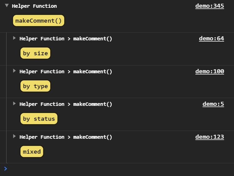
A visual guide made to help you when choosing which style is more appropriate to each message to be displayed.
### Next Releases
**Custom Style with consoleDefaultParams prop**
| It is in the roadmap to implement a feature that allows user to define its own color theme.
___
## Getting Started
### Dependencies
You must have node.js installed in you environment. You can ensure you have it installed by running `node -v` in the terminal of your preference.
### Install Package
You just need to run `npm i console-log-design-system` or you can directly download it from [npm oficial website](https://www.npmjs.com/package/console-log-design-system).
### Import
**How To Import Both makeComment() and makeCommentDemo()**
You can import the `makeComment()` and `makeCommentDemo()` methods simply by copying and pasting the following code snippet in yout component/module:
``` js
import clds from 'console-log-design-system';
const {
makeComment,
makeCommentDemo
} = clds;
```
You can also import it in a more manual manner, by importing in your vanilla JS script
``` js
import clds from './console-log-design-system/index';
const {
makeComment,
makeCommentDemo
} = clds;
```
...and then, calling your script as a module in you HTML file:
``` html
<script type="module" src="./main.js"></script>
```
**How To Import makeComment()**
You can import the `makeComment()` method simply by copying and pasting the following code snippet in yout component/module:
``` js
import clds from 'console-log-design-system';
const {
makeComment
} = clds;
```
You can also import it in a more manual manner, by importing in your vanilla JS script
``` js
import clds from './console-log-design-system/index';
const {
makeComment
} = clds;
```
...and then, calling your script as a module in you HTML file:
``` html
<script type="module" src="./main.js"></script>
```
**How To Import makeCommentDemo()**
You can import the `makeCommentDemo()` method simply by copying and pasting the following code snippet in yout component/module:
``` js
import clds from 'console-log-design-system';
const {
makeCommentDemo
} = clds;
```
You can also import it in a more manual manner, by importing in your vanilla JS script
``` js
import clds from './console-log-design-system/index';
const {
makeCommentDemo
} = clds;
```
...and then, calling your script as a module in you HTML file:
``` html
<script type="module" src="./main.js"></script>
```
### Usage
**How to use `makeComment()` ?**
You have to pass at leat a **title** as the first argument (that expect to receive a **string** typed argument).
``` js
makeComment('My Title');
```
In this case, message displayed will have the default status, a medium size and its type defined as main.
But you can pass more optional arguments, such as:
**comments**
An array with different comments. Each one of them will be displayed with `console.log` method
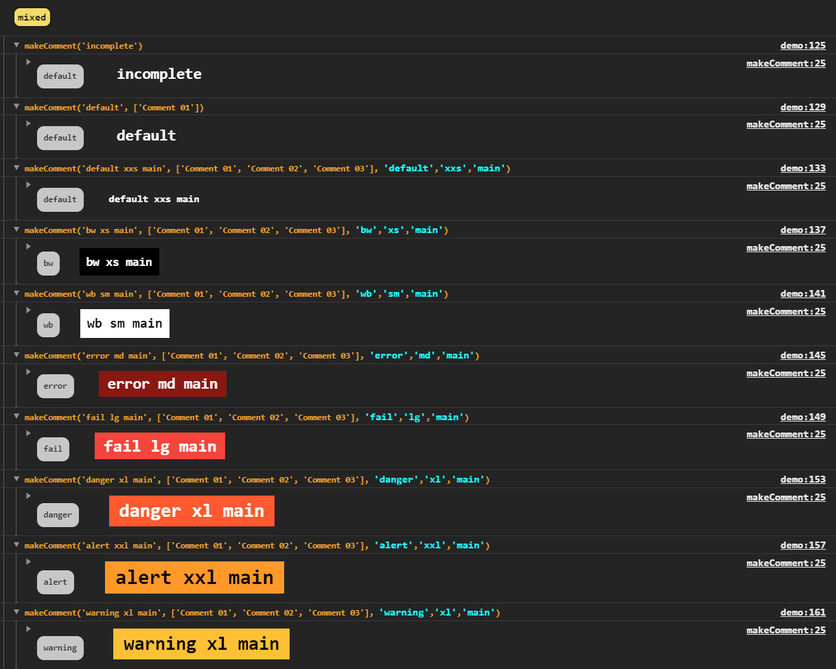
**status**
**`makeCommentDemo()` status options preview**
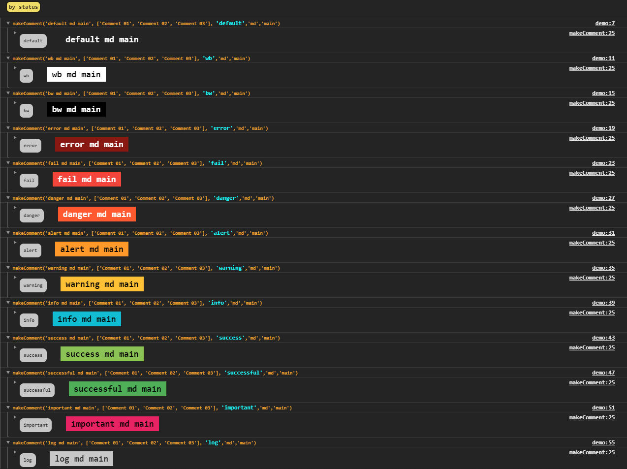
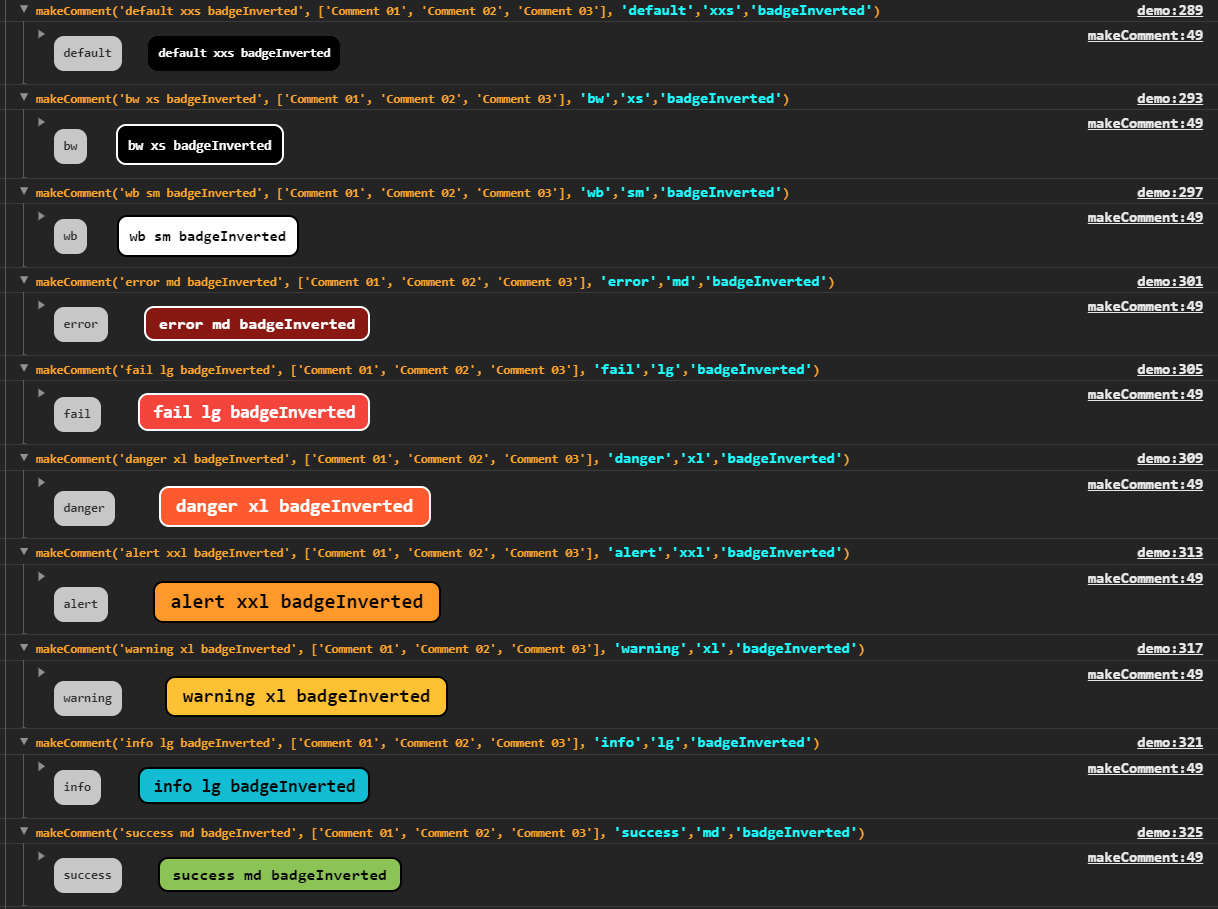
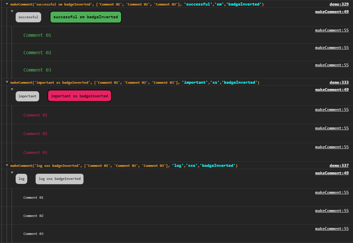
A string that represent the status of the message and define its colors. It is pobbible to choose between 'default', 'bw', 'wb', 'fail', 'danger', 'alert', 'warning', 'info', 'success', 'successful', 'important'
**size**
**`makeCommentDemo()` size options preview**
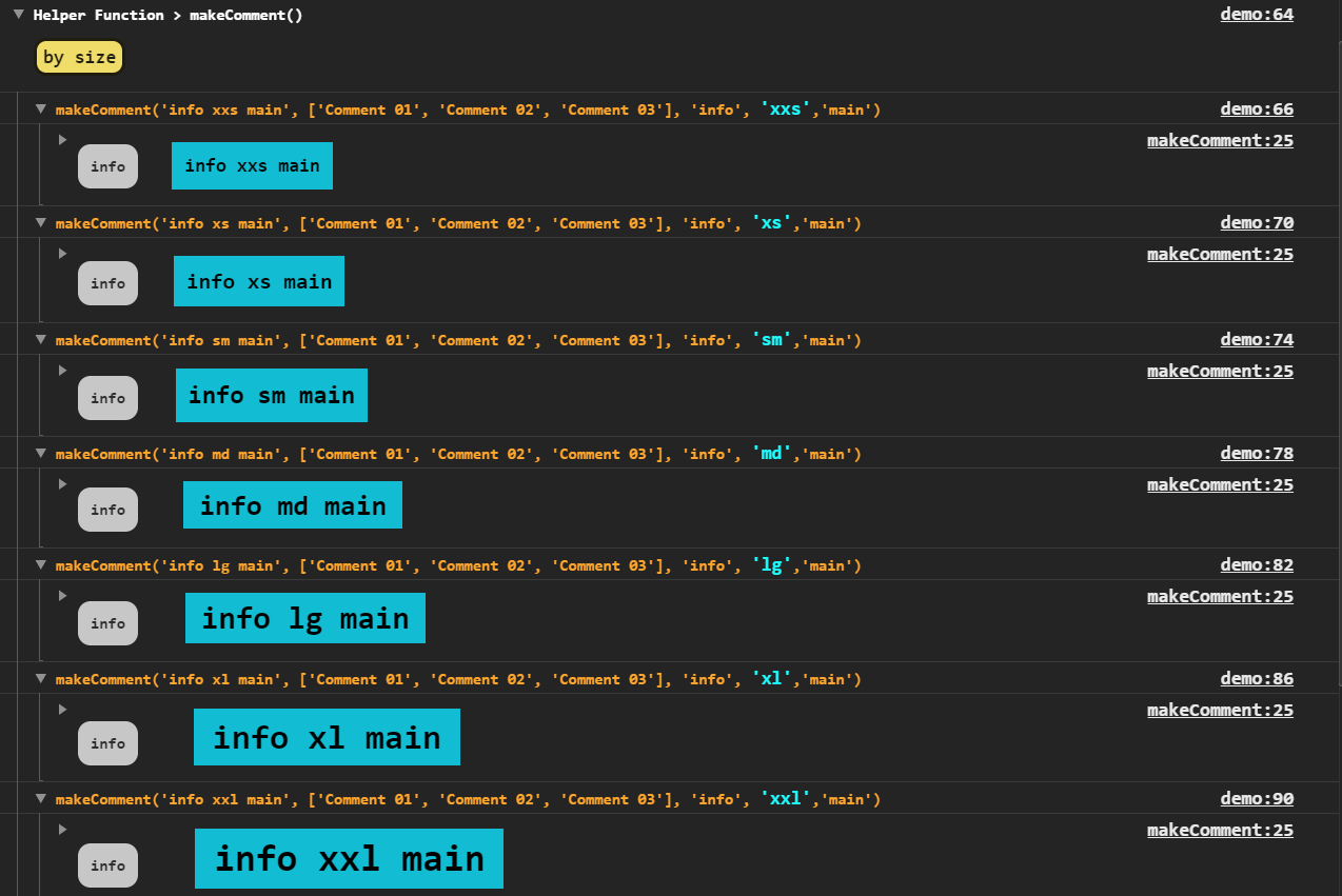
Defines sizes of the message. Possible values: 'xxs, 'xs', 'sm', 'md', 'lg', 'xl', 'xxl'
**type**
**`makeCommentDemo()` type options preview**
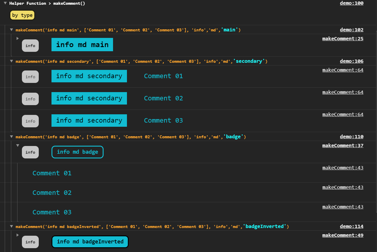
You can choose one of the following options: 'main', 'secondary', 'badge', 'badgeInverted'. The secondary type does not use `console.groupCollapsed` method, so title is joined with messages but it still have its own style.
**How to use `makeCommentDemo()` ?**
It doesn't require any params, you just need to import it and to call it passing the arguments you want to.

___
## Screenshots
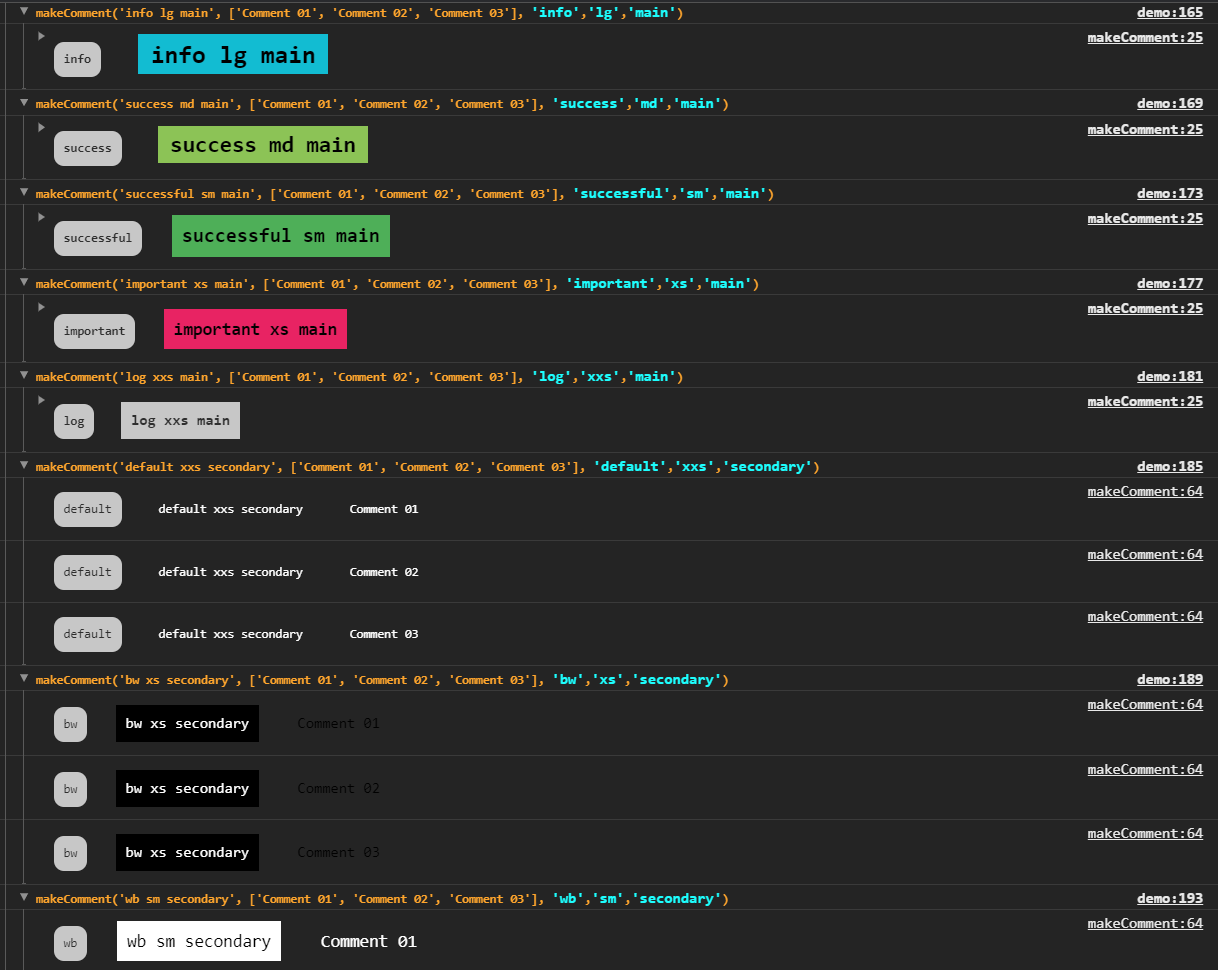
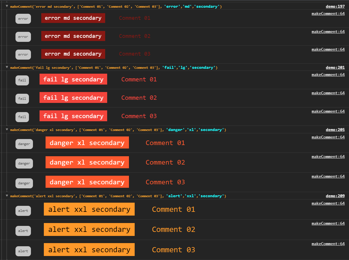
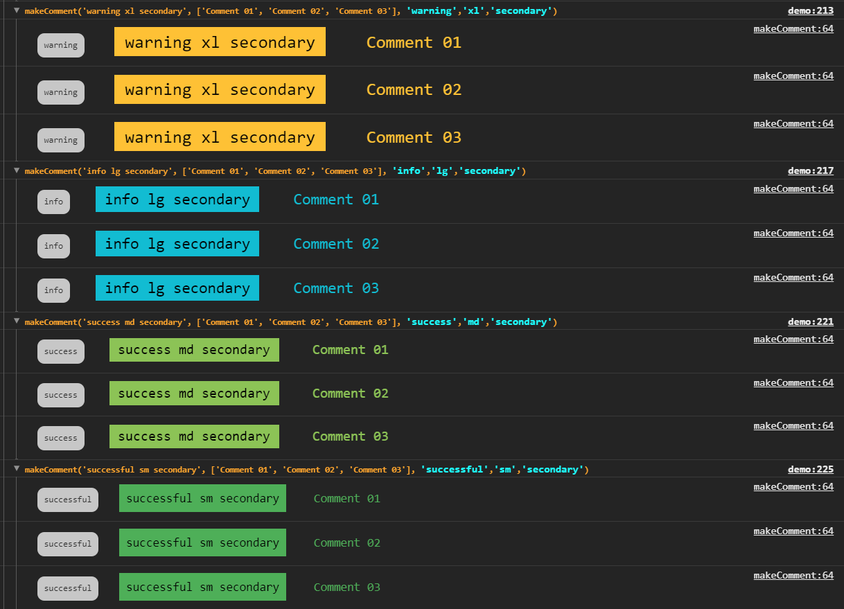
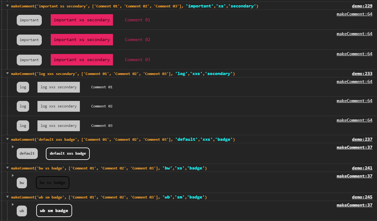
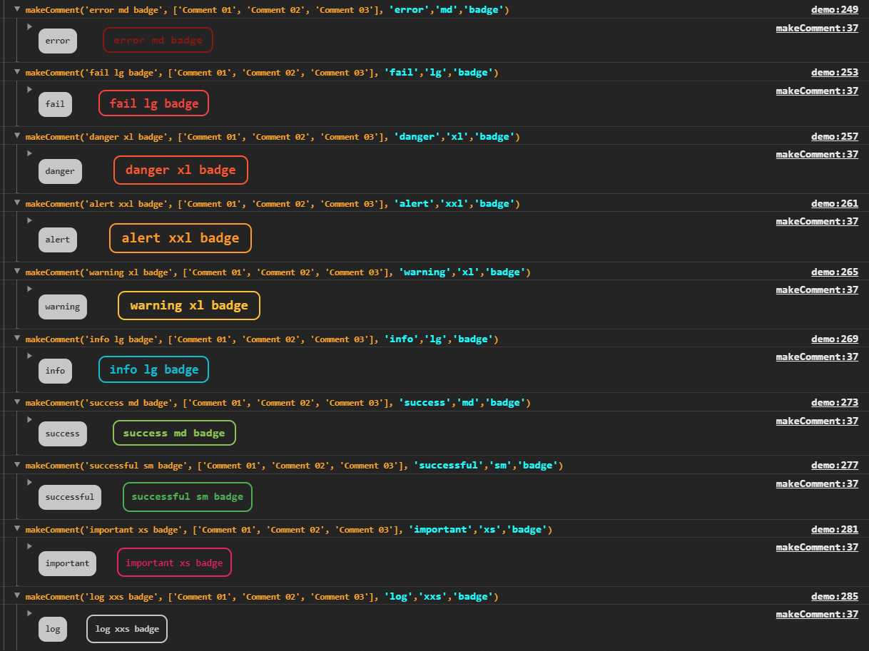
Some other screenshots to show how flexible can be the this package
___
## More Details About `makeComment()`
**`makeComment()`**
``` js
/**
* @function makeComment
* Returns a comment to console with a custom style according to the passed arguments
*
* @param {String} title - the title of the comment (set as groupCollapsed as default)
* @param {Array|undefined} [comments=[]] - array with each comment to be consoled as a string element
* @param {String='default','bw','wb','fail','danger','alert','warning','info','success','successful','important'} [status='default'] - status to be used to define its style (default|bw|wb|fail|danger|alert|warning|info|success|successful|important)
* @param {String='xxs,'xs','sm','md','lg','xl','xxl'} [size='md'] - defines font properties (xxs|xs|sm|md|lg|xl|xxl)
* @param {String='main','secondary','badge','badgeInverted'} [type='main'] - defines wich style to be applied (main|secondary|badge|badgeInverted)
*
* @requires consoleDefaultParams - that maps its styles template properties
*/
```
**`consoleDefaultParams`**
``` js
/**
* @const consoleDefaultParams
* Detains all default template console style
* @namespace
* @property {object} size - defines font-size, line-height as well as padding and margin according to its arguments passed (size and 'scenery')
* @property {object} size.xxs - defines extra small properties
* @property {object} size.xxs.main - defines main type (style) extra extra small properties
* @property {object} size.xxs.secondary - defines secondary type (style) extra extra small properties
* @property {object} size.xxs.badge - defines badge type (style) extra extra small properties
* @property {object} size.xxs.badgeInverted - defines badgeInverted type (style) extra extra small properties
* @property {object} size.xs - defines extra small properties
* @property {object} size.xs.main - defines main type (style) extra small properties
* @property {object} size.xs.secondary - defines secondary type (style) extra small properties
* @property {object} size.xs.badge - defines badge type (style) extra small properties
* @property {object} size.xs.badgeInverted - defines badgeInverted type (style) extra small properties
* @property {object} size.sm - defines small properties
* @property {object} size.sm.main - defines main type (style) small properties
* @property {object} size.sm.secondary - defines secondary type (style) small properties
* @property {object} size.sm.badge - defines badge type (style) small properties
* @property {object} size.sm.badgeInverted - defines badgeInverted type (style) small properties
* @property {object} size.md - defines medium properties (default)
* @property {object} size.md.main - defines main type (style) medium properties (default)
* @property {object} size.md.secondary - defines secondary type (style) medium properties (default)
* @property {object} size.md.badge - defines badge type (style) medium properties (default)
* @property {object} size.md.badgeInverted - defines badgeInverted type (style) medium properties (default)
* @property {object} size.lg - defines large properties
* @property {object} size.lg.main - defines main type (style) large properties
* @property {object} size.lg.secondary - defines secondary type (style) large properties
* @property {object} size.lg.badge - defines badge type (style) large properties
* @property {object} size.lg.badgeInverted - defines badgeInverted type (style) large properties
* @property {object} size.xl - defines extra large properties
* @property {object} size.xl.main - defines main type (style) extra large properties
* @property {object} size.xl.secondary - defines secondary type (style) extra large properties
* @property {object} size.xl.badge - defines badge type (style) extra large properties
* @property {object} size.xl.badgeInverted - defines badgeInverted type (style) extra large properties
* @property {object} size.xxl - defines extra extra large properties
* @property {object} size.xxl.main - defines main type (style) extra extra large properties
* @property {object} size.xxl.secondary - defines secondary type (style) extra extra large properties
* @property {object} size.xxl.badge - defines badge type (style) extra extra large properties
* @property {object} size.xxl.badgeInverted - defines badgeInverted type (style) extra extra large properties
* @property {object} color - defines color, background-color as well as border style, according to its arguments ('status' and 'scenery')
* @property {object} color.default - defines extra small properties
* @property {object} color.default.main - defines main type (style) default color properties
* @property {object} color.default.secondary - defines secondary type (style) default color properties
* @property {object} color.default.badge - defines badge type (style) default color properties
* @property {object} color.default.badgeInverted - defines badgeInverted type (style) default color properties
* @property {object} color.bw - defines extra small properties
* @property {object} color.bw.main - defines main type (style) bw color properties
* @property {object} color.bw.secondary - defines secondary type (style) bw color properties
* @property {object} color.bw.badge - defines badge type (style) bw color properties
* @property {object} color.bw.badgeInverted - defines badgeInverted type (style) bw color properties
* @property {object} color.wb - defines extra small properties
* @property {object} color.wb.main - defines main type (style) wb color properties
* @property {object} color.wb.secondary - defines secondary type (style) wb color properties
* @property {object} color.wb.badge - defines badge type (style) wb color properties
* @property {object} color.wb.badgeInverted - defines badgeInverted type (style) wb color properties
* @property {object} color.error - defines extra small properties
* @property {object} color.error.main - defines main type (style) error color properties
* @property {object} color.error.secondary - defines secondary type (style) error color properties
* @property {object} color.error.badge - defines badge type (style) error color properties
* @property {object} color.error.badgeInverted - defines badgeInverted type (style) error color properties
* @property {object} color.fail - defines extra small properties
* @property {object} color.fail.main - defines main type (style) fail color properties
* @property {object} color.fail.secondary - defines secondary type (style) fail color properties
* @property {object} color.fail.badge - defines badge type (style) fail color properties
* @property {object} color.fail.badgeInverted - defines badgeInverted type (style) fail color properties
* @property {object} color.danger - defines extra small properties
* @property {object} color.danger.main - defines main type (style) danger color properties
* @property {object} color.danger.secondary - defines secondary type (style) danger color properties
* @property {object} color.danger.badge - defines badge type (style) danger color properties
* @property {object} color.danger.badgeInverted - defines badgeInverted type (style) danger color properties
* @property {object} color.alert - defines extra small properties
* @property {object} color.alert.main - defines main type (style) alert color properties
* @property {object} color.alert.secondary - defines secondary type (style) alert color properties
* @property {object} color.alert.badge - defines badge type (style) alert color properties
* @property {object} color.alert.badgeInverted - defines badgeInverted type (style) alert color properties
* @property {object} color.warning - defines extra small properties
* @property {object} color.warning.main - defines main type (style) warning color properties
* @property {object} color.warning.secondary - defines secondary type (style) warning color properties
* @property {object} color.warning.badge - defines badge type (style) warning color properties
* @property {object} color.warning.badgeInverted - defines badgeInverted type (style) warning color properties
* @property {object} color.info - defines extra small properties
* @property {object} color.info.main - defines main type (style) info color properties
* @property {object} color.info.secondary - defines secondary type (style) info color properties
* @property {object} color.info.badge - defines badge type (style) info color properties
* @property {object} color.info.badgeInverted - defines badgeInverted type (style) info color properties
* @property {object} color.success - defines extra small properties
* @property {object} color.success.main - defines main type (style) success color properties
* @property {object} color.success.secondary - defines secondary type (style) success color properties
* @property {object} color.success.badge - defines badge type (style) success color properties
* @property {object} color.success.badgeInverted - defines badgeInverted type (style) success color properties
* @property {object} color.sucessful - defines extra small properties
* @property {object} color.sucessful.main - defines main type (style) sucessful color properties
* @property {object} color.sucessful.secondary - defines secondary type (style) sucessful color properties
* @property {object} color.sucessful.badge - defines badge type (style) sucessful color properties
* @property {object} color.sucessful.badgeInverted - defines badgeInverted type (style) sucessful color properties
* @property {object} color.important - defines extra small properties
* @property {object} color.important.main - defines main type (style) important color properties
* @property {object} color.important.secondary - defines secondary type (style) important color properties
* @property {object} color.important.badge - defines badge type (style) important color properties
* @property {object} color.important.badgeInverted - defines badgeInverted type (style) important color properties
* @property {object} color.log - defines extra small properties
* @property {object} color.log.main - defines main type (style) log color properties
* @property {object} color.log.secondary - defines secondary type (style) log color properties
* @property {object} color.log.badge - defines badge type (style) log color properties
* @property {object} color.log.badgeInverted - defines badgeInverted type (style) log color properties
*/
```
___
## Contact Me
**Marcelo Diament** | Front End Developer and Instructor
[Github][Github] | [LinkedIn][LinkedIn]
[//]: #
[Github]: <https://github.com/Marcelo-Diament>
[LinkedIn]: <https://linkedin.com/in/marcelodiament>