console-gui-tools
Version:
A simple library to draw option menu, text popup or other widgets and layout on a Node.js console.
548 lines • 18.2 kB
TypeScript
import { BackgroundColorName, ForegroundColorName } from "chalk";
import { HEX, RGB } from "../Utils.js";
import Control from "./Control.js";
/** @const {Object} drawingChars - The characters used to draw the progress bar. */
declare const drawingChars: {
precision: {
horizontal: {
[key: number]: {
char: string;
color: ForegroundColorName | HEX | RGB | undefined;
};
};
vertical: {
[key: number]: {
char: string;
color: ForegroundColorName | HEX | RGB | undefined;
};
};
block: {
full: {
char: string;
color: undefined;
};
half: {
char: string;
color: undefined;
};
empty: {
char: string;
color: undefined;
};
boxDrawing: {
topLeft: string;
topRight: string;
bottomLeft: string;
bottomRight: string;
horizontal: string;
vertical: string;
cross: string;
left: string;
right: string;
top: string;
bottom: string;
start: string;
end: string;
color: "" | `#${string}` | RGB | keyof import("chalk/source/vendor/ansi-styles/index.js").ForegroundColor;
};
labelStyle: undefined;
valueStyle: undefined;
};
};
"htop-light": {
horizontal: {
[key: number]: {
char: string;
color: ForegroundColorName | HEX | RGB | undefined;
};
};
vertical: {
[key: number]: {
char: string;
color: ForegroundColorName | HEX | RGB | undefined;
};
};
block: {
full: {
char: string;
color: undefined;
};
half: {
char: string;
color: undefined;
};
empty: {
char: string;
color: undefined;
};
boxDrawing: {
topLeft: string;
topRight: string;
bottomLeft: string;
bottomRight: string;
horizontal: string;
vertical: string;
cross: string;
left: string;
right: string;
top: string;
bottom: string;
start: string;
end: string;
color: "" | `#${string}` | RGB | keyof import("chalk/source/vendor/ansi-styles/index.js").ForegroundColor;
};
labelStyle: {
color: string;
bold: boolean;
};
valueStyle: {
color: string;
dim: boolean;
};
};
};
"htop-heavy": {
horizontal: {
[key: number]: {
char: string;
color: ForegroundColorName | HEX | RGB | undefined;
};
};
vertical: {
[key: number]: {
char: string;
color: ForegroundColorName | HEX | RGB | undefined;
};
};
block: {
full: {
char: string;
color: undefined;
};
half: {
char: string;
color: undefined;
};
empty: {
char: string;
color: undefined;
};
boxDrawing: {
topLeft: string;
topRight: string;
bottomLeft: string;
bottomRight: string;
horizontal: string;
vertical: string;
cross: string;
left: string;
right: string;
top: string;
bottom: string;
start: string;
end: string;
color: "" | `#${string}` | RGB | keyof import("chalk/source/vendor/ansi-styles/index.js").ForegroundColor;
};
labelStyle: {
color: string;
bold: boolean;
};
valueStyle: {
color: string;
dim: boolean;
};
};
};
htop: {
horizontal: {
[key: number]: {
char: string;
color: ForegroundColorName | HEX | RGB | undefined;
};
};
vertical: {
[key: number]: {
char: string;
color: ForegroundColorName | HEX | RGB | undefined;
};
};
block: {
full: {
char: string;
color: undefined;
};
half: {
char: string;
color: undefined;
};
empty: {
char: string;
color: undefined;
};
boxDrawing: {
topLeft: string;
topRight: string;
bottomLeft: string;
bottomRight: string;
horizontal: string;
vertical: string;
cross: string;
left: string;
right: string;
top: string;
bottom: string;
start: string;
end: string;
color: "" | `#${string}` | RGB | keyof import("chalk/source/vendor/ansi-styles/index.js").ForegroundColor;
};
labelStyle: {
color: string;
bold: boolean;
};
valueStyle: {
color: string;
dim: boolean;
};
};
};
};
/**
* @description The configuration object for the progress class
*
* @property {string} id The id of the progress (required)
* @property {number} length The length of the progress bar (required)
* @property {number} thickness The thickness of the progress bar (required)
* @property {number} x The x position of the progress bar (required)
* @property {number} y The y position of the progress bar (required)
* @property {number} [value] The value of the progress bar (optional)
* @property {number} [min] The minimum value of the progress bar (optional)
* @property {number} [max] The maximum value of the progress bar (optional)
* @property {string} [unit] The unit of the progress bar (optional)
* @property {number} [increment] The increment of the progress bar (optional)
* @property {string} [label] The label of the progress bar (optional)
* @property {ProgressStyle} [style] The style of the progress bar (optional)
* @property {Orientation} orientation The orientation of the progress bar (required)
* @property {boolean} [interactive] Whether the progress bar is interactive (optional)
* @property {boolean} [visible] Whether the progress bar is visible (optional)
* @property {boolean} [enabled] Whether the progress bar is enabled (optional)
* @property {boolean} [draggable] Whether the progress bar is draggable (optional)
*
* @export
* @interface ProgressConfig
*/
export interface ProgressConfig {
id: string;
length: number;
thickness: number;
x: number;
y: number;
increment?: number;
value?: number;
min?: number;
max?: number;
unit?: string;
label?: string;
style?: ProgressStyle;
orientation?: Orientation;
interactive?: boolean;
visible?: boolean;
enabled?: boolean;
draggable?: boolean;
onValueChanged?: (value: number) => void;
}
export type Orientation = "horizontal" | "vertical";
/**
* @description Defines the styles and settings for the progress bar
*
* @param {BackgroundColorName | HEX | RGB} background The background color of the progress bar
* @param {ForegroundColorName | HEX | RGB} borderColor The color of the border
* @param {ForegroundColorName | HEX | RGB} [textColor] The color of the text
* @param {ForegroundColorName | HEX | RGB} color The color of the progress bar
* @param {"precision" | "htop" | "htop-light" | "htop-heavy"} [theme] The theme to use for the progress bar ["precision", "htop", "htop-light", "htop-heavy"]
* @param {boolean} [boxed] Whether or not to draw a box around the progress bar
* @param {boolean} [showPercentage] Whether or not to show the percentage
* @param {boolean} [showValue] Whether or not to show the value
* @param {boolean} [showMinMax] Whether or not to show the min and max values
* @param {boolean} [showTitle] Whether or not to show the title
* @param {boolean} [bold] Whether or not to bold the text
* @param {boolean} [italic] Whether or not to italicize the text
* @param {boolean} [dim] Whether or not to dim the text
* @param {boolean} [underline] Whether or not to underline the text
* @param {boolean} [inverse] Whether or not to inverse the text
* @param {boolean} [hidden] Whether or not to hide the text
* @param {boolean} [strikethrough] Whether or not to strikethrough the text
* @param {boolean} [overline] Whether or not to overline the text
*
* @export
* @interface ProgressStyle
*/
export interface ProgressStyle {
background: BackgroundColorName | HEX | RGB;
borderColor: ForegroundColorName | HEX | RGB;
textColor?: ForegroundColorName | HEX | RGB;
color: ForegroundColorName | HEX | RGB;
theme?: keyof typeof drawingChars;
boxed?: boolean;
showPercentage?: boolean;
showValue?: boolean;
showMinMax?: boolean;
showTitle?: boolean;
bold?: boolean;
italic?: boolean;
dim?: boolean;
underline?: boolean;
inverse?: boolean;
hidden?: boolean;
strikethrough?: boolean;
overline?: boolean;
}
/**
* @class Progress
* @extends Control
* @description This class is an overload of Control that is used to create a Progress bar.
*
* 
*
* Emits the following events:
* - "valueChanged" when the user changes the value of the progress bar with the scroll wheel (if interactive is true).
* - "click" when the user clicks on the progress bar (if interactive is true).
* - "relese" when the user releases the mouse button on the progress bar (if interactive is true).
* - "rightClick" when the user clicks on the progress bar with right button (if interactive is true).
* - "rightRelese" when the user releases the right mouse button on the progress bar (if interactive is true).
*
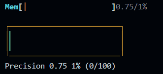
* ### Example of interactive progress bar
* 
*
* @param {ProgressConfig} config The configuration object for the progress bar
*
* @example ```js
* const pStyle = {
* boxed: true,
* showTitle: true,
* showValue: true,
* showPercentage: true,
* showMinMax: false,
* }
* const p = new Progress({
* id: "prog1",
* x: 10, y: 2,
* style: pStyle,
* theme: "htop",
* length: 25,
* label: "Mem"
* })
* const incr = setInterval(() => {
* const value = p.getValue() + 0.25
* p.setValue(value)
* if (value >= p.getMax()) {
* clearInterval(incr)
* }
* }, 100)
*
* const p1Style = {
* background: "bgBlack",
* borderColor: "yellow",
* color: "green",
* boxed: true,
* showTitle: true,
* showValue: true,
* showPercentage: true,
* showMinMax: true,
* }
* const p1 = new Progress({
* id: "prog1",
* x: 10, y: 4,
* style: pStyle,
* theme: "precision",
* length: 25,
* label: "Precision"
* })
* const incr1 = setInterval(() => {
* const value = p1.getValue() + 0.25
* p1.setValue(value)
* if (value >= p1.getMax()) {
* clearInterval(incr1)
* }
* }, 100)
* const p2Style = {
* background: "bgBlack",
* borderColor: "yellow",
* color: "magenta",
* boxed: true,
* showTitle: true,
* showValue: true,
* showPercentage: true,
* showMinMax: true,
* }
* const p2 = new Progress({
* id: "prog3",
* x: 10, y: 6,
* style: pStyle,
* theme: "precision",
* length: 25,
* label: "Interactive",
* direction: "vertical",
* interactive: true,
* })
* p2.on("valueChanged", (value) => {
* console.log(`Value changed: ${value}`)
* })
* ```
*/
export declare class Progress extends Control {
private value;
private max;
private min;
private unit;
private length;
private thickness;
private orientation;
private increment;
private interactive;
private label;
private enabled;
theme: keyof typeof drawingChars;
private style;
private status;
private onValueChanged;
constructor(config: ProgressConfig);
/**
* @description This method is used to render the Progress. It only returns the styled element of the Progress Bar and not the container.
* The progress bar is calculated based on the value, min and max.
* It's drawn using the drawingChars property. It uses the full block character and in the last block it uses one of the fractions of the block.
* for example: ████████▌ (the last block is half full).
* Every block can have 8 different states: 100%, 90%, 75%, 60%, 50%, 40%, 25% and 10%.
* So the whole bar should be divided by the the number of blocks multiplied by 8.
* @returns {SimplifiedStyledElement[][]} The styled element array of the Progress Bar.
*
* @example ```js
* const p = this.getProgress() // returns the styled element array of the Progress Bar.
* // p = [ {text: "▓▓▓▓▓▓▓▓▓▓", style: {background: "bgBlack", color: "white", bold: true}} ]
* ```
* @memberof Progress
*/
private getProgress;
/**
* @description This method is used to render the Progress. It returns the styled element of the Progress Bar and the container.
*
* @returns {Progress}
* @memberof Progress
*/
update: () => Progress;
/**
* @description Get the maximum value of the progress bar
*
* @returns {number} The maximum value of the progress bar
* @memberof ProgressBar
*/
getMax: () => number;
/**
* @description Get the minimum value of the progress bar
*
* @returns {number} The minimum value of the progress bar
* @memberof Progress
*/
getMin: () => number;
/**
* @description Get the value of the progress bar
*
* @returns {number} The value of the progress bar
* @memberof Progress
*/
getValue: () => number;
/**
* @description Get the length of the progress bar
*
* @returns {number} The length of the progress bar
* @memberof Progress
*/
getLength: () => number;
/**
* @description Get the progress bar thickness
*
* @returns {number} The progress bar thickness
* @memberof Progress
*/
getThickness: () => number;
/**
* @description Get the increment value
*
* @returns {number} The increment value
* @memberof Progress
*/
getIncrement: () => number;
/**
* @description Sets the increment value
*
* @param {number} value The increment value
* @returns {Progress} The progress bar instance
* @memberof Progress
*/
setIncrement: (value: number) => this;
/**
* @description Sets the value of the progress bar
*
* @param {number} length The length of the progress bar
* @returns {Progress} The progress bar instance
* @memberof Progress
*/
setLength: (length: number) => this;
/**
* @description Sets the thickness of the progress bar
*
* @param {number} thickness The thickness of the progress bar
* @returns {Progress} The progress bar instance
* @memberof Progress
*/
setThickness: (thickness: number) => this;
/**
* @description Sets the value of the progress bar
*
* @param {number} value The value of the progress bar
* @returns {Progress} The progress bar instance
* @memberof Progress
*/
setValue: (value: number) => this;
/**
* @description Sets the maximum value of the progress bar
*
* @param {number} max The maximum value of the progress bar
* @returns {Progress} The progress bar instance
* @memberof Progress
*/
setMax: (max: number) => this;
/**
* @description Set the minimum value of the progress bar
*
* @param {number} min The minimum value of the progress bar
* @returns {Progress} The progress bar instance
* @memberof Progress
*/
setMin: (min: number) => this;
/**
* @description Sets the progress bar label and updates the progress bar
*
* @param {string} label The text of the progress bar
* @returns {Progress} The progress bar instance
* @memberof Progress
*/
setLabel: (label: string) => this;
/**
* @description Sets the style of the progress bar and updates it
*
* @param {ProgressStyle} style The style of the progress bar
* @returns {Progress} The progress bar instance
* @memberof Progress
*/
setStyle: (style: ProgressStyle) => this;
/**
* @description Sets the enabled state of the progress bar (if interactive)
*
* @param {boolean} enabled The enabled state of the progress bar
* @returns {Progress} The progress bar instance
* @memberof Progress
*/
setEnabled: (enabled: boolean) => this;
}
export default Progress;
//# sourceMappingURL=ProgressBar.d.ts.map