console-gui-tools
Version:
A simple library to draw option menu, text popup or other widgets and layout on a Node.js console.
157 lines • 5.54 kB
TypeScript
import { BackgroundColorName, ForegroundColorName } from "chalk/source/vendor/ansi-styles/index.js";
import { HEX, RGB } from "../Utils.js";
import Control from "./Control.js";
/**
* @description The configuration object for the Button class
*
* @property {string} id The id of the button (required)
* @property {string} text The text of the button (if not specified, it will be "TEXT")
* @property {number} width The width of the button (if not specified, it will be the length of the text + 4)
* @property {number} height The height of the button (if not specified, it will be 3)
* @property {number} x The x position of the button (required)
* @property {number} y The y position of the button (required)
* @property {ButtonStyle} style The style of the button (if not specified, it will be { background: "bgBlack", borderColor: "white", color: "white", bold: true })
* @property {ButtonKey} key The key to press to trigger the button
* @property {function} onClick The function to call when the button is clicked
* @property {function} onRelease The function to call when the button is released
* @property {boolean} visible If the button is visible or not (default: true)
* @property {boolean} enabled If the button is enabled or not (default: true)
* @property {boolean} draggable If the button is draggable or not (default: false)
*
* @export
* @interface ButtonConfig
*/
export interface ButtonConfig {
id: string;
text: string;
width?: number;
height?: number;
x: number;
y: number;
style?: ButtonStyle;
key?: ButtonKey;
onClick?: () => void;
onRelease?: () => void;
visible?: boolean;
enabled?: boolean;
draggable?: boolean;
}
/**
* The configuration object for the ButtonKey class
* @export ButtonKey
* @interface ButtonKey
* @property {string} name The name of the key (required)
* @property {boolean} ctrl If the key is pressed with the ctrl key (default: false)
* @property {boolean} shift If the key is pressed with the shift key (default: false)
*/
export interface ButtonKey {
name: string;
ctrl?: boolean;
shift?: boolean;
meta?: boolean;
}
/**
* @description The configuration object for the ButtonStyle class
*
* @property {BackgroundColorName | HEX | RGB | ""} background The background color of the button (if not specified, it will be "bgBlack")
* @property {ForegroundColorName | HEX | RGB | ""} borderColor The border color of the button (if not specified, it will be "white")
* @property {ForegroundColorName | HEX | RGB | ""} color The text color of the button (if not specified, it will be "white")
* @property {boolean} bold If the text is bold or not (default: true)
* @property {boolean} italic If the text is italic or not (default: false)
* @property {boolean} dim If the text is dim or not (default: false)
* @property {boolean} underline If the text is underlined or not (default: false)
* @property {boolean} inverse If the text is inverted or not (default: false)
* @property {boolean} hidden If the text is hidden or not (default: false)
* @property {boolean} strikethrough If the text is strikethrough or not (default: false)
* @property {boolean} overline If the text is overlined or not (default: false)
*
* @export
* @interface ButtonStyle
*/
export interface ButtonStyle {
background?: BackgroundColorName | HEX | RGB | "";
borderColor?: ForegroundColorName | HEX | RGB | "";
color?: ForegroundColorName | HEX | RGB | "";
bold?: boolean;
italic?: boolean;
dim?: boolean;
underline?: boolean;
inverse?: boolean;
hidden?: boolean;
strikethrough?: boolean;
overline?: boolean;
}
/**
* @class Button
* @extends Control
* @description This class is an overload of Control that is used to create a button.
*
* 
*
* Emits the following events:
* - "click" when the user confirm
* - "relese" when the user cancel
* @param {ButtonConfig} config The configuration object
*
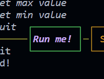
* @example ```js
* new Button({
id: "btnRun",
text: "Run me!",
x: 21,
y: 18,
style: {
color: "magentaBright",
bold: true,
italic: true,
borderColor: "green"
},
onRelease: () => {
GUI.log("Button clicked!")
},
draggable: true,
})
* ```
*/
export declare class Button extends Control {
private text;
private enabled;
private style;
onClick: () => void;
onRelease: () => void;
private status;
private key;
constructor(config: ButtonConfig);
/**
* @description Used to draw the button to the content of the control.
*
* @returns {Button}
* @memberof Button
*/
update: () => this;
/**
* @description Used to set the text of the button.
*
* @param {string} text
* @returns {Button}
* @memberof Button
*/
setText: (text: string) => this;
/**
* @description Used to set the style of the button.
*
* @param {ButtonStyle} style
* @returns {Button}
* @memberof Button
*/
setStyle: (style: ButtonStyle) => this;
/**
* @description Used to set the enabled state of the button.
*
* @param {boolean} enabled
* @returns {Button}
* @memberof Button
*/
setEnabled: (enabled: boolean) => this;
}
export default Button;
//# sourceMappingURL=Button.d.ts.map