bootstrap-vue-treeview
Version:
A tree view component for Bootstrap 4 and Vue.js 2.x.
100 lines (79 loc) • 4.42 kB
Markdown
> A treeview component for [Bootstrap](https://getbootstrap.com/) and [Vue.js 2.0+](https://vuejs.org/)
## Online demo
[https://bootstrap-vue-treeview.appdiamond.pl](https://bootstrap-vue-treeview.appdiamond.pl)
## Features
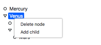
- Drag & drop nodes
- Context menu
## Installation
```bash
npm install --save bootstrap-vue-treeview
```
## Getting started
### Webpack
If you use Webpack bundler (recommended) you can import component and register it locally:
```javascript
import { bTreeView } from 'bootstrap-vue-treeview'
[...]
components: {
bTreeView
},
```
or globally using plugin:
```javascript
import BootstrapVueTreeview from 'bootstrap-vue-treeview'
Vue.use(BootstrapVueTreeview)
```
Now you can you the treeview component in your code:
```html
<b-tree-view :data="treeData"></b-tree-view>
```
```javascript
export default {
data() {
return {
treeData: [{"id": 2, "name": "Venus" , "children": [{"id": 3, "name": "Neptune"}, {"id": 4, "name": "Stratus"} ] } ]
}
}
}
```
## API
### TreeView
#### 1. Vue props
| Prop | Type | Description | Default value | Required |
| :--------------- |:--------------|:-----------------------|:--------------|:------|
| data | Array | Tree data | - | Yes |
| nodeKeyProp | String | Name of the property containing unique node key | "id" | No |
| nodeChildrenProp | String | Where to look for node children | "children" | No
| nodeLabelProp | String | Name of the property containing node label | "name" | No
| showIcons | Boolean | Show/hide icons | false | No
| showIcons | Boolean | Show/hide icons | false | No
| iconClassProp | String | Name of the property containing icon class | "icon" | No
| defaultIconClass | String | Icon class to apply if node has no icon class property | null | No
| prependIconClass | String | Class to apply to every icon (common to all icons) | null | No
| nodesDraggable | Boolean | Enable/disable drag & drop feature | false | No
| contextMenu | Boolean | Enable/disable context menu | true | No
| renameNodeOnDblClick | Boolean | Enable/disable double click to rename feature | true | No
| contextMenuItems | Array of menu items | Context menu items | [ { code: 'DELETE_NODE', label: 'Delete node' }, { code: 'RENAME_NODE', label: 'Rename node' } ] | No
#### 2. Events
| Event name | Description | Parameters |
|-----------------------|-----------------------------------------------------------------------------------------------------------------------------|-------------------------------------------|
| nodeSelect | Triggered every time a node is selected/deselected. Check second parameter to verify if the node was selected or deselected | TreeNode object, isSelected |
| contextMenuItemSelect | Triggered every time a context menu item was clicked. | Context menu item object (see below), TreeNode object |
| | | |
### TreeNode
Props and events of the tree node component are not intended to be used directly.
#### 1. Methods
| Method name | Description | Parameters |
|-------------|-------------------------------|------------|
| select | Select node | - |
| deselect | Deselect node | - |
| expand | Expand node (show children) | - |
| collapse | Collapse node (hide children) | - |
| toggle | Expand/collapse | - |
### Menu item
#### 1. Properties
| Property | Description |
|----------|------------------------------------|
| code | Code of the menu item. Check this code to know which menu item was clicked. |
| label | Label being displayed for the user |