aui-select-box
Version:
``` npm i aui-select-box ```
48 lines (34 loc) • 1.67 kB
Markdown
```
npm i aui-select-box
```
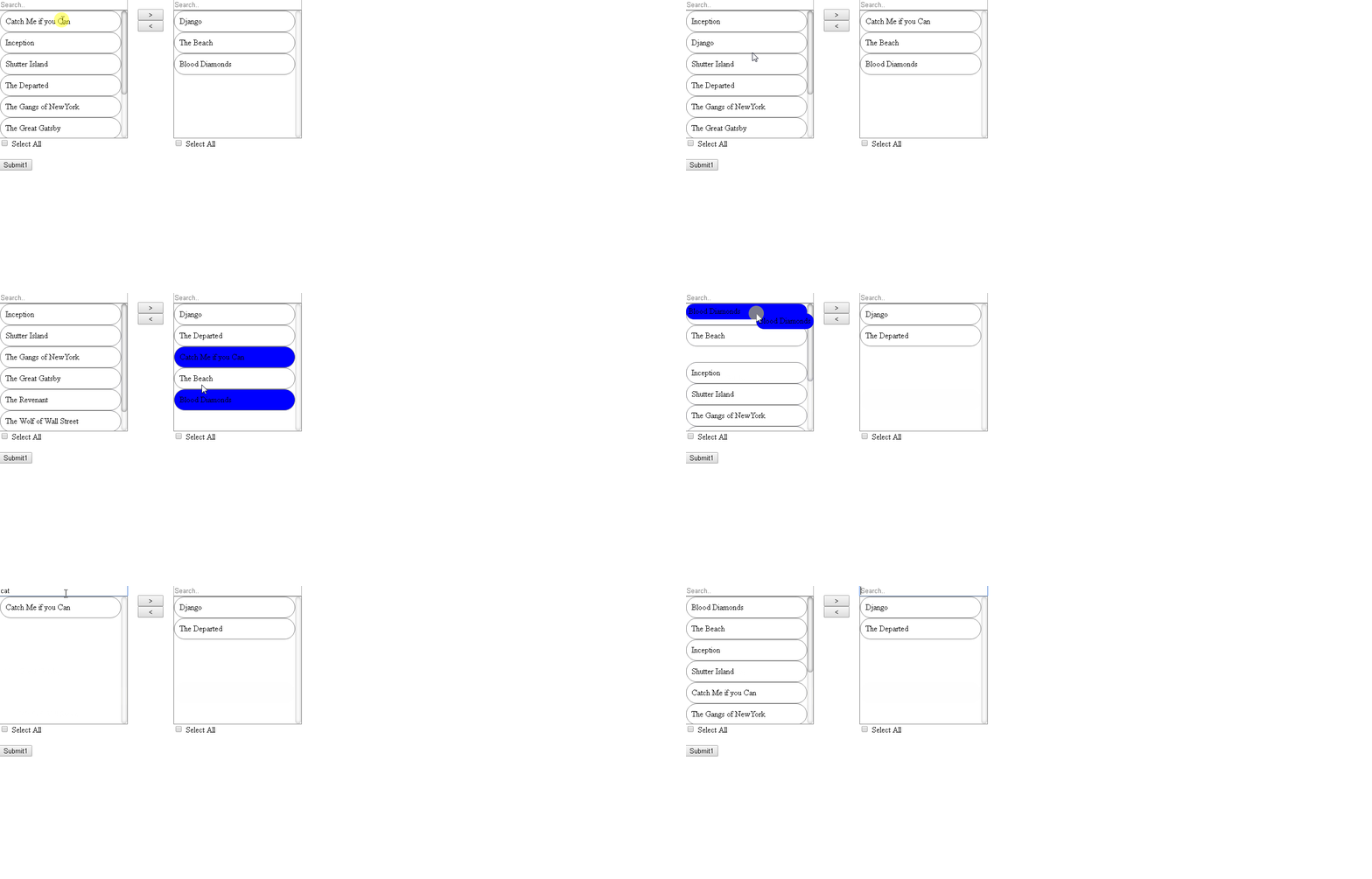
This component provides a multi select box with drag and drop feture between the lists. The list are searchable and sortable. It also has a select all feature. The styling can be customized using CSS.
[](./aui-select-box-demo.gif)
-list required list of items to select from
-search optional option to turn on filtering on the list; default=false
-sort optional option to turn on sorting on the list; default=false
-selectAll optional option to turn on select all feature on the lists; default=false
-disabled optional option to disable the component; default=false; In Disable mode search, sort and selectAll are false
-value option to set the default value in template mode; deafult=[]
-formControlName: tie the value to the form control
**ReactiveForms**
```
const selectedList: string[] = ['Django', 'The Beach', 'Blood Diamonds'];
this.userForm = new FormGroup({
'selectedItems': new FormControl(selectedList),
});
--OR--
this.userForm = new FormGroup({
'selectedItems': new FormControl({value: selectedList, disabled: true}),
});
<aui-select-box id="myListBox" [list]="list"
search="true" sort="true" selectAll="true"
formControlName="selectedItems"></aui-select-box>
```
**Template Form**
```
<aui-select-box id="myListBox" [list]="list" [value]="defaultValues"
search="true" sort="true" selectAll="true" [disabled]="false"
name="selectedItems" ngModel
```