app-launcher-karma
Version:
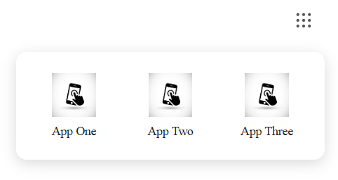
A React TypeScript component for an app launcher, similar to Google app launcher, for company products.
429 lines (354 loc) • 11.3 kB
Markdown
# app-launcher
A React-based app launcher component available as an npm package and also via CDN for easy integration in any web page.
## Features
- 🚀 Easy integration via CDN or npm
- ⚛️ Built with React and TypeScript
- 🎨 Fully customizable styling with CSS-in-JS
- 📱 Responsive design with smooth animations
- 🔗 Simple click-to-launch functionality
- ⌨️ Keyboard navigation (ESC to close)
- 🖱️ Click outside to close
- 🖼️ Supports both URL and base64 icons
- ♿ Accessible with proper ARIA labels
## Installation
### Via npm
For React projects, install the package using npm:
```bash
npm install app-launcher-karma
```
Then import the components as needed in your React application.
### Via CDN
For quick integration into any HTML page without a build process, use the CDN version.
### CDN Usage
Include the app launcher in any HTML page by loading React, ReactDOM, and the app-launcher CDN script. Then call the global `renderAppLauncher` function to render the component.
```html
<body>
<div id="app-launcher"></div>
<!-- Load React and ReactDOM from CDN -->
<script src="https://unpkg.com/react@18/umd/react.production.min.js"></script>
<script src="https://unpkg.com/react-dom@18/umd/react-dom.production.min.js"></script>
<!-- Load app-launcher from CDN -->
<script src="https://cdn.jsdelivr.net/npm/app-launcher-karma@1.0.3/dist/app-launcher.cdn.js"></script>
<!-- Render the app launcher -->
<script>
window.renderAppLauncher(
"app-launcher",
[
{ name: "App 1", icon: "/images/app1.jpg", url: "https://example.com/app1" },
{ name: "App 2", icon: "/images/app2.jpg", url: "https://example.com/app2" },
],
{
// Optional configuration
svgColor: "#FF0000", // Red dots
position: "right", // Position the dropdown
dropdownStyles: { // Custom styles
container: {
background: "#f5f5f5"
}
}
}
);
</script>
</body>
</html>
```
### npm Usage
#### JavaScript
```javascript
import { AppLauncher } from "app-launcher-karma";
function MyApp() {
const products = [
{
name: "App 1",
icon: "/images/app1.jpg",
url: "https://example.com/app1",
},
{
name: "App 2",
icon: "/images/app2.jpg",
url: "https://example.com/app2",
},
];
return (
<div>
<AppLauncher products={products} />
</div>
);
}
```
#### TypeScript
```typescript
import { AppLauncher, AppLauncherProduct } from "app-launcher-karma";
function MyApp() {
const products: AppLauncherProduct[] = [
{
name: "App 1",
icon: "/images/app1.jpg",
url: "https://example.com/app1",
},
{
name: "App 2",
icon: "/images/app2.jpg",
url: "https://example.com/app2",
},
];
return (
<div>
<AppLauncher products={products} />
</div>
);
}
```
## TypeScript Support
This package is written in TypeScript and includes type definitions. The following interfaces are available:
### AppLauncherProduct
```typescript
interface AppLauncherProduct {
name: string;
icon: string; // URL or base64 data URI
url: string;
}
```
### AppLauncherProps
```typescript
interface AppLauncherProps {
products: AppLauncherProduct[];
dropdownStyles?: DropdownStyles;
}
```
### DropdownStyles
```typescript
interface DropdownStyles {
container?: CSSProperties;
grid?: CSSProperties;
item?: CSSProperties;
icon?: CSSProperties;
label?: CSSProperties;
}
```
### Usage with Types
```typescript
import {
AppLauncher,
AppLauncherProduct,
AppLauncherProps,
} from "app-launcher-karma";
const products: AppLauncherProduct[] = [
{
name: "Gmail",
icon: "data:image/png;base64,iVBORw0KGgoAAAANSUhEUgAAAAEAAAABCAYAAAAfFcSJAAAADUlEQVR42mP8/5+hHgAHggJ/PchI7wAAAABJRU5ErkJggg==",
url: "https://gmail.com",
},
{
name: "Calendar",
icon: "/icons/calendar.png",
url: "https://calendar.google.com",
},
];
function MyComponent(): JSX.Element {
return <AppLauncher products={products} />;
}
```
### Custom Styling
```typescript
import {
AppLauncher,
AppLauncherProduct,
DropdownStyles,
} from "app-launcher-karma";
const customStyles: DropdownStyles = {
container: {
background: "#f8f9fa",
borderRadius: 16,
boxShadow: "0 8px 32px rgba(0,0,0,0.12)",
minWidth: 400,
},
grid: {
gridTemplateColumns: "repeat(4, 1fr)",
gap: 16,
},
item: {
padding: 12,
borderRadius: 12,
transition: "all 0.2s ease",
":hover": {
background: "#e9ecef",
},
},
icon: {
width: 64,
height: 64,
borderRadius: 8,
},
label: {
fontSize: 12,
fontWeight: 500,
color: "#495057",
},
};
const products: AppLauncherProduct[] = [
{ name: "Dashboard", icon: "/icons/dashboard.png", url: "/dashboard" },
{ name: "Analytics", icon: "/icons/analytics.png", url: "/analytics" },
];
function StyledLauncher(): JSX.Element {
return <AppLauncher products={products} dropdownStyles={customStyles} />;
}
```
## API Reference
### renderAppLauncher (CDN)
When using the CDN version, call `window.renderAppLauncher(elementId, products, options)` with the following configuration:
| Parameter | Type | Required | Description |
| ----------- | ------ | -------- | ----------------------------------------------------------------- |
| `elementId` | string | Yes | The id of the DOM element where the app launcher will be rendered |
| `products` | array | Yes | Array of product objects (see Product Object structure below) |
| `options` | object | No | Configuration options (see Options Object structure below) |
### Options Object
| Property | Type | Default | Description |
| ---------------- | -------------------------- | ------- | --------------------------------------------------------------- |
| `dropdownStyles` | DropdownStyles | {} | Custom styles for dropdown elements (see Styling section below) |
| `svgColor` | string | "#555" | Color of the launcher button dots |
| `position` | "right" , "left" ,"center" | "left" | Position of the dropdown relative to the launcher button |
| |
### Product Object
Each product in the `products` array should have the following structure:
| Property | Type | Required | Description |
| -------- | ------ | -------- | ------------------------------------------------- |
| `name` | string | Yes | Name of the product to display |
| `icon` | string | Yes | URL or base64 data URI for the product icon image |
| `url` | string | Yes | URL to launch when the product is clicked |
## Important Notes
- When using the CDN version, make sure to load React and ReactDOM before the app-launcher script
- The `renderAppLauncher` function is exposed globally by the CDN bundle
- Product icons should be optimized for web display (recommended: square images, 64x64px or larger)
- URLs can be absolute or relative paths
- Custom styles are merged with default styles, allowing for partial customization
- The dropdown uses a 3-column grid by default, but can be customized via `dropdownStyles.grid`
- The launcher button color can be customized using the svgColor option
- Dropdown positioning can be set to left (default), center, or right
## Styling & Customization
The app launcher supports comprehensive styling customization through the `dropdownStyles` prop. You can customize the following elements:
### Styling Options
| Style Key | Description | Default Values |
| ----------- | ------------------------ | -------------------------------------------------------------- |
| `container` | Main dropdown container | Background: `#fff`, border-radius: `12px`, shadow, positioning |
| `grid` | Product grid layout | 3-column grid with `10px` gap |
| `item` | Individual product items | Flex column layout, padding: `8px`, border-radius: `8px` |
| `icon` | Product icons | Size: `50x50px`, object-fit: `contain` |
| `label` | Product name labels | Font-size: `14px`, color: `#222` |
### Styling Examples
#### Dark Theme
```typescript
const darkStyles: DropdownStyles = {
container: {
background: "#2d3748",
border: "1px solid #4a5568",
},
item: {
color: "#e2e8f0",
":hover": {
background: "#4a5568",
},
},
label: {
color: "#e2e8f0",
},
};
```
#### Compact Layout
```typescript
const compactStyles: DropdownStyles = {
container: {
minWidth: 280,
padding: 12,
},
grid: {
gridTemplateColumns: "repeat(4, 1fr)",
gap: 8,
},
icon: {
width: 40,
height: 40,
},
label: {
fontSize: 12,
},
};
```
#### Large Icons
```typescript
const largeIconStyles: DropdownStyles = {
container: {
minWidth: 480,
},
grid: {
gridTemplateColumns: "repeat(3, 1fr)",
gap: 20,
},
item: {
padding: 16,
},
icon: {
width: 80,
height: 80,
borderRadius: 12,
},
label: {
fontSize: 16,
fontWeight: 600,
marginTop: 8,
},
};
```
## Examples
### CDN with Custom Styles
```html
<script>
const customStyles = {
container: {
background: "#f8f9fa",
borderRadius: 16,
minWidth: 400,
},
grid: {
gridTemplateColumns: "repeat(4, 1fr)",
gap: 16,
},
icon: {
width: 60,
height: 60,
borderRadius: 8,
},
};
window.renderAppLauncher(
"app-launcher",
[
{
name: "App 1",
icon: "/images/app1.jpg",
url: "https://example.com/app1",
},
{
name: "App 2",
icon: "/images/app2.jpg",
url: "https://example.com/app2",
},
],
{
// Optional configuration
svgColor: "#FF0000", // Red dots
position: "right", // Position the dropdown
dropdownStyles: {
// Custom styles
container: {
background: "#f5f5f5",
},
},
}
);
</script>
```
## License
This project is licensed under the MIT License.
## Support
If you encounter any issues or have questions, please file an issue on the GitHub repository.