angularjs-gauge
Version:
A Gauge directive for Angular 1.x apps and dashboards
189 lines (130 loc) • 9.51 kB
Markdown
# angular-gauge
[](https://badge.fury.io/js/angularjs-gauge)
[](https://travis-ci.org/ashish-chopra/angular-gauge)
[](https://david-dm.org/ashish-chopra/angular-gauge?type=peer)
[](https://david-dm.org/ashish-chopra/angular-gauge?type=dev)
[](https://github.com/dwyl/esta/issues)
A reusable gauge directive for Angular 1.x apps and dashboards. It provides many configurationable options to customize according to your needs. Checkout the live demo [here](https://ashish-chopra.github.io/angular-gauge).
If you are looking for Gauge Component for Angular 4 and beyond, checkout [ngx-gauge](https://github.com/ashish-chopra/ngx-gauge).
**NOTE: In angular-gauge 2.x, some breaking changes have been introduced. If you are upgrading from `v1.x.x` version to `v2.x.x` then checkout the [Upgrade Guide](#upgrade-guide) first.**
# Usage
### Install using npm
```
npm install angularjs-gauge
```
### Install using Bower
```
bower install angularjs-gauge
```
### Install manually
```
git clone https://github.com/ashish-chopra/angular-gauge.git
```
Copy the files from `dist/` manually into your project folder.Then, add the script to your code (after adding the dependency of Angular 1.5) and resolving the paths as given below:
```html
<head>
...
<head>
<body>
...
</body>
<script src="vendor/angular/angular.min.js"></script>
<script src="vendor/angularjs-gauge/dist/angularjs-gauge.min.js"></script>
```
Add as dependency in your module
```js
angular.module('yourApp', ['angularjs-gauge']);
```
Use it in your HTML markup like this
```html
<ng-gauge size="200" type="full" thick="5" min="0" max="120" value="68.2" cap="round" label="Speed" foreground-color="#ffcc66" background-color="rgba(255,255,255, 0.4)" append="mph"></ng-gauge>
```
If you face any problem, then raise an issue [here](https://github.com/ashish-chopra/angular-gauge/issues).
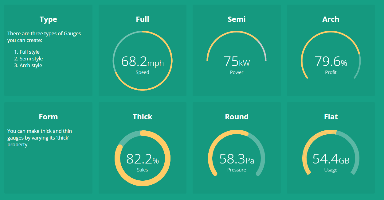
# Config Options
There are plenty of configurable options available to tune the `Gauge` as per your needs.
| Name | Description | Required | Default value | Possible values |
| --- | --- | --- | --- | --- |
| `size` | Specifies the size of the canvas in which Gauge will be drawn. It is used as `width` and `height` both. | No | `200` | Positive Integer |
| `type` | Specifies the gauge's type. | No | `"full"` | `"full"`, `"semi"`, `"arch"` |
| `min` | Specifies the minimum numeric value for gauge's scale. | No | `0` | Any numeric value |
| `max` | Specified the maximum numeric value for gauge's scale. | No | `100` | Any numeric value |
| `value` | Specifies the current value of the Gauge in the range specified by `min` and `max`. It is a required attribute. | Yes | `undefined` | Any numeric value |
| `cap` | The style of line ending at the gauge's end. | No | `"butt"` | `"round"`, `"butt"` |
| `thick` | Specified the thickness of the gauge's bar. | No | `6` | Any Positive Integer |
| `label` | Specifies the text to display below the Gauge's reading. | No | `undefined` | Any String |
| `foreground-color` | Specifies the foreground color of the Gauge's scale. | No | `rgba(0, 150, 136, 1)` | Any color value string |
| `background-color` | Specifies the background color of the Gauge's scale.| No | `rgba(0, 0, 0, 0.1)` | Any color value string |
| `append` | Specifies a `string` appended to the Gauge's reading. For example `"%"` most commonly used. | No | `undefined` | Any string |
| `prepend` | Specifies a `string` prepended to the Gauge's reading. For example `"$"` in case of financial data displayed in Gauge. | No | `undefined` | Any String |
| `duration` | Specifies the duration (in milliseconds) of the Gauge's animation | No | `1500` | Positive Integer |
| `thresholds` | Specifies an object of threshold values at which the gauge's color changes. Checkout an example [here](#configure-threshold-color-ranges). | No | `none` | {} |
| `label-only` | Only label specified by `label` attribute is shown, when set to `true`. | No | `false` | `true`, `false` |
| `fraction-size` | Number of decimal places to round the number to. If this is not provided then the fraction size is computed from the current locale's number formatting pattern. | No | `none` | Positive Integer |
# Global Defaults
angular-gauge ships with a provider to globally set config options for all gauge instances used in the application during angular config phase. You can specify `ngGaugeProvider` dependency during `config` phase. It supports a single API to set config options:
```js
ngGaugeProvider.setOptions(customOptions);
```
Here, `customOptions` is an object `{}` where keys are the configOptions name (in camelCase notation), mentioned in above section. For example, let see how to set `size`, `cap`, `thick`, `foreground-color` and `background-color` options globally using provider as shown below:
```js
angular
.module('myApp', ['angularjs-gauge'])
.config(configApp);
configApp.$inject = ['ngGaugeProvider'];
function configApp(ngGaugeProvider) {
// setting the default parameters for
// gauge instances globally.
ngGaugeProvider.setOptions({
size: 250,
cap: 'round',
thick: 15,
foregroundColor: "#ff8645", // note the camelCase notation for parameter name
backgroundColor: "#e4e4e4"
});
}
```
## Configure Threshold Color Ranges
You can customize the colors of the gauge based on the current value being shown. This feature is introduced in `v2.1.0`. Make sure to update your local copy before using this feature.
In order to show different colors when gauge crosses certain value, use property `thresholds`. It takes an object with the threshold value as `key` and an object with `color` property as `value`. For example:
```js
....
var threshold = {
'0': {color: 'green'},
'40': {color: 'orange'},
'75.5': {color: 'red'}
};
....
```
```html
<ng-gauge ... thresholds="threshold"></ng-gauge>
```
The keys in the threshold object signifies the minimum value at which the color will be applied. For instance, if the gauge's current value is `53.2`, then orange color will be applied because after point `40` every value will be displayed as `orange`, until next threshold is encountered. In this example `75.5` is the next threshold.
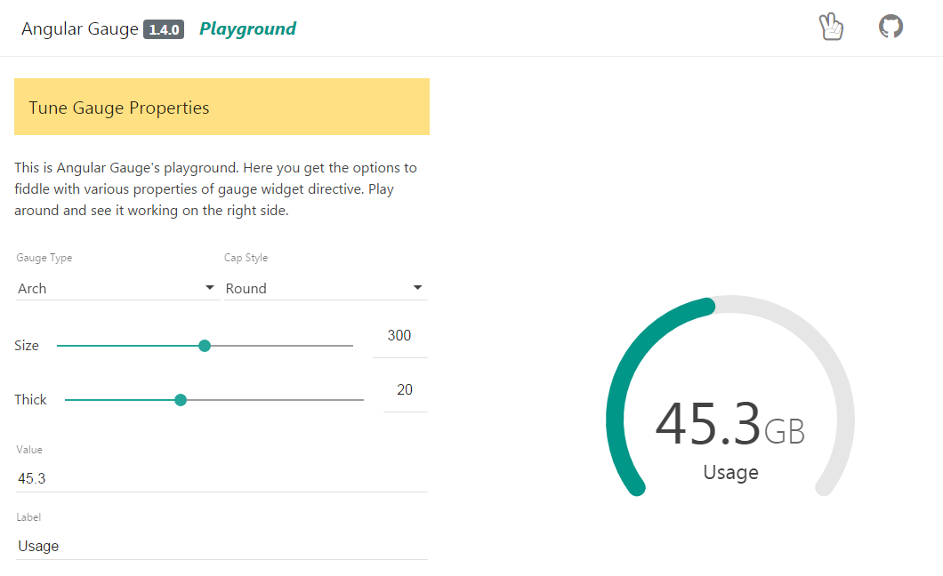
# Playground
The examples section is redesigned as a playground where you can play with Gauge by tuning its different parameters.
And, you can see the result live on-screen. It is good start to get familiar with Gauge.
# Upgrade Guide
If you are upgrading from angular-gauge 1.x version to any version in 2.x family, then make sure to read the release notes of the chosen version on the [Releases](https://github.com/ashish-chopra/angular-gauge/releases) section.
Following are the breaking changes introduced in 2.x.x onwards:
1. `used` and `total` attributes are removed.
2. `min` and `max` attributes are introduced which works with `value` attribute. Checkout [config options](#config-options) to know more about their usage.
# Contribute
The project is continously evolving with every new release. Give it a star, if you like it. For contribution, setup the development environment as follows:
1. clone and setup the project dependencies
```shell
$> git clone https://github.com/ashish-chopra/angular-gauge.git
$> npm install
```
2. Use following commands based on what you'd like to do:
```shell
$> npm start # starts the server at port 3000 and hosts the `/examples` directory.
$> npm test # runs test suite once and exit.
$> npm run test:watch # starts the test framework and watch for changes in code.
$> npm run build # triggers a manual build for library, outputs at `/dist` directory.
```
3. To add a new feature or fix a bug, make sure to create a new branch from `master`.
First thing first, explore the [issue tracker](https://github.com/ashish-chopra/angular-gauge/issues) to find something to contribute. There are tons of other project setup related issues and activities in which you can help. Your feedback could also be a great contribution.
If you face any problem, then raise an issue [here](https://github.com/ashish-chopra/angular-gauge/issues).
# License
[MIT License](https://github.com/ashish-chopra/angular-gauge/blob/master/LICENSE)