angular-ng-popup-modal
Version:
A lightweight, configurable, and developer-friendly popup modal for Angular applications. Built using **Angular CLI v15.1.0**, this modal component helps you plug clean confirmation dialogs into your app without any hassle.
134 lines (99 loc) • 4.83 kB
Markdown
# Angular Modern Popup Modal
A lightweight, configurable, and developer-friendly popup modal for Angular applications.
Built using **Angular CLI v15.1.0**, this modal component helps you plug clean confirmation dialogs into your app without any hassle.
## 🚀 Features
### ✨ Flexible & Dynamic
- Create modals dynamically using `ViewContainerRef`.
- Fully customizable text, labels, icons, and colors.
### 🧩 Rich Input Options
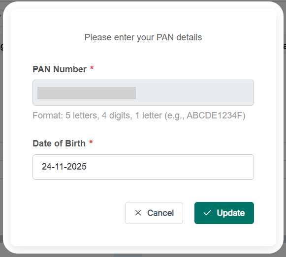
- Supports plain text or **HTML content**.
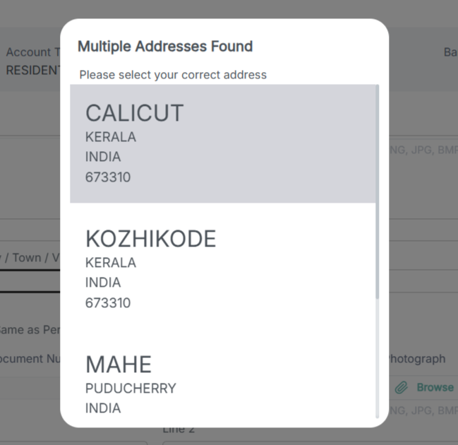
- Optional **dropdown**, **remarks box**, and **address list**.
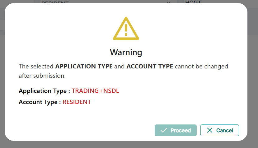
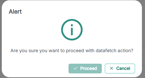
- Show/hide confirm or cancel buttons based on your use case.
### 🎨 Clean & Responsive UI
- Comes with built-in icons and color customization.
- Choose modal size: `small`, `medium`, or `large`.
### 🧲 Simple & Predictable Outputs
- Emits confirmation status.
- Emits selected values or address details when required.
### ♻️ Reusable Across Your App
- Packaged as an npm library → easy to plug into any Angular project.
## 📦 Installation
```bash
npm install angular-ng-popup-modal
```
## 🔧 Usage Example
Import the modal component:
```ts
import { NgPopupModalComponent } from 'sparc-popup-modal';
```
Template:
```html
<ng-template #confirmationPopUp></ng-template>
```
Trigger modal:
```ts
@ViewChild('confirmationPopUp', { read: ViewContainerRef }) container!: ViewContainerRef;
showPopUp() {
this.container.clear();
const compRef = this.container.createComponent(NgPopupModalComponent);
compRef.instance.popupHead = 'Confirmation';
compRef.instance.confrmText = 'Text';
compRef.instance.confirmLable = 'Proceed';
compRef.instance.cancelLable = 'Cancel';
compRef.instance.getConfirmStatus.subscribe((result: any) => {
if (result === 'Y') {
// user confirmed
} else {
// user cancelled
}
compRef.destroy();
});
}
```
## 🎛️ Inputs & Outputs
### Inputs
| Input | Description | | |
| -------------------- | ------------------------------ | -------- | -------- |
| `popupHead` | Popup header title | | |
| `confrmText` | Confirmation text | | |
| `textHTML` | HTML content (SafeHtml) | | |
| `showHTML` | Show HTML content (`Y`/`N`) | | |
| `confirmLable` | Confirm button label | | |
| `cancelLable` | Cancel button label | | |
| `confirmIcon` | Icon for confirm button | | |
| `cancelIcon` | Icon for cancel button | | |
| `contentIcon` | Icon for modal content | | |
| `isVisible` | Toggle popup visibility | | |
| `iconColor` | Color of the icons | | |
| `showConfirmation` | Show/hide confirm button | | |
| `showCancel` | Show/hide cancel button | | |
| `addressList` | Address list array | | |
| `showRemarks` | Show remarks input | | |
| `showRemarksBtn` | Show submit button for remarks | | |
| `showDropDown` | Show dropdown menu | | |
| `dropdownname` | Dropdown label | | |
| `dropDownValues` | Dropdown options | | |
| `isDropDownDisabled` | Enable/disable dropdown | | |
| `selectedValue` | Selected dropdown value | | |
| `popupWidth` | Modal width: `'small' | 'medium' | 'large'` |
### Outputs
| Output | Description |
| ------------------ | ------------------------------ |
| `getConfirmStatus` | Emits `'Y'` or `'N'` |
| `getAddress` | Emits selected address details |
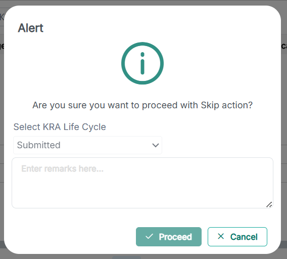
## 🖼️ Screenshots
## 📤 Publishing
```bash
ng build angular-ng-popup-modal
cd dist/angular-ng-popup-modal
npm publish
```
## 🧪 Running Unit Tests
```bash
ng test angular-ng-popup-modal
```