angular-material-dynamic-themes-eli
Version:
Making able the app to switch between material themes at run-time
244 lines (191 loc) • 10.3 kB
Markdown
<p dir="auto">
<a href="https://npmjs.com/package/angular-material-dynamic-themes-eli">
<img alt="npm (scoped)" src="https://img.shields.io/npm/v/angular-material-dynamic-themes.svg">
</a>
<a href="https://snyk.io//test/github/mirismaili/angular-material-dynamic-themes?targetFile=package.json">
<img src="https://snyk.io//test/github/mirismaili/angular-material-dynamic-themes/badge.svg?targetFile=package.json" alt="Known Vulnerabilities" data-canonical-src="https://snyk.io//test/github/mirismaili/angular-material-dynamic-themes?targetFile=package.json">
</a>
<a href="https://packagephobia.now.sh/result?p=angular-material-dynamic-themes">
<img src="https://packagephobia.now.sh/badge?p=angular-material-dynamic-themes" alt="install size">
</a>
<br>
<a href="http://commitizen.github.io/cz-cli/">
<img alt="Commitizen friendly" src="https://img.shields.io/badge/commitizen-friendly-brightgreen.svg">
</a>
<br>
<a href="https://github.com/mirismaili/angular-material-dynamic-themes/blob/master/LICENSE">
<img alt="GitHub" src="https://img.shields.io/github/license/mirismaili/angular-material-dynamic-themes.svg">
</a>
</p>
Originally made by [mirismaili](https://github.com/mirismaili) and published [here](https://www.npmjs.com/package/angular-material-dynamic-themes) but not maintained.
**Angular-Material-Dynamic-Themes**
Making able the app to switch between material themes at run-time
[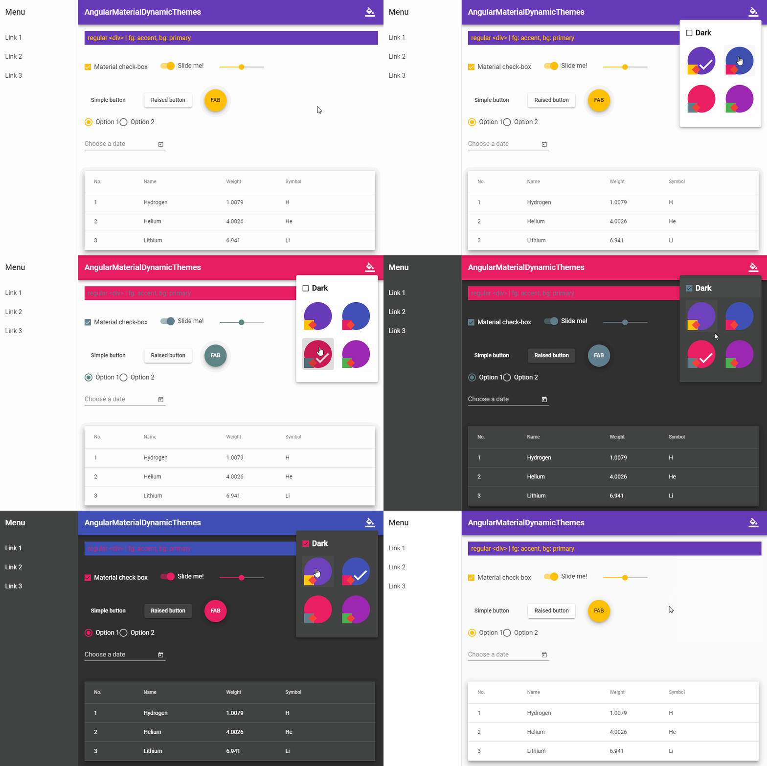](https://github.com/mirismaili/AngularMaterialDynamicThemes)
***
**Table of Contents**
* [Installation](#installation)
* [Basic Usage](#basic-usage)
* [Advanced Usage](#advanced-usage)
* [Possible configurations](#possible-configurations)
* [Use material themes for other elements (non\-material elements)](#use-material-themes-for-other-elements-non-material-elements)
* [Demo](#demo)
# Installation
In your **Angular Material project**:
```bash
npm install angular-material-dynamic-themes-eli
```
> NOTE: This solution is only compatible with **SASS/SCSS** preprocessor.
# Basic Usage
In your `styles.scss` (or `themes.scss` if you have):
```scss
// Below codes should only be included ONCE in your application.
'~@angular/material/theming';
mat-core();
// Add your desired themes to this map.
$themes-map: (
indigo-pink: (
primary-base: $mat-indigo,
accent-base: $mat-pink,
),
deeppurple-amber: (
primary-base: $mat-deep-purple,
accent-base: $mat-amber,
),
pink-bluegrey: (
primary-base: $mat-pink,
accent-base: $mat-blue-gray,
),
purple-green: (
primary-base: $mat-purple,
accent-base: $mat-green,
),
);
// Import the module and do the job:
'~angular-material-dynamic-themes/themes-core';
make-stylesheets($themes-map);
```
<sup>For more information about `$themes-map` and adding more customizations to your themes, see [Advanced Usage](#advanced-usage).</sup>
In your main component:
```typescript
import {Component, HostBinding} from '@angular/core'
import {OverlayContainer} from '@angular/cdk/overlay'
const THEME_DARKNESS_SUFFIX = `-dark`
export class AppComponent {
activeThemeCssClass: string
isThemeDark = false
activeTheme: string
constructor(private overlayContainer: OverlayContainer) {
// Set default theme here:
this.setActiveTheme('deeppurple-amber', /* darkness: */ false)
}
setActiveTheme(theme: string, darkness: boolean = null) {
if (darkness === null)
darkness = this.isThemeDark
else if (this.isThemeDark === darkness) {
if (this.activeTheme === theme) return
} else
this.isThemeDark = darkness
this.activeTheme = theme
const cssClass = darkness === true ? theme + THEME_DARKNESS_SUFFIX : theme
const classList = this.overlayContainer.getContainerElement().classList
if (classList.contains(this.activeThemeCssClass))
classList.replace(this.activeThemeCssClass, cssClass)
else
classList.add(cssClass)
this.activeThemeCssClass = cssClass
}
toggleDarkness() {
this.setActiveTheme(this.activeTheme, !this.isThemeDark)
}
}
```
And change the theme using `setActiveTheme()` (or `toggleDarkness()`) whenever you want. ✓
> **A more detailed instruction can be found here:**
>
> **[https://medium.com/@s.m.mirismaili/angular-material-dynamic-themes-compatible-with-angular-7-8-e642ad3c09f4](https://medium.com/@s.m.mirismaili/angular-material-dynamic-themes-compatible-with-angular-7-8-e642ad3c09f4)**
# Advanced Usage
## Possible configurations
`make-stylesheets()` is the only thing in the API and gets a single parameter named `$themes-map` that was a *map* like what you saw in [Basic Usage](#basic-usage). You can see its documentation in the sources. But we bring the most important section of it here, that is **the schema of each member** (of the map):
```
css-class-name: (
primary-base: base-palette, // example: $mat-purple // will be ignored if you set corresponding mat-palette (primary). Set it to `null` in this case.
accent-base: base-palette, // example: $mat-green // will be ignored if you set corresponding mat-palette (accent). Set it to `null` in this case.
warn-base?: base-palette, // DEFAULT: $mat-red // will be ignored if you set corresponding mat-palette (warn). Set it to `null` in this case.
primary?: mat-palette, // DEFAULT: mat-palette(primary-base)
accent?: mat-palette, // DEFAULT: mat-palette(accent-base)
warn?: mat-palette, // DEFAULT: mat-palette(warn-base)
light-or-dark?: {'light' | 'dark' | ''}, // DEFAULT: '' => "Both light & dark"
),
```
## Use material themes for other elements (non-material elements)
Define `themed-stylesheets()` mixin before invoking `make-stylesheets()` with one important input: `$mat-theme` (that would be what you want):
```scss
/**
* // IMPORTANT NOTE: This mixin is just for other elements (non-material elements) that you want use material themes
* // for them. If you don't have such elements, simply remove this mixin.
*
* This is a *callback-mixin* and will be called in `make-stylesheets` with a argument ($mat-theme). The schema of this
* only argument would be:
* {
* primary: mat-palette,
* accent: mat-palette,
* warn: mat-palette,
* background: mat-theme-background,
* foreground: mat-theme-foreground,
* is-dark: boolean,
* }
*/
themed-stylesheets($mat-theme) {
// We only need "primary-color" and "accent-color" in this example. So commented out other (not-necessary)
// things. Uncomment each you need.
$primary: map-get($mat-theme, primary);
$accent: map-get($mat-theme, accent);
//$warn: map-get($mat-theme, warn);
//$background: map-get($mat-theme, background);
//$foreground: map-get($mat-theme, foreground);
$primary-color: mat-color($primary);
$accent-color: mat-color($accent);
//$warn-color: mat-color($warn);
//// Background colors:
//$status-bar-color: map-get($background, 'status-bar' );
//$app-bar-color: map-get($background, 'app-bar' );
//$background-color: map-get($background, 'background' );
//$hover-color: map-get($background, 'hover' );
//$card-color: map-get($background, 'card' );
//$dialog-color: map-get($background, 'dialog' );
//$disabled-button-color: map-get($background, 'disabled-button' );
//$raised-button-color: map-get($background, 'raised-button' );
//$focused-button-color: map-get($background, 'focused-button' );
//$selected-button-color: map-get($background, 'selected-button' );
//$selected-disabled-button-color: map-get($background, 'selected-disabled-button');
//$disabled-button-toggle-color: map-get($background, 'disabled-button-toggle' );
//$unselected-chip-color: map-get($background, 'unselected-chip' );
//$disabled-list-option-color: map-get($background, 'disabled-list-option' );
//// Foreground colors:
//$base-color: map-get($foreground, 'base' );
//$divider-color: map-get($foreground, 'divider' );
//$dividers-color: map-get($foreground, 'dividers' );
//$disabled-color: map-get($foreground, 'disabled' );
//$disabled-button-color: map-get($foreground, 'disabled-button' );
//$disabled-text-color: map-get($foreground, 'disabled-text' );
//$elevation-color: map-get($foreground, 'elevation' );
//$hint-text-color: map-get($foreground, 'hint-text' );
//$secondary-text-color: map-get($foreground, 'secondary-text' );
//$icon-color: map-get($foreground, 'icon' );
//$icons-color: map-get($foreground, 'icons' );
//$text-color: map-get($foreground, 'text' );
//$slider-min-color: map-get($foreground, 'slider-min' );
//$slider-off-color: map-get($foreground, 'slider-off' );
//$slider-off-active-color: map-get($foreground, 'slider-off-active');
//$is-dark: map-get($mat-theme, is-dark);
// Define themed-stylesheets here:
// Example themed-stylesheet:
.themed-element {
background: $primary-color;
color: $accent-color;
}
}
```
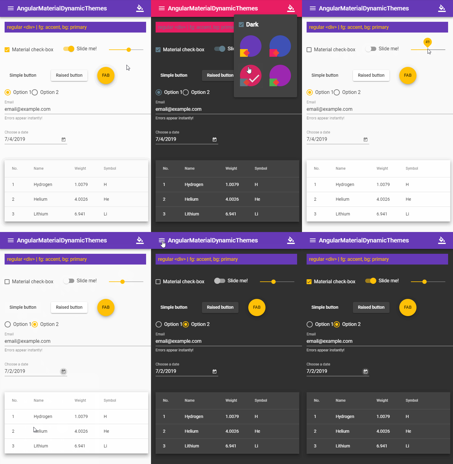
# Demo
https://github.com/mirismaili/AngularMaterialDynamicThemes
[](https://github.com/mirismaili/AngularMaterialDynamicThemes)