angular-hover-gradient-button
Version:
The Angular Hover Gradient Button is a customizable, easy-to-use Angular button with a hover gradient effect on hover.
95 lines (64 loc) • 2.86 kB
Markdown
# Angular Hover Gradient Button
The Angular Hover Gradient Button is a customizable, easy-to-use Angular button with a hover gradient effect on hover.
### [Demo](https://thiagopac.github.io/angular-hover-gradient-button-sample/) | [Stackblitz](https://stackblitz.com/~/github.com/thiagopac/angular-hover-gradient-button-sample)
## Features
- Customizable background color and hover color.
- Support for icons on the left or right side of the button's label.
- Flexible and easy-to-use with dynamic content.
## Installation
To install the Angular Hover Gradient Button in your project, you can run the following command:
```bash
npm install angular-hover-gradient-button
```
## Usage
First, import `AngularHoverGradientButton` in your Angular module or component:
```typescript
import { AngularHoverGradientButton } from "angular-hover-gradient-button";
@NgModule({
declarations: [AppComponent],
imports: [BrowserModule, AngularHoverGradientButton],
bootstrap: [AppComponent],
})
export class AppModule {}
```
Then, you can use the `angular-hover-gradient-button` component in your templates:
```html
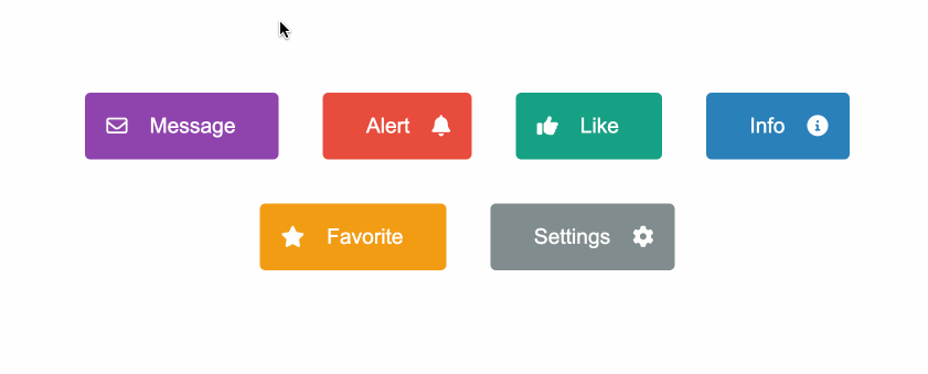
<angular-hover-gradient-button backgroundColor="#8e44ad" hoverColor="#3498db">
<i slot="left" class="fa-regular fa-envelope"></i>
<span slot="label">Message</span>
</angular-hover-gradient-button>
```
## Icons
The `angular-hover-gradient-button` component supports positioning of icon display using the `slot` attribute.
### Slot Attribute
The `slot` attribute determines the position of the icon within the button. There are two options for `slot`:
- `left`: Positions the icon on the left side of the button.
- `right`: Positions the icon on the right side of the button.
Example usage:
```html
<i class="fa fa-icon-name" slot="left"></i>
<!-- Icon on the left -->
<i class="fa fa-icon-name" slot="right"></i>
<!-- Icon on the right -->
```
## Inputs
| Input | Description | Type | Default Value |
| ----------------- | ------------------------------- | ------ | ------------- |
| `backgroundColor` | Background color of the button. | String | `'#1e3799'` |
| `hoverColor` | Color of the progress bar. | String | `'#78e08f'` |
## Styling
The component supports customization through CSS variables. You can override the following variables to customize the appearance:
```scss
angular-hover-gradient-button {
--button-color: white;
--button-padding: 1em;
--button-border-radius: 5px;
--button-border: none;
--button-font-size: 1.2em;
}
```
## Contributing
Contributions are welcome! Please open an issue or submit a pull request with your improvements.
## License
This project is licensed under the [ISC License](LICENSE.md).