aframe-colorwheel-component
Version:
A-Frame Color Wheel component, designed for A-Frame Material
106 lines (79 loc) • 3.97 kB
Markdown
## aframe-colorwheel-component
[](https://npmjs.org/package/aframe-colorwheel-component)
[](https://npmjs.org/package/aframe-colorwheel-component)
A-Frame Color Wheel component, designed to be used with A-Frame Material
***NOTE: A-Frame Material is not required to use this component***
For [A-Frame](https://aframe.io).
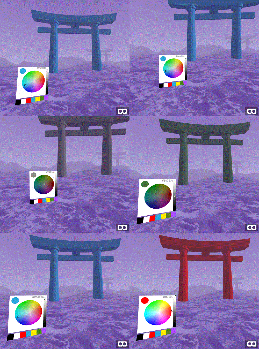
### Examples
* [Basic: Sky Changer](https://mokargas.github.io/aframe-colorwheel-component/examples/basic/index-sky.html)
* [Basic: Prop Colorization](https://mokargas.github.io/aframe-colorwheel-component/examples/basic)
* [Basic: Show Hex Value](https://mokargas.github.io/aframe-colorwheel-component/examples/basic/index-showhex.html)
* [Basic: Show Swatches](https://mokargas.github.io/aframe-colorwheel-component/examples/basic/index-showswatches.html)
### API
| Property | Description | Default Value |
| -------- | ----------- | ------------- |
| disabled | Wether the color wheel responds to clicks or taps | false |
| backgroundcolor | Background color of the UI | #fff |
| wheelSize | Size (m) if the color wheel element. Note: This will determine the UI size automatically and assumes a a square element | 0.4 (40cm) |
| showSelection | Show the color-selected circle (top left corner of UI) | true |
| selectionSize | Size (m) of the selection circle, if enabled | 0.10 (10cm) |
| showHexValue | Show the color as a hex value (Note: currently output only). If enabled, you can click on the value to copy the contents to your clipboard on selected devices only | false |
| showSwatches | Show a collection of swatch colors, specified by the swatches property | false |
| swatches | If showSwatches is set to true, the following colors will be available | ['#000000', '#FFFFFF', '#ff0000', '#2aa8dc', '#ffed00', '#4c881d', '#b14bff'] |
### Installation
#### Browser
* Install and use by directly including the [browser files](dist):
* Create a listener component to listen for changes
```html
<head>
<title>My Cool A-Frame Scene</title>
<script src="https://aframe.io/releases/0.6.1/aframe.min.js"></script>
<script src="https://unpkg.com/aframe-colorwheel-component/dist/aframe-colorwheel-component.min.js"></script>
<script type="text/javascript">
//Example of using the color wheel with events
AFRAME.registerComponent('color-listener', {
init: function(){
const el = this.el;
document.body.addEventListener('didchangecolor', function(evt){
//Available return formats from colorwheel
let style = evt.detail.style
let rgb = evt.detail.rgb
let hsv = evt.detail.hsv
let hex = evt.detail.hex
el.setAttribute('color', hex)
})
}
})
</script>
</head>
<body>
<a-scene>
<a-entity colorwheel></a-entity>
<a-sky color="#6EBAA7" color-listener></a-sky>
</a-scene>
</body>
```
<!-- If component is accepted to the Registry, uncomment this. -->
<!--
Or with [angle](https://npmjs.com/package/angle/), you can install the proper
version of the component straight into your HTML file, respective to your
version of A-Frame:
```sh
angle install aframe-colorwheel-component
```
-->
#### npm
Install via npm:
```bash
npm install aframe-colorwheel-component
```
Then require and use.
```js
require('aframe');
require('aframe-colorwheel-component');
```
#### TODO / Roadmap
* Enable setting swatch colors
* Deeper customisation (padding, background colors, shader style)
* Interop testing