@zwdvidal/react-native-dropdownalert
Version:
A simple alert to notify users about new chat messages, something went wrong or everything is ok.
130 lines (111 loc) • 8.83 kB
Markdown
## react-native-dropdownalert
[](http://facebook.github.io/react-native/)
[](https://www.npmjs.com/package/react-native-dropdownalert)
[](https://www.npmjs.com/package/react-native-dropdownalert)
[](https://travis-ci.org/testshallpass/react-native-dropdownalert)
[](https://codecov.io/gh/testshallpass/react-native-dropdownalert)
[](https://raw.github.com/testshallpass/react-native-dropdownalert/master/LICENSE)
   
### Table of contents
1. [Support](#support)
2. [Installation](#installation)
3. [Demo](#demo)
4. [Usage](#usage)
5. [Props](#props)
6. [Caveats](#caveats)
A simple alert to notify users about new chat messages, something went wrong or everything is ok. It can be closed by tap, cancel button, automatically with `closeInterval`, pan responder up gesture or programmatically.
### Support
| react-native version | package version | reason |
| ---- | :---: | ---- |
| 0.50.0 | >=3.2.0 | Added SafeAreaView (iPhone X) |
| 0.44.0 | >=2.12.0 | Added ViewPropTypes |
### Installation
```
npm i react-native-dropdownalert --save
```
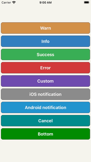
### Demo
### Usage
```javascript
// ...
import DropdownAlert from 'react-native-dropdownalert';
export default class App extends Component {
componentDidMount() {
this.fetchData();
}
fetchData = async () => {
try {
await fetch('https://mywebsite.com/endpoint/');
} catch (error) {
this.dropdown.alertWithType('error', 'Error', error.message);
}
};
render() {
return (
<View>
// !!! Make sure it is the last component in your document tree.
<DropdownAlert ref={ref => this.dropdown = ref} />
</View>
);
}
}
```
### Caveats
* Modals can overlap DropdownAlert if it's not inside the modal's document tree.
* It is important you place the `DropdownAlert` **ABOVE** the `StackNavigator`.
* [DropdownHolder example #1](https://gist.github.com/testshallpass/d76c656874e417bef4e0e6a63fc492af)
* [DropdownHolder example #2](https://gist.github.com/testshallpass/6c6c867269348c485a1e0d6ae3f55e90)
* [Redux + router flux example](https://gist.github.com/testshallpass/13f047205d1b966f55340b8962fe99c0)
* Repo: [react-native-dropdownalert-router-sample](https://github.com/mitsuruog/react-native-dropdownalert-router-sample) Thanks @mitsuruog and @articolo
### Props
| Name | Type | Description | Default |
| ---- | :---: | --- | --- |
| ```closeInterval``` | Number | dismiss alert at a certain time in milliseconds | 4000
| ```imageSrc``` | String or Number | local or network source for custom alert type | null
| ```infoImageSrc``` | String or Number | local or network source for info alert type | ```require('./assets/info.png')```
| ```warnImageSrc``` | String or Number | local or network source for warn alert type | ```require('./assets/warn.png')```
| ```errorImageSrc``` | String or Number | local or network source for error alert type | ```require('./assets/error.png')```
| ```successImageSrc``` | String or Number | local or network source for success alert type | ```require('./assets/success.png')```
| ```startDelta``` | Number | where the container starts (changes based on container height onLayout) | -100
| ```endDelta``` | Number | where the container ends | 0
| ```onClose``` | Function | Invoked when alert is closed Returns: ```data = {type, title, message, action}``` | null
| ```cancelBtnImageSrc``` | String or Number | local or network source | ```require('./assets/cancel.png')``` |
| ```titleNumOfLines``` | Number | number of lines | 1
| ```messageNumOfLines``` | Number | number of lines | 3
| ```onCancel``` | Function | Cancel button action. Returns: ```data = {type, title, message, action}``` | null
| ```showCancel``` | Bool | whether or not to show cancel button | false
| ```tapToCloseEnabled``` | Bool | enable/disable close with tap | true
| ```panResponderEnabled``` | Bool | enable/disable close with pan responder | true
| ```replaceEnabled``` | Bool | enables the alert to either state change without dismissal or go to next alert with dismissal | true
| ```translucent``` | Bool | StatusBar prop | false
| ```useNativeDriver``` | Bool | enable/disable native driver for animations. For android platform, in some older React Native versions, enable useNativeDriver can cause some problems. See [#65](https://github.com/testshallpass/react-native-dropdownalert/issues/65) | true (iOS) / false (Android)
| ```updateStatusBar``` | Bool | whether or not to update status bar styles | true
| ```activeStatusBarStyle``` | String | StatusBar barStyle when alert is open | `light-content`
| ```activeStatusBarBackgroundColor``` | String | StatusBar backgroundColor when alert is open | It takes on the backgroundColor of alert if predefined else default or provided prop
| ```inactiveStatusBarStyle``` | String | StatusBar barStyle when alert dismisses | `StatusBar._defaultProps.barStyle.value`
| ```inactiveStatusBarBackgroundColor``` | String | StatusBar backgroundColor when alert dismisses | `StatusBar._defaultProps.backgroundColor.value`
| ```wrapperStyle``` | Object | styles for the view that wraps the container. For [React Native Web](https://github.com/necolas/react-native-web) support you might want to set this to `{ position: 'fixed' }` | ```null```
| ```containerStyle``` | Object | styles for container for custom type only | ```{ padding: 16, flexDirection: 'row' }```
| ```zIndex``` | Number | zIndex attribute on outermost container | null
| ```titleStyle``` | Object | styles for title for all types | ```{ fontSize: 16, textAlign: 'left', fontWeight: 'bold', color: 'white', backgroundColor: 'transparent' }```
| ```messageStyle``` | Object | styles for message for all types | ```{ fontSize: 14, textAlign: 'left', fontWeight: 'bold', color: 'white', backgroundColor: 'transparent' }```
| ```imageStyle``` | Object | styles for image for all types | ```{ padding: 8, width: 36, height: 36, alignSelf: 'center' }```
| ```cancelBtnImageStyle``` | Object | styles for image for all types | ```{ padding: 8, width: 36, height: 36, alignSelf: 'center' }```
| ```successColor``` | String | Default background color of success message | #32A54A
| ```infoColor``` | String | Default background color of info message | #2B73B6
| ```warnColor``` | String | Default background color of warn message | #cd853f
| ```errorColor``` | String | Default background color of error message | #cc3232
| ```elevation``` | Number | Animated.View elevation | 1
| ```sensitivity``` | Number | Sensitivity for the pan responder up gesture | 20
| ```defaultContainer``` | Object | Style for inner view container (**override paddingTop with this**) | ```{ padding: 8, paddingTop: IS_ANDROID ? 0 : 20, flexDirection: 'row' } ```
| ```defaultTextContainer``` | Object | Style for inner text container (holds title and message) | ```{ flex: 1, padding: 8 }```
| ```renderImage``` | Function | Use to override the left image component | undefined
| ```renderCancel``` | Function | Use to override the cancel button component | undefined
| ```renderTitle``` | Function | Use to override the title component | undefined
| ```renderMessage``` | Function | Use to override the message component | undefined
| ```testID``` | String | Top level TouchableOpacity's testID | undefined
| ```accessibilityLabel``` | String | Top level TouchableOpacity's accessibilityLabel | undefined
| ```accessible``` | Boolean | Top level TouchableOpacity's accessible | false
| ```titleTextProps``` | Object | title text props. **does not override numOfLines (use titleNumOfLines)** | undefined
| ```messageTextProps``` | Object | message text props. **does not override numOfLines (use messageNumOfLines)** | undefined
> Inspired by: [RKDropdownAlert](https://github.com/cwRichardKim/RKDropdownAlert)